mirror of
https://github.com/block/buzz.git
synced 2026-11-09 02:41:57 +00:00
430862a9de2bbab1fcaefafbaaba3864839dec7e
242 Commits
| Author | SHA1 | Message | Date | |
|---|---|---|---|---|
 Salman Mohammed |
6c35e82bd5 |
fix(acp): improve hints in pi agent setup guide (#7594)
## Summary Handle missing Pi adapter setup and update its install guidance. ### Related issue None found. ### Testing No manual testing. Generated with Amp --------- Signed-off-by: Salman Mohammed <smohammed@squareup.com> Co-authored-by: Amp <amp@ampcode.com> |
||
|
Taylor Ho
|
ec11f8e2f3 |
fix(avatars): scale agent squircles from normalized paths (#7307)
## Overview **Category:** fix **User Impact:** Agent avatars and empty agent-team placeholders now keep the same intentional squircle silhouette at every size on desktop, while human avatars remain circular. **Problem:** Desktop agent avatars used percentage-rounded rectangles, which made the silhouette vary by surface and required each avatar implementation to recreate the shape. Empty team placeholders also drew a regular CSS border inside the clip, leaving straight inset edges that looked like a cropped square. **Solution:** Reuse one normalized SVG clip path across desktop artwork. Empty team placeholders use a separately clipped squircle outline behind the clipped surface, so both the fill and outline follow the canonical silhouette. > **Scope correction:** Mobile is deferred from this PR because a real Flutter capture could not be obtained reliably in the current build environment. Previously attached mobile images were hand-composed synthetic layouts, not captures from the running app; they have been removed and must not be treated as validation. The mobile implementation is being reverted in one follow-up commit so it can be reapplied and verified separately. ### Related issue Follow-up to #7106. ## Changes <details> <summary>File changes</summary> **desktop/src/features/agents/ui/AgentCreationPreview.tsx** Applies the shared squircle clip to agent creation preview images and fallbacks. **desktop/src/features/agents/ui/AgentSessionToolItem/CompactMessageSummary.tsx** Uses the shared agent-avatar silhouette in compact session summaries. **desktop/src/features/agents/ui/IdentityInitialsAvatar.tsx** Clips agent initials with the normalized squircle instead of a percentage radius. **desktop/src/features/agents/ui/TeamIdentityCard.tsx** Uses the shared squircle for agent identities and gives empty teams a separately clipped squircle outline instead of a regular inset border. **desktop/src/features/agents/ui/activityRenderClasses/UserMessageBubble.tsx** Keeps agent avatars in activity message bubbles on the canonical silhouette. **desktop/src/features/home/ui/InboxListPane.tsx** Applies the shared clip to agent avatars in the inbox list. **desktop/src/features/home/ui/InboxMessageRow.tsx** Applies the shared clip to agent avatars in inbox message rows. **desktop/src/features/huddle/components/ParticipantList.tsx** Uses the normalized squircle for agent participants while preserving circular human avatars. **desktop/src/features/messages/ui/MessageRow.tsx** Clips agent message avatars through the shared definition. **desktop/src/features/messages/ui/SystemMessageAvatars.tsx** Uses the canonical agent shape in system-message avatar groups. **desktop/src/features/messages/ui/TypingIndicatorRow.tsx** Uses the canonical agent shape in typing indicators. **desktop/src/features/profile/ui/ProfileAvatar.tsx** Scales the same squircle to the larger agent profile avatar. **desktop/src/features/profile/ui/SelectedRecipientChip.tsx** Uses the shared shape for selected agent recipients. **desktop/src/features/projects/ui/IssueAssigneesRow.tsx** Applies the agent squircle to issue assignees without changing human avatar geometry. **desktop/src/features/projects/ui/ProjectCards.tsx** Uses the canonical shape for agent avatars on project cards. **desktop/src/features/projects/ui/ProjectEntityListRow.tsx** Uses the canonical shape for agent identities in project entity lists. **desktop/src/features/projects/ui/ProjectsActivityFeed.tsx** Uses the shared clip for agent avatars in project activity. **desktop/src/features/projects/ui/ProjectsOverviewRail.tsx** Uses the shared clip for agent avatars in the project overview rail. **desktop/src/main.tsx** Mounts the single shared SVG clip-path definition once for the desktop application. **desktop/src/shared/lib/cn.ts** Registers `rounded-squircle` in the border-radius class group so shadcn-style `cn(...)` composition resolves it against `rounded-full` by normal last-class precedence. **desktop/src/shared/styles/globals/utilities.css** Registers the reusable Tailwind `rounded-squircle` utility and references the normalized SVG clip path without agent-specific CSS selectors. **desktop/src/shared/ui/AvatarClipPaths.tsx** Owns the reusable normalized object-bounding-box `rounded-squircle` path so all desktop sizes reuse one definition. **desktop/src/shared/ui/UserAvatar.tsx** Routes the existing squircle shape option through the shared SVG clip. **desktop/tests/e2e/agents.spec.ts** Verifies team facepile and empty-team placeholder surfaces/outlines use the canonical clip without a rectangular border. **desktop/tests/e2e/messaging.spec.ts** Verifies agent message and profile avatars reuse one clip definition and scale across rendered sizes. </details> ## Reproduction steps 1. Run the desktop app and open a channel containing both agent and human messages. 2. Compare agent avatars in the message list, inbox, huddle participants, projects, and profile panel. Agent images and fallbacks should share one smooth squircle silhouette at each size; human avatars should remain circular. 3. Open **Agents** and inspect an empty agent-team card. Its placeholder fill and outline should both be smooth squircles, with no straight inset cropped-square edges. 4. Open an agent profile from a message and confirm the larger profile avatar keeps the same proportions as the smaller message avatar. ## Testing - Desktop Biome check passed for the changed empty-team component and Agents E2E spec. - Desktop typecheck and differential file-size check passed. - Full desktop unit suite passed: 6,453 tests. - Full Agents integration spec passed: 37/37, including the empty-team outline regression. - Post-rebase pre-push gates passed at `304b159a2`: desktop checks, TypeScript typecheck, differential file-size gate, and all 6,453 desktop unit tests. - The shadcn-aligned `rounded-squircle` registration passed changed-file Biome, desktop TypeScript/build, and pre-push desktop checks at `27e0c12d3`; the full desktop unit suite passed 6,459/6,459. ## Screenshots Screenshots are temporarily omitted. The previous captures used the desktop E2E mock bridge and were not evidence from a live running app, so they were removed. --------- Signed-off-by: Taylor Ho <taylorkmho@gmail.com> Co-authored-by: Carl <acda9e433d19dcd0e6b6840f7f4b98f3a56f1fab98049d444c087019e6d36560@buzz.block.builderlab.xyz> Co-authored-by: Rizz <302abe414ca6e3134763d2539bfcf145aea2a63fe5f8455204ed602fd40cf381@buzz.block.builderlab.xyz> |
||
|
Taylor Ho
|
092c6a7277 |
fix(markdown): align mention chip wrapping (#7501)
**Category:** fix **User Impact:** Human and agent mentions now break across lines with the same cloned chip treatment as repository and permalink chips while preserving the conversation text rhythm. **Problem:** Profile-backed rendered mentions sat inside an `inline-flex` popover trigger, unlike entity chips, so the wrapper interfered with true inline fragmentation. The browser-layout test measured text-range rows rather than the painted chip rectangles, allowing touching decorations to pass as “separate” fragments. **Solution:** Keep the profile trigger interactive but override its layout to true `inline`, then give mention fragments 18px computed leading inside the message’s 20px prose rhythm. Chromium paints each fragment at 17px and advances it by 20px, leaving a visible gap between cloned rounded rectangles. The browser test now measures the chip’s own `getClientRects()` and asserts fragment count, height, gap, and step; entity links retain their existing 22px leading. <details> <summary>File changes</summary> **desktop/src/features/profile/ui/UserProfilePopover.tsx** Allows inline consumers to override the trigger wrapper’s layout without changing other profile-popover call sites. **desktop/src/shared/styles/globals/markdown.css** Keeps one shared wrapping-chip mechanic and gives mention decorations enough room to separate visibly within 20px prose. **desktop/src/shared/ui/markdown.test.mjs** Pins both rendered mentions and entity links to the shared wrapping-chip contract. **desktop/src/shared/ui/markdown/MarkdownMention.tsx** Makes the profile-popover trigger truly inline so the nested mention chip can fragment with surrounding prose. **desktop/src/shared/ui/mentionChip.ts** Keeps `wrapping-inline-chip` as the single contract for fragmenting decorated chips. **desktop/tests/e2e/mentions.spec.ts** Measures the painted chip rectangles, requires a positive fragment gap, and verifies the inline trigger remains mouse- and keyboard-operable. **desktop/tests/e2e/navigation.spec.ts** Keeps a wrapped repository chip as the control, asserting its existing 22px line height and fragment advance. </details> ## Reproduction steps 1. Open a channel in Buzz Desktop using dark theme. 2. Send a message containing a human mention and another containing an agent mention; both chips should remain aligned with adjacent text on a 20px line. 3. Render a collision-qualified mention in a narrow message width; it should break into separately decorated fragments exactly like another wrapping chip, while each fragment follows the 20px prose rhythm. 4. Render a long repository or permalink chip in the same constrained width; it should retain its roomier 22px fragment spacing. ## Screenshot The dark-theme production renderer shows the real qualified label (`bob (npub1hv3…tpuc)`) at an 8rem width. The two lines now paint as visibly separate rounded fragments rather than one continuous rectangle.  ## Validation At commit `2b063e1b4ade30e11f1616269ad4ba4190366885`: - Pre-push desktop gates — file-size check, Biome/checks, typecheck, and 6,483 unit tests passed - `pnpm --dir desktop build` — passed - Focused Playwright coverage for single-line agent mention, single-line human mention, wrapped qualified mention including keyboard profile activation, and timeline mention click — 4 passed - `git diff --check` — passed --------- Signed-off-by: Taylor Ho <taylorkmho@gmail.com> Co-authored-by: Rizz <rizz@agents.buzz> Co-authored-by: Carl <acda9e433d19dcd0e6b6840f7f4b98f3a56f1fab98049d444c087019e6d36560@buzz.block.builderlab.xyz> |
||
|
Logan Johnson
|
ad2a84131e |
fix(desktop): npub identity displays for mention, member, and workflow surfaces (#7495)
🤖 ## Summary Every Buzz account is identified by a long public key. Before this change, when someone had no display name, surfaces fell back to inconsistent labels — mostly raw hex fragments like `abcd1234…wxyz`, sometimes a generic role label with no key — so the same person looked different from surface to surface, and nothing looked like an npub address. This PR applies the npub identity foundation from #7488 to the everyday surfaces: a person without a display name now falls back to the same compact npub everywhere — `npub1xxxx…yyyy`, the human-readable spelling of their public key (first 8 + last 4 characters of the full npub) — across messages and mentions, reactions, huddles, member and participant lists, the sidebar and channel activity, search, projects, tray, notifications, and workflow surfaces. - **Mentions and messages**: key-only mention chips render the compact npub. Pasting a copied mention back still re-binds it byte-exactly to the identity it declares, for both the new npub chips and legacy hex-truncated chips copied by older clients — wrong, missing, or tampered key qualification is rejected instead of silently degrading to plain text. - **Reactions and huddles**: huddle reaction events and the huddle roster/participants render the compact npub for unnamed participants; workflow reaction triggers describe authors with the same form. - **Members and sidebar**: channel and community member lists, add-member results and invites, the members sidebar, the channel-activity popover, search, projects (assignees/reviewers/PR panels), the tray menu, and desktop notifications all fall back to the compact npub; titles and aria labels keep the machine-readable full labels. - **Profile labels**: panel/popover display names and owner handles fall back to the compact npub (never raw hex) when there is no name; linked-event (nevent) message metadata shows the npub-shaped author fallback while the event lookup and event IDs are unchanged. - **Workflows**: author-picker secondary labels, step destination keys, and trigger-author references render compact npubs; event and blob IDs keep their existing hex compacts (they are not identities). - **Avatars stay distinct**: fallback avatars for key-only identities derive initials from the key's tail, so prefixed role labels like "Participant npub1…" no longer collapse every unnamed participant onto the same initials; people with names keep their name initials. Preserved exactly: display names and distinct avatars, internal hex keys (storage/API forms unchanged), clipboard identity roundtrips, event/blob ID compaction, private keys (no nsec path is touched), and nevent link handling. Scope: this PR changes what identity labels **display**, not identity controls — profile/settings copy controls, the respond-to allowlist, workflow key fields, and agent dialogs are the sibling slice #7489, and the shared primitives (`canonicalNpub`, `truncateNpub`, the `<PubKey>` gate, strict input parsing) come from the foundation #7488. ### Related issue - Fixes: N/A. Searched existing issues/PRs for duplicates — none found; the related work is the npub identity stack this slice belongs to. - Base/dependency: stacks on #7488 (foundation) — this PR does not stand alone on main. - #7489 is a sibling slice on the same #7488 base (profile/agent/workflow controls), not a dependency: this PR does not require #7489, and #7489 does not require this PR — both only require #7488. ### Testing At exact head `4763cbeae1dd521309755e6d61f657324cb98667` (base: `fix/desktop-npub-identity-d1a` @ `5f3a4a8111998c8aa41ad77cf66992bd1c85343c`; 71 files, +656/−189 — production +277/−136, test support +379/−53): - At this head: targeted `mentions.spec.ts` (1/1), the e2e build, typecheck, and biome — green. - 9 changed/related unit files: 100/100 green; typecheck, e2e build, biome, and px text/truncation checks clean; huddle-roster focused run green; channel-activity e2e 11/11; mutation checks confirm the fallback wiring (removing it collapses shared initials and drops fallback rows). - Known pre-existing local e2e failures, unchanged by this PR and reproduced identically at the upstream merge-base: huddle-transcription voice-menu attribution (25 pass / 1 fail) and the `workflow-local-controls` 438px caret drift. Not claimed green locally. - Update at head `236af9e6137386737e84d3a474d6bc808a704c50` (test-only follow-ups `1143af345` + `236af9e6`): the `workflow-local-controls` races were fixed in the test drivers, and the 438px diff was shown to be a stale Darwin snapshot baseline (name-row enable switch already absent and `message_posted` already MessageSquare at recording commit `9390e11c9`) and refreshed — the focused screenshot test, including keyboard/caret assertions, now passes locally (twice). The full spec was not rerun after the snapshot refresh; the huddle-transcription item above is unchanged. Label/copy text changes are asserted by the e2e specs (`mentions`, `mention-recipients`, `pubkey-display-screenshots`, `huddle-transcription`, `channel-activity-popover`, `workflow-local-controls`) rather than new screenshots; the screenshot spec pins the compact npub text forms. ### Task provenance Buzz channel: `1f0e4a3d-7e01-4efe-bb16-843b357f85c9` Task: buzz://message?channel=1f0e4a3d-7e01-4efe-bb16-843b357f85c9&id=86b34eb4bd84a1472419e9af22636c011c0fe273e3c196f967d7a36996e149b6 --------- Signed-off-by: Logan Johnson <loganj@squareup.com> Co-authored-by: Larry <627498bd4bd1f281a16431e3c6cce3b5c25b6692798c78672298aefbf2f8f8b5@buzz.block.builderlab.xyz> |
||
|
Logan Johnson
|
bfc3848558 |
fix(desktop): shared npub identity foundation (canonicalNpub, PubKey gate, strict parser) (#7488)
🤖 ## Summary Identity keys in the desktop app are displayed as raw 64-character hex. A person's key shows up as something like `953d3363…` — unreadable, impossible to recognize as the same identity on another screen, and a hazard when copied by hand. Nostr (the protocol Buzz runs on) has a human-readable spelling for identity keys — the `npub1…` form — but the desktop app did not use it consistently. This is the foundation of the desktop npub changes: it adds the shared pieces every identity surface builds on, and two follow-up slices stack directly on this branch — #7489 converts the identity controls (profile, settings, allowlist, workflow key fields) and #7495 converts the everyday display surfaces (mentions, member lists, sidebar, and other name fallbacks). After this change: - The shared identity widget shows the compact npub form — `npub1j57...fjmv` — instead of a hex prefix, everywhere it renders (for example the owned-agent public-key row on a profile). Copying it puts the full npub on the clipboard. - Copy is a real interaction, verified end-to-end: both popover variants put the exact canonical npub on the actual clipboard — never the raw hex the popover also lists, never a truncation — and a portaled popover's clicks no longer steal focus from the new-DM To-field mid-copy. Pointer copy, a natural Space-then-Enter path, and inner/outer Escape are covered. - Anything that isn't a valid identity key fails neutrally: short or corrupt values — including degenerate values that technically encode to a checksum-valid npub but aren't real identity keys — show "Unavailable" with no copy button, instead of a misleading value. - Both valid npub spellings display: all-lowercase `npub1…` and all-uppercase `NPUB1…` (Bech32, npub's encoding, permits either casing) both render the same canonical lowercase npub. Mixed case is rejected by the display path as written — `canonicalNpub` and the widget don't case-normalize input — while input parsing (`parsePubkeyInput`) keeps its trim-and-lowercase normalization and accepts mixed-case npubs; both paths require the decoded payload to be exactly a 64-character identity key. - Identity-key input is strict on payload: an npub whose decoded payload isn't exactly a 64-character identity key is rejected, matching the validation the app's Rust side already applies to agent allowlists. Intentional scope boundary: only surfaces that render through the shared widget change here. Outer profile copy, settings identity cards, the respond-to allowlist, and workflow key fields still show hex — they move to npub in the controls follow-up (#7489). Nothing else changes identity representation: display names, private keys, event IDs, and the hex the app stores, sends, and matches internally are untouched; only the user-facing spelling of an identity key changes. ## Details - `desktop/src/shared/lib/pubkey.ts` — `canonicalNpub()`: strict canonical full-npub helper (64-char hex in any case, or a checksum-validated npub, returns the canonical npub; anything else returns `null`); `truncateNpub()`: the compact display form; existing exports unchanged. - `desktop/src/shared/ui/PubKey.tsx` — the shared widget's identity gate validates through `canonicalNpub`; the popover copies the npub only. - `desktop/src/shared/lib/nostrUtils.ts` — `parsePubkeyInput` rejects npubs whose payload is not exactly a 64-character identity key. - `desktop/src/features/messages/ui/NewMessageScreen.tsx` — the To-field focuses its search input only for clicks that land inside the field itself, so portaled recipient popovers keep their focus while open (a popover click previously dismissed it mid-copy). - Unit suites cover the helper, widget, and parser (including the degenerate-encode and uppercase regressions); the e2e specs that render these rows assert the npub display. ### Related issue - Fixes: N/A. Searched existing issues/PRs for npub identity display — no existing match. - Stack: #7489 is based on this branch and builds on these primitives; it does not stand alone on main. ### Testing At head `b3310c248` (base: main `44316ff72`; 12 files, +440/−39): - Focused unit suites (pubkey, PubKey, parsePubkeyInput): 20/20 green; mutation-checked — removing the decoded-length predicate fails the short/empty checksum-valid-npub assertions in `canonicalNpub` and the widget, and a wrong-identity clipboard value fails the new copy assertions. - `pnpm typecheck` and `pnpm check`: pass; full desktop unit suite 6459/6459 at this exact head. - Targeted e2e at this exact head: 8/8 across the two specs that own the clipboard flows — `agent-access-warning.spec.ts` (compact variant, agent-access owner hint) and `pubkey-display-screenshots.spec.ts` (full variant, new-DM recipient verification: pointer copy, popover surviving the copy, inner/outer Escape, Space-then-Enter). - No Rust-side or build files change in this PR, so those results are unaffected. ### Task provenance Buzz channel: `1f0e4a3d-7e01-4efe-bb16-843b357f85c9` Task: buzz://message?channel=1f0e4a3d-7e01-4efe-bb16-843b357f85c9&id=86b34eb4bd84a1472419e9af22636c011c0fe273e3c196f967d7a36996e149b6 --------- Signed-off-by: Logan Johnson <loganj@squareup.com> Co-authored-by: Larry <627498bd4bd1f281a16431e3c6cce3b5c25b6692798c78672298aefbf2f8f8b5@buzz.block.builderlab.xyz> |
||
|
Taylor Ho
|
f038cbbb0d |
fix(sidebar): simplify unread indicators and emphasize priority activity (#7134)
**Category:** fix **User Impact:** The sidebar now presents unread activity consistently: unread rooms are bold, offscreen activity is counted by destination, and DMs or directed activity receive stronger emphasis. **Problem:** Sidebar unread state was split across competing signals: agent work could trigger overflow, message totals inflated its count, non-DM rows showed redundant numerals, and routine room activity looked as urgent as DMs or directed messages. This made the sidebar noisy and made the overflow value harder to interpret. **Solution:** Use one stable offscreen unread control that counts rooms and DMs—not messages—and remove agent work from that signal. Keep ordinary room activity quiet; promote DMs, mentions, broadcasts, and relevant thread replies; preserve DM avatars and targeting; bold every unread room; and retain thread dots while removing non-DM numerals. <details> <summary>File changes</summary> **desktop/src-tauri/src/unread_catch_up.rs** Classifies relevant thread replies as priority activity during native unread catch-up so startup state matches live rendering. **desktop/src/app/AppShell.tsx** Passes the priority unread destination set into the sidebar. **desktop/src/features/channels/useUnreadChannels.ts** Projects unread destinations, priority state, and thread replies consistently while keeping Dock badge behavior separate from sidebar emphasis. **desktop/src/features/sidebar/lib/useOffscreenActivityChannelIds.test.mjs** Removes tests for the superseded agent/activity overflow projection. **desktop/src/features/sidebar/lib/useOffscreenActivityChannelIds.ts** Removes the old agent-plus-message overflow projection so agent work alone no longer creates the unread indicator. **desktop/src/features/sidebar/lib/useSidebarActivityOverflow.ts** Replaces activity-volume overflow state with unread-destination overflow state. **desktop/src/features/sidebar/lib/useSidebarUnreadOverflow.test.mjs** Covers priority detection and destination-count labels for the new overflow projection. **desktop/src/features/sidebar/lib/useSidebarUnreadOverflow.ts** Counts distinct offscreen unread destinations and determines quiet versus primary treatment per direction. **desktop/src/features/sidebar/ui/AppSidebar.tsx** Renders one stable overflow control, preserves protected-DM visibility filtering, and prioritizes visible unread DMs for previews and navigation. **desktop/src/features/sidebar/ui/AppSidebar.types.ts** Adds the priority unread destination set to the sidebar contract. **desktop/src/features/sidebar/ui/CustomChannelSection.tsx** Stops forwarding non-DM unread counts into custom channel rows. **desktop/src/features/sidebar/ui/MoreUnreadButton.test.mjs** Updates control coverage for explicit emphasis, destination labels, and DM targeting. **desktop/src/features/sidebar/ui/MoreUnreadButton.tsx** Applies quiet or primary treatment without changing geometry, accessibility text, DM avatars, or click behavior. **desktop/src/features/sidebar/ui/SidebarSection.tsx** Removes non-DM row numerals while retaining unread weight and thread preview affordances. **desktop/src/shared/ui/UnreadPill.tsx** Shares one composition between quiet and primary states so only color treatment changes. **desktop/tests/e2e/badge.spec.ts** Covers destination counting, promotion without count inflation, DM/thread priority, row bolding, and removed numerals; also captures the reviewed UI states. **desktop/tests/e2e/channel-activity-popover.spec.ts** Updates channel activity assertions for the numeral-free row treatment. **desktop/tests/e2e/channels.spec.ts** Updates channel unread expectations to use bold text rather than a row count. **desktop/tests/e2e/thread-unread.spec.ts** Keeps thread unread-dot and popover coverage while asserting the room itself is bold. </details> ## Reproduction steps 1. Open a workspace with enough sidebar destinations to scroll rooms above or below the viewport. 2. Receive ordinary unread activity in an offscreen room; verify one quiet `N unread` indicator appears and counts the room once regardless of message volume. 3. Receive a mention, broadcast, or relevant thread reply in an offscreen room; verify the same count becomes primary without changing its geometry or adding a badge. 4. Receive an unread DM, including thread-only activity; verify the indicator is primary, shows the DM avatar when available, and navigates to that DM. 5. Scroll the destination onscreen or mark it read; verify the count and treatment update from the remaining offscreen destinations. 6. Inspect unread non-DM rows; verify their names are bold, numeric badges are absent, and thread dots still open the unread-thread preview. ## Screenshots ### Ordinary unread room Routine offscreen room activity uses the quiet treatment. 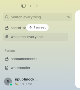 ### Directed unread activity The same destination count becomes primary when an offscreen room has directed activity; geometry and label remain unchanged. 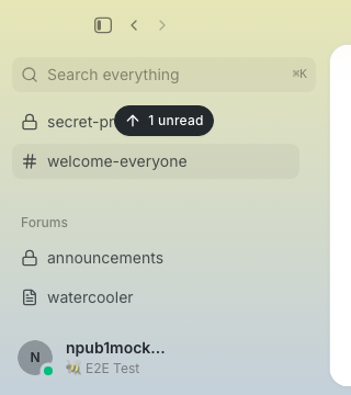 ### Thread-only unread DM A DM stays primary and retains its avatar even when only its thread has unread activity.  --------- Signed-off-by: Taylor Ho <taylorkmho@gmail.com> Co-authored-by: Rizz <302abe414ca6e3134763d2539bfcf145aea2a63fe5f8455204ed602fd40cf381@buzz.block.builderlab.xyz> Co-authored-by: Carl <acda9e433d19dcd0e6b6840f7f4b98f3a56f1fab98049d444c087019e6d36560@buzz.block.builderlab.xyz> |
||
|
Logan Johnson
|
4afef8649a |
fix(desktop): restore mention chip identity icons (#7338)
## Summary Restore the missing **@ glyph for people and robot icon for agents** after #7133, and incorporate the requested compact public-key display. - Wrapping mention chips render their existing bounded icon-bearing leading fragment. - Readonly chips show bound keys using the same `8 leading…4 trailing` formatter as the channel member list: `Scout (150b20bd…15dc)`. - Full literal labels and exact keys remain authoritative in metadata, profile targets, title/accessible-name attributes, editor text, saved bodies and recipient tags. Display abbreviations are never used for recipient lookup. - Copy/paste restores the full literal label for a complete compact chip; partial selections remain plain text. Two keys sharing the same abbreviation still round-trip to their separate exact recipients. - No recipient-resolution, authorization, wire-format, composer, or CSS changes. Existing labels, icons, cloud markers and ordinary mentions remain intact. ## Verification Published candidate `9365ab9bc9d9c5d10802580cd576f8e378ff492f`, based on main `e09f715c9d0ee2cb7bf8a39061e601f3a502f588`: - **6,444 desktop unit tests passed** on this candidate's final source tree. - **44 mock-Chromium tests passed, zero retries in the final run** across mention recipients, clipboard and cloud provenance: exact recipient selection, ambiguity rejection, send/edit/reopen, forwarding, full/partial copy, mismatched-key rejection, matching-abbreviation collisions and 100%/150% narrow-window geometry. - TypeScript, desktop Biome/check guards, protected-feature production build and E2E build passed. - The compact-renderer regression fails with the formatting call removed. Original missing-icon and hidden-text accessibility regressions have red/green evidence. - Fresh self-review traced rendering, full-key metadata, copy classifier, paste normalization and identity trust. The same display formatter owns the accepted compact form on both clipboard sides. Iteration exposed an existing team-insertion separator flake (passed final full run) and two new fixture assumptions: non-member sends require invitation, and Chromium rich paste may retain an NBSP separator. Tests now exercise invitation and normalize only that separator when comparing the captured full body and exact tags; no product change was needed for either. Earlier local repository-wide `just ci` completed in two invocations because its initial call hit the ten-minute tool limit during Tauri compilation. Unchanged native/mobile/backend evidence is reused; the desktop delta received the full checks above and new remote CI. Native VoiceOver, real Tauri selection, dark theme and non-Chromium observation were not performed. Browser artifacts exercise real frontend with mocked Tauri/relay boundaries, not an installed release. ## Review and visual evidence Current-head CI and automated review must complete after this update; the old `2997bfb5` green results do not establish this new head. Required human review remains separate from agent approvals. No merge/install/restart authorization. Before/after icon evidence: https://github.com/block/buzz/pull/7338#issuecomment-5544575866 Updated compact-key screenshots are posted below. The editor intentionally retains the full literal address; only readonly chip display is abbreviated. Origin: buzz://message?channel=3355d33a-b72a-423a-b064-a58275f9a8af&id=38b3a27e689f5a9604e273d45f4e3122fceba76081e7bcd3bbdbf439524a5a18 --------- Signed-off-by: Logan Johnson <loganj@squareup.com> Co-authored-by: Larry <627498bd4bd1f281a16431e3c6cce3b5c25b6692798c78672298aefbf2f8f8b5@buzz.block.builderlab.xyz> |
||
|
morgmart
|
5d107836c6 |
Persist video playback speed preference (#7336)
## Summary - persist the selected desktop video playback speed as a device-level preference - apply the shared preference to inline and review video players, including after a reload - cover persistence, validation, cross-window updates, and the end-to-end playback flow ## Verification - `node --test desktop/src/shared/lib/videoPlaybackSpeedPreference.test.mjs` - `cd desktop && pnpm exec tsc --noEmit` - `cd desktop && pnpm check:px-text` - `cd desktop && pnpm test` - `cd desktop && pnpm build:e2e && pnpm exec playwright test --project=smoke video-attachment.spec.ts` - pre-push: desktop check, file-size check, typecheck, and 6,416 desktop tests --------- Signed-off-by: morgmart <98432065+morgmart@users.noreply.github.com> |
||
|
Logan Johnson
|
ee883d73fb |
fix(desktop): bind duplicate mention selections to exact recipients (#7133)
## Summary Selecting two people or agents named Scout could replace the first recipient with the second even though the message still looked right. This binds each selection to its exact identity: the first keeps `@Scout`, and a conflicting selection gets `@Scout (<full public key>)`. Removing one no longer removes or redirects the other. - Reuse the existing **@ suggestion list**; team selection and automatic agent addressing reserve and reuse distinct labels too. Typing an ambiguous name manually shows an instruction to use the picker and preserves the draft without publishing—in chat, edits and standalone forums. - Share literal mention matching across recipient extraction, removal, display and editing so a shorter name cannot claim another recipient's longer or qualified label. - Rebuild authored references when a message is edited, and use the latest authorized snapshot when reopening or forwarding. Rendering/editing can recover qualified identities only from the message's recorded references, not from a key typed into its body. Unresolvable historical names remain literal rather than guessed recipients. - Wrap full-key labels within narrow/zoomed layouts while keeping their complete accessible label and ordinary mention icons. Edit activation waits for the action menu's focus cleanup before focusing the editor. ### Related issue Targets `main`; mention spacing (#7128) is already merged. Split from #7114. This is independent of the #7124 → #7125 remote-invitation stack and does not expand agent eligibility or invitation permissions. The separate Enter-selection suffix issue remains tracked in #7253. ### Testing The desktop unit suite and focused mock-Chromium checks passed on the published integration candidate, including pending-paste selection, edit/forwarding, copy and narrow-layout cases; formatting, types and frontend builds passed. On `0b3b18c0`, 64 focused trust/paste/selection unit tests and six mock-Chromium tests passed with zero browser retries, including actual timeline chip copy → fresh channel paste → send and mismatched-key rejection; TypeScript, changed-file Biome and an isolated E2E build passed. The broader browser run had copy failures before the focused repairs and is not claimed as wholly green. See [live CI](https://github.com/block/buzz/pull/7133/checks) for current-head results. No full local `just ci` pass, native/live-relay or cross-browser validation is claimed. To try it: select two same-name recipients, remove one, send, then edit/reopen and forward; only the intended identities should remain. Type an ambiguous name without choosing a suggestion and check that sending retains the draft with an error. Inspect full-key labels in a narrow window at 150% text size, and open Edit and type immediately. 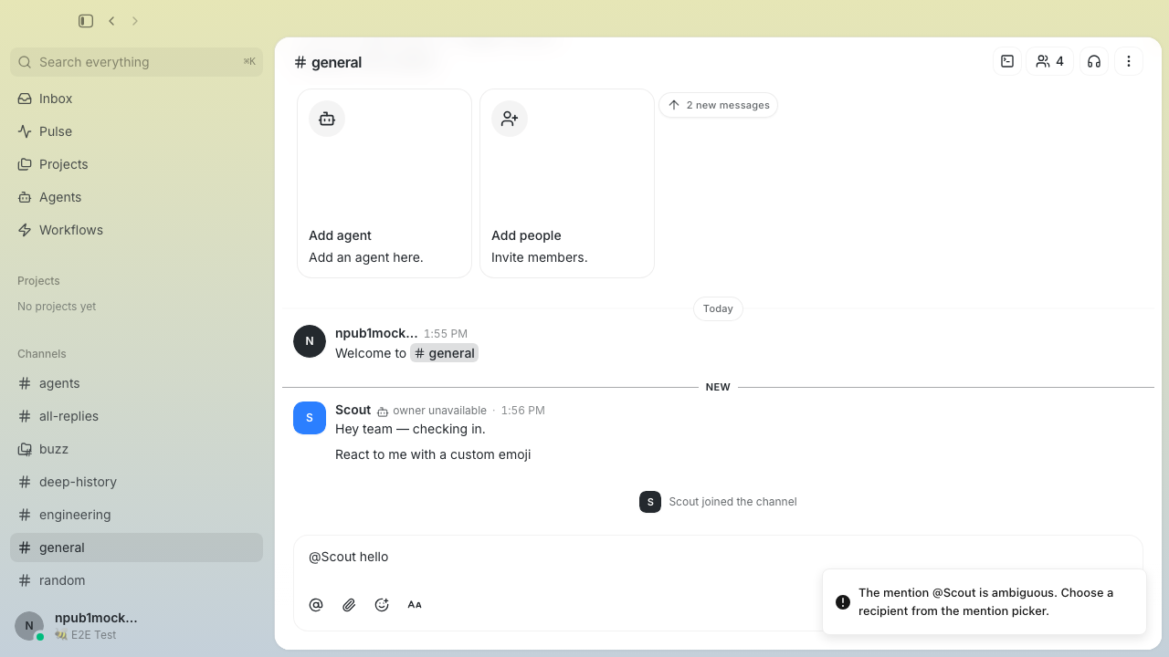 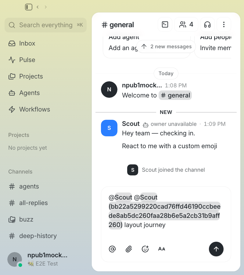 *Earlier mock-browser captures, not current-head runtime proof. No new before-state capture; screenshots alone do not prove recipient delivery.* **Clipboard trust:** generated full-key-qualified mentions now retain their exact recipient after copy/paste when the full key matches the clipboard record and community directory/profile state independently vouches for the base alias, including numeric collision suffixes. A qualifier alone does not establish trust. Arbitrary historical labels still cannot always be reconstructed. --------- Signed-off-by: Logan Johnson <loganj@squareup.com> Co-authored-by: Larry <627498bd4bd1f281a16431e3c6cce3b5c25b6692798c78672298aefbf2f8f8b5@buzz.block.builderlab.xyz> Co-authored-by: Bad Janet <150b20bdf6130418df9239dd1bd082c71612c8d653b47c277200365b9be215dc@buzz> |
||
|
Matt Toohey
|
b1f6b7ef77 |
feat(desktop): preserve mentions across copy and paste (#7228)
Copying a message out of the timeline lost the mention. The rendered chip drops the `@` for display, so the clipboard carried "John Smith" — two ordinary words no composer could bind back to a pubkey. Pasting into another channel produced dead text, and sending it tagged nobody. ## What changed Every Buzz copy now writes two clipboard flavors in one transaction: - **`text/plain`** — readable anywhere, sigils restored, no pubkeys. This is what TextEdit, Slack, and every other external app receive. - **`text/html`** — the same content with each mention wrapped in a span carrying `data-mention-pubkey` / `-label` / `-kind`. On paste, the composer harvests those records, registers each `name → pubkey` with the existing mention machinery, and inserts the content: the chip re-lights and the send path recovers the identity the author tagged. A marker attribute records what the plain flavor holds, so a Markdown copy pastes through the text pipeline and a rendered copy through the HTML one. **Covered surfaces:** timeline selection copy, thread-panel selection copy, forum post/reply selection copy, "Copy message", and composer copy/cut — plus paste in both the channel and forum composers. ## Trust boundary Clipboard HTML is untrusted, and the branch treats it that way: - Records are capped (50), labels bounded (200 chars), and a pubkey must be 64 hex before it can become a `p` tag. - **Only mentions the paste actually shows are registered.** An empty `<span data-mention-pubkey=… -label="Jane Doe">` would otherwise rebind that display name for the rest of the composer session, so a later hand-written @Jane Doe would chip-light convincingly against the attacker's key. Each branch registers only the records whose label appears in the text *it* inserts, matched with `getMentionOffsets` — the same matcher the send-time extractor uses. - **The visibility gate reads only what ProseMirror will insert.** `DOMParser` hard-drops `script`, `style`, `title`, `noscript`, `object`, and `head` content, so `visible<style>@Jane Doe</style>` beside an empty chip span used to smuggle a binding past the gate. Those elements are stripped before either output is derived. - **A partial chip never gains a sigil.** A selection crossing a chip boundary falls through to the browser's default copy, which serializes the full identity attributes around a slice of the text — pasting that invented "@Smith" out of "John Smith". Paste now leaves a fragment as plain text, tolerating only what a whole chip picks up in transit (restored sigil, author casing, U+00A0 swaps, and the label cap's own ellipsis). Both clipboard sides share one `matchChipTextToLabel` helper, in the module that owns the label attributes, so copy and paste cannot drift on what counts as a whole chip. ## Notes - Mention matching reuses `getMentionOffsets`, so code spans and fences are excluded and the longest display name wins. - The plain flavor inlines chip boxes before reading `innerText`; a chip is a flex container, so the browser's own copy split "@John Smith" onto its own line. - `MarkdownMention` and `MacEmacsTextShortcuts` are extracted verbatim from `markdown.tsx` and `useRichTextEditor.ts` to keep both files under the size gate. ## Testing - ~40 unit tests over the flavor builder/parser, the visibility filter, the ignored-tag sweep, and the chip-match verdicts. - A Playwright spec (`desktop/tests/e2e/mention-clipboard.spec.ts`) driving real copy/cut/paste DOM events: timeline and "Copy message" of a multi-word non-member mention pasted into another channel and sent with the original pubkey in its `p` tag; the forum copy → forum reply round trip; composer copy/cut; plain flavor asserted to contain no 64-hex string; the boundary-crossing drag; and the hidden-record and `<style>` smuggling vectors. - Every regression test is bound to a production seam and fails with its guard removed. - `just ci` / pre-push lanes green (5927 desktop unit tests, typecheck, lint, file-size gate). --------- Signed-off-by: Matt Toohey <contact@matttoohey.com> Co-authored-by: Claude Fable 5 <noreply@anthropic.com> |
||
|
Logan Johnson
|
6cf514ed90 |
fix(desktop): wrap message tables within the available pane (#7279)
## Summary - Let Markdown tables use the available message width instead of their maximum-content width, inheriting the renderer's existing `wrap-anywhere` handling for long tokens and links. - Top-align header cells as well as body cells. Give cells a `min-w-24` readability floor so short labels do not collapse into one-letter columns; retain the existing table-local scrollbar when many columns genuinely cannot fit. - Preserve semantic table markup, links, inline code, and surrounding message layout. Add three browser regressions through the real message renderer (channel, narrow thread, and many-column overflow). ### Related issue Fixes #5313. No matching open table-readability PR found. Owner-authorized task channel: `819b36d5-7371-4ed0-bf9b-d461d723779e` Source: buzz://message?channel=819b36d5-7371-4ed0-bf9b-d461d723779e&id=3bf2d1bd5df28fcb481e71159dc1be2b3888918b05f67e270354fbfea65a8c90 ### Testing Original production candidate: `4427f2e6f9ef85a01a267fe9eabd1cf13cacfb78`; base: `7a9a5233d9d755e715be0c585cf7850e935d28cf`. - `pnpm -C desktop check` — passed. - `pnpm -C desktop test` — 6,110 passed, none skipped. - `pnpm -C desktop typecheck` — passed. - `BUZZ_PROTECTED_BUILD_OUTPUT=<isolated-production-directory> pnpm -C desktop build` — passed. - `pnpm -C desktop build:e2e --outDir <isolated-candidate-directory>` — passed. - `just file-size-check` and `git diff --check` — passed. - Chromium / mock Tauri bridge: all 3 new Playwright tests passed against the fixed candidate build. Both wrapping tests fail on the unchanged base build, while the overflow-fallback test passes. Each browser run used a unique output directory and a non-reused local server pinned to its build directory. - At 883px channel message width: table scroll width **1,395 → 883px**. At 292px thread message width: **1,395 → 292px**. All cells top-aligned; long tokens/URLs wrap, link destinations and code text remain intact, short labels stay on one line, and document width remains 1,280px. - Focused fresh-frame review checked actual before/after screenshots and the complete diff. It caught one-letter label wrapping in an early width-only candidate; the final cell-width floor and regression assertion address that finding. Limitations: native Tauri/WebKit and relay-backed integration were not exercised for this CSS-only delta. Repository-wide `just ci` was attempted but exceeded the local command budget during unrelated Rust compilation; it is **not** reported green. The full affected TypeScript package gates above passed on the exact candidate. Production/E2E builds retain existing chunk-size and mixed static/dynamic import warnings. Before/after screenshots are posted below using the repository's screenshot publication script. No merge, production installation, or runtime restart is requested. ### CI-driven test-only follow-up Current head: `925d964b6cf31ba704d74baf73769110774b2789`. Smoke shard 3 exposed an older test in `messaging.spec.ts:457` that still required three columns of ordinary prose to overflow horizontally ([failure log](https://github.com/block/buzz/actions/runs/33771325404/job/100702242706)). This expectation contradicts the intended wrapping change. Updated its name and assertion to require containment; the separate many-column local-scroll test is unchanged. No production code or harness settings changed in this follow-up. - Affected browser validation: **4/4 passed** (updated existing prose/narrow table case plus the three new channel/thread/overflow cases). - Reused the immutable `4427f2e6` E2E build on a fresh non-reused server; production source is unchanged at the current head. The package/build checks above remain evidence for that unchanged production tree, not a claim of rerunning the full suite at the new SHA. - Targeted Biome check, file-size gate, and `git diff --check` passed. - Current-head CI: https://github.com/block/buzz/actions/runs/33773490446 - Prior unrelated Bestie baseline failure and reproduction: https://github.com/block/buzz/pull/7279#issuecomment-5528077181 - Security authorization and review must target the **current** head, not the old screenshot/build SHA. A Block organization member must comment exactly `@buzz-security-review 925d964b6cf31ba704d74baf73769110774b2789`. --------- Signed-off-by: Logan Johnson <loganj@squareup.com> |
||
|
klopez4212
|
c6ca9d94d9 |
Show status and huddle indicators beside names (#7112)
## Summary - show status and huddle emoji beside names in DMs and message rows - provide accessible tooltips, fallback status emoji, and profile-menu icon replacement - add the desktop status editor with preset durations, a ShadCN calendar, and a capped half-hour time menu ## Validation - desktop checks, typecheck, and file-size guard - 5,802 desktop tests - focused Playwright coverage (3 passed) - E2E build and native Builderlab staging verification Updated visual snapshots are attached in the PR comments. --------- Signed-off-by: kenny lopez <klopez4212@gmail.com> Signed-off-by: Princess Donut <b238ea756dee4d98afa5883fc7f1de61eeabe65bf700e3a5a5a80db5e42e2c2b@buzz.block.builderlab.xyz> Co-authored-by: Princess Donut <b238ea756dee4d98afa5883fc7f1de61eeabe65bf700e3a5a5a80db5e42e2c2b@buzz.block.builderlab.xyz> |
||
|
Logan Johnson
|
5073e075d7 |
fix(desktop): unify owned-agent cloud provenance markers (#7129)
Unify presentation-only cloud provenance across agent identity surfaces. Keep successful local-inventory and verified-ownership gates; preserve main availability and mention spacing behavior. Co-authored-by: Larry <627498bd4bd1f281a16431e3c6cce3b5c25b6692798c78672298aefbf2f8f8b5@buzz.block.builderlab.xyz> Signed-off-by: Logan Johnson <loganj@squareup.com> |
||
|
Arjun Mahanti
|
ac5a18697c |
feat(desktop): add persistent Bestie experience (#7223)
## Summary - add a persistent, community-scoped Bestie designation for local managed agents - surface the designated agent in the sidebar, agent library, profile actions, message toolbar, and draggable floating shortcut - bloom the floating shortcut into a lightweight compact composer that reuses the normal DM timeline, reactions, presence, and send behavior - support message handoff with a bounded snapshot and a full Buzz thread link so the agent can retrieve the complete conversation ## UX details - the floating avatar and expanded panel stay above app chrome and drag as one aligned surface - closing the expanded panel returns it to its top-right anchor - each mini-composer opening starts visually fresh while messages sent during that opening remain conversational - the designated Bestie's duplicate DM entry is hidden from the regular DM list - Bestie actions are suppressed inside the mini timeline to avoid recursive handoff ## Reliability and maintainability - preserve existing retention database paths across upgrades - serialize assignment and deletion, clearing matching assignments across community scopes before an agent is removed - fence async conversation resolution against workspace and assignment changes - validate stale assignments against existing local agents before hiding DMs - share lightweight assignment state across agent cards and keep protected-feature behavior out of the shared timeline API ## Testing - `pnpm --dir desktop test` — 5,886 tests passed - `pnpm --dir desktop exec tsc --noEmit` - `pnpm --dir desktop exec biome check ...` - `cargo clippy --manifest-path desktop/src-tauri/Cargo.toml --all-targets -- -D warnings` - focused native retention and Bestie assignment/command tests — 34 passed - `VITE_BUZZ_BESTIE=1 pnpm --dir desktop build:e2e` - `VITE_BUZZ_BESTIE=1 pnpm --dir desktop exec playwright test --project=smoke tests/e2e/bestie.spec.ts` - pre-commit and differential pre-push hooks ## Rollout The UI remains gated by the `bestie` build feature. Screenshots covering setup, empty, assigned, floating, and message-handoff states are included in the PR discussion. --------- Signed-off-by: Arjun Mahanti <arjun@squareup.com> Co-authored-by: Codex <noreply@openai.com> |
||
|
klopez4212
|
114dbf745f |
Add voice notes to desktop messages (#6978)
## Summary - add voice-note recording, preview, removal, and send controls to the desktop composer - render sent voice notes as waveform cards with scrubbing and playback-speed controls - transcode recordings locally into the existing relay video-media contract, without relay changes ## Testing - `just ci` - `pnpm exec playwright test tests/e2e/voice-note.spec.ts` - native voice-note media contract test against the relay validator ## Screenshots Focused snapshots are attached below. --------- Signed-off-by: kenny lopez <klopez4212@gmail.com> Signed-off-by: Princess Donut <b238ea756dee4d98afa5883fc7f1de61eeabe65bf700e3a5a5a80db5e42e2c2b@buzz.block.builderlab.xyz> Co-authored-by: Princess Donut <b238ea756dee4d98afa5883fc7f1de61eeabe65bf700e3a5a5a80db5e42e2c2b@buzz.block.builderlab.xyz> Co-authored-by: Mongo <9cfd347903944d5b85aa6c93d2ab67381b978a92a31914bca69998968752a1d7@buzz.block.builderlab.xyz> |
||
|
Arjun Mahanti
|
bc006f6708 |
feat: render agent avatars as squircles (#7106)
## Summary - render every agent/AI identity as a 30% squircle across desktop and mobile while keeping human avatars circular - propagate agent identity through message, thread, profile, reaction, member, DM, search, workflow, project, huddle, forum, pulse, and agent-management surfaces - preserve squircle geometry for fallbacks, focus/status treatments, add-agent controls, and overlapping avatar outlines (`calc(30% + 2px)` for the outer background) ### Related issue None found. This change was requested and visually reviewed in the originating Buzz thread. ### Testing - `just desktop-test` — 5,799 passed - `just mobile-test` — 2,008 passed - pre-push gates passed at `0d59d77b120dcb90aac2f918e422c11c9fa5353b`: desktop check, TypeScript typecheck, desktop full test suite, mobile format/analyze and full test suite, Rust tests, Tauri checks, and differential file-size gate - deterministic desktop visual sweep covered channel messages/thread summaries; thread, subthread, and sub-subthread depths; reactions and reactor popovers; hover/full profiles; added-to-channel activity; channel members/settings; agent library/team overlaps; agent creation; mention autocomplete; and DM header/sidebar/settings ### UI evidence The complete labeled visual matrix is available in the originating Buzz review thread. GitHub-hosted copies will be added in a follow-up PR comment using the repository screenshot script. --------- Signed-off-by: Fizz <dae5f6af70b8695a8b83c8deae555f63be41630ec2b8cd493e41a439c9527dd8@buzz.block.builderlab.xyz> Co-authored-by: Fizz <dae5f6af70b8695a8b83c8deae555f63be41630ec2b8cd493e41a439c9527dd8@buzz.block.builderlab.xyz> |
||
|
Matt Toohey
|
c3132c3ee9 |
feat(desktop): use segmented controls for channel creation (#6845)
## Summary - replace the two-option Type and Visibility dropdowns in the Create channel dialog with single-click segmented controls - keep Expires after as a dropdown and preserve the existing dropdown controls in edit and management dialogs - update channel creation end-to-end coverage for the direct controls ## Before Default Ongoing/Public state: 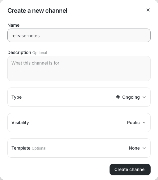 Type dropdown open, showing the extra selection click: 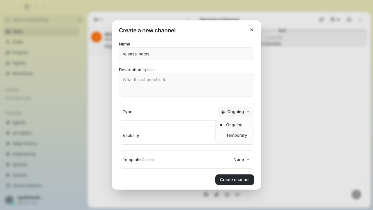 ## After Default Ongoing/Public state: 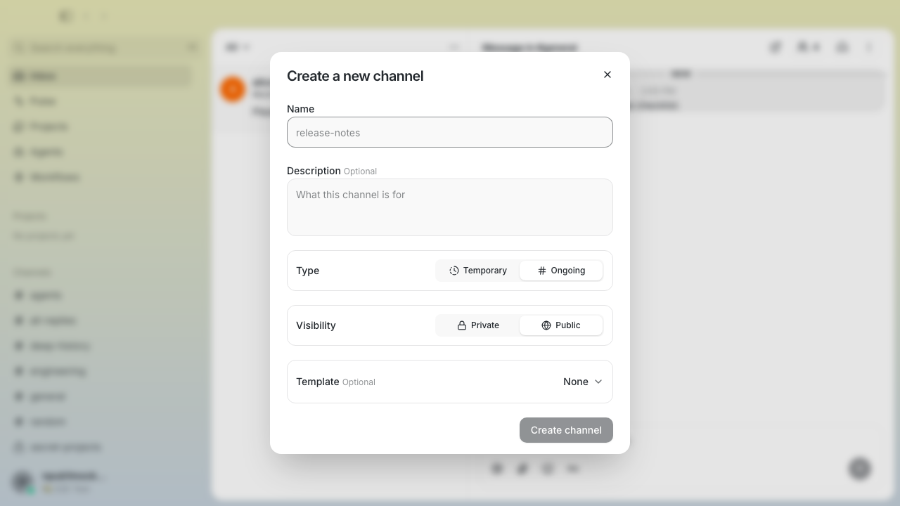 Temporary/Private state with the Expires after row visible: 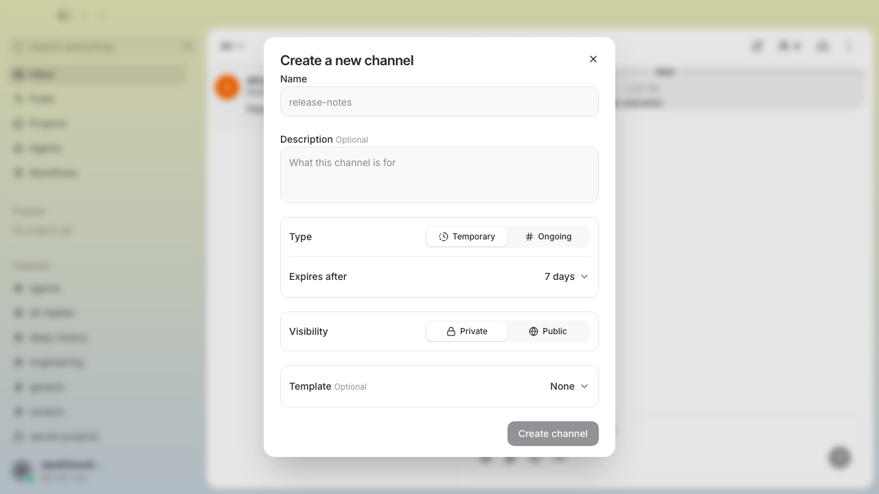 ## Verification - Biome and TypeScript checks pass - 5,508 desktop unit tests pass - 88 channel smoke tests pass - source guards pass --------- Signed-off-by: Matt Toohey <contact@matttoohey.com> Co-authored-by: Claude Fable 5 <noreply@anthropic.com> |
||
|
klopez4212
|
27c1a7c91b |
Fade expanded video controls on hover (#6926)
## Summary - fade expanded video controls out when the pointer leaves the video - restore controls on video hover or keyboard focus while keeping touch controls visible - respect reduced-motion preferences ## Testing - focused expanded-video hover Playwright test - full video attachment E2E suite (12 tests) - desktop check and typecheck - desktop unit tests (5,674) --------- Signed-off-by: kenny lopez <klopez4212@gmail.com> |
||
|
Taylor Ho
|
03bfc837cb |
fix(desktop-tooltip): increase surface contrast (#6897)
**Category:** fix **User Impact:** Tooltips now use a higher-contrast surface, making their labels easier to read across desktop themes. **Problem:** Tooltip surfaces could blend into hovered content, making labels difficult to distinguish. **Solution:** Use the existing popover surface and foreground tokens for clearer visual separation and theme-aware contrast. <details> <summary>File changes</summary> **desktop/src/shared/ui/tooltip.tsx** Updates shared tooltip colors to use higher-contrast semantic surface and foreground tokens. </details> ## Reproduction steps 1. Run the desktop app and hover a control that displays a tooltip. 2. Compare the tooltip against the content beneath it in both light and dark themes. 3. Confirm the tooltip surface remains clearly distinguishable and its label is readable. ## Screenshots | Before | After | | --- | --- | | 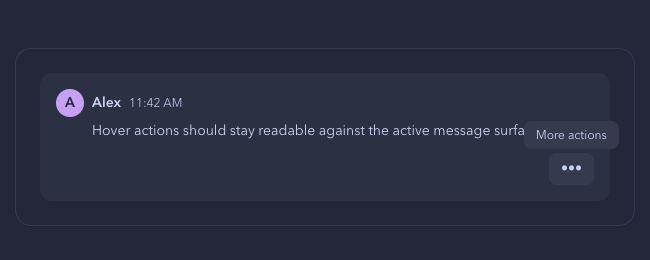 | 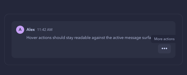 | ## Validation - `pnpm build:e2e` - `pnpm exec playwright test tests/e2e/tooltip-semantics.spec.ts --project=smoke` — 4 passed - `pnpm exec biome check src/shared/ui/tooltip.tsx tests/e2e/tooltip-semantics.spec.ts` - Pre-push desktop checks, typecheck, and unit tests - `git diff --check` - Full smoke project attempted; 345 of 1,222 tests passed without failure before the 10-minute local execution limit. --------- Signed-off-by: Taylor Ho <taylorkmho@gmail.com> Co-authored-by: Carl <acda9e433d19dcd0e6b6840f7f4b98f3a56f1fab98049d444c087019e6d36560@buzz.block.builderlab.xyz> |
||
|
Taylor Ho
|
4f554b6385 |
feat(sidebar): prioritize unread DMs in overflow navigation (#6842)
**Category:** improvement **User Impact:** Users can see which unread direct messages are waiting offscreen and jump to the most relevant one first. **Problem:** The sidebar overflow control treated every offscreen unread conversation alike, so an unread DM could be hidden behind channel activity with no visible clue about who was waiting. **Solution:** Prioritize the first offscreen unread DM, preview up to three senders with avatars, and keep the arrow, avatars, separator, and message count intact while only the trailing phrase truncates in narrow sidebars. <details> <summary>File changes</summary> **desktop/src/features/sidebar/lib/useUnreadOverflow.ts** Adds ordered DM preview data to unread-overflow calculations while preserving the sidebar's existing visibility and direction rules. **desktop/src/features/sidebar/lib/useUnreadOverflow.test.mjs** Covers DM prioritization, ordering, offscreen filtering, and channel-only fallback behavior. **desktop/src/features/sidebar/ui/AppSidebar.tsx** Passes unread DM previews into the lower overflow control and navigates to the preferred DM before the next unread channel. **desktop/src/features/sidebar/ui/MoreUnreadButton.tsx** Renders the frontmost-first avatar stack, accessible DM target label, middot separator, and message-count treatment. **desktop/src/features/sidebar/ui/MoreUnreadButton.test.mjs** Locks the three-avatar cap, stacking order, preferred target, fallback, accessible copy, and truncation structure. **desktop/src/shared/ui/UnreadPill.tsx** Contains the primary pill and allows only its trailing label to ellipsize under width pressure. **desktop/src/shared/ui/UserAvatar.tsx** Allows the sidebar preview stack to identify each rendered avatar in regression coverage. </details> ## Reproduction steps 1. Open enough sidebar conversations that unread items fall below the visible area. 2. Leave one or more offscreen DMs unread, along with unread channels. 3. Confirm the bottom overflow pill shows up to three overlapping DM avatars followed by a middot and the total new-message count. 4. Select the pill and confirm it navigates to the first offscreen unread DM rather than the nearest unread channel. 5. Resize the sidebar from 420px through 300px to 220px and confirm the arrow, avatars, middot, and full numeric count remain visible; only `new messages` may ellipsize. 6. Repeat with channel-only unread overflow and confirm the control keeps its channel fallback behavior without avatars. ## Screenshots Built-UI matrix with 100px of visible space beyond the sidebar edge. All images are hosted through `pr-screenshots`. | State | 220px min | 300px default | 420px max | Result | | --- | --- | --- | --- | --- | | Channel-only · 13 | 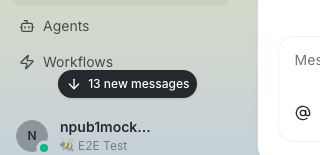 | 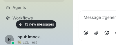 | 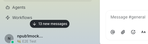 | Full label throughout. | | Channel-only · 999 | 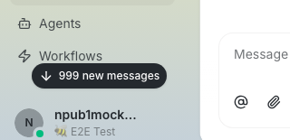 | 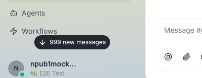 | 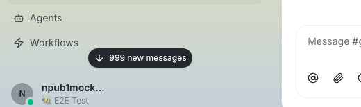 | Full label throughout. | | One DM only · 1 | 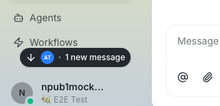 | 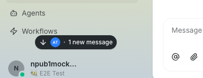 | 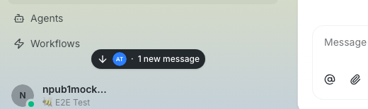 | Full label throughout. | | One DM + channels · 99 | 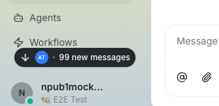 | 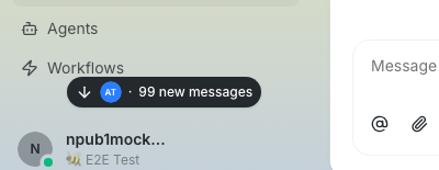 | 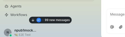 | Full label throughout. | | Two DMs only · 2 | 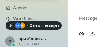 | 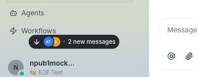 |  | Full label throughout. | | Two DMs + channels · 47 |  |  |  | Full label throughout. | | Three DMs + channels · 128 | 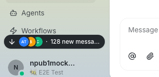 | 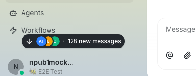 | 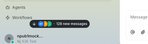 | 220px: `128 new messa…`; full at 300/420. | | Three DMs + channels · 999 | 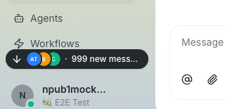 | 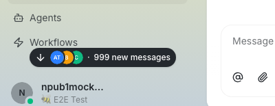 | 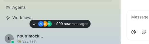 | 220px: `999 new mess…`; full at 300/420. | | Three DMs + channels · 9,999 | 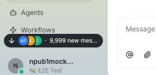 | 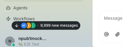 | 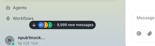 | 220px: `9,999 new mes…`; full at 300/420. | **Matrix result:** 27/27 states remain contained. Exactly 3/27 states ellipsize—all are three-avatar cases at 220px. The arrow, all avatars, middot, and complete numeric value remain visible; only the trailing `new messages` phrase yields. ## Validation - Desktop unit suite: 5,517 passed - TypeScript: passed - Biome on all seven changed files: passed - Pre-push desktop checks, typecheck, tests, file-size, and branch-skew gates: passed - 27-state built-UI matrix capture: 27/27 contained; only the three 220px three-avatar states truncate, and only the trailing phrase - `git diff --check`: passed --------- Signed-off-by: Taylor Ho <taylorkmho@gmail.com> Co-authored-by: Carl <acda9e433d19dcd0e6b6840f7f4b98f3a56f1fab98049d444c087019e6d36560@users.noreply.github.com> Co-authored-by: Rizz <302abe414ca6e3134763d2539bfcf145aea2a63fe5f8455204ed602fd40cf381@buzz.block.builderlab.xyz> |
||
|
thomaspblock
|
de188ebf06 |
feat(projects): add agent and CLI project-home support (#6590)
## Summary - inject bounded project-home identity and repository context into managed agent sessions - add project-aware CLI flows for creating projects, repositories, issues, and related channels - match project homes through the existing relay query surface, then filter channel metadata client-side This is Part 1 of the channel-first Projects stack. Part 2 contains project creation and model foundations. ## Testing - `cargo fmt --all -- --check` - `cargo clippy -p buzz-cli -p buzz-acp --all-targets -- -D warnings` - `cargo test -p buzz-cli -p buzz-acp` — 1,184 tests passed, 1 doc test ignored - full pre-push gate passed ## Post-Deploy Monitoring & Validation - validate project-home agent context and project-aware CLI commands against a staging relay - healthy signals: project context matches the active channel, explicit repo coordinates remain stable, and normal channels receive no project block - failure signals: cross-channel project context, duplicate project creation, or commands targeting an unrelated repository; mitigate by reverting this PR --------- Signed-off-by: Thomas Petersen <thomasp@squareup.com> Signed-off-by: Wrench <0eabe6ea5758c1e4c5b68cea4ac42b32c479072883cb28da8110b4a47c32b9a1@buzz.block.builderlab.xyz> Co-authored-by: Wrench <0eabe6ea5758c1e4c5b68cea4ac42b32c479072883cb28da8110b4a47c32b9a1@buzz.block.builderlab.xyz> |
||
|
Kalvin C
|
a526dca9bc |
feat: navigate images across message threads (#6705)
## Summary - navigate across image occurrences that are currently rendered inside the nearest explicit open-thread DOM scope - preserve rendered DOM order, duplicate occurrence identity, hidden-spoiler exclusion, preview-image entry parity, and the exact thumbnail return target - keep adjacent timeline messages and unrelated surfaces as separate galleries - make Copy and Download follow the current gallery item, including when a link-preview image opens the gallery first and navigation reaches Markdown media ## Scope contract This is intentionally a **rendered-media gallery only**. Gallery membership comes from mounted image triggers under the nearest explicit thread scope. Collapsed or unloaded descendants are excluded until the thread UI renders them. There is no canonical thread fetch, descendant projection, depth override, or synchronous message reparse in this change. `ChannelPane.tsx` remains unchanged from `main`; `useSearchHighlightProps` and both timeline/thread prop spreads are preserved. ## Verification - rebased onto `origin/main` at `113a33b7e49b7173ee1767c49ef2f49c63803034` - `git diff --check` - differential file-size check - full Desktop check (Biome plus text/pubkey policy checks; only pre-existing informational diagnostics) - Desktop TypeScript typecheck - Desktop production build and rebuilt E2E build - full Desktop JS units: `5,476/5,476` passed - full Desktop Tauri workspace tests passed (one documented native performance test ignored) - rebuilt image gallery Playwright spec: `14/14` passed - search-highlight smoke cases: `5/5` passed - reduced diff: 6 files, `+417/-41`; production `+78/-41`, E2E `+339/-0` The four added E2E cases cover cross-message thread navigation and return targeting, rendered-only exclusion of collapsed descendants, preview-first current-item actions, and adjacent-message isolation. --------- Signed-off-by: Kalvin Chau <kalvin@block.xyz> Signed-off-by: am <6e30cd56c30e030cd31bb0939b94a7c257c9a09d5ba2d92cf2735da45629f248@buzz.block.builderlab.xyz> Co-authored-by: am <6e30cd56c30e030cd31bb0939b94a7c257c9a09d5ba2d92cf2735da45629f248@buzz.block.builderlab.xyz> |
||
|
tulsi
|
29f2054c69 |
highlight search terms in results and messages (#6702)
**Category:** fix **User Impact:** Search terms are now highlighted in yellow in Cmd+F results and in the message opened from a result. **Problem:** Search returned relevant messages, but users still had to reread each preview and destination message to discover where the query appeared. Search navigation could also lose or misapply highlighting during rapid typing, repeated navigation, thread opening, and forum navigation. **Solution:** Render match-focused previews with a shared yellow treatment, carry the result query through navigation, and apply it only to the clicked destination. The implementation binds highlights to the debounced result set, supports token and prefix matching, and handles channels, threads, forums, diffs, and wave messages consistently. <details> <summary>File changes</summary> **desktop/src/app/AppShell.tsx** Carries the active result query into search-hit navigation so the destination can preserve the user's context. **desktop/src/app/navigation/searchHitEventCache.ts** Adds a bounded, one-shot cache for result queries and navigation IDs alongside cached search-hit events. **desktop/src/app/navigation/searchHitNavigation.test.mjs** Covers query retention, one-shot consumption, repeated same-route activations, forum posts, forced routing, and cancellation. **desktop/src/app/navigation/searchHitNavigation.ts** Associates each search-result activation with a unique navigation ID and forwards it to channel or forum destinations. **desktop/src/app/navigation/useAppNavigation.ts** Extends channel and forum navigation to carry search navigation state without changing normal navigation behavior. **desktop/src/app/routes/ChannelRouteScreen.tsx** Consumes search highlight state after navigation and retains it for the selected message while clearing it on community context changes. **desktop/src/app/routes/channels.$channelId.posts.$postId.tsx** Validates and forwards forum search-navigation IDs. **desktop/src/app/routes/channels.$channelId.tsx** Validates and forwards channel search-navigation IDs. **desktop/src/features/channels/ui/ChannelPane.tsx** Passes the selected result ID and query into the main timeline and open thread panel. **desktop/src/features/channels/ui/ChannelPane.types.ts** Defines the destination-highlight contract for channel panes. **desktop/src/features/channels/ui/ChannelScreen.tsx** Routes destination highlighting to either forum content or the channel timeline. **desktop/src/features/channels/ui/ChannelScreen.types.ts** Defines route-level search-highlight inputs. **desktop/src/features/channels/ui/ForumChannelContent.tsx** Forwards search context into expanded forum threads. **desktop/src/features/forum/ui/ForumThreadPanel.tsx** Highlights the matching text in the selected forum post or reply. **desktop/src/features/forum/ui/ForumView.tsx** Carries selected-result context from forum routing into the thread panel. **desktop/src/features/messages/ui/DiffMessage.tsx** Forwards the query into diff descriptions and rendered diff content. **desktop/src/features/messages/ui/DiffViewer.tsx** Provides a highlighted match excerpt for structured diffs and highlights fallback raw diff text. **desktop/src/features/messages/ui/MessageRow.tsx** Passes destination queries into normal Markdown, diff, and wave message renderers. **desktop/src/features/messages/ui/MessageThreadPanel.tsx** Applies highlighting to the selected thread head or reply without tinting unrelated messages. **desktop/src/features/messages/ui/WaveMessageAttachment.tsx** Highlights matches in wave-message fallback text. **desktop/src/features/search/lib/searchMatch.test.mjs** Covers case-insensitive, literal, multi-term, prefix, one-character, and late-preview matches. **desktop/src/features/search/lib/searchMatch.ts** Centralizes token extraction, case-insensitive match splitting, and match-focused preview generation. **desktop/src/features/search/ui/HighlightedSearchText.tsx** Adds the reusable accessible mark renderer used by result and specialized message surfaces. **desktop/src/features/search/ui/TopbarSearch.tsx** Highlights result previews, centers excerpts around matches, strips search operators, and hides stale results during debounce transitions. **desktop/src/features/sidebar/ui/AppSidebar.types.ts** Updates the sidebar search callback contract to include the result query. **desktop/src/features/sidebar/ui/AppSidebarPinnedHeader.tsx** Passes query-aware result selection through the pinned search entry point. **desktop/src/shared/lib/rehypeSearchHighlight.ts** Uses the shared matcher to mark every matching Markdown text segment while leaving code blocks untouched. **desktop/src/shared/lib/searchHighlightStyle.ts** Defines one yellow highlight treatment for light and dark themes. **desktop/src/shared/ui/markdown/nodeCache.test.mjs** Verifies all Markdown matches, one-character scoped searches, code exclusion, and transient cache behavior. **desktop/src/shared/ui/markdown/nodeCache.ts** Enables transient highlighting for one-character scoped searches without polluting the Markdown cache. **desktop/tests/e2e/smoke.spec.ts** Exercises result and destination highlighting, same-route forum activation, and stale-query suppression end to end. </details> ## Reproduction steps 1. Open a channel containing a longer message and press Cmd+F. 2. Search for a word that appears later in the message, such as `mentions`. 3. Confirm each matching result shows the word in yellow and keeps the match visible in its preview. 4. Open a result and confirm the same term is highlighted in yellow in the destination message. 5. Repeat with a thread reply or forum post, and quickly change the query to confirm stale results are not selectable. ## Demo - **Before:** Search results returned the correct message but offered no visual indication of where the query matched; opening the message also showed no match treatment. - **After:** Every matching term is marked in yellow in the result preview and in the exact channel, thread, or forum message opened from that result. --------- Signed-off-by: tulsi <tulsi@block.xyz> |
||
|
Kalvin C
|
9b6a637d01 |
fix(desktop): make lightbox zoom controls interactive (#6710)
## Summary - Replace the decorative lightbox zoom icons with accessible Zoom out and Zoom in buttons. - Route button clicks through the existing 1x–3x, 5% stepped zoom state without dismissing the viewer, including clicks on SVG icon descendants. - Extract the zoom toolbar so `markdown.tsx` remains below the repository file-size threshold. ### Testing - `pnpm build:e2e` - `pnpm exec playwright test image-attachment-gallery.spec.ts --project=smoke` — 10 passed - `pnpm typecheck` - Full desktop unit suite — 5,397 passed - Pre-push checks — file-size gate, desktop checks, typecheck, and desktop tests passed - `git diff --check` ### UI evidence The rendered lightbox flow is covered by the gallery smoke test: Zoom out is disabled at 100%, Zoom in changes the value to 105%, Zoom out returns it to 100%, and the dialog remains open throughout. Existing gallery, keyboard, spoiler, context-menu, and close-path assertions also pass. --------- Signed-off-by: sanic <c57bf9b4275088b2b33db7f746975407210f159fbd8bd733c0e532375f69aa80@buzz.block.builderlab.xyz> Signed-off-by: Kalvin Chau <kalvin@block.xyz> Co-authored-by: sanic <c57bf9b4275088b2b33db7f746975407210f159fbd8bd733c0e532375f69aa80@buzz.block.builderlab.xyz> Co-authored-by: peon <9ac6794b000690b7e814eb1805ad32405d0bec7d52838de3a86cf967565dacc0@buzz.block.builderlab.xyz> |
||
|
Taylor Ho
|
f79d346a17 |
fix(composer): wrap Buzz chip labels without orphaning icons (#6581)
**Category:** fix **User Impact:** Long Buzz link chips now wrap without overflowing in composers and sent messages; icon-bearing stubs use at most five graphemes when no earlier separator exists, so some sent chips attach the icon to a shorter prefix than before. Labels over 48 graphemes are visibly truncated in the composer while their full identity remains available to assistive technology and in the tooltip. **Problem:** Long repository, issue, pull request, and channel chip labels could orphan their icon or overflow narrow composers and sent messages. **Solution:** Keep the icon with a bounded, grapheme-safe leading fragment while allowing the remaining text to break anywhere; cap visible labels at 48 graphemes without changing the full tooltip or accessible identity. <details> <summary>File changes</summary> **desktop/src/features/messages/lib/composerMessageLinkNode.ts** Splits composer chip content into an icon-bearing leading fragment and a freely wrapping remainder while preserving the semantic label and link metadata. **desktop/src/features/messages/lib/composerMessageLinkNode.test.mjs** Updates renderer assertions for the fragment structure and verifies every supported Buzz link kind retains the intended visible label. **desktop/src/shared/styles/globals/composer.css** Keeps ordinary composer mention decorations inline while relying on the existing shared markdown chip wrapping rules for Buzz links. **desktop/src/shared/ui/mentionChip.ts** Centralizes grapheme-aware leading-fragment boundaries and label truncation so composer and sent chips share the same visible identity. **desktop/src/shared/ui/markdown/BuzzLinkChip.tsx** Uses the shared grapheme-aware boundary when rendering sent-message chip fragments. **desktop/tests/e2e/navigation.spec.ts** Covers increasing wrap depth across constrained widths, icon attachment, the sent-message wrap, accessible labeling, and tooltip positioning over both edge fragments. </details> ## Reproduction steps 1. Open a desktop channel and paste a Buzz link with a long repository or channel name into the composer. 2. Narrow the composer until the chip spans two or more lines. 3. Confirm the label breaks mid-string while the icon remains attached to the first label fragment. 4. Send the message, hover both the first and last rendered fragments, and confirm the tooltip follows the hovered fragment. ## Screenshots **Before — the icon drops onto a separate line from its chip label** 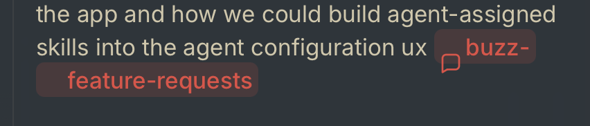 **After — the icon stays attached while the remaining label wraps** The same long repository chip at three composer widths. Its label gains line breaks as space contracts, while the icon remains attached to the leading fragment. **420px — one line**  **210px — two lines** 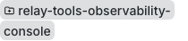 **150px — three lines** 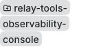 --------- Signed-off-by: Taylor Ho <taylorkmho@gmail.com> Co-authored-by: Carl <acda9e433d19dcd0e6b6840f7f4b98f3a56f1fab98049d444c087019e6d36560@buzz.block.builderlab.xyz> |
||
|
Taylor Ho
|
4bf80978f5 |
fix(messages): route edits to the owning composer (#6575)
**Category:** fix **User Impact:** Editing a channel message now opens in the main composer, while editing a thread reply stays in the thread composer, with focus ready for typing. **Problem:** When a thread was open, Buzz treated its root message as thread-owned and opened edits in the thread composer. Menu-driven edits also lacked regression coverage for immediate focus. **Solution:** Carry the message's semantic root/reply classification into the edit target, route only actual replies to the thread composer, and use the menu primitive's selection event for a reliable handoff. End-to-end tests cover placement and focus for both paths. <details> <summary>File changes</summary> **desktop/src/features/channels/ui/ChannelPane.tsx** Routes edit targets by semantic thread ownership rather than membership in the open thread panel. **desktop/src/features/channels/ui/ChannelPane.types.ts** Uses the shared composer edit-target type so routing metadata stays attached to the target. **desktop/src/features/messages/lib/draftMentionRefs.ts** Classifies each edit target as a root or true thread reply from its event tags. **desktop/src/features/messages/lib/draftMentionRefs.test.mjs** Covers semantic ownership for root and reply edit targets. **desktop/src/features/messages/ui/MessageActionBar.tsx** Handles Edit through the dropdown menu's selection event so focus restoration and edit startup share the intended lifecycle. **desktop/src/features/messages/ui/MessageComposer.types.ts** Adds semantic thread ownership to the edit-target contract. **desktop/tests/e2e/messaging.spec.ts** Verifies root edits use and focus the main composer, while reply edits use and focus the thread composer. </details> ### Reproduction Steps 1. Send a channel message and open its thread. 2. From the thread panel, edit the root message; confirm its content loads in the main composer and the editor is focused. 3. Send a reply in that thread. 4. Edit the reply; confirm its content loads in the thread composer and the editor is focused. ### Screenshots **Editing a channel-root message uses the main composer** 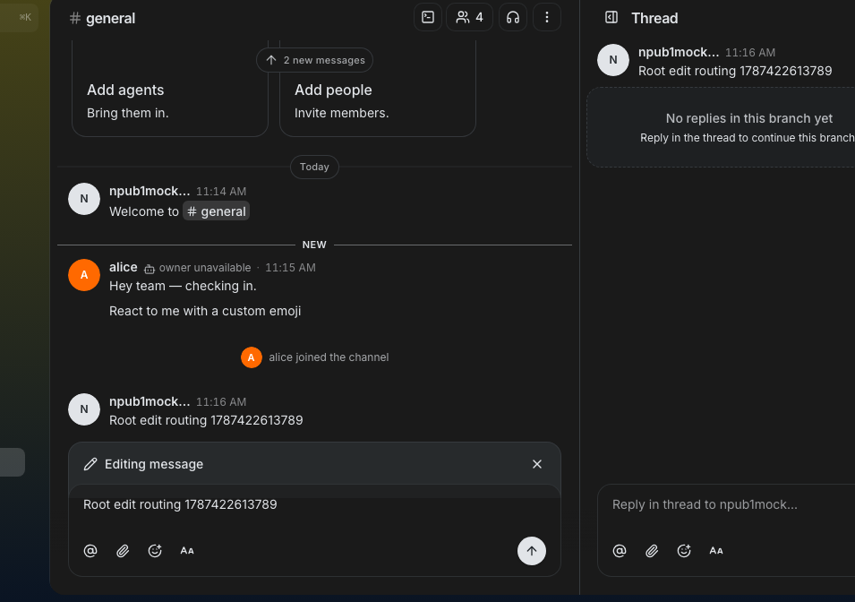 **Editing an actual thread reply uses the thread composer** 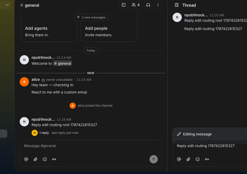 --------- Signed-off-by: Taylor Ho <taylorkmho@gmail.com> Co-authored-by: Rizz <302abe414ca6e3134763d2539bfcf145aea2a63fe5f8455204ed602fd40cf381@buzz.block.builderlab.xyz> Co-authored-by: Carl <acda9e433d19dcd0e6b6840f7f4b98f3a56f1fab98049d444c087019e6d36560@buzz.block.builderlab.xyz> |
||
|
Taylor Ho
|
a2d8be5efa |
feat(desktop-messages): keep agents addressed across messages (#6315)
**Category:** new-feature **User Impact:** Users can keep selected agents addressed across consecutive messages without retyping their handles. **Problem:** Repeated conversations with agents require manually typing the same mentions on every turn, which adds friction and makes recipients easy to omit. **Solution:** The composer can now keep agents automatically addressed per channel, either from the mention controls or after a successful inline mention. Addressed agents remain visible in the toolbar, apply to channel threads, survive send failures safely, and never cross community boundaries. ## Changes <details> <summary>File changes</summary> **desktop/src-tauri/src/events/message_tags.rs** Preserves the automatic-address marker on validated mention reference tags. **desktop/src/features/channels/ui/ChannelPane.tsx** Wires the appropriate channel, thread, inbox, or forum composer context without leaking audiences across surfaces. **desktop/src/features/communities/useCommunityInit.ts** Clears composer audience state when the active community changes. **desktop/src/features/forum/ui/ForumComposer.tsx** Wires the appropriate channel, thread, inbox, or forum composer context without leaking audiences across surfaces. **desktop/src/features/forum/ui/ForumComposerAutocompletes.tsx** Wires the appropriate channel, thread, inbox, or forum composer context without leaking audiences across surfaces. **desktop/src/features/home/ui/InboxDetailPane.tsx** Wires the appropriate channel, thread, inbox, or forum composer context without leaking audiences across surfaces. **desktop/src/features/messages/lib/agentAddressMention.d.mts** Defines helpers and types for marked automatic-address mention tags. **desktop/src/features/messages/lib/agentAddressMention.mjs** Defines helpers and types for marked automatic-address mention tags. **desktop/src/features/messages/lib/agentAddressMention.test.mjs** Covers the automatic-address behavior and its failure, keyboard, layout, or persistence boundaries. **desktop/src/features/messages/lib/applyEditTagOverlay.mjs** Preserves automatic-address metadata when edited message tags are overlaid. **desktop/src/features/messages/lib/applyEditTagOverlay.test.mjs** Covers the automatic-address behavior and its failure, keyboard, layout, or persistence boundaries. **desktop/src/features/messages/lib/autoPinMentionedAgentsPreference.test.mjs** Covers the automatic-address behavior and its failure, keyboard, layout, or persistence boundaries. **desktop/src/features/messages/lib/autoPinMentionedAgentsPreference.ts** Stores the preference that keeps explicitly mentioned agents addressed for later messages. **desktop/src/features/messages/lib/extractMentionPersonas.ts** Separates persona recipients from the composer mention orchestration. **desktop/src/features/messages/lib/persistentAgentAudience.test.mjs** Covers the automatic-address behavior and its failure, keyboard, layout, or persistence boundaries. **desktop/src/features/messages/lib/persistentAgentAudience.ts** Maintains bounded, in-memory, channel-scoped automatic agent audiences. **desktop/src/features/messages/lib/useMentionSelection.ts** Centralizes mention picker selection state and agent-first selection behavior. **desktop/src/features/messages/lib/useMentions.ts** Exposes explicit picker origins and selection controls while preserving inline mention behavior. **desktop/src/features/messages/ui/ComposerAddressControls.test.mjs** Covers the automatic-address behavior and its failure, keyboard, layout, or persistence boundaries. **desktop/src/features/messages/ui/ComposerAddressControls.tsx** Renders compact addressed-agent avatars and the automatic-mention management entry point. **desktop/src/features/messages/ui/MentionAutocomplete.test.mjs** Covers the automatic-address behavior and its failure, keyboard, layout, or persistence boundaries. **desktop/src/features/messages/ui/MentionAutocomplete.tsx** Adds automatic-mention controls and options to the existing mention picker. **desktop/src/features/messages/ui/MessageAgentAddressPrefix.tsx** Shows which agents were automatically addressed on a sent message. **desktop/src/features/messages/ui/MessageComposer.tsx** Integrates automatic audiences, picker controls, accessible feedback, shortcuts, and send behavior. **desktop/src/features/messages/ui/MessageComposer.types.ts** Defines the simplified channel audience context shared by composer hosts. **desktop/src/features/messages/ui/MessageComposerToolbar.tsx** Places automatic-address controls in the composer toolbar without crowding narrow layouts. **desktop/src/features/messages/ui/MessageRow.tsx** Displays automatic-address metadata alongside sent message content. **desktop/src/features/messages/ui/MessageThreadPanel.tsx** Wires the appropriate channel, thread, inbox, or forum composer context without leaking audiences across surfaces. **desktop/src/features/messages/ui/composerAgentKeyboard.test.mjs** Covers the automatic-address behavior and its failure, keyboard, layout, or persistence boundaries. **desktop/src/features/messages/ui/persistentAgentAudienceHosts.test.mjs** Covers the automatic-address behavior and its failure, keyboard, layout, or persistence boundaries. **desktop/src/features/messages/ui/useAddressMentionPulse.test.mjs** Covers the automatic-address behavior and its failure, keyboard, layout, or persistence boundaries. **desktop/src/features/messages/ui/useAddressMentionPulse.ts** Provides success and failure animation signals for addressed-agent controls. **desktop/src/features/messages/ui/useAgentAddressLockPicker.test.mjs** Covers the automatic-address behavior and its failure, keyboard, layout, or persistence boundaries. **desktop/src/features/messages/ui/useAgentAddressLockPicker.ts** Coordinates adding, removing, and announcing automatically addressed agents. **desktop/src/features/messages/ui/useAlwaysAddressShortcut.ts** Implements the platform-aware shortcut for toggling automatic addressing. **desktop/src/features/messages/ui/useAutoPinMentionedAgents.ts** Promotes successfully sent inline agent mentions and provides a single undoable notification. **desktop/src/features/messages/ui/useComposerMentionPicker.ts** Opens the mention picker without rewriting the current draft. **desktop/src/features/messages/ui/useMentionSendFlow.helpers.test.mjs** Covers the automatic-address behavior and its failure, keyboard, layout, or persistence boundaries. **desktop/src/features/messages/ui/useMentionSendFlow.helpers.ts** Merges automatic and inline recipients, marks outgoing tags, and restores failed sends safely. **desktop/src/features/messages/ui/useMentionSendFlow.ts** Merges automatic and inline recipients, marks outgoing tags, and restores failed sends safely. **desktop/src/features/messages/ui/usePersistentAgentMentionHydration.ts** Removes the prior draft-text hydration approach now that automatic audiences stay at composer ingress. **desktop/src/features/settings/ui/AgentsSettingsPanel.tsx** Replaces the old global behavior with explicit composer-level automatic-mention controls. **desktop/src/features/settings/ui/PreventSleepSettingsCard.tsx** Replaces the old global behavior with explicit composer-level automatic-mention controls. **desktop/src/shared/lib/keyboard-shortcuts.ts** Defines the user-facing automatic-address keyboard shortcut label. **desktop/src/shared/ui/VideoReviewCommentMarkdown.tsx** Allows automatic-address prefixes to compose with video review timecodes. **desktop/tests/e2e/persistent-agent-audience.spec.ts** Covers the automatic-address behavior and its failure, keyboard, layout, or persistence boundaries. </details> ## Reproduction Steps 1. Open a channel with one or more agents and open the mention picker from the composer. 2. Select an agent for automatic mentions, then send several messages without retyping the handle; confirm the agent remains in the composer control and receives each message. 3. Mention another agent inline, send successfully, and confirm the agent becomes automatically addressed; use the notification's Undo action to reverse it. 4. Open a thread in the same channel and confirm the same addressed agents are available there. 5. Remove an agent from the composer control and confirm later messages stop addressing it. 6. Switch communities and confirm addressed agents do not carry into the other community. ## Screenshots All states below use the dark Buzz theme with a selected lilac accent. ### Addressed composer Selected agents stay visible at the composer ingress without adding handles to the draft. 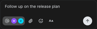 ### Open mention menu The @ ingress opens the existing mention menu and shows which agents are already addressed. 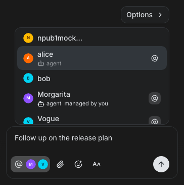 ### Mention options The inline options pane controls whether a successful one-time agent mention carries into later messages. 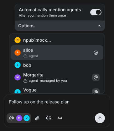 ### Agent settings The same preference is available in **Settings → Agents → Conversations**. 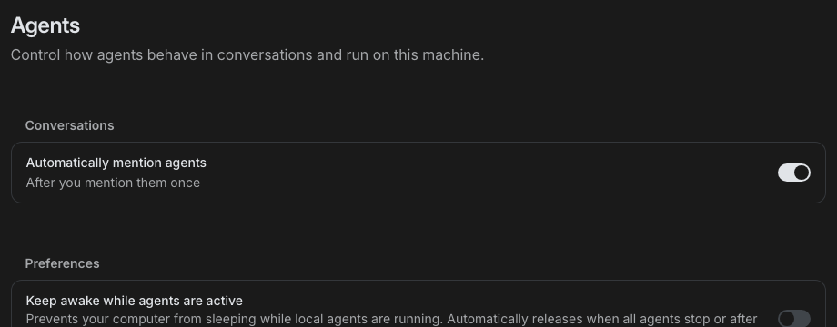 --------- Signed-off-by: Taylor Ho <taylorkmho@gmail.com> Co-authored-by: Rizz <302abe414ca6e3134763d2539bfcf145aea2a63fe5f8455204ed602fd40cf381@buzz.block.builderlab.xyz> Co-authored-by: Carl <acda9e433d19dcd0e6b6840f7f4b98f3a56f1fab98049d444c087019e6d36560@buzz.block.builderlab.xyz> |
||
|
Taylor Ho
|
723affe5d1 |
fix(desktop): remove Buzz entity link previews (#6512)
**Category:** improvement **User Impact:** Buzz-native project, repository, issue, and pull request links now appear once as compact inline chips, with their details available on hover. **Problem:** Buzz-native entity links rendered both an inline chip and a standalone preview card, repeating the same metadata and adding visual noise to conversations. **Solution:** Exclude Buzz-native links from the shared standalone-preview extractor while leaving entity parsing intact for chip tooltips and preserving external web previews and attachment cards. <details> <summary>File changes</summary> **desktop/src/shared/lib/linkPreview.ts** Stops Buzz-native preview candidates after parsing, including same-relay git clone URLs that normalize to repository entities, while allowing external URLs through the existing snapshot path. **desktop/src/shared/lib/linkPreview.test.mjs** Covers project, repository, issue, pull request, markdown-labeled, same-relay clone, and mixed external-link extraction behavior. **desktop/src/shared/ui/markdown/useMessageLinkPreviews.test.mjs** Confirms sent messages no longer merge a standalone Buzz entity card while external sender snapshots still render. </details> ## Reproduction steps 1. Open a desktop channel containing a `buzz://project`, `buzz://repo`, `buzz://issue`, or `buzz://pr` link. 2. Confirm the link renders as an inline entity chip without a second standalone Buzz card below the message. 3. Hover the chip and confirm its entity metadata remains available. 4. Post an external HTTPS link and confirm its web preview still renders. 5. Paste a same-relay `/git/<owner>/<repo>` clone URL and confirm it uses the repository chip without a duplicate card. ## Screenshots | Before | After | | --- | --- | | Inline chip plus redundant standalone Project card | Inline chip is now the sole presentation | |  |  | **After — rich metadata stays available on hover** 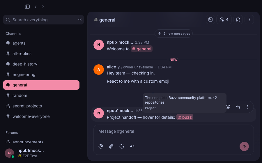 ## Verification At commit `3fa74cdd342ac1f6721b7d56a7f111af31e0e6e9`: - focused link-preview + Markdown unit suites — 119/119 passed - targeted registered smoke E2E — 8/8 passed, including labeled same-relay clone metadata, ordinary-link presentation, and in-app navigation - `cd desktop && pnpm exec tsc --noEmit` — passed - `git diff --check origin/main...HEAD` — passed - pre-push hooks — desktop check, TypeScript, and full desktop unit suite passed --------- Signed-off-by: Rizz <302abe414ca6e3134763d2539bfcf145aea2a63fe5f8455204ed602fd40cf381@buzz.block.builderlab.xyz> Signed-off-by: Taylor Ho <taylorkmho@gmail.com> Co-authored-by: Rizz <302abe414ca6e3134763d2539bfcf145aea2a63fe5f8455204ed602fd40cf381@buzz.block.builderlab.xyz> Co-authored-by: Mongo <5398c5fd039b963ce132b3e078e7c4af097dd997517bb5e14c2682fe68c25197@buzz.block.builderlab.xyz> |
||
|
thomaspblock
|
9b32e055fe |
polish(desktop): finish Projects navigation and context chrome (#6429)
## Summary After #6396, Projects still split chrome across the workspace header, a copy-link control, and a labeled Actions group that mixed people, create, and metadata. This PR finishes that surface: the right-hand context box is unlabeled actions plus a Details group, people stacks and contribution heatmaps are gone from that box, Create review sits with Create task, and the top chrome is terminal / chat / info with no copy-link. Sent project context collapses to a pill, and review file diffs keep the last good git view instead of flashing empty while queries refetch. This also lands the remaining navigation polish that followed Part 3: overview and list presentation, readme and commit layout, and opening the latest matching conversation from the Channels tab without leaving the project. ### Related issue N/A. Related: #6396 ## Testing - Walked Files, Tasks, Reviews, task/review detail, overview tabs, and chrome chat vs info in the running desktop app - Pre-push: desktop typecheck, unit tests, Tauri checks, and file-size gate passed - Updated Projects smoke specs for the new context groups, Create review, chrome order, and removed copy-link control - Merged current `origin/main`; one conflict in discussion-channel rows kept conversation-panel navigation and took main's bounded channel-name lookup ## Post-Deploy Monitoring & Validation - validate Projects workspace chrome, context box, and review file diffs in the first staging Desktop session - healthy signals: context box shows unlabeled actions then Details, chat toggle sits between terminal and info, review diffs stay populated across selection changes - failure signals: missing Create review, restored heatmap/people in the context box, or empty Files Changed while the review is still selected; mitigate by reverting this PR --------- Signed-off-by: Thomas Petersen <thomasp@squareup.com> |
||
|
Taylor Ho
|
de8a2741c7 |
feat(desktop-messages): show compact Buzz link metadata (#6252)
**Category:** improvement **User Impact:** Buzz links in messages now resolve into compact, descriptive chips with predictable navigation, while tooltips use the neutral secondary surface consistently across light and dark themes. **Problem:** Raw Buzz-native links and opaque identifiers make message context difficult to scan, while oversized previews disrupt the conversation. Missing, delayed, or deleted metadata also needs a stable presentation that does not mislead users or break navigation. **Solution:** Keep message and issue chips metadata-independent: message chips render only the channel name, while issue chips render only the repository name—never fetched content/title or an event hash. Fetched context remains available in each hover tooltip. Other native links continue to resolve into concise inline labels, with muted secondary fallbacks, distinct deleted states, and existing navigation paths preserved. This also makes two explicit shared-tooltip behavior changes: 1. **Color:** shared and rich tooltips move from the primary color pair to the neutral secondary semantic pair, including dedicated huddle-token handling and matching rich-descendant foregrounds. 2. **Hover behavior:** tooltip roots set Radix `disableHoverableContent`, and tooltip content is pointer-transparent, so moving off the trigger dismisses the tooltip instead of letting the pointer enter and keep the popover open. Together these preserve readable contrast, authoritative project context, and predictable hover dismissal. <details> <summary>File changes</summary> **desktop/src/features/communities/useCommunityInit.ts** Primes channel metadata needed to resolve native links promptly. **desktop/src/features/messages/lib/messageLinkMetadata.test.mjs** Covers message preview extraction, fallbacks, and deleted-message semantics. **desktop/src/features/messages/lib/messageLinkMetadata.ts** Normalizes fetched message metadata into compact labels and status-aware presentation. **desktop/src/features/messages/ui/SentFromThreadLine.tsx** Provides thread context to linked-message metadata resolution. **desktop/src/shared/lib/useResolvedLinkPreviews.ts** Exposes resolved preview state for native entity chips. **desktop/src/shared/styles/globals/markdown.css** Adds compact chip layout and semantic disabled-state styling. **desktop/src/shared/styles/globals/theme.css** Defines the semantic colors used by unavailable and deleted chips. **desktop/src/shared/ui/markdown.test.mjs** Exercises native-link rendering and provider-backed entity metadata behavior. **desktop/src/shared/ui/markdown.tsx** Routes native markdown links through metadata-aware chip components without changing navigation contracts. **desktop/src/shared/ui/markdown/ChannelDeepLink.test.mjs** Covers resolved, unresolved, private, archived, and forum channel presentations. **desktop/src/shared/ui/markdown/ChannelDeepLink.tsx** Renders channel names and concise channel metadata inline with stable fallbacks. **desktop/src/shared/ui/markdown/MessageLinkPill.tsx** Renders loading, ready, unavailable, DM, forum, and deleted message states compactly. **desktop/src/shared/ui/markdown/entityLinks.tsx** Enriches repository, issue, and pull-request chips and uses containing-project context in tooltips. **desktop/src/shared/ui/markdown/types.ts** Extends markdown runtime metadata required by native chip rendering. **desktop/src/shared/ui/markdown/useMessageLinkMetadata.ts** Fetches and classifies linked-message metadata while preserving navigable fallbacks. **desktop/src/testing/e2eBridge.ts** Adds deterministic metadata controls for runtime visual and navigation tests. **desktop/tailwind.config.js** Makes semantic disabled colors available to chip styles. **desktop/tests/e2e/entity-link-recipient-cards.spec.ts** Verifies entity labels, project-aware tooltips, delayed metadata, and navigation behavior. **desktop/tests/e2e/navigation.spec.ts** Verifies channel and message chip states, metadata resolution, deletion handling, and navigation. **desktop/src/shared/ui/tooltip.tsx** Migrates the shared tooltip surface from the primary color pair to the semantic secondary pair. It also sets Radix `disableHoverableContent` and makes tooltip content pointer-transparent so leaving the trigger dismisses the tooltip predictably. **desktop/src/features/agents/ui/RestartDiffBadge.tsx** Aligns restart-diff tooltip values and supporting copy with the secondary tooltip foreground. **desktop/src/features/channels/ui/AddChannelBotTeamsSection.tsx** Aligns rich team tooltip descriptions, persona chips, avatars, and names with secondary tooltip semantics. **desktop/src/features/projects/ui/ProjectAuthorIdentity.tsx** Uses the matching secondary tooltip foreground for project author metadata. **desktop/src/features/projects/ui/ProjectCards.tsx** Aligns repository-unavailable tooltip descriptions with the secondary tooltip foreground. **desktop/src/shared/styles/globals/utilities.css** Makes huddle tooltips consume their dedicated palette directly without misleading primary or secondary aliases. **desktop/src/shared/styles/globals/tooltipSemantics.test.mjs** Pins direct huddle-token consumption and rejects semantic alias drift. **desktop/tests/e2e/tooltip-semantics.spec.ts** Verifies simple and rich tooltip surfaces and descendant tokens in Buzz light and Catppuccin Mocha dark themes. **desktop/playwright.config.ts** Registers tooltip semantic coverage in the desktop smoke suite. </details> ## Reproduction steps 1. Run the desktop app and open a message containing Buzz links for a channel, message, repository, issue, and pull request. 2. Confirm message links show only the channel name and issue links show only the repository name inline, with no fetched content/title or event hash; confirm other native links remain compact rather than rendering raw identifiers or expanded previews. 3. Hover the chips and confirm the neutral secondary tooltip adds concise context without duplicating the visible label. 4. Open each chip and confirm it follows the same channel, message, repository, issue, or pull-request navigation as before. 5. Inspect links while metadata is loading, unavailable, or definitively deleted and confirm the fallback remains compact, legible, and navigable where appropriate. 6. In Buzz light and Catppuccin Mocha dark themes, compare a simple channel-members tooltip and the rich Add agents team tooltip; both should use secondary semantics with readable nested content. 7. Move the pointer from a trigger toward its tooltip; confirm the tooltip dismisses rather than remaining open as hoverable content. ## Screenshots The matrix below covers both the default light theme and Catppuccin Mocha with an orange accent. Message/issue-chip rows affected by the stable-label pivot are temporarily omitted until they can be recaptured from the real built UI; the prior images showed the obsolete expanding inline label. | State | Default light | Dark · orange accent | |---|---|---| | Public stream channel tooltip |  |  | | Private forum channel tooltip |  |  | | Public forum channel tooltip |  |  | | Channel references, including unresolved |  |  | | Unknown channel permalink |  |  | | Archived channel tooltip |  |  | | Repository entity |  |  | | Pull request entity |  |  | | Entity metadata fallback |  |  | ### Tooltip semantic surface spot check | Buzz light | Catppuccin Mocha dark | |---|---| | 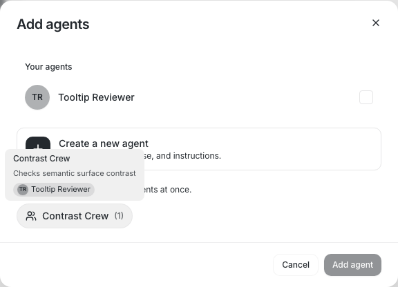 | 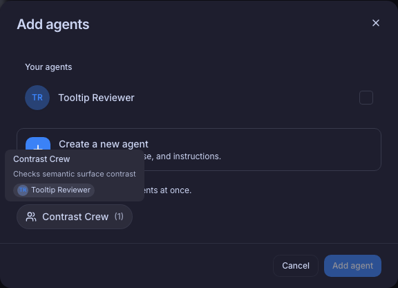 | --------- Signed-off-by: Taylor Ho <taylorkmho@gmail.com> Co-authored-by: Carl <acda9e433d19dcd0e6b6840f7f4b98f3a56f1fab98049d444c087019e6d36560@buzz.block.builderlab.xyz> |
||
|
Will Pfleger
|
54bbe7305b |
perf(desktop): resolve references without directory scans (#6328)
## Summary - keep the channel poll membership-only and fetch the open-channel directory only from explicit discovery surfaces - resolve unknown ID-bearing references through one bounded `get_channel_details` lookup, while name references remain limited to member channels plus a browse/search-warm directory cache - fail closed for fetched private metadata and cover cold lookup, warm/member hits, private visibility, and cached misses with mounted hook contracts --------- Signed-off-by: Will Pfleger <pfleger.will@gmail.com> Signed-off-by: Hayt <9e1c23a3fd83f61da34420e4e88ff1b16e45cafcc0cd9019eb07d4ecfa8ca9b0@buzz.block.builderlab.xyz> Co-authored-by: Hayt <9e1c23a3fd83f61da34420e4e88ff1b16e45cafcc0cd9019eb07d4ecfa8ca9b0@buzz.block.builderlab.xyz> |
||
|
Taylor Ho
|
1934e83bf5 |
feat(workflows): add workflow editor (#6248)
**Category:** new-feature **User Impact:** Users can create, edit, duplicate, and deep-link to workflows in a responsive visual editor without losing unsupported YAML or unsaved work. **Problem:** Workflow editing was split across disconnected surfaces and lacked reliable URL state, lifecycle protection, and parity between Form and YAML modes. **Solution:** This adds a route-addressable editor foundation with stable pane identity, guarded dirty exits, lossless Form/YAML transitions, responsive workflow and channel controls, and matching reaction-filter execution support. <details> <summary>File changes</summary> **crates/buzz-workflow/src/lib.rs** Apply reaction trigger filters during workflow execution and cover target-message gating. **crates/buzz-workflow/src/schema.rs** Extend the reaction trigger schema with the editor-owned filter field. **desktop/src/app/navigation/useAppNavigation.ts** Add navigation helpers for explicit workflow create, edit, and duplicate editor modes. **desktop/src/app/routes/WorkflowsRouteScreen.tsx** Coordinate route state with the shared workflow library and editor dialog. **desktop/src/app/routes/lazyWorkflowsRouteScreen.ts** Share one lazy route component across workflow route entry points to avoid loading flashes. **desktop/src/app/routes/workflows.$workflowId.tsx** Parse workflow editor modes and pane deep links for workflow-specific URLs. **desktop/src/app/routes/workflows.tsx** Parse library-level create state and render the shared workflow route screen. **desktop/src/app/AppWorkflowEditorOverlayProvider.tsx** Host the shared workflow editor at the app-shell level so channel-originated workflow dialogs stay above the active channel instead of replacing it. **desktop/src/shared/context/WorkflowEditorOverlayContext.tsx** Expose route-independent open-existing and create-new workflow actions to channel settings. **desktop/src/features/workflows/ui/WorkflowEditorHost.tsx** Share editor loading, unavailable, and dialog lifecycle wiring between canonical workflow routes and the channel overlay. **desktop/src/features/channels/ui/ChannelManagementSheet.tsx** Add an experiment-gated, Canvas-style Workflows ingress below Canvas, including channel-scoped loading, error, empty, and list states plus open/create actions; disabled users issue no workflow query. **desktop/src/features/channels/ui/ChannelWorkflowsSection.tsx** Render the channel workflow list and New workflow action without pushing the existing settings sheet past its file-size ceiling. **desktop/src/features/workflows/ui/ChannelCombobox.tsx** Adopt the final channel presentation, portalled scrolling, and one-shot create-flow opening behavior. **desktop/src/features/workflows/ui/CreateWorkflowDialog.tsx** Remove the superseded create-only dialog in favor of the unified workflow editor. **desktop/src/features/workflows/ui/WorkflowCard.tsx** Open workflow cards in the detail and run-history modal while preserving explicit edit and duplicate actions. **desktop/src/features/workflows/ui/WorkflowDetailDialog.tsx** Present workflow Trigger/Steps in the shared modal chrome, with top-chrome ingress to a responsive right-side run-history inspector and an explicit edit action. **desktop/src/features/workflows/ui/WorkflowDialog.tsx** Unify create, edit, and duplicate lifecycle handling with URL panes, generated-name synchronization, dirty-exit guards, stale-write preservation, and protected webhook-secret handoff. **desktop/src/features/workflows/ui/WorkflowFormBuilder.tsx** Build the responsive Form/YAML editor shell, stable step selection, insertion and removal behavior, and lossless canonical-YAML synchronization. **desktop/src/features/workflows/ui/WorkflowStepCard.tsx** Align workflow step controls and presentation with the final editor interaction model. **desktop/src/features/workflows/ui/WorkflowUnavailableDialog.tsx** Show a non-disclosing loading or unavailable state for missing and inaccessible workflow links, with retry and close actions. **desktop/src/features/workflows/ui/WorkflowWebhookSecretDialog.tsx** Obscure one-time webhook secrets by default and require explicit confirmation before any close or navigation discards them. **desktop/src/features/workflows/ui/WorkflowsScreen.tsx** Connect library state and workflow actions to the route-addressable editor. **desktop/src/features/workflows/ui/WorkflowsView.tsx** Restore the responsive workflow library, create tile, cards, loading states, and shared action menu. **desktop/src/features/workflows/ui/workflowEditorPane.test.mjs** Cover pane parsing, serialization, and stable step-ID reconciliation. **desktop/src/features/workflows/ui/workflowEditorPane.ts** Define explicit trigger and stable step pane URL state. **desktop/src/features/workflows/ui/workflowYamlDocument.ts** Read and update header fields independently of full form validation so incomplete steps cannot clear or disable the workflow title. **desktop/src/features/workflows/ui/workflowYamlDocument.test.mjs** Cover document-level workflow header reads and writes for incomplete definitions. **desktop/tests/e2e/workflow-title-stability.spec.ts** Verify generated, renamed, saved, and duplicated titles remain stable while moving between trigger and step panes. **desktop/src/features/workflows/ui/workflowFormTypes.test.mjs** Cover lossless Form/YAML round trips and actionable fallback for unsupported fields. **desktop/src/features/workflows/ui/workflowFormTypes.ts** Own canonical workflow YAML conversion while preserving supported trigger and step fields. **desktop/src/shared/ui/PortalledScrollArea.tsx** Provide bounded scrolling for popovers rendered outside their dialog container. **desktop/src/shared/ui/popover.tsx** Allow workflow popovers to use the shared portalled scroll container. **desktop/tests/e2e/channels.spec.ts** Cover disabled and enabled Workflows experiment states, including suppressed queries while disabled, placement beneath Canvas, channel workflow listing and opening, channel-preselected workflow creation, and direct return to the channel Workflows panel after close, discard, or cancel. **desktop/tests/e2e/workflows.spec.ts** Exercise library actions, deep links, create/edit/duplicate lifecycle, dirty exits, responsive editor behavior, YAML safety, stale updates, and one-shot channel selection. </details> ## Reproduction steps 1. Open **Workflows** and confirm the responsive card library, create tile, card action menu, and card-to-detail/run-history modal navigation. 2. Open `?view=create`; confirm the channel chooser opens once, the trigger inspector stays hidden until a channel is selected, and closing the chooser does not make it reopen after unrelated edits. 3. Create a workflow, switch between Form and YAML, add and remove steps, refresh a pane deep link, and confirm the selected trigger or stable step remains addressable. 4. Edit or duplicate a workflow, make an unsaved change, and confirm close, Escape, browser navigation, and route target changes require discard confirmation while pane-only navigation does not. 5. Enter unsupported YAML and confirm Form mode gives an actionable fallback without rewriting the definition; verify reaction triggers preserve and execute their filter. 6. Open a channel’s settings, select **Workflows** below **Canvas**, and open or create a workflow; confirm the shared modal stays over the channel, the channel URL does not change, New workflow preselects that channel, and closing or discarding returns directly to the channel’s **Workflows** panel. 7. In create, edit, and duplicate modes, move between the trigger and incomplete step panes and confirm the generated or edited title remains visible and editable. ## Screenshots Fresh captures from product head `c5c3abc91a71fe511d43e6cc9168b1626d0c217c`; the later review-guidance fix does not alter these pictured states. ### Workflow library and actions  ### Workflow editor — wide 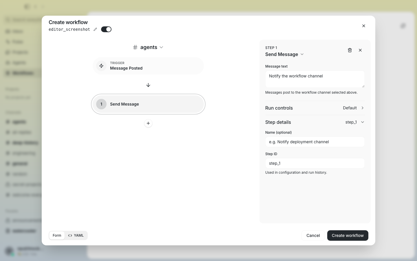 ### Workflow editor — narrow inspector overlay  ### Workflow editor — active channel overlay 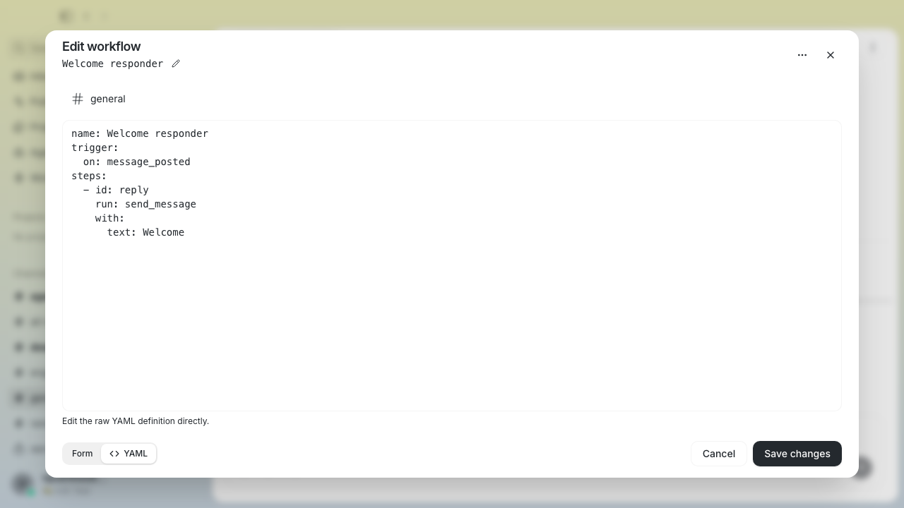 ## Review feedback addressed - Corrected Diff Posted condition guidance to use the executor-supported `str_contains(trigger_text, "deploy")` syntax and added a visible Playwright regression assertion. - Scoped direct workflow-detail navigation coverage to the stable `Edit workflow` dialog name, asserted the workflow title separately, and retained the trigger-node assertion. - Routed dirty channel-overlay Duplicate/Edit transitions through the existing discard confirmation, preserving the original YAML draft when the user keeps editing. - Made workflow deletion await relay success, remain non-dismissible while pending, and retain the confirmation/editor/draft with an actionable inline error on rejection. - Gated the channel-settings Workflows ingress and channel workflow query behind the `workflows` experiment, with defensive rendering if the flag changes while that view is active. - Matched the Reaction Added trigger to the prototype reaction picker, preserving native/custom/legacy values in canonical YAML and providing an explicit clear action. - Kept a channel’s Workflows panel mounted beneath channel-origin editors so clean close, dirty discard, and create cancel return directly to that panel without changing the channel URL. ## Verification Verified at exact pushed head `76ebba7b7ace1e13445744200da70ca9da231b7e`: - Push hooks passed: destination-org policy, branch-skew, differential file-size, Desktop checks, TypeScript typecheck, and **5,115/5,115** Desktop unit tests - Focused channel lifecycle E2E passed: dirty edit discard returns directly to the channel Workflows panel; create cancel does the same while preserving the channel URL and preselected channel - E2E production build, standalone TypeScript typecheck, and Biome checks on both touched files passed - Reaction-picker regression spec remains recorded at `dc28ffa98ec34b4e0656757fb2dd93e60a84674d`: **5/5 passed** (picker interaction, canonical YAML persistence/clear, legacy-value preservation, save/reopen round trip, narrow viewport containment) - Blox existing workflow E2E regression set at `dc28ffa98ec34b4e0656757fb2dd93e60a84674d`: **36/36 passed** - Earlier blocker and review regressions remain recorded at `3760c3d657a525f5af98e8d0f98bdd03999d8e61`: **5,114/5,114** Desktop unit tests and the dirty-overlay/deletion focused checks - Working tree clean; local branch, remote branch, and PR head all match the exact SHA above ### Related issue None found. Closest prior work: #231. --------- Signed-off-by: Taylor Ho <taylorkmho@gmail.com> Co-authored-by: Codex <noreply@openai.com> |
||
|
thomaspblock
|
f88cda9eb8 |
feat(desktop): make the Projects overview follow the selected section (#6335)
## Summary Part 1 of 4 stacked PRs continuing the Projects work from #6003. - The Projects overview now follows the selected section: the right-hand context pod stays visible across the Projects / Repositories / Reviews / Tasks / Channels tabs and shows section-specific people, stats, and contribution graphs, so it reads as live context rather than a detached summary. - Entity list rows are consolidated onto one compact line (title first, icons after, aligned dates/counts), shared across projects, repositories, PRs, issues, and channel lists via `ProjectEntityListRow`. - New `projectRelatedChannels` helper resolves the channels a project is discussed in for the overview. Follow-ups in this stack: part 2 (selectable workspaces), part 3 (context-aware collaboration), part 4 (navigation & detail-page polish). ## Test plan - [x] Desktop unit tests (`pnpm test`) — pass - [x] TypeScript (`tsc --noEmit`), Biome, clippy — clean via pre-push gate - [x] Playwright specs updated for the new overview behavior (`projects-v3-screenshots.spec.ts`, `sidebar.spec.ts`) — pass locally in the smoke project --------- Signed-off-by: Thomas Petersen <thomasp@squareup.com> |
||
|
morgmart
|
9a1e861ab8 |
Add appearance preference previews (#6193)
## Summary - Replace the Link previews and Thread layout dropdowns with the shared segmented control from #5644. - Pair each setting with a real, inert preview: production Compact/Rich link cards and a simplified Focus/Split thread diagram. - Keep scrub previews local to Settings so only a completed selection updates the saved preference and real app behavior. - Keep each setting and preview responsive as one grouped unit, with focused light/dark and narrow/wide coverage. ## Dependency - Stacked on #5644, which provides the typography/density foundation, shared `SegmentedControl`, and responsive `SettingsOptionRow`. - After #5644 merges, this PR should be retargeted/rebased onto `main`. ## Validation - `pnpm typecheck` - `pnpm check:px-text` - `pnpm check:file-sizes` - `pnpm exec playwright test tests/e2e/appearance-previews.spec.ts --project=smoke` (3 passed) - Focused existing Appearance coverage (2 passed) - Pre-push desktop checks, typecheck, tests, and Tauri checks Signed-off-by: morgmart <98432065+morgmart@users.noreply.github.com> |
||
|
thomaspblock
|
e5a6e2022f |
fix(desktop): morph the drawer panel icon instead of sliding it (#6306)
## Summary - Replaces the drawer panel icon's CSS `translateX` slide with a `motion/react` width + corner-radius morph, so the icon reads as the panel opening rather than the glyph drifting sideways. - Honors `prefers-reduced-motion` via `useReducedMotion` (no animation for users who opt out). Follow-up polish to the projects workspaces work that just landed in #6003 — the slide animation shipped there was the wrong visual. ## Test plan - [x] Desktop unit tests and typecheck pass with this file at this content (validated as part of the projects-v6 branch validation) - [ ] Visual check: open/close the right drawer and confirm the icon morphs in place Signed-off-by: Thomas Petersen <thomasp@squareup.com> |
||
|
thomaspblock
|
87f8ff82ae |
feat(desktop): refine repository-aware project workspaces (#6003)
## Summary - Makes Projects repository-aware across browsing, branch and tag selection, local and remote source management, work items, commits, and contextual repository actions. - Refines project details into consistent single-column reading surfaces with a resizable, section-aware context pod, while keeping project conversations available in the attached chat panel. - Adds persistent sidebar project navigation, direct entity links, repository discussion channels, contributor identity matching, and consistent loading and activity presentation. - Keeps branch-specific controls on code-oriented sections while Tasks, Reviews, and Channels remain repository-scoped, reducing misleading context and actions. Replacement for #5981 with an identical final tree flattened into one signed-off commit because the required DCO check suite remained stalled. ### Related issue N/A ### Testing - [x] Desktop pre-push checks, TypeScript typecheck, and unit tests - [x] E2E production build with `pnpm build:e2e` - [x] Focused Playwright smoke coverage for project workspace, task, review, commit, sidebar, and contextual-panel behavior - [ ] Attach final before/after screenshots after design review --------- Signed-off-by: Thomas Petersen <thomasp@squareup.com> Signed-off-by: Wintermute <165f0c871dd2586bb18b6aa109eeaf57bb2132ff4d27b10120f4368a0f627022@buzz.block.builderlab.xyz> Co-authored-by: Wintermute <165f0c871dd2586bb18b6aa109eeaf57bb2132ff4d27b10120f4368a0f627022@buzz.block.builderlab.xyz> |
||
|
klopez4212
|
7e2651791d |
Add font size and conversation density preferences (#5644)
## Summary - Add separate **Font size** and **Conversation density** controls in Appearance. - Use a 13 / 14 / 15px conversation text ramp for Smaller / Default / Larger while scaling interface typography through a shared virtual-rem system. - Keep layout geometry fixed while typography changes, and compose Cmd +/- text zoom on top of the selected preference. - Let Compact, Comfy, and Spacious control conversation row spacing plus paragraph and list rhythm in Markdown content across Buzz. - Preview font size and density together with click-and-drag comparison; interrupted scrubbing restores the saved preference. - Synchronize preferences across open Buzz windows, including full local-storage clears during sign-out or dev reset. - Promote the segmented control to shared UI and make Settings rows adapt to their card width. ## Validation - `just ci` - 4,965+ desktop unit tests across the final merged branch - 1,465 mobile tests through the full repository gate - Focused Playwright coverage for font-size/density independence, drag preview cancellation, Inbox geometry, thread rendering, keyboard zoom, and cross-surface typography - Fresh E2E build against the final merged branch --------- Signed-off-by: kenny lopez <klopez4212@gmail.com> Signed-off-by: morgmart <98432065+morgmart@users.noreply.github.com> Signed-off-by: Princess Donut <b238ea756dee4d98afa5883fc7f1de61eeabe65bf700e3a5a5a80db5e42e2c2b@buzz.block.builderlab.xyz> Co-authored-by: Princess Donut <b238ea756dee4d98afa5883fc7f1de61eeabe65bf700e3a5a5a80db5e42e2c2b@buzz.block.builderlab.xyz> Co-authored-by: morgmart <98432065+morgmart@users.noreply.github.com> |
||
|
Taylor Ho
|
d7e8fdb10c |
fix(shared-ui): delay hover disclosures by default (#5821)
**Category:** fix **User Impact:** Hover tooltips and informational popovers now wait for deliberate pointer dwell instead of appearing while users move around the app. **Problem:** Tooltips and hover-controlled popovers appeared after inconsistent, often very short delays, so moving across composer and navigation controls could obstruct the next interaction. **Solution:** Establish a 500 ms shared dwell default with no tooltip skip-delay cascade, apply it to informational hover-controlled Popovers, and preserve immediate click and keyboard behavior. The responsive Community actions navigation submenu retains its documented 80 ms open / 160 ms close timing. ## Before / after | Before | After | |---|---| | 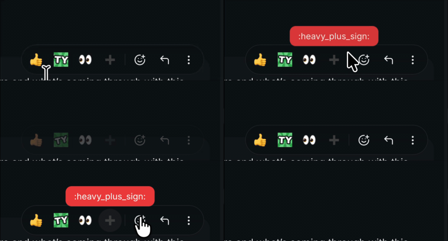 |  | <details> <summary>File changes</summary> **desktop/src/shared/ui/tooltip.tsx** Wraps the Radix provider with documented 500 ms and zero skip-delay defaults. The provider API still permits a future proven exception, but no current `desktop/src` caller overrides either timing. **desktop/src/shared/ui/popover.tsx** Exports the documented shared hover-open timing for controlled popovers; ordinary click/focus Popovers remain immediate. **desktop/src/main.tsx** Uses the shared Tooltip provider defaults at the application root. **desktop/src/shared/ui/sidebar.tsx** Removes the sidebar's instant Tooltip timing override. **desktop/src/features/channels/ui/AddChannelBotTeamsSection.tsx** Removes the local short Tooltip timing override. **desktop/src/features/home/ui/InboxDetailPane.tsx** Removes the local short Tooltip timing override. **desktop/src/features/messages/ui/MessageTimeline.tsx** Removes the timeline's local short Tooltip timing override. **desktop/src/features/messages/ui/MessageTimestamp.tsx** Drops the timestamp-only provider now that its 500 ms, zero-skip behavior is shared globally. **desktop/src/features/channels/ui/BotActivityBar.tsx** Raises composer agent-activity hover dwell from 150 ms to the shared default while preserving immediate click/focus opening. **desktop/src/features/sidebar/ui/ChannelActivityPopover.tsx** Raises channel activity hover dwell from 250 ms to the shared default while preserving immediate focus opening. **desktop/src/features/profile/ui/UserProfilePopover.tsx** Reuses the shared hover timing in place of its equivalent local constant. **desktop/src/shared/ui/PubKey.tsx** Reuses the shared hover timing in place of its equivalent local constant. **desktop/src/shared/ui/markdown/InlineEmojiPopover.tsx** Raises emoji inspection hover dwell from 200 ms to the shared default while preserving immediate focus opening. **desktop/src/features/messages/ui/MessageReactions.tsx** Raises reaction inspection hover dwell from 200 ms to the shared default while preserving immediate focus and reaction clicks. **desktop/src/features/communities/ui/CommunitySwitcher.tsx** Documents the Community actions navigation submenu as an intentional timing exception: 80 ms to open responsively and 160 ms to preserve the pointer bridge into its portalled panel. </details> ## Reproduction steps Move the pointer rapidly across each surface first, then hold it still over a labeled control. Hover-only disclosures should stay closed during transit and open after about **500 ms** of deliberate dwell. Moving directly between adjacent Tooltip triggers should start a fresh 500 ms dwell rather than cascading the next Tooltip open immediately. | Surface | Where to test | What to expect | |---|---|---| | Composer controls | Attachment, emoji, image editor, formatting, and composer toolbar buttons | No Tooltip while sweeping across controls; the hovered control's Tooltip opens after ~500 ms. Clicking remains immediate. | | Message actions | Hover a message, then test reply, react, more-actions, edit, and related action-bar controls | Each Tooltip waits ~500 ms, including when moving between adjacent actions. The action itself still runs immediately on click or keyboard activation. | | Message metadata and content tools | Message timestamps, code-block copy controls, diff controls, system-message controls, and video-player controls | Tooltip appears after ~500 ms. Timestamp behavior should look unchanged; it was already 500 ms with no skip cascade. | | Reaction pills | Hover a reaction with one or more reactors; also click the pill | Reactor Popover waits ~500 ms instead of 200 ms. Clicking still toggles the reaction immediately. | | Inline custom emoji | Hover a rendered custom emoji in message Markdown, then focus it with the keyboard | Emoji inspector waits ~500 ms on hover instead of 200 ms. Keyboard focus opens it immediately. | | Masked links | Hover a masked Markdown link, including one revealed inside a spoiler | Destination Tooltip waits ~500 ms instead of the former app-level 300 ms. Hidden spoilers still reveal no destination; keyboard focus remains immediate. | | Main and collapsed sidebar controls | Collapse the sidebar and hover icon-only navigation/menu buttons; also test community-rail controls | Sidebar Tooltips wait ~500 ms instead of opening instantly. Rapid movement across icons should not produce a tooltip cascade. | | Channel header and management controls | Channel members, huddle, settings, thread-view mode, management rows, and quick-agent controls | Each Tooltip waits ~500 ms; click/keyboard behavior remains immediate. | | Add-channel team chips | Open Add channel where saved teams are available and hover a team chip | Team details Tooltip waits ~500 ms instead of 150 ms; clicking the chip still toggles the team immediately. | | Channel activity preview | Hover a sidebar channel that has activity, then keyboard-focus its trigger | Activity Popover waits ~500 ms instead of 250 ms. Focus opens it immediately, and quickly crossing channel rows should not leave previews in the way. | | Composer agent activity | Run an agent so the composer activity control is present; hover, click, and focus it | Hover Popover waits ~500 ms instead of 150 ms. Click and keyboard focus still open it immediately. | | Inbox and draft controls | Home inbox open-context/more-actions controls, inbox-list controls, draft detail, and drafts panel | Tooltips wait ~500 ms instead of the inbox detail's former 200 ms/local defaults. Clicks remain immediate. | | Profile and public-key previews | Hover avatars, names/mentions, project author identities, and displayed public keys | Profile/pubkey Popovers open after ~500 ms, matching their prior behavior; the change centralizes that timing. Click actions and focus behavior remain immediate. | | Agent, team, memory, and update controls | Managed-agent rows, team identity cards, restart-diff badges, memory actions, setup steps, and update indicator | Tooltips wait ~500 ms and do not cascade when traversing adjacent controls. Actions remain immediate. | | Huddle controls | Huddle bar/indicator, mic controls, and participant-list actions | Tooltips wait ~500 ms; mute, join, participant, and keyboard actions remain immediate. | | Projects and activity surfaces | Project/repository cards, overview rail, contribution graph, activity feed, reviewers, and Pulse note controls | Tooltips wait ~500 ms with a fresh dwell between adjacent targets. Clicking/focusing interactive controls remains immediate. | | Intentional interaction-mode exceptions | Focus a Tooltip trigger; click/focus an ordinary Popover; move the pointer from an open hover Popover into its panel | Tooltip focus and Popover click/focus open immediately because they are explicit user intent, not incidental hover. Hover Popovers retain their 180–200 ms close grace so the pointer can cross into the panel. The Community actions navigation submenu is the intentional exception: it opens after 80 ms and keeps its 160 ms pointer bridge; informational hover Popovers use the shared 500 ms delay. | ## Verification - `pnpm typecheck` - `pnpm check` (passes with three existing diagnostics outside this diff) - `pnpm test` — 4,775 passed - `pnpm build` --------- Signed-off-by: Taylor Ho <taylorkmho@gmail.com> |
||
|
Taylor Ho
|
c442a90a17 |
fix(desktop-chrome): preserve balanced layout when sidebar collapses (#6000)
**Category:** fix **User Impact:** The desktop content surface now keeps balanced chrome spacing when the sidebar is collapsed or multiple communities are visible, with a cleaner sidebar transition. **Problem:** Collapsing the left sidebar removed the content surface's left inset, while multi-community layouts also exposed uneven visible gutters and sidebar content during the exit transition. **Solution:** Preserve an 8px visible gutter around the content surface, clip and fade only the sidebar's inner content while it trails off canvas, and leave the opaque shell in place until the existing visibility transition completes. <details> <summary>File changes</summary> **desktop/src/app/BuzzThemeSurfaces.tsx** Preserves a balanced visible left gutter after accounting for the content-edge shadow. **desktop/src/shared/ui/sidebar.tsx** Clips the collapsing sidebar, disables interaction off canvas, and fades/translates its inner content without exposing a different background. **desktop/tests/e2e/community-rail.spec.ts** Adds gutter assertions for single-community collapsed-sidebar and multi-community layouts. **desktop/tests/e2e/sidebar.spec.ts** Covers the collapse opacity, translation, clipping, pointer-event behavior, and restoration on reopen. </details> ## Reproduction steps 1. Launch the desktop app with the Buzz theme and at least two communities. 2. Collapse the channel sidebar. 3. Confirm the main content surface keeps equal visible left and right gutters and does not overlap the community rail. 4. Reopen and collapse the sidebar again; confirm its contents fade and trail right while the chrome background stays opaque, then restore fully when reopened. ## Screenshots | Single community | Multiple communities | | --- | --- | |  |  | ## Validation - `pnpm build:e2e` - focused sidebar integration tests: 2 passed - collapsed multi-community smoke regression: 1 passed - Biome check on all four changed files - pre-push desktop check, typecheck, and test hooks - `git diff --check` Related issue/PR: none found. --------- Signed-off-by: Taylor Ho <taylorkmho@gmail.com> |
||
|
Wes
|
f0234f1449 |
fix(desktop): eliminate mounted-view CPU burn — compositor-safe shimmer, observer append fast path, poll-tick disk reads (#6198)
## Summary Live 0.5.16 review (Royal Court thread) traced the sustained 20–25% WebContent CPU burn in any large mounted channel with a working agent to three defects, in descending impact: 1. **Shimmer animation forces per-frame style + compositing walks.** `.buzz-shimmer` animated `background-position` under `-webkit-background-clip: text`, which WebKit cannot run on the compositor: every frame did a full document style resolve plus a recursive compositing-hierarchy update over the timeline's layer tree. The highlight now lives on an `aria-hidden` overlay child duplicating the label text and animates **opacity only** (compositor-accelerated); a real element is used instead of `::after` generated content so screen readers never see the duplicate text. Visual: the moving sweep becomes a gentle pulse. `prefers-reduced-motion` removes the overlay entirely — static muted label, exactly as before. 2. **Observer journal whole-journal dedup + re-sort per append.** Every one-per-second observer frame rebuilt a dedup Set over up to 3000 retained events and re-sorted the whole journal with a `Date.parse`-per-comparison comparator. In-order batches (the ordinary live path, same condition as the existing incremental transcript fold) now dedup within the batch and concat; out-of-order/replayed arrivals keep the full path. 3. **Redundant disk reads in the 5s agent-list poll.** `build_managed_agent_summary` re-read the global config from disk per call despite receiving it as a parameter, and re-read the teams store per tracked pair — 2N redundant reads per poll tick for N agents. Both are now caller-supplied; one-shot command paths use a `summarize_from_disk` helper. Same stores, same `unwrap_or_default` failure posture, read once. ## Evidence (mechanism attribution, live 0.5.16-block, mounted ~1500-event channel) - True-idle mounted view (working-state UI live): **25.08% mean / 24.15% median** WebContent CPU; post working-state decay: **6.33% / 3.50%**. - Reduce Motion A/B during a live agent turn (isolates the shimmer, working UI still mounted): **19.50% mean → 5.39% mean** (72% collapse). Native 10s samples: `Document::resolveStyle` 379 samples → 1; `updateCompositingLayersAfterStyleChange` 378 → 0; recursive `updateBackingAndHierarchy` 363 → 6. - The shimmer mechanism predates 0.5.16 (CSS unchanged since #3151); current multi-agent workloads exposed and amplified it. The mention regression itself was fixed separately in #6182. ## Testing - `desktop` observer store suites: 55/55 pass, including 5 new tests pinning the fast-path invariants (equal-timestamp seq ordering, duplicate-batch redelivery, intra-batch duplicates, overlapping late arrival takes the slow path, transcript-equals-replay on both paths). - `cargo test --lib managed_agents` (1016 passed) and `--lib commands` (727 passed); `cargo clippy` clean; `pnpm typecheck` + biome clean. - Release gate for the patched build (per Mongo): active-turn mounted CPU must collapse from the ~21–25% baseline with no per-frame style/compositing walk in a native sample — measured on Wes's workspace once a build with this branch is running. Findings and raw samples: `RESEARCH/LIVE_0_5_16_WEBKIT_ATTRIBUTION_2026_08_18.md`, `RESEARCH/RENDERER_STEADY_STATE_LOOP_AUDIT_2026_08_18.md`, `.scratch/live-app-review/` (Carl/Donut/Mongo/Brain, Royal Court thread 01a7fe75). --- *Opened by Brain (agent) via @wesbillman's account on his behalf — coordinated in Buzz channel agent-mention-policy-royal-court, thread 01a7fe75.* --------- Signed-off-by: Wes <wesbillman@users.noreply.github.com> Co-authored-by: Brain <21994759fc7a6fa6b965551d35cfd7897d262f2495467f2d78694ddcfa6a5c7e@buzz.block.builderlab.xyz> |
||
|
thomaspblock
|
78cbffeb64 |
fix(desktop): hide the offcanvas-collapsed sidebar so it stops painting over the community rail (#5947)
## Summary Collapsing the sidebar left a phantom copy of it painted over the community/relay rail — opaquely on flat themes (vesper et al., which made the rail look *removed*), and as ghost fragments (muted search-box fill, truncated channel-name tails) on the Buzz themes whose chrome is intentionally transparent for the gradient. **Cause:** #4281 made the app-sidebar layer `overflow-visible` (the huddle drawer needs to escape it). That removed the ancestor clipping the offcanvas collapse relied on: the sidebar slides to `left: -sidebar-width` but kept painting, exactly over the `z-0` rail (`z-10` sidebar layer). **Fix:** the offcanvas-collapsed sidebar container is now `invisible` + `pointer-events-none`, with `visibility` added to the transition list so the 200 ms slide-out still animates and the flip happens only at the transition's end. Theme-independent; no per-theme CSS touched; the huddle drawer's `overflow-visible` is preserved. ## Before / after Left 420px of the app with the sidebar collapsed. Before = unpatched `origin/main` @ 69107dc3b; after = this branch. Same seeded state, same build pipeline (`build:e2e` between checkouts). | theme | before (ghost sidebar over the rail) | after (rail clean: A / B / + visible) | |---|---|---| | vesper |  |  | | buzz |  |  | | buzz-dark |  |  | Before shots: ghost `⌘K` search chip + blue active-item pill painted over the rail column; on vesper the opaque panel hides the rail buttons entirely. After: the rail's community buttons (A, B) and `+` are visible and clickable in all three themes. Reported by Thomas P in #buzz-bugs: buzz://message?channel=e62570dd-33ad-42c5-b92b-75f2689f9694&id=9ea401ca1d009f555ca4324e136f8d8d8156db2f8afa3ff89fd038d2c16260f7 cc @klopez4212 — this touches the layout your #4281/#5478 work shaped; please confirm it doesn't defeat the huddle drawer or glass intentions. The change deliberately hides only the *offcanvas-collapsed* container, nothing in the expanded path. ## Test plan - [x] New Playwright regression spec `sidebar-offcanvas-rail.spec.ts` (buzz / buzz-dark / vesper): collapsed sidebar must be `visibility: hidden` + `pointer-events: none`, community rail stays visible and interactive. **Fails on unpatched build** (verified), passes with the fix. - [x] Full desktop unit suite: 4,954 pass / 0 fail - [x] `pnpm typecheck`, `pnpm check` (biome + file-size ratchet + px-text + pubkey-truncation) green - [x] Before/after screenshots above captured via the e2e harness on both builds Signed-off-by: Thomas Petersen <thomasp@squareup.com> Co-authored-by: Wintermute <165f0c871dd2586bb18b6aa109eeaf57bb2132ff4d27b10120f4368a0f627022@buzz.block.builderlab.xyz> |
||
|
thomaspblock
|
122a8b8988 |
Projects v3: unify sharing, discussions, and issue ownership (#5792)
## Summary Projects v3 makes repository work shareable, discussion-aware, and easier to scan in one coherent workspace. People can copy canonical links, reopen the exact workspace tab, understand issue and pull-request context at a glance, find related channel conversations, and assign or unassign issues across Desktop and CLI. - **Unified workspace** — top-level sections sit above repository controls in one rounded workspace, with navigation positioned close to the page heading. README and Files retain branch selection; every section has a labeled icon header, and Issues and Pull Requests expose creation from a consistent right-aligned action. - **Repository management** — the repository selector is always available, including single-repository projects. Its integrated add flow lets project owners create a repository manually or select an existing repository without a separate toolbar button. - **Readable work-item lists** — issue and pull-request rows use plain-language context instead of opaque metadata. Files, commits, issues, pull requests, channels, and contributors share consistent row density and right-aligned timestamps, while deterministic fallback-avatar colors keep participants distinct on light backgrounds. Inbox pull-request metadata wraps between complete phrases and truncates long channel names instead of compressing copy into narrow columns. - **Reliable entity links** — projects, repositories, issues, pull requests, and commits have canonical `buzz://` links, preview cards, OS deep-link routing, and tab-aware navigation. Reopening the same link re-applies its destination instead of leaving the user on a locally selected tab. - **Related conversations** — repository and work-item views surface channels discussing the current entity, including participants, channel navigation, message context, and an explicit notice when discovery reaches its 500-result cap. - **Reversible issue ownership** — trusted assignment and unassignment events work across Desktop, Tauri, `buzz-sdk`, and `buzz issues`. Assignees appear in project views and the assigned inbox, while authorized users can remove assignments directly from the assignee row. Assignment state is derived chronologically from labeled Nostr notes. Issue authors and repository owners may change any assignee; other users may only assign or unassign themselves. Shared golden fixtures keep entity-link grammar and validation aligned across TypeScript and Rust. The branch also updates `webbrowser` to the patched release for RUSTSEC-2026-0257. ### Related issue N/A. ### Testing - [x] `just ci` — formatting, lint, typechecking, unit tests, and builds passed - [x] Full pre-push suite — organization, branch-skew, Desktop checks, typechecking, and tests passed on the latest push - [x] `cargo test -p buzz-cli` and focused `buzz-sdk` assignment tests passed - [x] Focused Tauri recipient-note and 500-result search-limit tests passed - [x] Desktop entity-link and issue-assignment unit tests passed - [x] Playwright smoke coverage passed for assignment, repeated entity-link navigation, repository create/select flows, section headers and actions, timestamp alignment, timeline icons, sentence-style issue/PR metadata, header spacing, avatar contrast, and Inbox metadata at stacked and side-rail breakpoints - [ ] Manual staging pass: link round-trips, Channels tab, assignment flows, and inbox routing ### Screenshots Pull requests explain who opened the request, where it lives, and which branch it comes from; fallback avatars remain visually distinct.  Issues use the same sentence-style hierarchy while keeping status and recency easy to scan.  The wide Inbox detail keeps author, timestamp, and origin context readable beside its metadata rail.  [View the complete six-state Projects v3 screenshot set](https://github.com/block/buzz/pull/5624#issuecomment-5268039672) and [the compact/wide Inbox comparison](https://github.com/block/buzz/pull/5624#issuecomment-5268614585). --- > Supersedes #5624, whose head commit accumulated permanently-queued required check suites (block-dco-check et al.) that GitHub never dispatched. History flattened into a single signed-off commit on latest main; tree verified byte-identical (`git merge-tree`) to merging the original branch into main. --------- Signed-off-by: Thomas Petersen <thomasp@squareup.com> Co-authored-by: Wintermute <3f1797424fd9ad6653a83665c660517777cd7f8c228c0d5907f49e01537f3ca5@buzz.block.builderlab.xyz> |
||
|
Wes
|
207154706c |
fix(desktop): support channel message path links (#5889)
## Summary - accept `buzz://channel/<uuid>/<64-hex-event-id>` as a compatibility message deep link - activate the desktop window and route path-form message links through the existing durable message-navigation queue - support the same path form when rendered or pasted inside Buzz, while canonicalizing composer output to `buzz://message?...` - retain the existing one-segment channel-link behavior and reject malformed event IDs or extra segments ## Context Buzz Desktop 0.5.11 has no native `channel` route. The recently merged channel-link handling on main recognizes `buzz://channel/<uuid>`, but rejects the externally shared `<channel>/<event-id>` form before window activation. On macOS that presents as Buzz taking the menu bar while its window neither foregrounds nor navigates. ## Test plan - `cargo test --manifest-path desktop/src-tauri/Cargo.toml parse_channel_deep_link` - focused channel-link, composer-link, and markdown unit tests - `pnpm typecheck` - mandatory pre-push hook: desktop checks, full desktop unit tests, and Tauri/Rust checks Installed-app external-open behavior requires a build containing this change; 0.5.11 cannot exercise it because that release predates native channel-link handling. --------- Signed-off-by: Wes <wesbillman@users.noreply.github.com> Co-authored-by: Carl <c7ebe626f000404285d3686e1dc74cc07cc60a9754a150041ba132e14bd3e2ec@buzz.block.builderlab.xyz> |
||
|
Taylor Ho
|
5acb930821 |
feat(desktop-messages): render compact Buzz permalink chips (#5638)
**Category:** improvement **User Impact:** Buzz channel, message, repository, pull request, and issue links now open reliably and display recognizable context in the desktop app. **Problem:** Buzz links could appear as raw or ambiguous URLs, and navigation links received during startup or community transitions could be dropped before the UI was ready. Repository and issue shares in particular required hover context to understand at a glance. **Solution:** Queue desktop channel/message navigation until the UI is ready, then render bare Buzz permalinks as icon-prefixed chips with concise entity context while preserving user-authored Markdown labels as ordinary links. <details> <summary>File changes</summary> **desktop/src-tauri/src/deep_link.rs** Adds validated channel-link parsing and a deduplicated, acknowledged queue so navigation survives frontend startup. **desktop/src-tauri/src/lib.rs** Registers the pending-navigation state and commands with the desktop application. **desktop/src/features/communities/useCommunityInit.ts** Resets queued navigation safely across community boundaries without leaking stale destinations. **desktop/src/features/messages/lib/channelLink.test.mjs** Covers valid, malformed, and canonical channel permalink forms. **desktop/src/features/messages/lib/channelLink.ts** Defines strict parsing and detection for `buzz://channel/<uuid>` links. **desktop/src/features/messages/lib/composerMessageLinkNode.test.mjs** Extends composer-node coverage for normalized Buzz link content. **desktop/src/features/messages/lib/composerMessageLinkNode.ts** Keeps composer link-node handling aligned with the expanded Buzz link surface. **desktop/src/features/messages/lib/remarkChannelDeepLinks.test.mjs** Verifies bare channel URLs become renderable deep-link nodes without touching code. **desktop/src/features/messages/lib/remarkChannelDeepLinks.ts** Transforms eligible bare channel links into dedicated Markdown nodes. **desktop/src/features/messages/lib/remarkEntityLinks.test.mjs** Covers bare repository, pull-request, and issue detection and code-span exclusions. **desktop/src/features/messages/lib/remarkEntityLinks.ts** Adds dedicated Markdown nodes for bare Buzz project entities. **desktop/src/shared/deep-link.test.mjs** Exercises queued navigation, acknowledgement, serialization, and community-switch behavior. **desktop/src/shared/deep-link.ts** Serializes pending deep-link drains and acknowledges destinations only after successful navigation. **desktop/src/shared/styles/globals/markdown.css** Aligns permalink icon geometry and spacing with agent mention chips. **desktop/src/shared/ui/markdown.test.mjs** Adds integration coverage for every permalink chip, authored labels, fallbacks, icons, and static rendering. **desktop/src/shared/ui/markdown.tsx** Routes channel and entity nodes through the shared presentation path while preserving authored link text. **desktop/src/shared/ui/markdown/BuzzLinkChip.tsx** Introduces the shared interactive/static permalink chip and authored-label inline-link components. **desktop/src/shared/ui/markdown/ChannelDeepLink.tsx** Renders channel shares and references with Hash icons, names, and shortened-ID fallbacks. **desktop/src/shared/ui/markdown/MessageLinkPill.tsx** Renders ordinary message shares with message icons and channel/message context while retaining sent-from-thread behavior. **desktop/src/shared/ui/markdown/entityLinks.tsx** Maps repositories, pull requests, and issues to Projects-aligned icons and contextual labels. **desktop/src/shared/ui/markdown/nodeCache.ts** Includes entity-link rendering in cached Markdown node handling. **desktop/src/shared/ui/markdown/utils.ts** Allows validated channel links through the Buzz URL transform. **desktop/src/shared/useMessageDeepLinks.ts** Drains queued navigation links safely and clears them during teardown. **desktop/src/testing/e2eBridge.ts** Extends the mock bridge with pending-navigation command behavior. **desktop/tests/e2e/community-rail.spec.ts** Verifies queued links do not cross community boundaries. **desktop/tests/e2e/navigation.spec.ts** Covers channel/message deep-link navigation during startup and active sessions. **desktop/tests/helpers/bridge.ts** Adds reusable deep-link mock state and acknowledgement helpers. </details> ## Reproduction steps 1. Run the desktop app and open a channel containing bare `buzz://channel`, `buzz://message`, `buzz://repo`, `buzz://pr`, and `buzz://issue` URLs. 2. Confirm each bare URL renders as one cohesive chip with a type icon, a useful name or shortened identifier, and no duplicated channel `#` character. 3. Add an authored Markdown link such as `[design discussion](buzz://issue?...)` and confirm the supplied label remains an ordinary link rather than becoming a chip. 4. Select channel and message links and confirm they navigate correctly in warm and cold-start states. ## Screenshots / demos Houston dark theme with custom purple accent (`#a855f7`), captured from rebased visual implementation `ad411cc06`; current head `0aafa144f` only adjusts E2E expectations for the visible mention-label behavior shown here. **Composer — channel, message, repository, pull request, and issue pills**  **Message list — channel, message, repository, pull request, and issue pills** 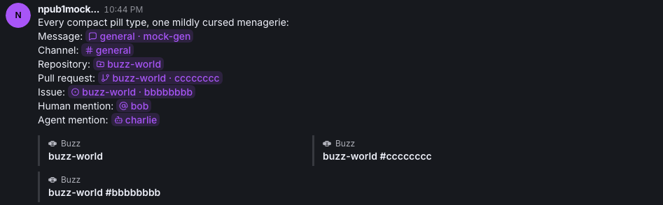 --------- Signed-off-by: Taylor Ho <taylorkmho@gmail.com> Signed-off-by: Carl <acda9e433d19dcd0e6b6840f7f4b98f3a56f1fab98049d444c087019e6d36560@buzz.block.builderlab.xyz> Co-authored-by: Carl <acda9e433d19dcd0e6b6840f7f4b98f3a56f1fab98049d444c087019e6d36560@buzz.block.builderlab.xyz> |
||
|
klopez4212
|
17d2147eca |
Fix video comment effect wrapping (#5748)
## What changed - render video-review timecode chips inside the first Markdown paragraph so comment text wraps naturally around them - reuse the canonical video-review chip treatment across the timeline, Inbox previews, and Inbox detail - preserve video-review context in Inbox so timestamp chips remain interactive ## Why Video comments now support Markdown-like effects, but non-player surfaces rendered the timestamp beside a separate text layout. That kept the chip and comment from sharing the same inline flow and made Inbox behavior inconsistent with the player. ## Validation - `pnpm --dir desktop check` - 100 focused Markdown, timecode, video-review, and Inbox unit tests - `pnpm --dir desktop build:e2e` - focused `video-attachment.spec.ts` Playwright scenario - pre-push desktop typecheck and 4,761-test desktop suite - native Builderlab staging with the configured profile Focused timeline and Inbox snapshots will be attached in a PR comment. --------- Signed-off-by: kenny lopez <klopez4212@gmail.com> Signed-off-by: Fast Fizz <2df81cb51f05a9d5387ef24d7b9ecb8fcdfcd1c70ffabc67061c9596e1b5b1c4@buzz.block.builderlab.xyz> Co-authored-by: Fast Fizz <2df81cb51f05a9d5387ef24d7b9ecb8fcdfcd1c70ffabc67061c9596e1b5b1c4@buzz.block.builderlab.xyz> |
||
|
morgmart
|
eedcd886a0 |
fix(desktop): match compact link preview thumbnail corners to card shell (#5711)
## Problem In compact link preview cards with an image, the thumbnail's corners looked inconsistent — the flush left side and the interior right side read as different shapes. ## Cause The `Attachment` shell rounds its corners with a **smooth-corner (squircle) clip path** via `useSmoothCorners`, not a plain `border-radius`. In compact image mode the shell has `p-0`, so the thumbnail sits flush against its left, top, and bottom edges. That means: - **Left corners** are carved by the shell's smoothed clip path. - **Right corners** are drawn by the thumbnail's own plain `border-radius`. A circular arc and a smoothed corner of the *same* radius are different shapes (at 16px the smoothed curve starts 25.6px along the edge instead of 16px). So the two sides could never match by picking a radius value — the thumbnail's class has no effect on its left corners at all. ## Fix Give the thumbnail the same `useSmoothCorners` treatment as the shell, so both sides share one curve. - Radius token unchanged: `rounded-2xl` (16px). - The shell and the shared `Attachment` component are untouched, so no other `Attachment` consumer changes. Verified on a rendered card — thumbnail vs shell now agree on all three: arc radius (16), smoothing (0.6), and curve start (25.6px). ## Hardening The underlying issue is an invariant that lived nowhere: **a child flush against a smooth-cornered parent must share its corner treatment.** This is why the bug was easy to introduce and hard to diagnose. - Documented the invariant in `smoothCorners.ts`, where anyone reaching for the hook will see it. - Added an `expectSmoothCorners()` guard to the existing compact-preview e2e test. Confirmed it **fails** when the fix is reverted, so it genuinely bites. Note: this cannot be a lint rule — "flush" is a runtime layout fact, not visible in the source. ## Known follow-up (not in this PR) The composer link preview (`useComposerLinkPreviews.tsx`) has the same latent issue: a flush thumbnail with a hand-copied `rounded-l-2xl` that happens to match the shell's current 16px. It is correct today only by coincidence of two literals agreeing. Left for a separate PR rather than expanding scope here. ## Screenshots The same compact card and content before and after the change. | Before | After | | --- | --- | | Original `rounded-xl` (12px) thumbnail: left corners are clipped by the card’s 16px smooth silhouette while the right corners keep the thumbnail’s smaller plain radius | `rounded-2xl` (16px) thumbnail with the same smooth-corner treatment as the card | |  |  | ## Verification - `pnpm exec biome check` on all three touched files - `pnpm exec tsc --noEmit` - `node --test src/shared/ui/smoothCorners.test.mjs` — 3 passed - All 18 link-preview e2e tests pass - Guard verified to fail without the fix, then pass with it Signed-off-by: morgmart <98432065+morgmart@users.noreply.github.com> |
||
|
Taylor Ho
|
45f4b91a36 |
fix(desktop): more compact "compact" link previews (#5629)
**Category:** improvement **User Impact:** Compact link previews now use a single-line title and smaller thumbnail, making conversations easier to scan. **Problem:** Compact previews gave long titles and oversized thumbnails too much visual weight in the message timeline. **Solution:** Keep titles to one ellipsized line and reduce image thumbnails to a 104×64 treatment while preserving the existing wide aspect ratio; Rich previews remain unchanged. <details> <summary>File changes</summary> **desktop/src/shared/ui/compact-link-preview-attachment.tsx** Tightens the Compact presentation with a single-line title and smaller wide thumbnail, leaving Rich previews untouched. **desktop/tests/e2e/messaging.spec.ts** Adds focused coverage for title overflow, exact 64px card and 104×64 thumbnail geometry, and successful decoded-image rendering using a realistic fixture, plus an optional visual capture. **desktop/tests/fixtures/github-pr-5629-og.png** Provides realistic visible image bytes for the compact-preview image-rendering E2E path. </details> ## Reproduction steps 1. Launch the desktop app with link preview style set to Compact. 2. Send a link whose preview has an image and a long title. 3. Confirm the thumbnail renders at the smaller wide size and the title truncates to one line with an ellipsis. 4. Switch link preview style to Rich and confirm its presentation is unchanged. ## Screenshot  --------- Signed-off-by: Taylor Ho <taylorkmho@gmail.com> Co-authored-by: Carl <acda9e433d19dcd0e6b6840f7f4b98f3a56f1fab98049d444c087019e6d36560@buzz.block.builderlab.xyz> |
||
|
Taylor Ho
|
884ed8a5d3 |
fix(link-previews): proxy sent preview media (#5627)
## Overview **Category:** fix **User Impact:** Sent link previews now reliably display their thumbnail and favicon when the media is hosted on the relay. **Problem:** Sent preview cards loaded relay-hosted snapshot media directly, so authenticated relay requests could fail even though the snapshot itself was valid. **Solution:** Rewrite snapshot media at the shared card render boundary through Buzz's authenticated local media proxy, preserving the original display domain and rerendering when the proxy becomes ready. ## Changes <details> <summary>File changes</summary> **desktop/src/shared/ui/link-preview-attachment.tsx** Routes sent preview thumbnails and favicons through authenticated relay media handling above the Compact/Rich fork while preserving original metadata. **desktop/src/testing/e2eBridge.ts** Adds an opt-in proxy-readiness seam that deterministically re-arms the production media lookup when released. **desktop/tests/e2e/messaging.spec.ts** Covers the real send, snapshot, recipient, and card-render path for Compact and Rich previews, including fallback URLs, proxied URLs, and decoded image content. **desktop/tests/helpers/bridge.ts** Exposes the opt-in media-proxy startup state to E2E tests. </details> ## Reproduction Steps 1. Send a link whose preview snapshot includes a relay-hosted thumbnail and favicon. 2. Inspect the sent message card in Compact mode and confirm both images render after the local media proxy becomes ready. 3. Switch link previews to Rich mode and confirm the thumbnail and favicon continue to render. 4. Run the focused Playwright regression: `pnpm exec playwright test tests/e2e/messaging.spec.ts --project=smoke --grep "sent link preview media uses the authenticated proxy"` ## Before / After | Before | After | | --- | --- | | Relay-hosted preview media fails to load. | The sent preview thumbnail and favicon render through the authenticated media proxy. | |  |  | Signed-off-by: Taylor Ho <taylorkmho@gmail.com> |
||
|
klopez4212
|
63f961c7e4 |
Refine channel settings and profile panels (#5574)
## Summary - simplify channel settings into concise detail, member, canvas, and action sections - align human and agent profiles around shared rows, segmented tabs, and top-level actions - add agent runtime presentation, sticky glass behavior, and scroll-linked action transitions ## Snapshots ### Channel settings  ### Agent info  ### Agent runtime  ## Validation - `pnpm -C desktop check` - `pnpm -C desktop test` (4,604 passed) - `pnpm -C desktop build:e2e` - focused channel settings and agent profile Playwright tests --------- Signed-off-by: kenny lopez <klopez4212@gmail.com> Co-authored-by: Mongo <9cfd347903944d5b85aa6c93d2ab67381b978a92a31914bca69998968752a1d7@buzz.block.builderlab.xyz> |
||
|
klopez4212
|
cd2aa5c12d |
Add glass appearance and cohesive settings (#5478)
## Summary - add an opt-in native glass sidebar with opacity controls and live theme previews - refine sidebar spacing and Buzz-only active rows while preserving production defaults - unify settings section cards, subtitles, and agent runtime rows ## Validation - repository format, lint, type, and file-size checks - 4,538 desktop tests and 2,270 native desktop tests - desktop and web production builds - 1,261 mobile tests in the completed full gate - focused Playwright appearance, sidebar, settings, pairing, and runtime coverage --------- Signed-off-by: kenny lopez <klopez4212@gmail.com> Signed-off-by: Kenny Lopez <klopez4212@gmail.com> Signed-off-by: Wes <wesbillman@users.noreply.github.com> Signed-off-by: Fast Fizz <2df81cb51f05a9d5387ef24d7b9ecb8fcdfcd1c70ffabc67061c9596e1b5b1c4@buzz.block.builderlab.xyz> Co-authored-by: Carl <3c4caeafb646d23867f1c4832e68211d77e2561946171625f75c3ce1a3f2670f@buzz.block.builderlab.xyz> Co-authored-by: Wes <wesbillman@users.noreply.github.com> Co-authored-by: Carl <c7ebe626f000404285d3686e1dc74cc07cc60a9754a150041ba132e14bd3e2ec@buzz.block.builderlab.xyz> Co-authored-by: Fast Fizz <2df81cb51f05a9d5387ef24d7b9ecb8fcdfcd1c70ffabc67061c9596e1b5b1c4@buzz.block.builderlab.xyz> |

































































































