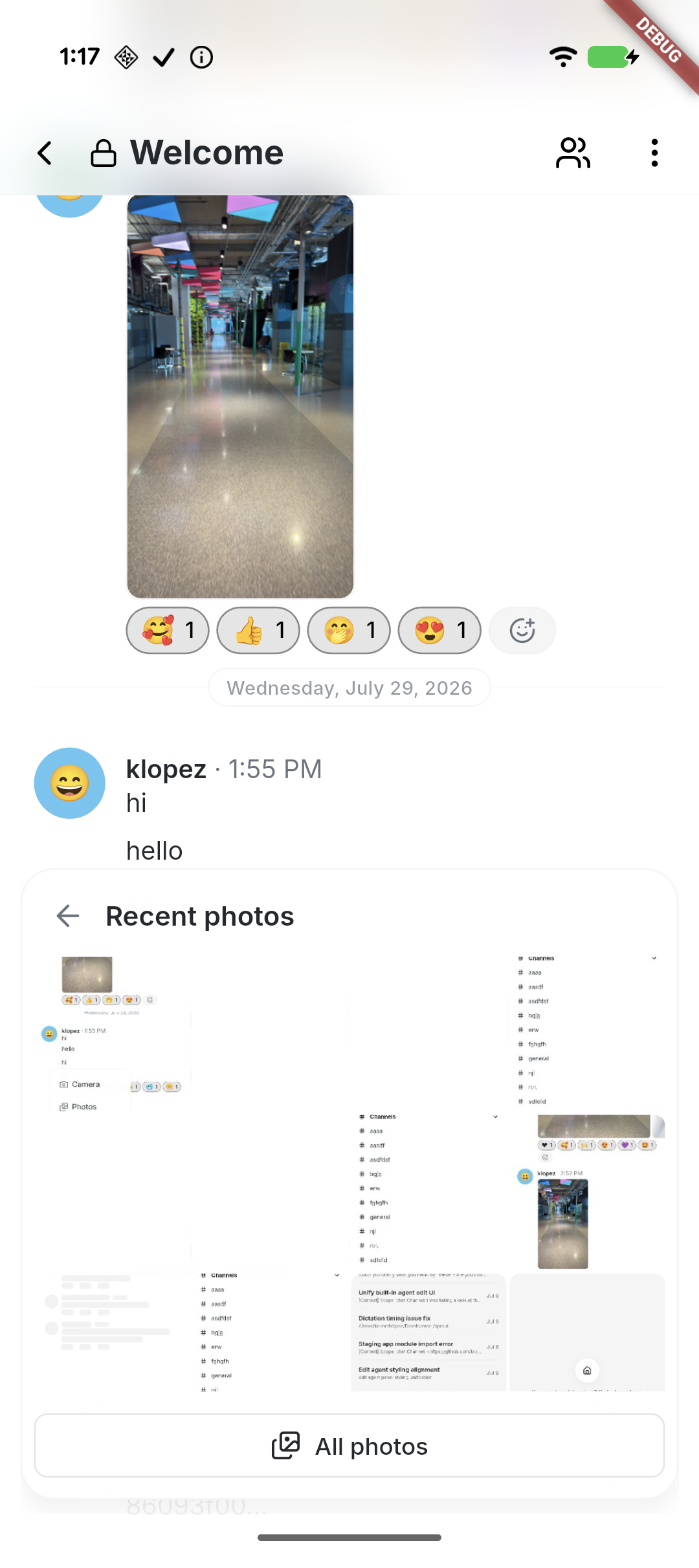
## Summary
Polish mobile Home and Solo: group Search/Inbox beside a separate
profile avatar, move Inbox and Settings to bottom-up pages with Close
controls, and place tabs opposite the plus/compose action. Morph plus to
compose clockwise when entering Solo and reverse counterclockwise when
returning Home, with a directional quarter-turn of the icon inside a
level button and a subtle scale pulse, respecting reduced motion. Align
Search’s Close control with Inbox, simplify its placeholder, and
initialize selected filter contrast correctly. Collapse the plus menu
when leaving Home. Center Solo’s native-glass New chat empty state and
keep it stationary behind the keyboard.

Standardize Tabler icons and neutral backgrounds, retain SF Back/Close
on iOS, use native Liquid Glass headers, tab container, and actions
(solid grey selected tab, slightly darker on iOS) on iOS and black
actions on Android, and smooth the expanded menu corners. Repair native
header safe-area/return layout and compose movement after cancellation.

### Related issue
None found for this UI refinement; follows #8337.

### Testing
- Formatting, analysis, full mobile suite: 3,487 passed, 4 skipped; 3
push-configuration tests passed. File-size checks passed.
- Base UI built and installed on Pixel and iPhone in place. Pixel
navigation/New chat cancellation checked. Subsequent glass and rotation
refinements are previewed on iPhone; motion feel awaits human
confirmation.
- Draft pending human confirmation of the final Settings entrance/return
behavior on iPhone.

### Pixel snapshots
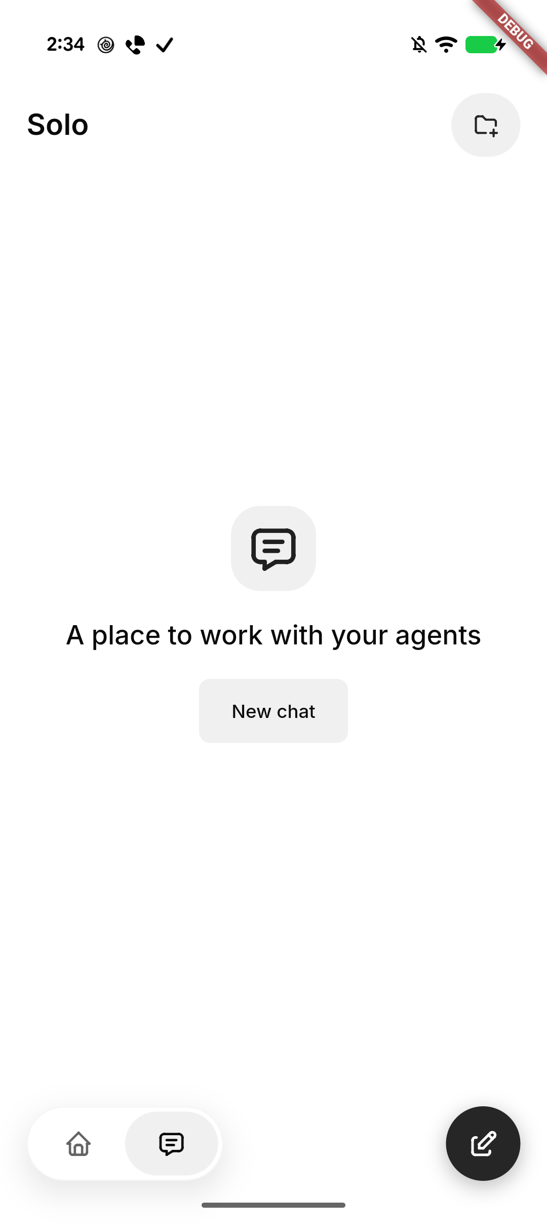
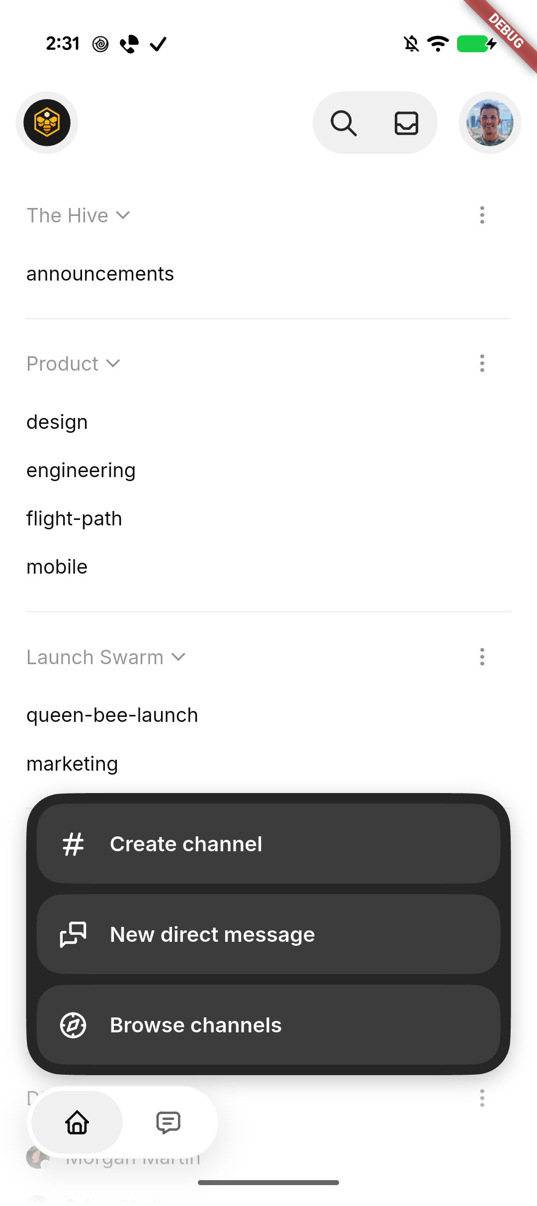
| Solo | Expanded actions |
| --- | --- |
| <img
src="https://raw.githubusercontent.com/block/buzz/16dc0f8af971e63d788fee20974997fab925dec9/docs/screenshots/mobile-home-solo/pixel-solo.png"
width="280" alt="Solo empty state with New chat" /> | <img
src="https://raw.githubusercontent.com/block/buzz/16dc0f8af971e63d788fee20974997fab925dec9/docs/screenshots/mobile-home-solo/pixel-actions.png"
width="280" alt="Expanded channel actions with smooth corners" /> |

---------

Signed-off-by: kenny lopez <klopez4212@gmail.com>
Co-authored-by: Terp <5856f6900e8e0a4e0ea1f4f8d2ee33e4753d2119bc122f94ecafc660b46c0511@buzz.block.builderlab.xyz>
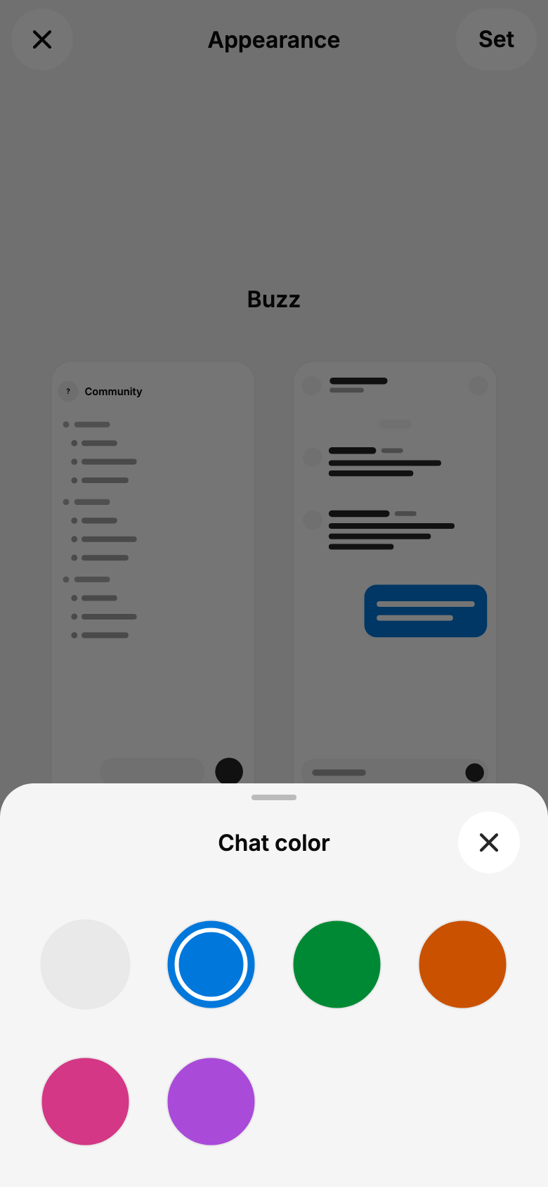
Aligns mobile with desktop's neutral palette and six chat colors.
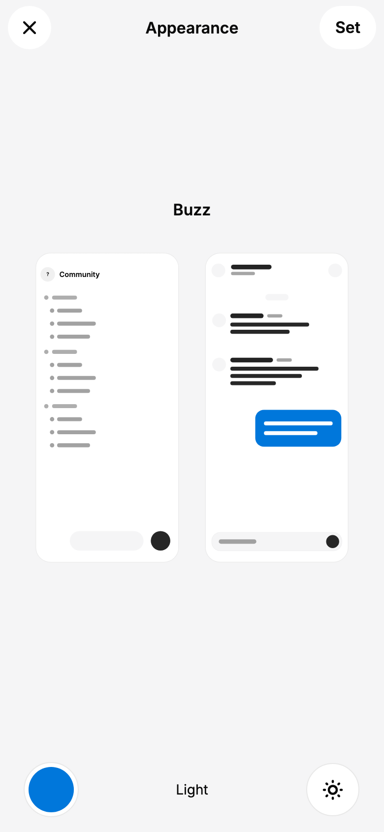
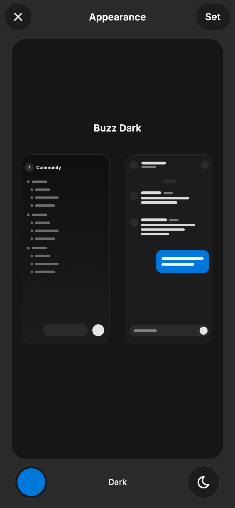
Appearance now offers Light, Dark, and System instead of themes, while
preserving community preferences and the single Home and Chat preview
pair.
Chat colors survive local preference reloads without historical-index
remapping, and the Chat preview shows the draft outgoing bubble color.
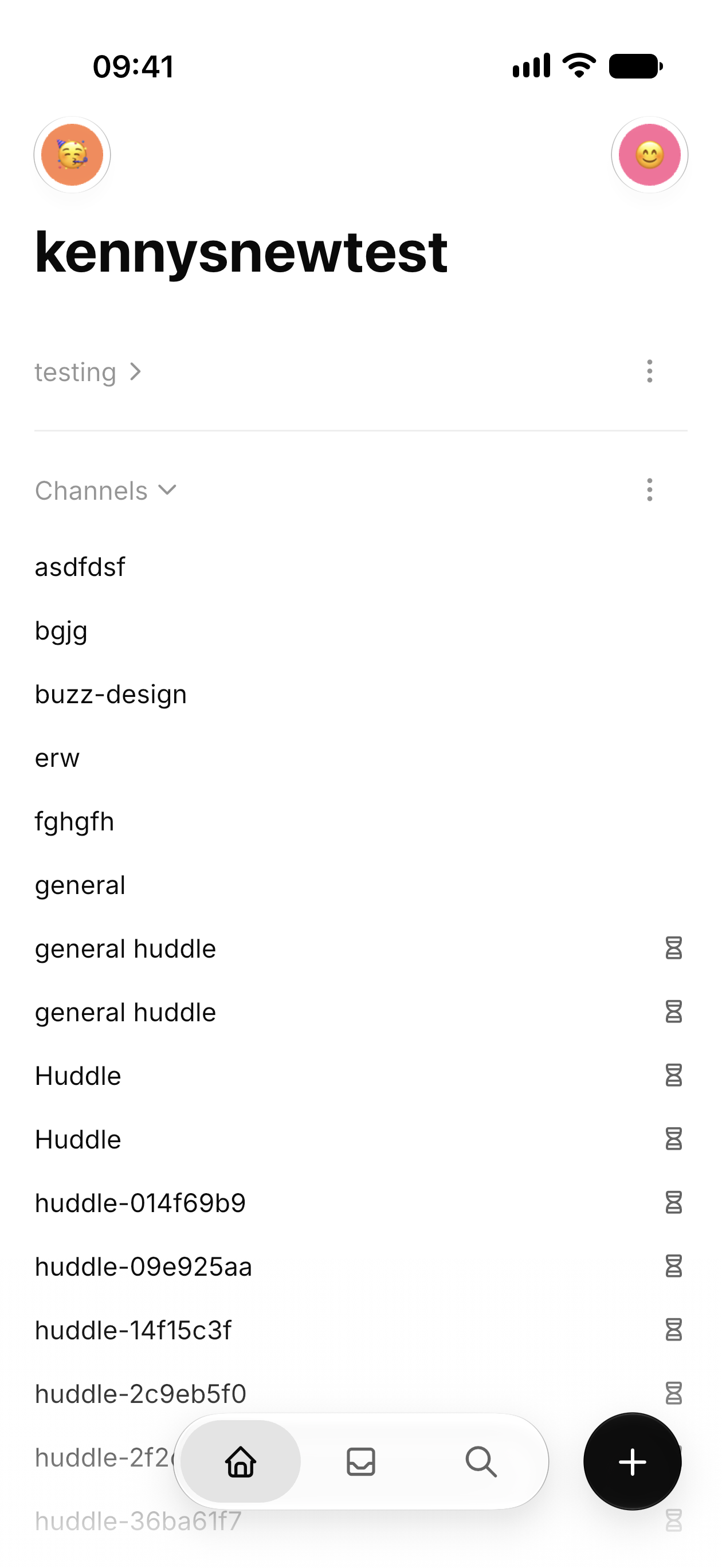
Channel and section icons are removed, section chevrons sit beside
names, and section dividers use 7% opacity. DM avatars remain.
Validation: `just mobile-check`, 35 focused tests, and the full mobile
suite passed (3,351 tests; 4 skipped). Updated light/dark previews were
rendered and visually checked. The earlier release was verified on
iPhone; this follow-up has not been reinstalled. The earlier
repository-wide lint passed, but full `just ci` was stopped for low disk
space. Hosted CI is running for the new head.
**Intentional design parity:** Section labels and chevrons retain
desktop’s `--text-unavailable` colors: light `#959595`, dark `#595959`.
Verified against `block/buzz-app` main at
`0201b54c496120a44e020834663dc534cae9a79f`. These colors do not meet
4.5:1 text contrast on the mobile section surfaces; the product decision
for this PR is to preserve desktop parity and leave them unchanged.
Kenneth explicitly accepts this known contrast tradeoff for this
PR/release and requests that reviewers treat it as a scoped product
exception rather than a blocker. This does not claim WCAG compliance or
change the repository-wide accessibility target. Any future contrast
adjustment should be coordinated across desktop and mobile.
### Snapshots
Channel list: physical iPhone. Appearance and chat colors:
Flutter-rendered previews.
| Channels | Light | Dark | Chat colors |
| --- | --- | --- | --- |
|
|
|
|
|
---------
Signed-off-by: kenny lopez <klopez4212@gmail.com>
## Summary
Use rounded, grouped rows consistently across mobile sheets and menus,
including Members and list pickers. Keep sheet content above the system
gesture area with 4dp of extra bottom padding on Android and iOS.

### Related issue
No duplicate found; related member-picker work: #4051.

### Testing
- Mobile analysis, formatting, file-size checks, and full mobile test
suite pass.
- Android build installed and launched on Pixel 10.
- Before/after Members previews use sample data (attached below).
- Full `just ci` stopped during Rust compilation because local disk
space ran out.

Signed-off-by: kenny lopez <klopez4212@gmail.com>
## Summary
- replace mobile connecting and reconnecting banners with element-shaped
skeletons for channel lists and message timelines
- add a low-contrast two-second shimmer and same-slot reveal, with
reduced-motion support
- align top, section, loaded-row, and skeleton label columns

## Why
Connection banners shifted content and did not match the desktop loading
treatment. The skeletons preserve layout and make reconnects less
disruptive.

## Testing
- `just mobile-check`
- `just mobile-test` — 704 passed, 1 skipped
- Pixel 10 visual verification in loaded and reconnecting states

---------

Signed-off-by: kenny lopez <klopez4212@gmail.com>
## Summary
- reorganize mobile settings around profile, appearance, and connection
cards
- add System/Light/Dark theme pairing, accent selection, and the Buzz
gradient theme
- align avatar badges, status editing, and supporting mobile chrome

## Test plan
- `just mobile-check`
- `just mobile-test`
## Summary

- Refine mobile navigation with icon-only tabs, haptics, a solid active
state, and spring quick actions.
- Bring Create channel and New message closer to desktop with radio
settings, keyboard submission, relay people, and wrapped recipient
chips.
- Keep both sheets draggable below the status area and prevent keyboard
overflow with many recipients.

## Testing

- `just mobile-check`
- `just mobile-test`
- Pixel 10 manual verification