mirror of
https://github.com/block/buzz.git
synced 2026-11-09 10:51:42 +00:00
 b1d60f98e2
## Summary
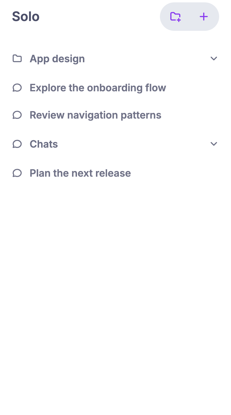
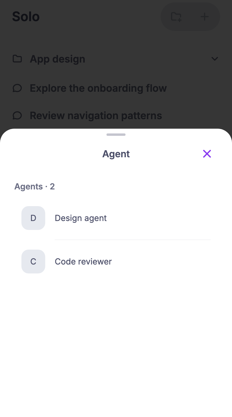
Bring desktop Solo chats and project organization to mobile, with synced
collapsible sections, shared unread highlights and tab badges, agent
selection, shared search, native iOS creation sheets, and inline typing
bubbles that transition into replies.

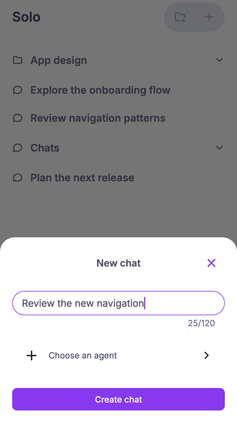
Resolve Solo placement for every chat entry route, retain encrypted
organization snapshots for offline reading, and let users resume or
discard unfinished chat and project setup without deleting existing
messages.

### Related issue
Related: #6565; expandable agent transcripts remain separate work.

### Testing
- Fresh Solo read state seeds each active chat from its captured initial
last-message timestamp before exposing row/section/tab unread state.
Baselines survive intervening channel updates and reset across
identity/community boundaries while surviving read-state readiness
changes. Regressions cover multiple chats, events before read-state
readiness and during/after seeding, and identity changes; removing
either the seed or the display gate fails them.
- Chat completion reconciles a retained Solo-save journal even when
placement is already confirmed. False/throwing cleanup regressions
ensure the outer intent remains until reconciliation and only one
placement is published. Typing terminal-close loops remain bounded; the
retry budget resets after an uninterrupted eight-second health interval
or transport reconnect.
- Typing retry budgets reset after sustained recovery; invalid Solo
updates retain cached rows with a retry warning that survives failed
refreshes. Project names use the editors’ 120-grapheme limit, including
emoji and combining characters. Regression coverage exercises repeated
recovery, invalid live/refresh heads, and character-limit boundaries.
- Rebased onto current main, preserving the newer Search controls,
Huddle timeline filtering, and message-media layout.
- Failed project journal writes reload storage before claiming recovery
and reopen the entered name for retry. Typing subscription rejections
are caught; terminal closures clear stale indicators and retry with a
bounded backoff, canceled on disposal. Regression tests cover both
false/throwing storage writes and initial/late subscription rejection.
- Explicit ordinary destinations skip optional Solo lookup waits.
Generic destinations perform one bounded lookup in the destination
(search no longer duplicates it); an unavailable classification falls
back to ordinary sending per the product owner's explicit choice.
Positively identified Solo destinations use Solo providers.
- Terminal Solo subscription closure preserves cached rows and exposes
live-update Retry. Page coverage verifies warning visibility, usable
rows during recovery, and a subsequent terminal close. Removing the
warning or the immediate ordinary-route guard fails its regression.
- Generic channel entries share an ordinary default when Solo
classification is unavailable, per the requested product behavior. Known
Solo placement takes precedence; callers can explicitly require
unresolved placement to remain blocked. Bounded initial lookup preserves
known Solo deep-link routing.
- Dirty newest snapshots and offline-save warnings survive transport
reconnects; Retry persists that same event even if the relay returns an
older head. Community changes replace the service, and agent-directory
reconnect refresh remains intact.
- Pending-save discard reloads failed removals. Repeated reconnect
testing confirms typing subscriptions are released on provider rebuild
and disposal; removing the existing cleanup fails the regression.
- Ordinary Home/create routes explicitly preserve private-channel
sending during Solo failures; identified Solo sends use the Solo sender
and explicit unresolved routes remain fail-closed. Solo unread replies
beyond the initial 200-event page are loaded through the oldest-unread
boundary.
- Chat/project/agent cleanup reloads failed removals, retains
same-process recovery, and protects replaced records. False/throw
regressions verify retries do not duplicate creation or membership.
Route, unread, and cleanup guard-removal mutations each fail their
regression.
- Ordinary channels, DMs, and forums remain sendable when optional Solo
sync fails; explicit unresolved placement stays blocked. Controlled
cache races retain the newest verified snapshot, keep usable chats
visible, and retry offline persistence without stale writes. Both
protection-removal regressions fail as expected.
- Confirmed journal cleanup checks false/throwing removal and
exact-record identity. Interrupted agent choices are visible
immediately, identify the saved agent, and cover Resume/Later/Discard
with accessible name/key-fallback controls.
- Notification deep links preserve the contiguous history cursor;
same-second messages infer the newest agent consistently. Failed
offline-cache writes surface Retry, with false/throwing storage failures
and offline restart covered.
- Composite history cursors cover 350 same-second events plus older
history; removing the ID cursor makes the regression fail. Agent changes
now journal before granting access, with restart/failure and
Resume/Later/Discard widget coverage. Signed malformed profiles remain
isolated.
- Native iOS avatar tests passed on the simulator: visible-row loading,
three-request concurrency, streamed byte limits, response validation,
downsampling/pixel limits, cancellation, and visible avatar updates.
- Solo and Home share observed-event/read-marker logic. Widget coverage
verifies unread rows, collapsed-section indicators, the tab badge before
first Solo visit, message/thread reads, forced unread, and filtering
archived/nonmember/unplaced chats.
- Chat intent is saved before ownership and organization preflight;
tests cover interrupted ownership lookup and a disconnect while the
native creation form is open.
- Mobile analysis, formatting, file-size checks, and full mobile tests
passed at `1d4c41354`.
- Project creation persists its encrypted name/UUID before connectivity
checks or relay reads. Restart tests cover Resume/Later/Discard, scope
isolation, stale-intent rejection, and lost acknowledgements. Removing
the pre-network save makes all four production-flow regressions fail.
- Regression coverage includes notification/Activity routing, inline
replies, unknown-placement send protection, restart recovery/discard,
and encrypted offline cache isolation/refresh.
- Earlier feature build exercised on a physical iPhone with existing
account/community data; review follow-ups have not been reinstalled on
the device. UIKit agent-row accessibility checks passed on an iOS
simulator.
- Earlier cross-platform `just ci` stopped on the existing `buzz-acp`
test `signals_cancel_startup_turn_and_pending_stdin_without_hanging`
(process exit-code assertion); no Rust production changes are included
in this PR.

### Remaining review limitation
Agent discovery is bounded to 10 pages / 1,000 profiles with automatic
retries disabled. Owner-scoped discovery remains open because the
current relay ignores `#auth` filters; supporting that query requires a
relay change.

### Snapshots
Sample data, shared Flutter/Android surface. Native iOS uses platform
sheets and controls.

| Solo: projects and chats | New chat | Choose an agent |
| --- | --- | --- |
| <img
src="https://raw.githubusercontent.com/block/buzz/d9b29aa079a3b9a88e8ed89b70df8d6af06fa41b/pr-8337--01-solo.png"
width="240" alt="Solo with collapsible projects and chats" /> | <img
src="https://raw.githubusercontent.com/block/buzz/d9b29aa079a3b9a88e8ed89b70df8d6af06fa41b/pr-8337--02-new-chat.png"
width="240" alt="New chat form" /> | <img
src="https://raw.githubusercontent.com/block/buzz/d9b29aa079a3b9a88e8ed89b70df8d6af06fa41b/pr-8337--03-agent-picker.png"
width="240" alt="Agent selection list" /> |

---------

Signed-off-by: kenny lopez <klopez4212@gmail.com>
Signed-off-by: Logan Johnson <loganj@squareup.com>
Co-authored-by: Terp <5856f6900e8e0a4e0ea1f4f8d2ee33e4753d2119bc122f94ecafc660b46c0511@buzz.block.builderlab.xyz>
Co-authored-by: Logan Johnson <loganj@squareup.com>
Co-authored-by: Larry <627498bd4bd1f281a16431e3c6cce3b5c25b6692798c78672298aefbf2f8f8b5@buzz.block.builderlab.xyz>
687 lines
31 KiB
Swift
687 lines
31 KiB
Swift
import Flutter
|
|
import UIKit
|
|
|
|
/// Each Flutter route owns a UIKit navigation controller. Its private scroll
|
|
/// view mirrors the Flutter viewport so UIKit performs the large-title layout.
|
|
final class IosNavigationBarFactory: NSObject, FlutterPlatformViewFactory {
|
|
private let messenger: FlutterBinaryMessenger
|
|
private weak var parent: UIViewController?
|
|
|
|
init(messenger: FlutterBinaryMessenger, parent: UIViewController?) {
|
|
self.messenger = messenger
|
|
self.parent = parent
|
|
super.init()
|
|
}
|
|
|
|
func createArgsCodec() -> FlutterMessageCodec & NSObjectProtocol {
|
|
FlutterStandardMessageCodec.sharedInstance()
|
|
}
|
|
|
|
func create(withFrame frame: CGRect, viewIdentifier viewId: Int64, arguments args: Any?) -> FlutterPlatformView {
|
|
IosNavigationBarView(frame: frame, id: viewId, args: args, messenger: messenger, parent: parent)
|
|
}
|
|
}
|
|
|
|
final class NavigationTitleView: UIVisualEffectView, UIGestureRecognizerDelegate {
|
|
var onActivate: (() -> Void)?
|
|
private let titleLabel = UILabel()
|
|
private let subtitleLabel = UILabel()
|
|
private let contentStack = UIStackView()
|
|
private let textStack = UIStackView()
|
|
private let subtitleStack = UIStackView()
|
|
|
|
init(title: String?, subtitle: String, color: UIColor) {
|
|
if #available(iOS 26.0, *) {
|
|
super.init(effect: UIGlassEffect(style: .regular))
|
|
} else {
|
|
super.init(effect: UIBlurEffect(style: .systemMaterial))
|
|
}
|
|
clipsToBounds = true
|
|
layer.cornerCurve = .continuous
|
|
titleLabel.text = title
|
|
titleLabel.textColor = color
|
|
subtitleLabel.text = subtitle
|
|
subtitleLabel.textColor = .secondaryLabel
|
|
for label in [titleLabel, subtitleLabel] {
|
|
label.textAlignment = .center
|
|
label.lineBreakMode = .byTruncatingTail
|
|
label.adjustsFontForContentSizeCategory = false
|
|
label.setContentCompressionResistancePriority(.defaultLow, for: .horizontal)
|
|
}
|
|
subtitleStack.axis = .horizontal
|
|
subtitleStack.alignment = .center
|
|
subtitleStack.spacing = 6
|
|
subtitleStack.addArrangedSubview(subtitleLabel)
|
|
textStack.axis = .vertical
|
|
textStack.alignment = .center
|
|
textStack.addArrangedSubview(titleLabel)
|
|
textStack.addArrangedSubview(subtitleStack)
|
|
contentStack.axis = .horizontal
|
|
contentStack.alignment = .center
|
|
contentStack.spacing = 8
|
|
contentStack.addArrangedSubview(textStack)
|
|
contentStack.translatesAutoresizingMaskIntoConstraints = false
|
|
contentView.addSubview(contentStack)
|
|
NSLayoutConstraint.activate([
|
|
contentStack.leadingAnchor.constraint(equalTo: contentView.leadingAnchor, constant: 12),
|
|
contentStack.trailingAnchor.constraint(equalTo: contentView.trailingAnchor, constant: -12),
|
|
contentStack.centerYAnchor.constraint(equalTo: contentView.centerYAnchor),
|
|
])
|
|
translatesAutoresizingMaskIntoConstraints = false
|
|
updateFonts()
|
|
// Flutter creates platform views with a zero frame. Keep a nonzero
|
|
// intrinsic width and let UINavigationBar compress it between its items.
|
|
setContentCompressionResistancePriority(.defaultLow, for: .horizontal)
|
|
isAccessibilityElement = true
|
|
accessibilityTraits = .button
|
|
let tap = UITapGestureRecognizer(target: self, action: #selector(activate))
|
|
tap.delegate = self
|
|
addGestureRecognizer(tap)
|
|
}
|
|
|
|
func setAvatar(_ image: UIImage?, presence: UIColor?) {
|
|
// Bar-item images carry alignment insets; the title owns its 32pt layout.
|
|
let avatar = UIImageView(image: image?.withAlignmentRectInsets(.zero))
|
|
avatar.accessibilityIdentifier = "dm-navigation-avatar"
|
|
avatar.contentMode = .scaleAspectFit
|
|
let avatarContainer = UIView()
|
|
avatar.translatesAutoresizingMaskIntoConstraints = false
|
|
avatarContainer.addSubview(avatar)
|
|
contentStack.insertArrangedSubview(avatarContainer, at: 0)
|
|
NSLayoutConstraint.activate([
|
|
avatarContainer.widthAnchor.constraint(equalToConstant: 32),
|
|
avatarContainer.heightAnchor.constraint(equalToConstant: 32),
|
|
avatar.leadingAnchor.constraint(equalTo: avatarContainer.leadingAnchor),
|
|
avatar.trailingAnchor.constraint(equalTo: avatarContainer.trailingAnchor),
|
|
avatar.topAnchor.constraint(equalTo: avatarContainer.topAnchor),
|
|
avatar.bottomAnchor.constraint(equalTo: avatarContainer.bottomAnchor),
|
|
])
|
|
textStack.alignment = .leading
|
|
for label in [titleLabel, subtitleLabel] { label.textAlignment = .natural }
|
|
if let presence {
|
|
let badge = UIView()
|
|
badge.backgroundColor = presence
|
|
badge.layer.cornerRadius = 4
|
|
badge.layer.borderWidth = 1.5
|
|
badge.layer.borderColor = UIColor.systemBackground.cgColor
|
|
badge.accessibilityIdentifier = "dm-navigation-presence"
|
|
badge.translatesAutoresizingMaskIntoConstraints = false
|
|
avatarContainer.addSubview(badge)
|
|
NSLayoutConstraint.activate([
|
|
badge.widthAnchor.constraint(equalToConstant: 8),
|
|
badge.heightAnchor.constraint(equalToConstant: 8),
|
|
badge.trailingAnchor.constraint(equalTo: avatarContainer.trailingAnchor),
|
|
badge.bottomAnchor.constraint(equalTo: avatarContainer.bottomAnchor),
|
|
])
|
|
}
|
|
invalidateIntrinsicContentSize()
|
|
}
|
|
|
|
func setSubtitlePresence(_ color: UIColor) {
|
|
let dot = UIView()
|
|
dot.backgroundColor = color
|
|
dot.layer.cornerRadius = 3
|
|
dot.isAccessibilityElement = false
|
|
dot.accessibilityIdentifier = "dm-navigation-status-dot"
|
|
subtitleStack.insertArrangedSubview(dot, at: 0)
|
|
NSLayoutConstraint.activate([
|
|
dot.widthAnchor.constraint(equalToConstant: 6),
|
|
dot.heightAnchor.constraint(equalToConstant: 6),
|
|
])
|
|
invalidateIntrinsicContentSize()
|
|
}
|
|
|
|
func setEphemeralStatus(_ label: String) {
|
|
// The subtitle carries the visible temporary/expiry text. Keep the full
|
|
// retention explanation on the title's single VoiceOver element too.
|
|
accessibilityLabel = [accessibilityLabel, label].compactMap { $0 }.joined(separator: ", ")
|
|
}
|
|
|
|
func gestureRecognizer(_ gestureRecognizer: UIGestureRecognizer, shouldReceive touch: UITouch) -> Bool {
|
|
acceptsTitleTouch(in: touch.view)
|
|
}
|
|
|
|
// UIKit can wrap titleView in a UIControl. Only controls inside our title
|
|
// should consume the title tap.
|
|
func acceptsTitleTouch(in touchedView: UIView?) -> Bool {
|
|
var touched = touchedView
|
|
while let view = touched, view !== self {
|
|
if view is UIControl { return false }
|
|
touched = view.superview
|
|
}
|
|
return true
|
|
}
|
|
|
|
required init?(coder: NSCoder) { return nil }
|
|
|
|
@objc private func activate() { onActivate?() }
|
|
|
|
override func accessibilityActivate() -> Bool {
|
|
guard isUserInteractionEnabled, let onActivate else { return false }
|
|
onActivate()
|
|
return true
|
|
}
|
|
|
|
override var intrinsicContentSize: CGSize {
|
|
let contentSize = contentStack.systemLayoutSizeFitting(UIView.layoutFittingCompressedSize)
|
|
return CGSize(width: contentSize.width + 24, height: max(44, contentSize.height))
|
|
}
|
|
|
|
override func traitCollectionDidChange(_ previousTraitCollection: UITraitCollection?) {
|
|
super.traitCollectionDidChange(previousTraitCollection)
|
|
if previousTraitCollection?.preferredContentSizeCategory != traitCollection.preferredContentSizeCategory {
|
|
updateFonts()
|
|
invalidateIntrinsicContentSize()
|
|
setNeedsLayout()
|
|
}
|
|
}
|
|
|
|
override func sizeThatFits(_ size: CGSize) -> CGSize {
|
|
let desired = intrinsicContentSize
|
|
return CGSize(width: min(size.width, desired.width), height: desired.height)
|
|
}
|
|
|
|
private func updateFonts() {
|
|
// Compact navigation remains a 44pt toolbar. Scale within that budget;
|
|
// the complete title/subtitle remains available as one VoiceOver label.
|
|
titleLabel.font = UIFontMetrics(forTextStyle: .headline).scaledFont(
|
|
for: .systemFont(ofSize: 17, weight: .semibold), maximumPointSize: 20,
|
|
compatibleWith: traitCollection)
|
|
subtitleLabel.font = UIFontMetrics(forTextStyle: .caption1).scaledFont(
|
|
for: .systemFont(ofSize: 12), maximumPointSize: 14,
|
|
compatibleWith: traitCollection)
|
|
}
|
|
|
|
override func layoutSubviews() {
|
|
super.layoutSubviews()
|
|
layer.cornerRadius = bounds.height / 2
|
|
}
|
|
}
|
|
|
|
private final class NavigationClipView: UIView {
|
|
var onLayout: (() -> Void)?
|
|
override func layoutSubviews() {
|
|
super.layoutSubviews()
|
|
onLayout?()
|
|
}
|
|
}
|
|
|
|
private final class NavigationContentController: UIViewController {
|
|
let scrollView = UIScrollView()
|
|
override func loadView() {
|
|
view = scrollView
|
|
scrollView.contentSize = CGSize(width: 1, height: 10000)
|
|
scrollView.isUserInteractionEnabled = false
|
|
scrollView.scrollsToTop = false
|
|
scrollView.backgroundColor = .clear
|
|
if #available(iOS 26.0, *) {
|
|
// Configure the native effect before UIKit lays out the bar; the
|
|
// platform-view configuration selects it or the material fallback.
|
|
scrollView.topEdgeEffect.style = .soft
|
|
scrollView.bottomEdgeEffect.isHidden = true
|
|
}
|
|
}
|
|
}
|
|
|
|
private final class IosNavigationBarView: NSObject, FlutterPlatformView {
|
|
private let container: NavigationClipView
|
|
private let material = UIVisualEffectView(effect: UIBlurEffect(style: .systemUltraThinMaterial))
|
|
private let materialFade = CAGradientLayer()
|
|
// A transparent, noninteractive viewport provides the system status fade
|
|
// independently of the layout-only scroll view that collapses large titles.
|
|
private let edgeScrollView = UIScrollView()
|
|
private let content = NavigationContentController()
|
|
private let navigation: UINavigationController
|
|
private let channel: FlutterMethodChannel
|
|
private var offset: CGFloat = 0
|
|
private var alwaysFrosted = false
|
|
private var usesSystemScrollEdge = false
|
|
private var expandedBarHeight: CGFloat = 0
|
|
private var titleIsCollapsed: Bool?
|
|
private let compactTitle = UILabel()
|
|
private let compactTitleContainer = UIStackView()
|
|
private let compactTitleMask = CALayer()
|
|
private var titleColor = UIColor.label
|
|
private var largeTitleOpacity: CGFloat = -1
|
|
private var measuredWidth: CGFloat = 0
|
|
private var measuredSafeTop: CGFloat = -1
|
|
private var measuredCategory: UIContentSizeCategory?
|
|
private var measuring = false
|
|
private var metrics: [String: Any]?
|
|
private weak var trackedAvatar: UIButton?
|
|
private var reportedAvatarFrame: CGRect?
|
|
|
|
init(frame: CGRect, id: Int64, args: Any?, messenger: FlutterBinaryMessenger, parent: UIViewController?) {
|
|
container = NavigationClipView(frame: frame)
|
|
navigation = UINavigationController(rootViewController: content)
|
|
channel = FlutterMethodChannel(name: "buzz/ios_navigation_bar/\(id)", binaryMessenger: messenger)
|
|
super.init()
|
|
container.clipsToBounds = true
|
|
container.backgroundColor = .clear
|
|
material.isUserInteractionEnabled = false
|
|
material.accessibilityIdentifier = "navigation-scroll-material"
|
|
material.alpha = 0
|
|
// Keep the scroll-edge backdrop light and let it fade into the page
|
|
// instead of drawing a uniformly frosted rectangular toolbar.
|
|
materialFade.colors = [UIColor.black.cgColor, UIColor.black.cgColor, UIColor.clear.cgColor]
|
|
materialFade.locations = [0, 0.55, 1]
|
|
material.layer.mask = materialFade
|
|
container.addSubview(material)
|
|
if #available(iOS 27.0, *) {
|
|
edgeScrollView.accessibilityIdentifier = "navigation-status-edge"
|
|
edgeScrollView.isUserInteractionEnabled = false
|
|
edgeScrollView.scrollsToTop = false
|
|
edgeScrollView.accessibilityElementsHidden = true
|
|
edgeScrollView.backgroundColor = .clear
|
|
edgeScrollView.contentInsetAdjustmentBehavior = .never
|
|
edgeScrollView.contentSize = CGSize(width: 1, height: 10000)
|
|
edgeScrollView.topEdgeEffect.style = .soft
|
|
edgeScrollView.bottomEdgeEffect.isHidden = true
|
|
container.addSubview(edgeScrollView)
|
|
}
|
|
navigation.view.backgroundColor = .clear
|
|
navigation.navigationBar.isTranslucent = true
|
|
parent?.addChild(navigation)
|
|
container.addSubview(navigation.view)
|
|
navigation.didMove(toParent: parent)
|
|
container.onLayout = { [weak self] in self?.layout() }
|
|
channel.setMethodCallHandler { [weak self] call, result in
|
|
switch call.method {
|
|
case "configure": self?.configure(call.arguments as? [String: Any] ?? [:])
|
|
case "prepareForReveal":
|
|
UIView.performWithoutAnimation {
|
|
self?.container.setNeedsLayout()
|
|
self?.container.layoutIfNeeded()
|
|
}
|
|
case "scroll":
|
|
self?.setScrollOffset((call.arguments as? NSNumber)?.doubleValue ?? 0)
|
|
default: result(FlutterMethodNotImplemented); return
|
|
}
|
|
result(nil)
|
|
}
|
|
configure(args as? [String: Any] ?? [:])
|
|
}
|
|
|
|
func view() -> UIView { container }
|
|
|
|
private func layout() {
|
|
// Only the bar is exposed by the platform-view clip. A full viewport is
|
|
// needed for UIKit's scroll-edge and large-title calculations.
|
|
guard !measuring else { return }
|
|
let viewportHeight = container.window?.bounds.height ?? container.bounds.height
|
|
edgeScrollView.frame = CGRect(x: 0, y: 0, width: container.bounds.width, height: viewportHeight)
|
|
navigation.view.frame = edgeScrollView.frame
|
|
navigation.view.layoutIfNeeded()
|
|
measureIfNeeded()
|
|
applyScroll()
|
|
// Glass-backed conversations need only a short status-area fade.
|
|
// Recompute the material bounds after rotation and inset changes.
|
|
let statusHeight = navigation.view.safeAreaInsets.top
|
|
// Before iOS 26 the actions have no glass, and subtitle-less thread
|
|
// titles remain plain UIKit labels even on iOS 26. They need material
|
|
// beneath the entire control area, not just the status indicators.
|
|
let glassBackedControls: Bool
|
|
if #available(iOS 26.0, *) {
|
|
glassBackedControls = content.navigationItem.titleView is NavigationTitleView
|
|
} else {
|
|
glassBackedControls = false
|
|
}
|
|
let statusOnly = alwaysFrosted && !navigation.navigationBar.prefersLargeTitles && glassBackedControls
|
|
let height = statusOnly
|
|
? min(container.bounds.height, statusHeight > 0 ? statusHeight + 6 : 0)
|
|
: container.bounds.height
|
|
CATransaction.begin()
|
|
CATransaction.setDisableActions(true)
|
|
material.frame = CGRect(x: 0, y: 0, width: container.bounds.width, height: height)
|
|
materialFade.frame = material.bounds
|
|
materialFade.locations = statusOnly
|
|
? [0, NSNumber(value: Double(max(0, height - 12) / max(1, height))), 1]
|
|
: (navigation.navigationBar.prefersLargeTitles ? [0, 0.55, 1] : [0, 0.85, 1])
|
|
CATransaction.commit()
|
|
reportAvatarBounds()
|
|
}
|
|
|
|
private func reportAvatarBounds() {
|
|
guard let avatar = trackedAvatar, avatar.window != nil, avatar.bounds.width > 0 else { return }
|
|
avatar.layoutIfNeeded()
|
|
guard let image = avatar.imageView, image.bounds.width > 0 else { return }
|
|
let frame = image.convert(image.bounds, to: container)
|
|
guard frame != reportedAvatarFrame else { return }
|
|
reportedAvatarFrame = frame
|
|
DispatchQueue.main.async { [weak self] in
|
|
self?.channel.invokeMethod("avatarBounds", arguments: [
|
|
"id": "leading", "x": frame.minX, "y": frame.minY,
|
|
"width": frame.width, "height": frame.height
|
|
])
|
|
}
|
|
}
|
|
|
|
private func configure(_ args: [String: Any]) {
|
|
navigation.overrideUserInterfaceStyle = args["dark"] as? Bool == true ? .dark : .light
|
|
material.overrideUserInterfaceStyle = navigation.overrideUserInterfaceStyle
|
|
edgeScrollView.overrideUserInterfaceStyle = navigation.overrideUserInterfaceStyle
|
|
// Let the ultra-thin system material provide its own adaptive tint.
|
|
material.contentView.backgroundColor = .clear
|
|
let bar = navigation.navigationBar
|
|
let color = Self.color(args["foreground"])
|
|
bar.tintColor = color
|
|
titleColor = color
|
|
largeTitleOpacity = -1
|
|
let largeTitle = args["largeTitle"] as? Bool == true
|
|
alwaysFrosted = args["alwaysFrosted"] as? Bool == true
|
|
if #available(iOS 26.0, *) {
|
|
if #available(iOS 27.0, *) { usesSystemScrollEdge = true }
|
|
content.scrollView.topEdgeEffect.style = .soft
|
|
content.scrollView.topEdgeEffect.isHidden = !usesSystemScrollEdge || !alwaysFrosted || largeTitle
|
|
edgeScrollView.isHidden = alwaysFrosted && !largeTitle
|
|
}
|
|
// iOS 26 does not composite this native edge over sibling Flutter content
|
|
// in our embedding, so retain the ultra-thin material fallback there.
|
|
// Conversations use the navigation controller's native edge. Other pages
|
|
// use a stationary native edge so UIKit's large-title inset adjustments
|
|
// cannot hide the status-area fade when the title expands or collapses.
|
|
material.isHidden = usesSystemScrollEdge
|
|
// Let the native fade extend past the bar without enlarging its hit area.
|
|
// The mirrored content is transparent and the bottom edge is hidden.
|
|
container.clipsToBounds = !usesSystemScrollEdge
|
|
let appearance = UINavigationBarAppearance()
|
|
if usesSystemScrollEdge {
|
|
appearance.configureWithDefaultBackground()
|
|
} else {
|
|
appearance.configureWithTransparentBackground()
|
|
}
|
|
appearance.titleTextAttributes = [.foregroundColor: color]
|
|
appearance.largeTitleTextAttributes = [.foregroundColor: color]
|
|
bar.standardAppearance = appearance
|
|
bar.scrollEdgeAppearance = appearance
|
|
bar.compactAppearance = appearance
|
|
if bar.prefersLargeTitles != largeTitle {
|
|
measuredWidth = 0
|
|
titleIsCollapsed = nil
|
|
}
|
|
bar.prefersLargeTitles = largeTitle
|
|
// Conversations request a stable backdrop from the first frame, including
|
|
// loading/empty timelines. Other pages retain their scroll-edge treatment.
|
|
material.alpha = alwaysFrosted ? 1 : min(1, offset / 12)
|
|
let item = content.navigationItem
|
|
item.title = args["title"] as? String
|
|
if let subtitle = args["subtitle"] as? String {
|
|
let button = NavigationTitleView(title: item.title, subtitle: subtitle, color: color)
|
|
button.accessibilityIdentifier = "channel-navigation-title"
|
|
let enabled = args["titleEnabled"] as? Bool == true
|
|
button.accessibilityLabel = enabled
|
|
? "Open settings for \(item.title ?? ""), \(subtitle)"
|
|
: "\(item.title ?? ""), \(subtitle)"
|
|
button.accessibilityTraits = enabled ? .button : .header
|
|
button.isUserInteractionEnabled = enabled
|
|
if enabled {
|
|
button.onActivate = { [weak self] in self?.channel.invokeMethod("action", arguments: "title") }
|
|
}
|
|
if let avatar = args["titleAvatar"] as? [String: Any] {
|
|
button.setAvatar(makeItem(avatar).image,
|
|
presence: args["titlePresenceColor"] is NSNumber ? Self.color(args["titlePresenceColor"]) : nil)
|
|
}
|
|
if args["titleAvatar"] as? [String: Any] == nil, args["titlePresenceColor"] is NSNumber {
|
|
button.setSubtitlePresence(Self.color(args["titlePresenceColor"]))
|
|
}
|
|
if let label = args["ephemeralLabel"] as? String {
|
|
button.setEphemeralStatus(label)
|
|
}
|
|
button.frame.size = button.intrinsicContentSize
|
|
item.titleView = button
|
|
} else if largeTitle {
|
|
compactTitle.text = item.title
|
|
compactTitle.font = .preferredFont(forTextStyle: .headline)
|
|
compactTitle.adjustsFontForContentSizeCategory = true
|
|
compactTitle.textColor = color
|
|
compactTitle.accessibilityTraits = .header
|
|
compactTitle.sizeToFit()
|
|
compactTitleMask.backgroundColor = UIColor.black.cgColor
|
|
compactTitle.layer.mask = compactTitleMask
|
|
if compactTitle.superview == nil { compactTitleContainer.addArrangedSubview(compactTitle) }
|
|
compactTitleContainer.frame.size = compactTitle.intrinsicContentSize
|
|
item.titleView = compactTitleContainer
|
|
} else {
|
|
item.titleView = nil
|
|
}
|
|
item.largeTitleDisplayMode = bar.prefersLargeTitles ? .always : .never
|
|
trackedAvatar = nil
|
|
reportedAvatarFrame = nil
|
|
if let leading = args["leading"] as? [String: Any] {
|
|
item.leftBarButtonItems = [makeItem(leading)]
|
|
} else if args["back"] as? Bool == true {
|
|
item.leftBarButtonItems = [makeItem(["id": "back", "label": "Back", "symbol": "chevron.backward", "enabled": true])]
|
|
} else {
|
|
item.leftBarButtonItems = nil
|
|
}
|
|
item.rightBarButtonItems = (args["actions"] as? [[String: Any]] ?? []).reversed().map(makeItem)
|
|
if let metrics {
|
|
channel.invokeMethod("metrics", arguments: metrics)
|
|
}
|
|
container.setNeedsLayout()
|
|
}
|
|
|
|
private func measureIfNeeded() {
|
|
guard container.window != nil, container.bounds.width > 0 else { return }
|
|
let category = navigation.traitCollection.preferredContentSizeCategory
|
|
let safeTop = navigation.view.safeAreaInsets.top
|
|
guard measuredWidth != container.bounds.width || measuredSafeTop != safeTop || measuredCategory != category else { return }
|
|
measuring = true
|
|
titleIsCollapsed = nil
|
|
defer { measuring = false }
|
|
let bar = navigation.navigationBar
|
|
let large = bar.prefersLargeTitles
|
|
// Measure UIKit's actual compact and expanded layouts before presenting
|
|
// this frame. Flutter reserves these measured dimensions, never the other
|
|
// way around. Recalculate after rotation or a Dynamic Type change.
|
|
bar.prefersLargeTitles = false
|
|
content.navigationItem.largeTitleDisplayMode = .never
|
|
navigation.view.setNeedsLayout()
|
|
navigation.view.layoutIfNeeded()
|
|
let compact = bar.frame.height
|
|
bar.prefersLargeTitles = large
|
|
content.navigationItem.largeTitleDisplayMode = large ? .always : .never
|
|
content.scrollView.setContentOffset(CGPoint(x: 0, y: -1000), animated: false)
|
|
navigation.view.setNeedsLayout()
|
|
navigation.view.layoutIfNeeded()
|
|
expandedBarHeight = bar.frame.height
|
|
measuredWidth = container.bounds.width
|
|
measuredSafeTop = safeTop
|
|
measuredCategory = category
|
|
var metrics: [String: Any] = ["compactHeight": compact]
|
|
if large { metrics["expandedHeight"] = expandedBarHeight }
|
|
self.metrics = metrics
|
|
DispatchQueue.main.async { [weak self] in
|
|
self?.channel.invokeMethod("metrics", arguments: metrics)
|
|
}
|
|
}
|
|
|
|
private func setScrollOffset(_ value: CGFloat) {
|
|
offset = max(0, value)
|
|
material.alpha = alwaysFrosted ? 1 : min(1, offset / 12)
|
|
applyScroll()
|
|
reportAvatarBounds()
|
|
}
|
|
|
|
private func applyScroll() {
|
|
let scroll = content.scrollView
|
|
guard container.window != nil else { return }
|
|
// UIKit reduces adjustedContentInset as the title collapses. Using that
|
|
// moving inset as zero leaves the title collapsed when Flutter returns to
|
|
// the top. Keep zero anchored to the expanded bar, including the current
|
|
// safe area, throughout the scroll cycle.
|
|
expandedBarHeight = max(expandedBarHeight, navigation.navigationBar.frame.height)
|
|
let topInset = navigation.view.safeAreaInsets.top + expandedBarHeight
|
|
// Compact conversations always have their content behind the overlay.
|
|
// Zero represents the viewport's top, not an empty native inset; this
|
|
// makes the system edge ready before Flutter's first scroll notification.
|
|
let contentBehindBar = usesSystemScrollEdge && alwaysFrosted && !navigation.navigationBar.prefersLargeTitles
|
|
let desired = CGPoint(x: 0, y: contentBehindBar ? offset : -topInset + offset)
|
|
let compactHeight = (metrics?["compactHeight"] as? CGFloat) ?? navigation.navigationBar.frame.height
|
|
let collapseRange = max(1, expandedBarHeight - compactHeight)
|
|
let collapsed = offset >= collapseRange
|
|
let wasCollapsed = titleIsCollapsed
|
|
titleIsCollapsed = collapsed
|
|
UIView.performWithoutAnimation {
|
|
if navigation.navigationBar.prefersLargeTitles {
|
|
// Fade the actual text throughout the last part of the gesture. A
|
|
// snapshot transition of the platform view gets clipped by Flutter's
|
|
// shrinking header and can still look like a one-frame title switch.
|
|
let progress = min(1, max(0, (offset - collapseRange * 0.35) / (collapseRange * 0.65)))
|
|
let opacity = 1 - progress
|
|
if abs(largeTitleOpacity - opacity) > 0.001 {
|
|
largeTitleOpacity = opacity
|
|
for appearance in [navigation.navigationBar.standardAppearance,
|
|
navigation.navigationBar.scrollEdgeAppearance,
|
|
navigation.navigationBar.compactAppearance].compactMap({ $0 }) {
|
|
appearance.largeTitleTextAttributes[.foregroundColor] = titleColor.withAlphaComponent(opacity)
|
|
}
|
|
navigation.navigationBar.largeTitleTextAttributes = [.foregroundColor: titleColor.withAlphaComponent(opacity)]
|
|
}
|
|
}
|
|
scroll.setContentOffset(desired, animated: false)
|
|
navigation.view.layoutIfNeeded()
|
|
// Expanding changes UIKit's inset and can compensate the offset.
|
|
if abs(scroll.contentOffset.y - desired.y) > 0.1 {
|
|
scroll.setContentOffset(desired, animated: false)
|
|
navigation.view.layoutIfNeeded()
|
|
}
|
|
}
|
|
if navigation.navigationBar.prefersLargeTitles {
|
|
// UIKit owns title-view alpha on some iOS versions. A mask keeps the
|
|
// text fade independent from its layout-driven visibility changes.
|
|
CATransaction.begin()
|
|
CATransaction.setDisableActions(true)
|
|
compactTitleMask.frame = compactTitle.bounds
|
|
compactTitleMask.opacity = collapsed ? 1 : 0
|
|
CATransaction.commit()
|
|
if wasCollapsed != collapsed {
|
|
compactTitleMask.removeAllAnimations()
|
|
if collapsed && wasCollapsed != nil && !UIAccessibility.isReduceMotionEnabled {
|
|
let fade = CABasicAnimation(keyPath: "opacity")
|
|
fade.fromValue = 0
|
|
fade.toValue = 1
|
|
fade.duration = 0.18
|
|
fade.timingFunction = CAMediaTimingFunction(name: .easeOut)
|
|
compactTitleMask.add(fade, forKey: "titleFade")
|
|
}
|
|
}
|
|
}
|
|
}
|
|
|
|
private func makeAction(_ data: [String: Any]) -> UIAction {
|
|
let id = data["id"] as? String ?? ""
|
|
let enabled = data["enabled"] as? Bool == true
|
|
let symbol = (data["symbol"] as? String).flatMap { UIImage(systemName: $0) }
|
|
return UIAction(title: data["label"] as? String ?? "", image: symbol,
|
|
attributes: enabled ? [] : [.disabled],
|
|
state: data["selected"] as? Bool == true ? .on : .off) { [weak self] _ in
|
|
self?.channel.invokeMethod("action", arguments: id)
|
|
}
|
|
}
|
|
|
|
private func makeItem(_ data: [String: Any]) -> UIBarButtonItem {
|
|
let action = makeAction(data)
|
|
let children = data["children"] as? [[String: Any]] ?? []
|
|
let item = children.isEmpty
|
|
? UIBarButtonItem(primaryAction: action)
|
|
: UIBarButtonItem(title: action.title, image: action.image, primaryAction: nil,
|
|
menu: UIMenu(children: children.map(makeAction)))
|
|
if #available(iOS 26.0, *) {
|
|
item.hidesSharedBackground = data["plain"] as? Bool == true
|
|
}
|
|
item.accessibilityLabel = data["label"] as? String
|
|
item.isEnabled = data["enabled"] as? Bool == true
|
|
if data["avatarInitial"] is String { item.title = nil }
|
|
if let encoded = data["iconData"] as? String,
|
|
let bytes = Data(base64Encoded: encoded), let image = UIImage(data: bytes) {
|
|
item.image = UIGraphicsImageRenderer(size: CGSize(width: 24, height: 24)).image { _ in
|
|
image.draw(in: CGRect(x: 0, y: 0, width: 24, height: 24))
|
|
}.withRenderingMode(.alwaysTemplate)
|
|
item.title = nil
|
|
}
|
|
|
|
if let encoded = data["imageData"] as? String,
|
|
let bytes = Data(base64Encoded: encoded), let image = UIImage(data: bytes) {
|
|
// Character artwork floats on the glass; photos fill its circular face.
|
|
// Preserve the 24-point alignment footprint so UIKit does not widen it.
|
|
let diameter: CGFloat = data["avatarIsAgent"] as? Bool == true && data["avatarArtwork"] as? Bool != true ? 44 : 36
|
|
let inset = (diameter - 24) / 2
|
|
let size = CGSize(width: diameter, height: diameter)
|
|
item.image = UIGraphicsImageRenderer(size: size).image { _ in
|
|
image.draw(in: CGRect(origin: .zero, size: size))
|
|
}.withRenderingMode(.alwaysOriginal).withAlignmentRectInsets(
|
|
UIEdgeInsets(top: inset, left: inset, bottom: inset, right: inset)
|
|
)
|
|
}
|
|
if item.image == nil, let initial = data["avatarInitial"] as? String {
|
|
// An avatar-shaped placeholder is available synchronously, before
|
|
// Flutter finishes decoding the photo. Never fall back to a glyph icon.
|
|
let size = CGSize(width: 36, height: 36)
|
|
item.title = nil
|
|
item.image = UIGraphicsImageRenderer(size: size).image { _ in
|
|
Self.color(data["avatarBackground"]).setFill()
|
|
UIBezierPath(roundedRect: CGRect(origin: .zero, size: size),
|
|
cornerRadius: size.width * 0.5).fill()
|
|
let text = initial as NSString
|
|
let attributes: [NSAttributedString.Key: Any] = [
|
|
.font: UIFont.systemFont(ofSize: 16, weight: .medium),
|
|
.foregroundColor: Self.color(data["avatarForeground"])
|
|
]
|
|
let textSize = text.size(withAttributes: attributes)
|
|
text.draw(at: CGPoint(x: (size.width - textSize.width) / 2,
|
|
y: (size.height - textSize.height) / 2), withAttributes: attributes)
|
|
}.withRenderingMode(.alwaysOriginal).withAlignmentRectInsets(
|
|
UIEdgeInsets(top: 6, left: 6, bottom: 6, right: 6)
|
|
)
|
|
}
|
|
if data["activityColor"] is NSNumber, let symbol = item.image {
|
|
let size = CGSize(width: 28, height: 26)
|
|
item.image = UIGraphicsImageRenderer(size: size).image { _ in
|
|
symbol.withTintColor(navigation.navigationBar.tintColor).draw(in: CGRect(x: 0, y: 4, width: 22, height: 22))
|
|
UIColor.systemBackground.setFill()
|
|
UIBezierPath(ovalIn: CGRect(x: 18, y: 0, width: 10, height: 10)).fill()
|
|
Self.color(data["activityColor"]).setFill()
|
|
UIBezierPath(ovalIn: CGRect(x: 19.5, y: 1.5, width: 7, height: 7)).fill()
|
|
}.withRenderingMode(.alwaysOriginal)
|
|
item.accessibilityValue = data["activityLabel"] as? String
|
|
}
|
|
if data["tracksAvatarBounds"] as? Bool == true, data["id"] as? String == "leading",
|
|
data["avatarInitial"] is String {
|
|
// An explicit native button gives Flutter a public, measured destination
|
|
// without depending on UINavigationBar's private view hierarchy.
|
|
let button = UIButton(type: .custom)
|
|
// UIKit adds the glass button's own padding around this custom view.
|
|
// Match the 36-point image on both axes so that glass stays circular.
|
|
button.frame = CGRect(x: 0, y: 0, width: 36, height: 36)
|
|
button.widthAnchor.constraint(equalToConstant: 36).isActive = true
|
|
button.heightAnchor.constraint(equalToConstant: 36).isActive = true
|
|
button.setImage(item.image?.withAlignmentRectInsets(.zero), for: .normal)
|
|
button.addAction(action, for: .touchUpInside)
|
|
button.isEnabled = item.isEnabled
|
|
button.accessibilityLabel = item.accessibilityLabel
|
|
button.accessibilityIdentifier = "community-navigation-avatar"
|
|
let hidden = data["avatarHidden"] as? Bool == true
|
|
button.alpha = hidden ? 0 : 1
|
|
button.accessibilityElementsHidden = hidden
|
|
trackedAvatar = button
|
|
return UIBarButtonItem(customView: button)
|
|
}
|
|
return item
|
|
}
|
|
|
|
private static func color(_ value: Any?) -> UIColor {
|
|
guard let argb = (value as? NSNumber)?.uint32Value else { return .label }
|
|
return UIColor(red: CGFloat((argb >> 16) & 255) / 255,
|
|
green: CGFloat((argb >> 8) & 255) / 255,
|
|
blue: CGFloat(argb & 255) / 255, alpha: CGFloat(argb >> 24) / 255)
|
|
}
|
|
|
|
deinit {
|
|
channel.setMethodCallHandler(nil)
|
|
navigation.willMove(toParent: nil)
|
|
navigation.view.removeFromSuperview()
|
|
navigation.removeFromParent()
|
|
}
|
|
}
|