mirror of
https://github.com/block/buzz.git
synced 2026-10-28 21:11:48 +00:00
 a5dfdd6d55
Aligns mobile with desktop's neutral palette and six chat colors. Appearance now offers Light, Dark, and System instead of themes, while preserving community preferences and the single Home and Chat preview pair. Chat colors survive local preference reloads without historical-index remapping, and the Chat preview shows the draft outgoing bubble color. Channel and section icons are removed, section chevrons sit beside names, and section dividers use 7% opacity. DM avatars remain. Validation: `just mobile-check`, 35 focused tests, and the full mobile suite passed (3,351 tests; 4 skipped). Updated light/dark previews were rendered and visually checked. The earlier release was verified on iPhone; this follow-up has not been reinstalled. The earlier repository-wide lint passed, but full `just ci` was stopped for low disk space. Hosted CI is running for the new head. **Intentional design parity:** Section labels and chevrons retain desktop’s `--text-unavailable` colors: light `#959595`, dark `#595959`. Verified against `block/buzz-app` main at `0201b54c496120a44e020834663dc534cae9a79f`. These colors do not meet 4.5:1 text contrast on the mobile section surfaces; the product decision for this PR is to preserve desktop parity and leave them unchanged. Kenneth explicitly accepts this known contrast tradeoff for this PR/release and requests that reviewers treat it as a scoped product exception rather than a blocker. This does not claim WCAG compliance or change the repository-wide accessibility target. Any future contrast adjustment should be coordinated across desktop and mobile. ### Snapshots Channel list: physical iPhone. Appearance and chat colors: Flutter-rendered previews. | Channels | Light | Dark | Chat colors | | --- | --- | --- | --- | | 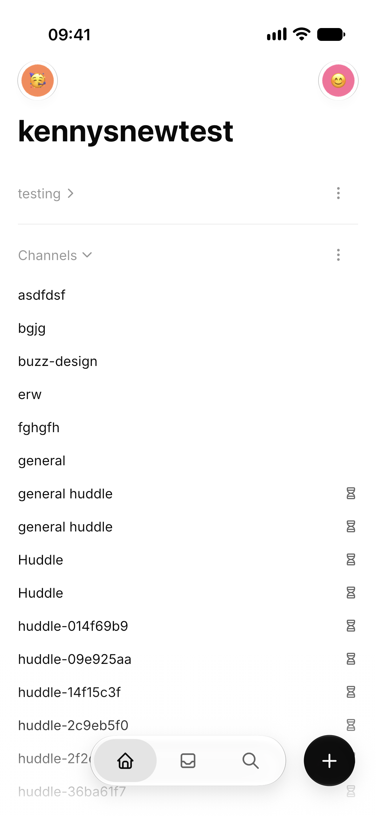 | 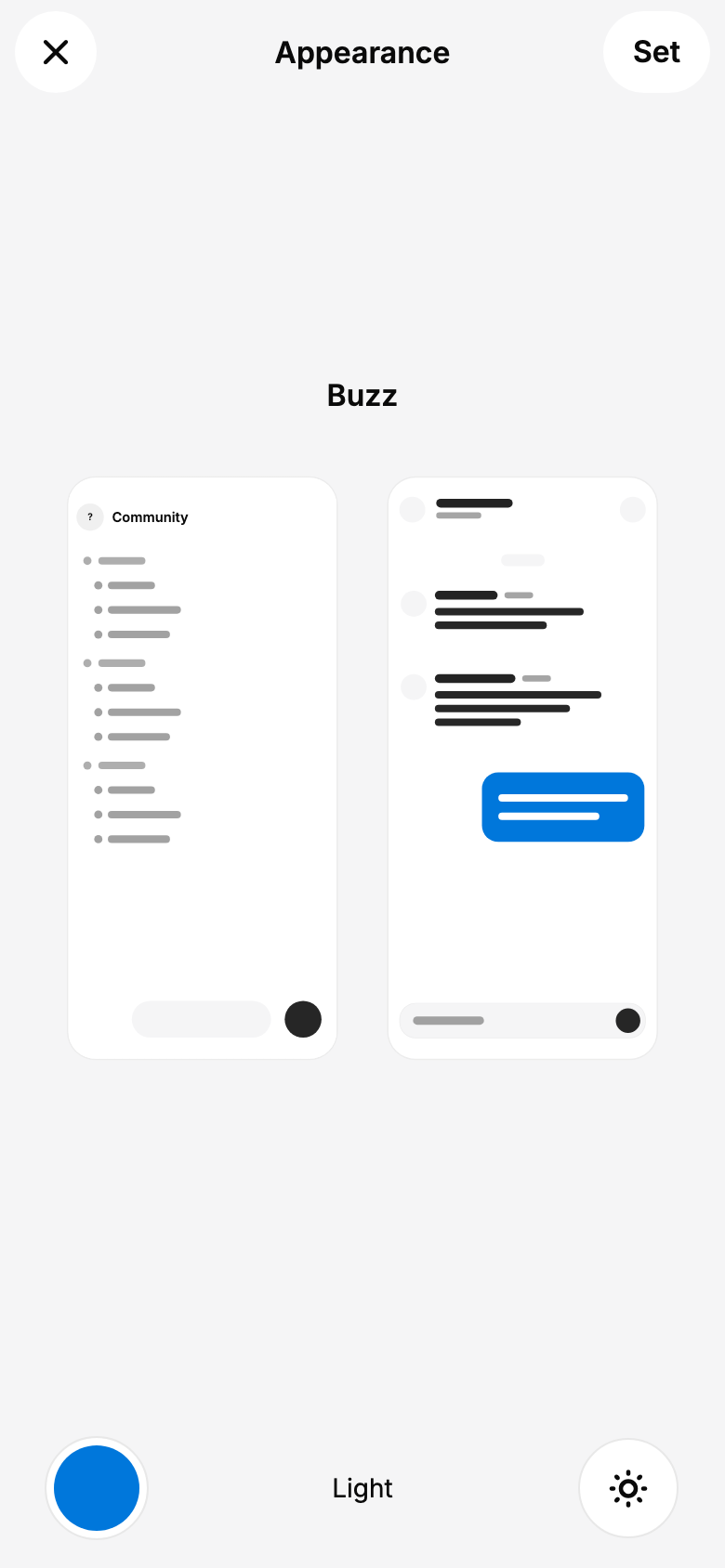 | 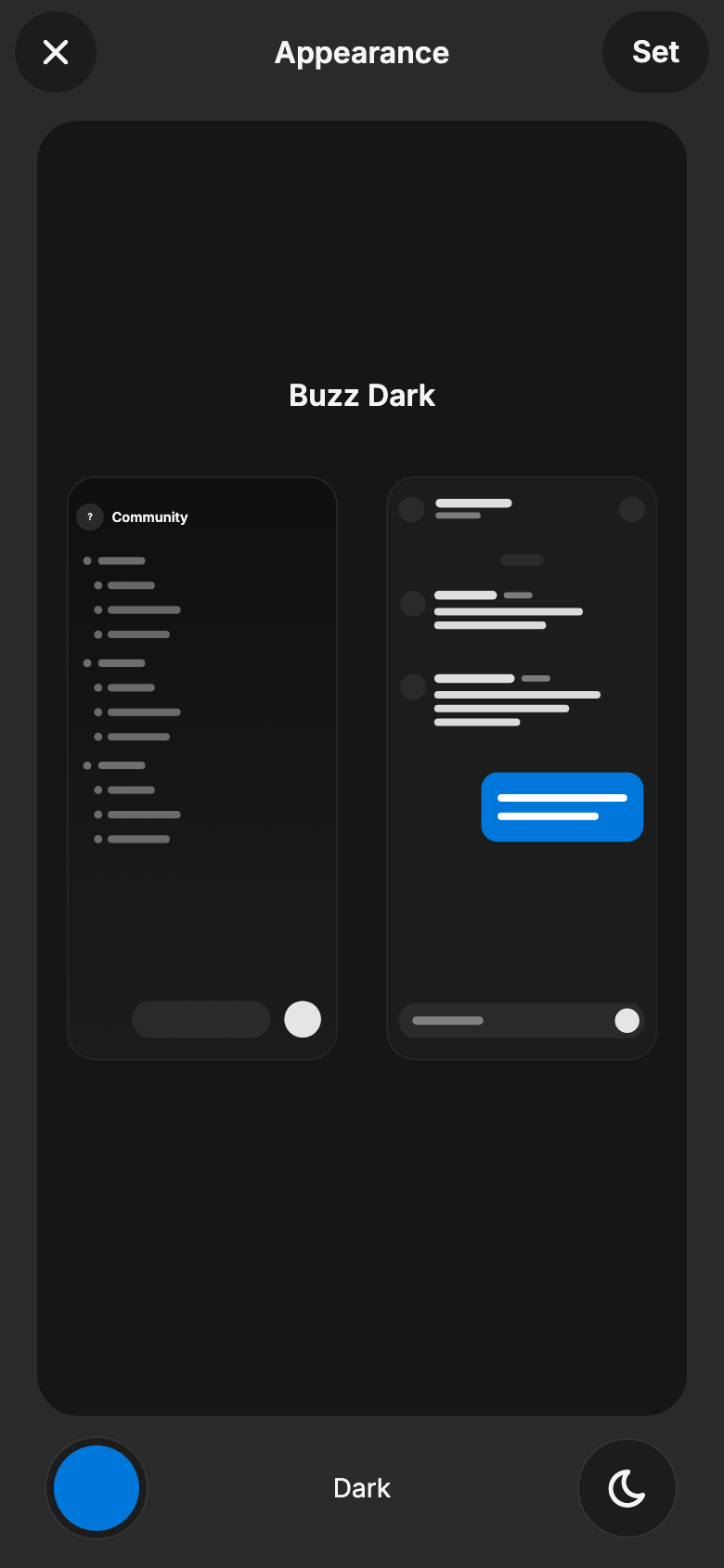 | 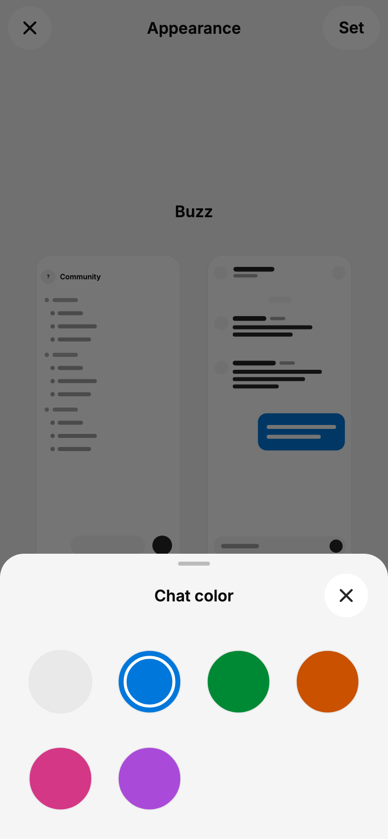 | --------- Signed-off-by: kenny lopez <klopez4212@gmail.com>




350 lines
12 KiB
Dart
350 lines
12 KiB
Dart
import 'package:flutter/material.dart';
|
|
import 'package:flutter/services.dart';
|
|
|
|
import 'app_colors.dart';
|
|
import 'color_scheme.dart';
|
|
import 'grid.dart';
|
|
import 'text_theme.dart';
|
|
|
|
/// Border radius constants matching desktop shadcn "New York" style.
|
|
/// Desktop uses --radius: 0.625rem (10px) as base:
|
|
/// lg = 10px, md = 8px, sm = 6px
|
|
class Radii {
|
|
/// Small radius for compact UI elements.
|
|
static const double xs = 4.0;
|
|
static const double lg = 10.0;
|
|
static const double md = 8.0;
|
|
static const double sm = 6.0;
|
|
|
|
/// Shared strong radius for grouped rows, fields, and utility containers.
|
|
static const double container = 22.0;
|
|
static const double card = container; // Backwards-compatible card alias.
|
|
static const double popover = container;
|
|
static const double dialog = 24.0; // desktop uses rounded-3xl for dialogs
|
|
|
|
/// Fully rounds pills, circles, and other capsule shapes.
|
|
static const double full = 999.0;
|
|
}
|
|
|
|
class AppTheme {
|
|
static ThemeData light({
|
|
ColorScheme? colorScheme,
|
|
Gradient? topSectionGradient,
|
|
}) {
|
|
final scheme = colorScheme ?? lightColorScheme;
|
|
final appColors = AppColors(
|
|
success: const Color(0xFF218358), // Desktop green-11
|
|
warning: const Color(0xFFAB6400), // Desktop amber-11
|
|
accent: scheme.tertiary,
|
|
huddleDrawerSurface: const Color(0xFF000000),
|
|
huddleControlSurface: const Color(0xFF333333),
|
|
onHuddleDrawer: const Color(0xFFFAFAFA),
|
|
topSectionGradient: topSectionGradient,
|
|
);
|
|
|
|
return _buildTheme(
|
|
scheme: scheme,
|
|
appColors: appColors,
|
|
brightness: Brightness.light,
|
|
statusBarIconBrightness: Brightness.dark,
|
|
statusBarBrightness: Brightness.light,
|
|
);
|
|
}
|
|
|
|
static ThemeData dark({
|
|
ColorScheme? colorScheme,
|
|
Gradient? topSectionGradient,
|
|
}) {
|
|
final scheme = colorScheme ?? darkColorScheme;
|
|
final appColors = AppColors(
|
|
success: const Color(0xFF3DD68C), // Desktop green-11
|
|
warning: const Color(0xFFFFCA16), // Desktop amber-11
|
|
accent: scheme.tertiary,
|
|
huddleDrawerSurface: scheme.primaryContainer,
|
|
huddleControlSurface: Color.alphaBlend(
|
|
scheme.onPrimaryContainer.withValues(alpha: 0.18),
|
|
scheme.primaryContainer,
|
|
),
|
|
onHuddleDrawer: scheme.onPrimaryContainer,
|
|
topSectionGradient: topSectionGradient,
|
|
);
|
|
|
|
return _buildTheme(
|
|
scheme: scheme,
|
|
appColors: appColors,
|
|
brightness: Brightness.dark,
|
|
statusBarIconBrightness: Brightness.light,
|
|
statusBarBrightness: Brightness.dark,
|
|
);
|
|
}
|
|
|
|
static ThemeData _buildTheme({
|
|
required ColorScheme scheme,
|
|
required AppColors appColors,
|
|
required Brightness brightness,
|
|
required Brightness statusBarIconBrightness,
|
|
required Brightness statusBarBrightness,
|
|
}) {
|
|
return ThemeData(
|
|
useMaterial3: true,
|
|
colorScheme: scheme,
|
|
splashFactory: NoSplash.splashFactory,
|
|
scaffoldBackgroundColor: scheme.surface,
|
|
extensions: [appColors],
|
|
fontFamily: 'Inter',
|
|
textTheme: textTheme,
|
|
appBarTheme: AppBarTheme(
|
|
backgroundColor: Colors.transparent,
|
|
foregroundColor: scheme.onSurface,
|
|
surfaceTintColor: Colors.transparent,
|
|
elevation: 0,
|
|
scrolledUnderElevation: 0,
|
|
titleTextStyle: textTheme.titleMedium?.copyWith(
|
|
color: scheme.onSurface,
|
|
),
|
|
systemOverlayStyle: SystemUiOverlayStyle(
|
|
statusBarColor: Colors.transparent,
|
|
statusBarIconBrightness: statusBarIconBrightness,
|
|
statusBarBrightness: statusBarBrightness,
|
|
),
|
|
),
|
|
|
|
// Bottom navigation: clean style, no indicator pill
|
|
navigationBarTheme: NavigationBarThemeData(
|
|
backgroundColor: scheme.surface,
|
|
elevation: 0,
|
|
indicatorColor: Colors.transparent,
|
|
iconTheme: WidgetStateProperty.resolveWith((states) {
|
|
if (states.contains(WidgetState.selected)) {
|
|
return IconThemeData(color: scheme.primary, size: 24);
|
|
}
|
|
return IconThemeData(color: scheme.onSurfaceVariant, size: 24);
|
|
}),
|
|
labelTextStyle: WidgetStateProperty.resolveWith((states) {
|
|
if (states.contains(WidgetState.selected)) {
|
|
return textTheme.labelSmall?.copyWith(
|
|
color: scheme.primary,
|
|
fontWeight: FontWeight.w600,
|
|
);
|
|
}
|
|
return textTheme.labelSmall?.copyWith(color: scheme.onSurfaceVariant);
|
|
}),
|
|
),
|
|
|
|
// Buttons: desktop uses rounded-md (8px), h-9 (36px), px-4 (16px)
|
|
elevatedButtonTheme: ElevatedButtonThemeData(
|
|
style: ElevatedButton.styleFrom(
|
|
backgroundColor: scheme.primary,
|
|
foregroundColor: scheme.onPrimary,
|
|
elevation: 0,
|
|
padding: const EdgeInsets.symmetric(horizontal: 16, vertical: 10),
|
|
minimumSize: const Size(0, 36),
|
|
shape: RoundedRectangleBorder(
|
|
borderRadius: BorderRadius.circular(Radii.md),
|
|
),
|
|
textStyle: textTheme.labelMedium?.copyWith(
|
|
fontWeight: FontWeight.w500,
|
|
),
|
|
),
|
|
),
|
|
filledButtonTheme: FilledButtonThemeData(
|
|
style: FilledButton.styleFrom(
|
|
elevation: 0,
|
|
padding: const EdgeInsets.symmetric(horizontal: 16, vertical: 10),
|
|
minimumSize: const Size(0, 36),
|
|
shape: RoundedRectangleBorder(
|
|
borderRadius: BorderRadius.circular(Radii.md),
|
|
),
|
|
textStyle: textTheme.labelMedium?.copyWith(
|
|
fontWeight: FontWeight.w500,
|
|
),
|
|
),
|
|
),
|
|
outlinedButtonTheme: OutlinedButtonThemeData(
|
|
style: OutlinedButton.styleFrom(
|
|
backgroundColor: scheme.surface,
|
|
foregroundColor: scheme.onSurface,
|
|
side: BorderSide(color: scheme.outline, width: 1),
|
|
padding: const EdgeInsets.symmetric(horizontal: 16, vertical: 10),
|
|
minimumSize: const Size(0, 36),
|
|
shape: RoundedRectangleBorder(
|
|
borderRadius: BorderRadius.circular(Radii.md),
|
|
),
|
|
textStyle: textTheme.labelMedium?.copyWith(
|
|
fontWeight: FontWeight.w500,
|
|
),
|
|
),
|
|
),
|
|
textButtonTheme: TextButtonThemeData(
|
|
style: TextButton.styleFrom(
|
|
foregroundColor: scheme.onSurface,
|
|
padding: const EdgeInsets.symmetric(horizontal: 16, vertical: 8),
|
|
minimumSize: const Size(0, 36),
|
|
shape: RoundedRectangleBorder(
|
|
borderRadius: BorderRadius.circular(Radii.md),
|
|
),
|
|
textStyle: textTheme.labelMedium?.copyWith(
|
|
fontWeight: FontWeight.w500,
|
|
),
|
|
),
|
|
),
|
|
|
|
// Cards: desktop uses rounded-lg (10px), flat, no elevation
|
|
cardTheme: CardThemeData(
|
|
color: scheme.surfaceContainerHighest,
|
|
margin: EdgeInsets.zero,
|
|
elevation: 0,
|
|
shape: RoundedRectangleBorder(
|
|
borderRadius: BorderRadius.circular(Radii.lg),
|
|
),
|
|
),
|
|
|
|
// Inputs: desktop uses outlined style, rounded-md (8px), h-9 (36px)
|
|
inputDecorationTheme: InputDecorationTheme(
|
|
filled: false,
|
|
border: OutlineInputBorder(
|
|
borderRadius: BorderRadius.circular(Radii.md),
|
|
borderSide: BorderSide(color: scheme.outline),
|
|
),
|
|
enabledBorder: OutlineInputBorder(
|
|
borderRadius: BorderRadius.circular(Radii.md),
|
|
borderSide: BorderSide(color: scheme.outline),
|
|
),
|
|
focusedBorder: OutlineInputBorder(
|
|
borderRadius: BorderRadius.circular(Radii.md),
|
|
borderSide: BorderSide(color: scheme.primary),
|
|
),
|
|
errorBorder: OutlineInputBorder(
|
|
borderRadius: BorderRadius.circular(Radii.md),
|
|
borderSide: BorderSide(color: scheme.error),
|
|
),
|
|
focusedErrorBorder: OutlineInputBorder(
|
|
borderRadius: BorderRadius.circular(Radii.md),
|
|
borderSide: BorderSide(color: scheme.error),
|
|
),
|
|
contentPadding: const EdgeInsets.symmetric(
|
|
horizontal: 12,
|
|
vertical: 10,
|
|
),
|
|
isDense: true,
|
|
),
|
|
|
|
// Dialogs: desktop uses rounded-3xl (24px), custom overlay
|
|
dialogTheme: DialogThemeData(
|
|
backgroundColor: scheme.surface,
|
|
elevation: 0,
|
|
shape: RoundedRectangleBorder(
|
|
borderRadius: BorderRadius.circular(Radii.dialog),
|
|
side: BorderSide(color: scheme.outline),
|
|
),
|
|
titleTextStyle: textTheme.titleLarge?.copyWith(
|
|
color: scheme.onSurface,
|
|
fontSize: 18,
|
|
fontWeight: FontWeight.w600,
|
|
letterSpacing: -0.3,
|
|
),
|
|
contentTextStyle: textTheme.bodyMedium?.copyWith(
|
|
color: scheme.onSurfaceVariant,
|
|
),
|
|
),
|
|
|
|
progressIndicatorTheme: ProgressIndicatorThemeData(
|
|
strokeWidth: 2,
|
|
color: scheme.primary,
|
|
circularTrackColor: scheme.onSurfaceVariant.withValues(alpha: 0.2),
|
|
),
|
|
|
|
listTileTheme: ListTileThemeData(
|
|
titleTextStyle: textTheme.titleSmall?.copyWith(color: scheme.onSurface),
|
|
subtitleTextStyle: textTheme.bodyMedium?.copyWith(
|
|
color: scheme.secondary,
|
|
),
|
|
iconColor: scheme.secondary,
|
|
contentPadding: const EdgeInsets.symmetric(horizontal: Grid.twelve),
|
|
minVerticalPadding: Grid.twelve,
|
|
horizontalTitleGap: Grid.twelve,
|
|
shape: RoundedRectangleBorder(
|
|
borderRadius: BorderRadius.circular(Radii.md),
|
|
),
|
|
),
|
|
|
|
// Chips: desktop uses rounded-sm (6px)
|
|
chipTheme: ChipThemeData(
|
|
labelStyle: textTheme.bodySmall?.copyWith(color: scheme.secondary),
|
|
// M3 resolves the chip container via `color` (WidgetStateProperty);
|
|
// `selectedColor` is the legacy M2 path and is ignored here. Selected
|
|
// filter chips (Pulse/Search/Activity tabs) use the accent.
|
|
color: WidgetStateProperty.resolveWith((states) {
|
|
if (states.contains(WidgetState.selected)) return scheme.primary;
|
|
return scheme.surfaceContainerHighest;
|
|
}),
|
|
checkmarkColor: scheme.onPrimary,
|
|
shape: RoundedRectangleBorder(
|
|
side: BorderSide.none,
|
|
borderRadius: BorderRadius.circular(Radii.sm),
|
|
),
|
|
side: BorderSide.none,
|
|
padding: const EdgeInsets.symmetric(horizontal: 8),
|
|
labelPadding: EdgeInsets.zero,
|
|
),
|
|
|
|
// Popup menus use the same corner radius as grouped utility rows.
|
|
popupMenuTheme: PopupMenuThemeData(
|
|
color: scheme.surface.withValues(alpha: 0.98),
|
|
elevation: 8,
|
|
shadowColor: scheme.shadow.withValues(alpha: 0.18),
|
|
surfaceTintColor: Colors.transparent,
|
|
textStyle: textTheme.labelLarge?.copyWith(color: scheme.onSurface),
|
|
labelTextStyle: WidgetStatePropertyAll(
|
|
textTheme.labelLarge?.copyWith(color: scheme.onSurface),
|
|
),
|
|
shape: RoundedRectangleBorder(
|
|
borderRadius: BorderRadius.circular(Radii.popover),
|
|
side: BorderSide(
|
|
color: Colors.black.withValues(alpha: 0.04),
|
|
width: 1,
|
|
),
|
|
),
|
|
),
|
|
|
|
// Bottom sheet: match dialog radius
|
|
bottomSheetTheme: BottomSheetThemeData(
|
|
backgroundColor: scheme.surface,
|
|
elevation: 0,
|
|
shape: const RoundedRectangleBorder(
|
|
borderRadius: BorderRadius.vertical(
|
|
top: Radius.circular(Radii.dialog),
|
|
),
|
|
),
|
|
),
|
|
|
|
// Tooltips: desktop uses rounded-md, primary bg
|
|
tooltipTheme: TooltipThemeData(
|
|
decoration: BoxDecoration(
|
|
color: scheme.primary,
|
|
borderRadius: BorderRadius.circular(Radii.md),
|
|
),
|
|
textStyle: textTheme.bodySmall?.copyWith(
|
|
color: scheme.onPrimary,
|
|
fontSize: 12,
|
|
),
|
|
padding: const EdgeInsets.symmetric(horizontal: 12, vertical: 6),
|
|
),
|
|
|
|
dividerTheme: DividerThemeData(
|
|
color: scheme.outline,
|
|
thickness: 1,
|
|
space: 1,
|
|
),
|
|
|
|
// Snackbar
|
|
snackBarTheme: SnackBarThemeData(
|
|
behavior: SnackBarBehavior.floating,
|
|
shape: RoundedRectangleBorder(
|
|
borderRadius: BorderRadius.circular(Radii.md),
|
|
),
|
|
),
|
|
);
|
|
}
|
|
}
|