mirror of
https://github.com/block/buzz.git
synced 2026-11-08 10:21:46 +00:00
 5d44038ea5
## Summary
New users had no cue that the slot at the bottom of Home is where they
make an agent. A one-time, deliberately loud "Create your first agent"
card now sits above the empty Bestie slot and points at it.
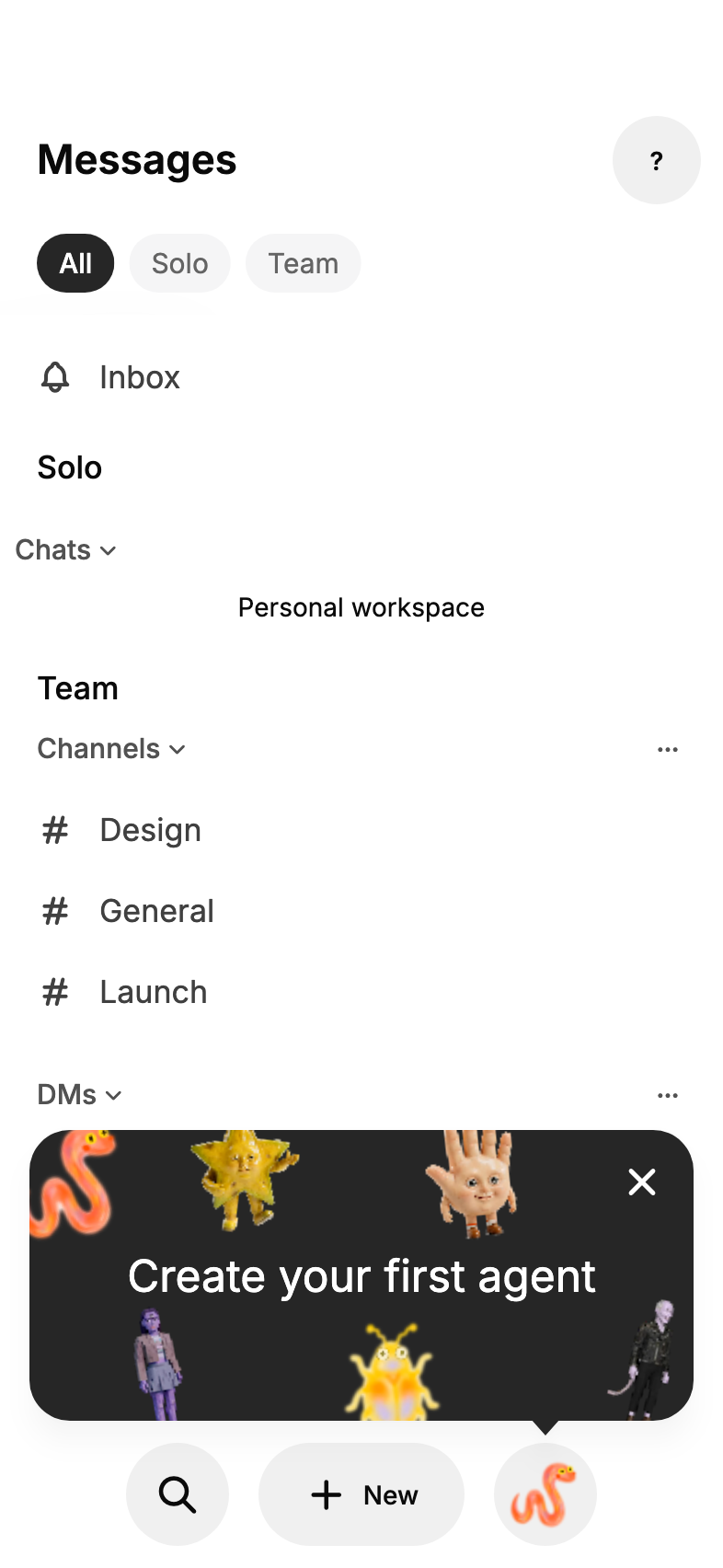
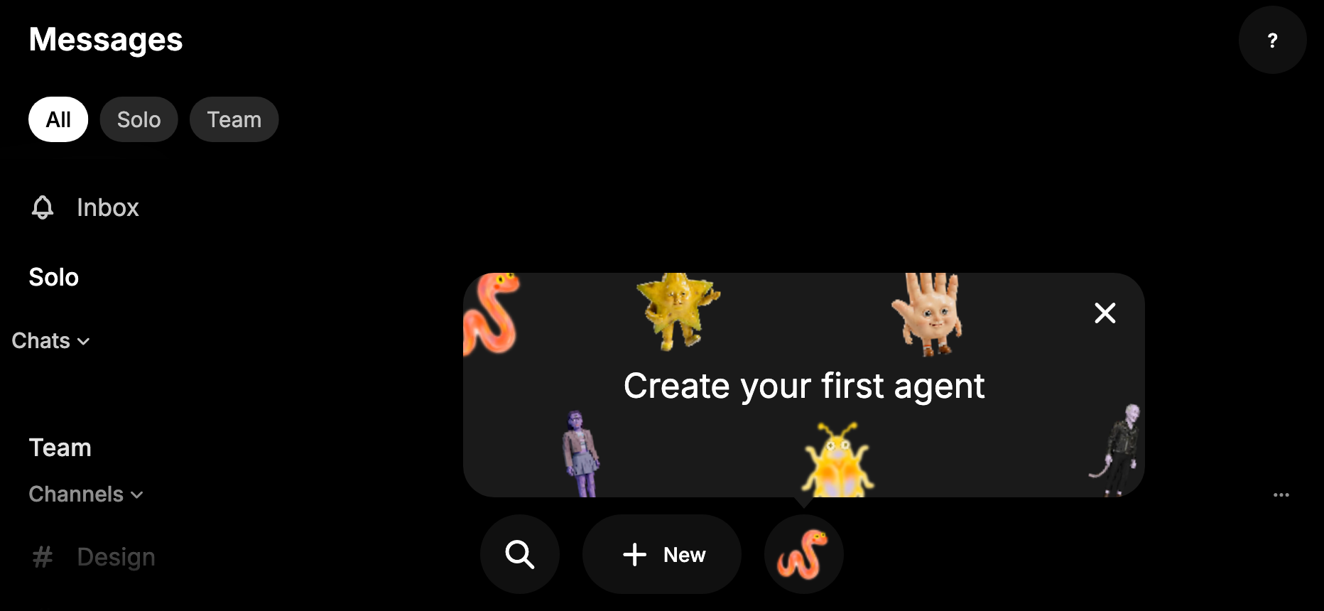
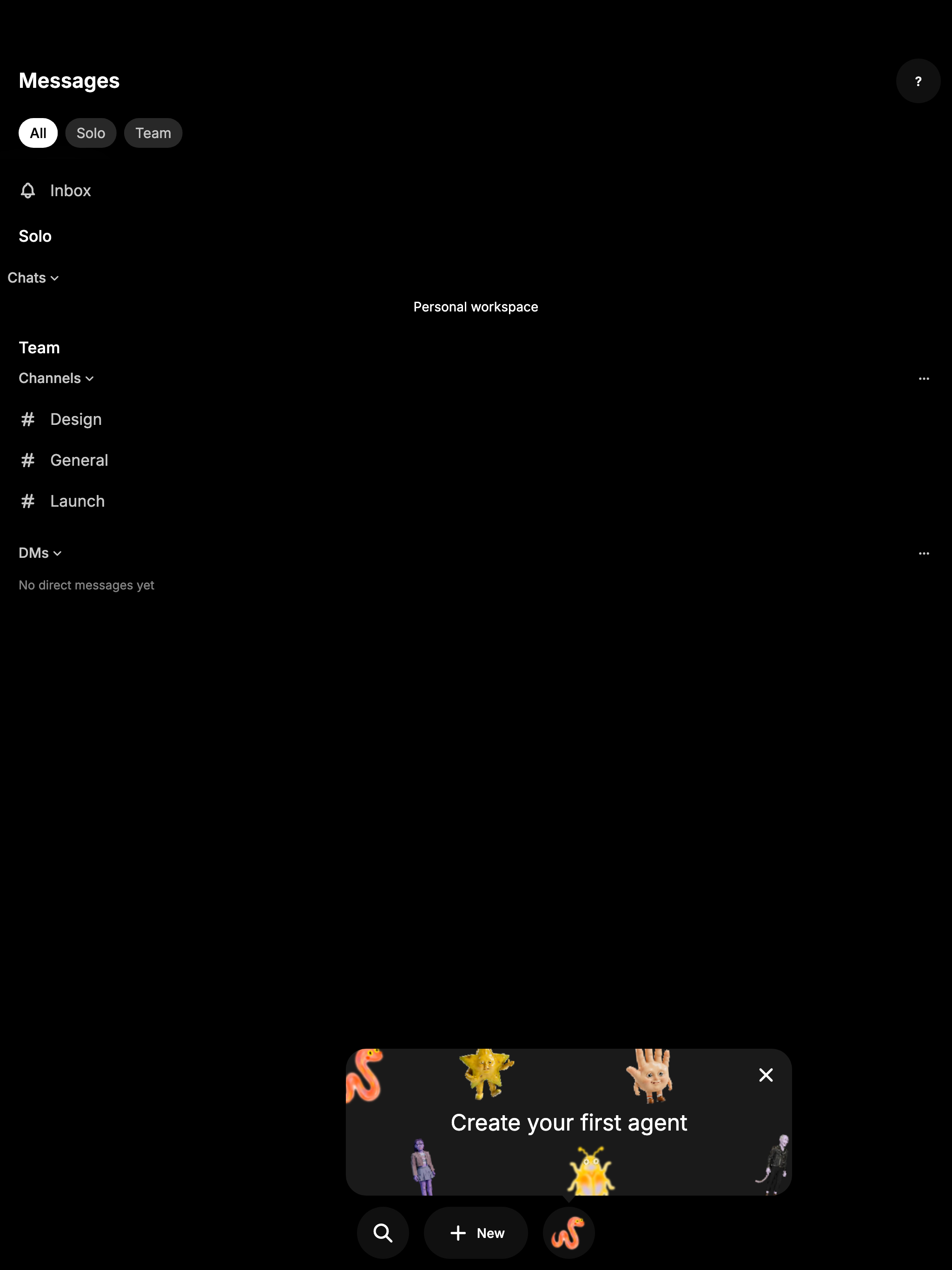
- The card spans the screen above the bottom bar, with agent pictures
(the same ones the empty slot cycles through) scattered around its edges
and the message centered as plain text. It's allowed to cover part of
the chat list.
- It waits three seconds on Home, then pops up from the agent slot with
the popover entrance (a quick fade, rise and scale). Leaving Home
restarts the wait, so it never pops over another screen. With reduced
motion it appears without animation after the same wait.
- Tapping the card starts agent creation. The close button dismisses it
for good, as does a screen reader's dismiss action, activating the slot,
or ending up with a Bestie. Dismissal is remembered per account and
community. Other taps on Home go through to the page and leave the card
up.
- It shows when remote agents are on, the Bestie preference has loaded
with none set, and the account owns no agents yet. The last check keeps
existing users who never picked a Bestie from being told to create their
"first" agent.
- It only shows while Home is the current route, so sheets and pushed
screens hide it and it comes back afterwards if it was never dismissed.
The card is a new `BuzzCallout.card` variant of the reusable
`BuzzCallout` in the mobile design system (the plain tip variant stays
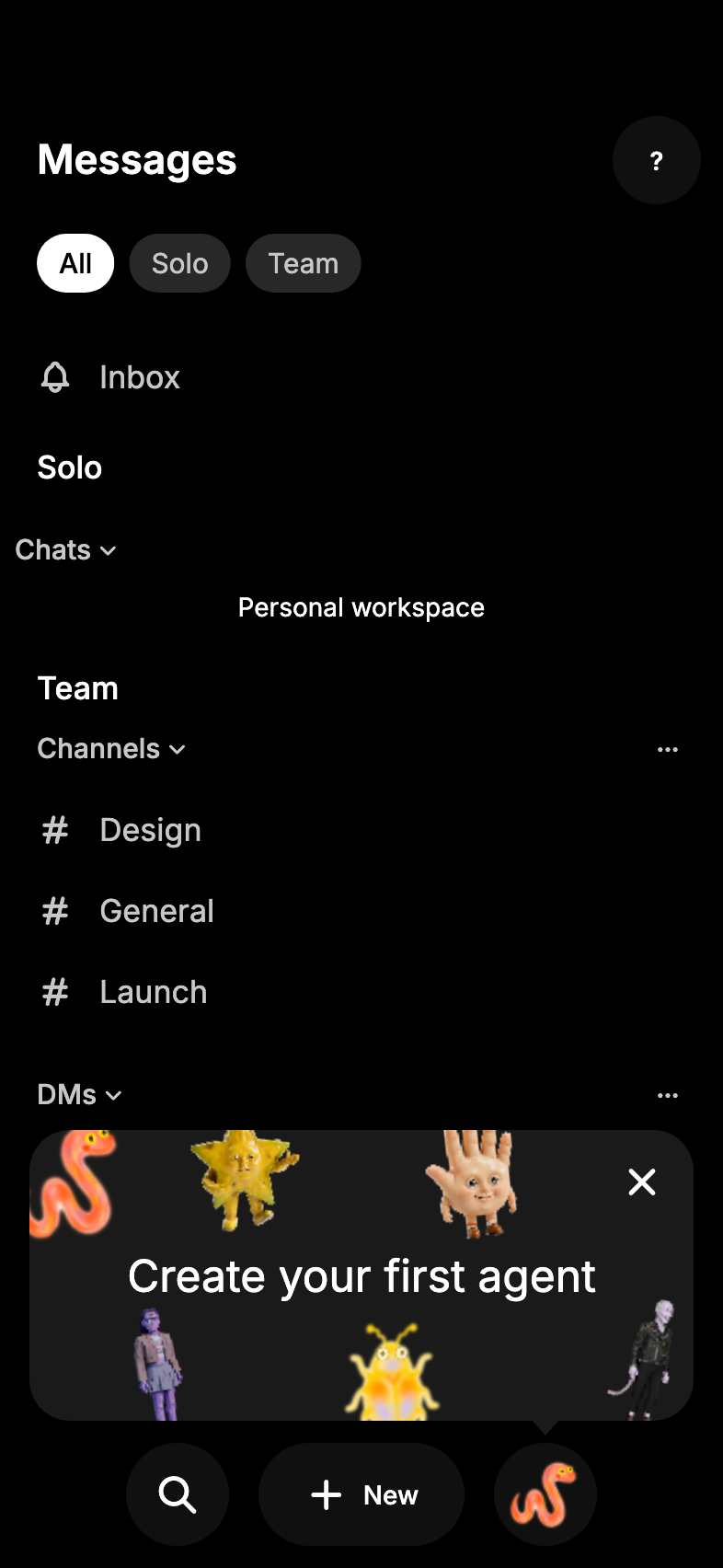
available). It uses the inverse surface in light mode and the raised
dark surface in dark mode (matching toasts), with an arrow, existing
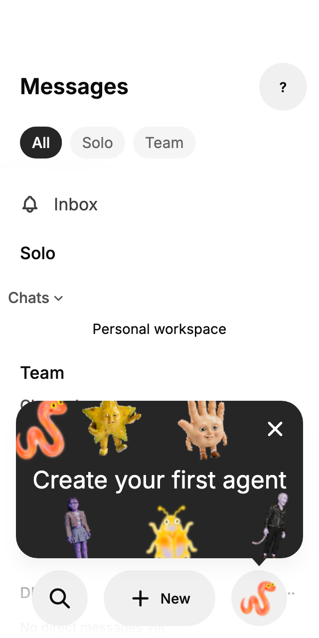
radius, spacing and popover elevation tokens, and stays phone-sized on
wider screens. It grows to fit large text below its close button, and it
has live-region semantics, so screen readers announce it.
## Screenshots
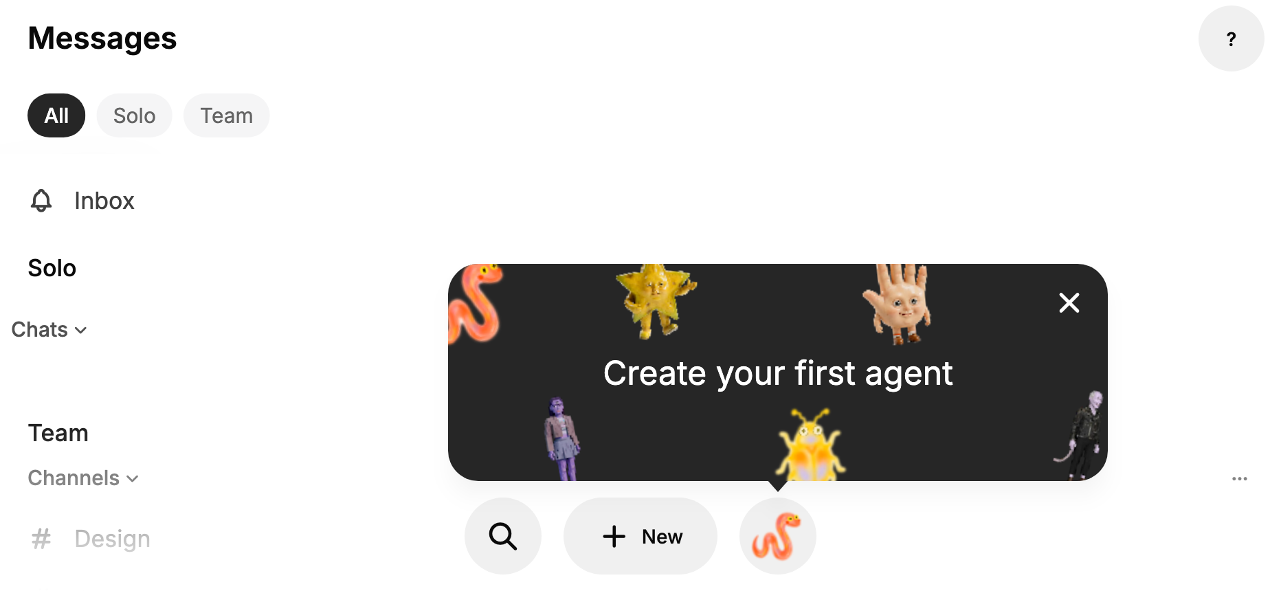
These come from the widget test harness with the real agent pictures, at
small (320), standard (393) and landscape phone sizes, plus a tablet.
The harness can't render the native iOS glass bar, so these use the
Flutter bar; the card is the same on both platforms. Pictures look a
little soft because the harness renders at 1x and scales up. In
landscape and on tablets the card stops at large-phone width so the
pictures don't spread too thin.
| Standard, light | Standard, dark | Small, light |
| --- | --- | --- |
| 
| 
| 
|
| Landscape, light | Landscape, dark |
| --- | --- |
| 
| 
|
| Tablet, dark |
| --- |
| 
|
## Testing
- Launcher tests cover first show and placement, Home staying tappable
underneath without dismissing, the card tap starting creation, the close
button, slot activation without a touch, screen reader dismiss, a Bestie
appearing, no reshow after dismissal, a separate community getting its
own first run, staying hidden for people with agents or without remote
agents, hiding under a sheet, the three-second wait and entrance,
reduced motion, and leaving Home during the wait (each
mutation-checked).
- Component tests cover the tip beside an edge target (320 and 1024
wide, 3x text) and the card: full width at 320, capped on wide screens,
growing at 3x text so the message stays clear of the close button
(mutation-checked), and the close button staying its own screen reader
control.
- The full mobile suite passes locally with CI's dart-defines, and
pre-push mobile checks passed at e2fdb791c.
- Still needs a device check on a real iPhone with a fresh account.
🤖 Generated with [Claude Code](https://claude.com/claude-code)
---------
Signed-off-by: morgmart <98432065+morgmart@users.noreply.github.com>
Co-authored-by: Carl <c217fe6b9d958f41c3a5e030dccc7f626775a923089cb6491305eade75ea1f1b@buzz.block.builderlab.xyz>
Co-authored-by: Claude Opus 5.5 <noreply@anthropic.com>
Co-authored-by: Morgarita <6e967af659416160ab4f2fd56d74c8c6f273791ee7bfc9468a1be37c387947be@buzz.block.builderlab.xyz>






275 lines
8.6 KiB
Dart
275 lines
8.6 KiB
Dart
import 'dart:math' as math;
|
|
import 'dart:ui' show SemanticsRole;
|
|
|
|
import 'package:flutter/material.dart';
|
|
|
|
import '../theme/theme.dart';
|
|
|
|
/// How app popovers enter: a quick fade while scaling up from slightly small.
|
|
const appPopoverEnterDuration = Duration(milliseconds: 150);
|
|
const appPopoverEnterCurve = Curves.easeOutCubic;
|
|
const appPopoverStartScale = 0.96;
|
|
const _popoverExitDuration = Duration(milliseconds: 110);
|
|
|
|
/// Elevation shared by anchored menus and composer popover surfaces.
|
|
const appPopoverElevation = 8.0;
|
|
|
|
/// Returns the translucent surface color shared by app popovers.
|
|
Color appPopoverColor(BuildContext context) =>
|
|
context.colors.surface.withValues(alpha: 0.98);
|
|
|
|
/// Returns the shadow color shared by app popovers.
|
|
Color appPopoverShadowColor(BuildContext context) =>
|
|
context.colors.shadow.withValues(alpha: 0.18);
|
|
|
|
/// Returns the grouped-container shape and shared popover hairline.
|
|
RoundedRectangleBorder appPopoverShape(BuildContext context) =>
|
|
RoundedRectangleBorder(
|
|
borderRadius: BorderRadius.circular(Radii.popover),
|
|
side: BorderSide(color: Colors.black.withValues(alpha: 0.04), width: 1),
|
|
);
|
|
|
|
/// The horizontal edge a popover aligns to on its triggering control.
|
|
enum AnchoredPopoverAlignment {
|
|
/// Aligns the popover's leading edge with the trigger's leading edge.
|
|
start,
|
|
|
|
/// Centers the popover horizontally on the trigger.
|
|
center,
|
|
|
|
/// Aligns the popover's trailing edge with the trigger's trailing edge.
|
|
end,
|
|
}
|
|
|
|
/// Shows an anchored, cross-platform popup menu with the Activity controls'
|
|
/// sizing, motion, and safe-area placement.
|
|
Future<T?> showAnchoredPopover<T>({
|
|
required BuildContext context,
|
|
required List<PopupMenuEntry<T>> items,
|
|
required double width,
|
|
required AnchoredPopoverAlignment alignment,
|
|
Color? color,
|
|
ShapeBorder? shape,
|
|
double elevation = appPopoverElevation,
|
|
Color? shadowColor,
|
|
Offset offset = Offset.zero,
|
|
EdgeInsetsGeometry menuPadding = EdgeInsets.zero,
|
|
Clip clipBehavior = Clip.antiAlias,
|
|
Key? surfaceKey,
|
|
}) async {
|
|
final navigator = Navigator.of(context);
|
|
final overlay = navigator.overlay;
|
|
final triggerRenderObject = context.findRenderObject();
|
|
final overlayRenderObject = overlay?.context.findRenderObject();
|
|
if (triggerRenderObject is! RenderBox || overlayRenderObject is! RenderBox) {
|
|
return Future<T?>.value();
|
|
}
|
|
|
|
final triggerRect = MatrixUtils.transformRect(
|
|
triggerRenderObject.getTransformTo(overlayRenderObject),
|
|
Offset.zero & triggerRenderObject.size,
|
|
);
|
|
final overlayRect = Offset.zero & overlayRenderObject.size;
|
|
final mediaQuery = MediaQuery.of(context);
|
|
|
|
final route = _AnchoredPopoverRoute<T>(
|
|
position: RelativeRect.fromRect(triggerRect, overlayRect),
|
|
items: items,
|
|
width: width,
|
|
alignment: alignment,
|
|
offset: offset,
|
|
color: color ?? appPopoverColor(context),
|
|
shape: shape ?? appPopoverShape(context),
|
|
elevation: elevation,
|
|
shadowColor: shadowColor ?? appPopoverShadowColor(context),
|
|
menuPadding: menuPadding,
|
|
clipBehavior: clipBehavior,
|
|
surfaceKey: surfaceKey,
|
|
screenPadding: EdgeInsets.fromLTRB(
|
|
math.max(Grid.xxs, mediaQuery.padding.left),
|
|
math.max(Grid.xxs, mediaQuery.padding.top),
|
|
math.max(Grid.xxs, mediaQuery.padding.right),
|
|
math.max(Grid.xxs, mediaQuery.padding.bottom),
|
|
),
|
|
reducedMotion: mediaQuery.disableAnimations,
|
|
barrierLabel: MaterialLocalizations.of(context).modalBarrierDismissLabel,
|
|
);
|
|
final result = await navigator.push<T>(route);
|
|
return result;
|
|
}
|
|
|
|
class _AnchoredPopoverRoute<T> extends PopupRoute<T> {
|
|
final RelativeRect position;
|
|
final List<PopupMenuEntry<T>> items;
|
|
final double width;
|
|
final AnchoredPopoverAlignment alignment;
|
|
final Offset offset;
|
|
final Color color;
|
|
final ShapeBorder shape;
|
|
final double elevation;
|
|
final Color shadowColor;
|
|
final EdgeInsetsGeometry menuPadding;
|
|
final Clip clipBehavior;
|
|
final Key? surfaceKey;
|
|
final EdgeInsets screenPadding;
|
|
final bool reducedMotion;
|
|
final String _barrierLabel;
|
|
|
|
_AnchoredPopoverRoute({
|
|
required this.position,
|
|
required this.items,
|
|
required this.width,
|
|
required this.alignment,
|
|
required this.offset,
|
|
required this.color,
|
|
required this.shape,
|
|
required this.elevation,
|
|
required this.shadowColor,
|
|
required this.menuPadding,
|
|
required this.clipBehavior,
|
|
required this.surfaceKey,
|
|
required this.screenPadding,
|
|
required this.reducedMotion,
|
|
required String barrierLabel,
|
|
}) : _barrierLabel = barrierLabel;
|
|
|
|
@override
|
|
Color? get barrierColor => null;
|
|
|
|
@override
|
|
bool get barrierDismissible => true;
|
|
|
|
@override
|
|
String? get barrierLabel => _barrierLabel;
|
|
|
|
@override
|
|
Duration get transitionDuration =>
|
|
reducedMotion ? Duration.zero : appPopoverEnterDuration;
|
|
|
|
@override
|
|
Duration get reverseTransitionDuration =>
|
|
reducedMotion ? Duration.zero : _popoverExitDuration;
|
|
|
|
@override
|
|
Widget buildPage(
|
|
BuildContext context,
|
|
Animation<double> animation,
|
|
Animation<double> secondaryAnimation,
|
|
) {
|
|
final curvedAnimation = animation.drive(
|
|
CurveTween(curve: appPopoverEnterCurve),
|
|
);
|
|
final scaleAnimation = Tween<double>(
|
|
begin: appPopoverStartScale,
|
|
end: 1,
|
|
).animate(curvedAnimation);
|
|
final transformOrigin = switch (alignment) {
|
|
AnchoredPopoverAlignment.start => Alignment.topLeft,
|
|
AnchoredPopoverAlignment.center => Alignment.topCenter,
|
|
AnchoredPopoverAlignment.end => Alignment.topRight,
|
|
};
|
|
|
|
return CustomSingleChildLayout(
|
|
delegate: _AnchoredPopoverLayoutDelegate(
|
|
position: position,
|
|
alignment: alignment,
|
|
offset: offset,
|
|
screenPadding: screenPadding,
|
|
),
|
|
child: FadeTransition(
|
|
key: const ValueKey('activity-popover-fade'),
|
|
opacity: curvedAnimation,
|
|
child: ScaleTransition(
|
|
key: const ValueKey('activity-popover-scale'),
|
|
scale: scaleAnimation,
|
|
alignment: transformOrigin,
|
|
child: Material(
|
|
key: surfaceKey,
|
|
type: MaterialType.card,
|
|
color: color,
|
|
surfaceTintColor: Colors.transparent,
|
|
elevation: elevation,
|
|
shadowColor: shadowColor,
|
|
shape: shape,
|
|
clipBehavior: clipBehavior,
|
|
child: SizedBox(
|
|
width: width,
|
|
child: Semantics(
|
|
role: SemanticsRole.menu,
|
|
scopesRoute: true,
|
|
namesRoute: true,
|
|
explicitChildNodes: true,
|
|
child: SingleChildScrollView(
|
|
padding: menuPadding,
|
|
child: ListBody(children: items),
|
|
),
|
|
),
|
|
),
|
|
),
|
|
),
|
|
),
|
|
);
|
|
}
|
|
}
|
|
|
|
class _AnchoredPopoverLayoutDelegate extends SingleChildLayoutDelegate {
|
|
final RelativeRect position;
|
|
final AnchoredPopoverAlignment alignment;
|
|
final Offset offset;
|
|
final EdgeInsets screenPadding;
|
|
|
|
const _AnchoredPopoverLayoutDelegate({
|
|
required this.position,
|
|
required this.alignment,
|
|
required this.offset,
|
|
required this.screenPadding,
|
|
});
|
|
|
|
@override
|
|
BoxConstraints getConstraintsForChild(BoxConstraints constraints) {
|
|
return BoxConstraints.loose(
|
|
Size(
|
|
constraints.maxWidth - screenPadding.horizontal,
|
|
constraints.maxHeight - screenPadding.vertical,
|
|
),
|
|
);
|
|
}
|
|
|
|
@override
|
|
Offset getPositionForChild(Size size, Size childSize) {
|
|
final anchorBottom = size.height - position.bottom;
|
|
final desiredX = switch (alignment) {
|
|
AnchoredPopoverAlignment.start => position.left + offset.dx,
|
|
AnchoredPopoverAlignment.center =>
|
|
position.left +
|
|
(size.width - position.left - position.right - childSize.width) /
|
|
2 +
|
|
offset.dx,
|
|
AnchoredPopoverAlignment.end =>
|
|
size.width - position.right - childSize.width + offset.dx,
|
|
};
|
|
final minX = screenPadding.left;
|
|
final maxX = size.width - screenPadding.right - childSize.width;
|
|
final x = desiredX.clamp(minX, maxX).toDouble();
|
|
|
|
final belowY = anchorBottom + offset.dy;
|
|
final aboveY = position.top - childSize.height - offset.dy;
|
|
final maxY = size.height - screenPadding.bottom - childSize.height;
|
|
final desiredY =
|
|
belowY + childSize.height <= size.height - screenPadding.bottom
|
|
? belowY
|
|
: aboveY;
|
|
final y = desiredY.clamp(screenPadding.top, maxY).toDouble();
|
|
|
|
return Offset(x, y);
|
|
}
|
|
|
|
@override
|
|
bool shouldRelayout(_AnchoredPopoverLayoutDelegate oldDelegate) {
|
|
return position != oldDelegate.position ||
|
|
alignment != oldDelegate.alignment ||
|
|
offset != oldDelegate.offset ||
|
|
screenPadding != oldDelegate.screenPadding;
|
|
}
|
|
}
|