mirror of
https://github.com/block/buzz.git
synced 2026-10-28 04:51:40 +00:00
 c8ea4fb4eb
## Summary
Polish mobile Home and Solo: group Search/Inbox beside a separate
profile avatar, move Inbox and Settings to bottom-up pages with Close
controls, and place tabs opposite the plus/compose action. Morph plus to
compose clockwise when entering Solo and reverse counterclockwise when
returning Home, with a directional quarter-turn of the icon inside a
level button and a subtle scale pulse, respecting reduced motion. Align
Search’s Close control with Inbox, simplify its placeholder, and
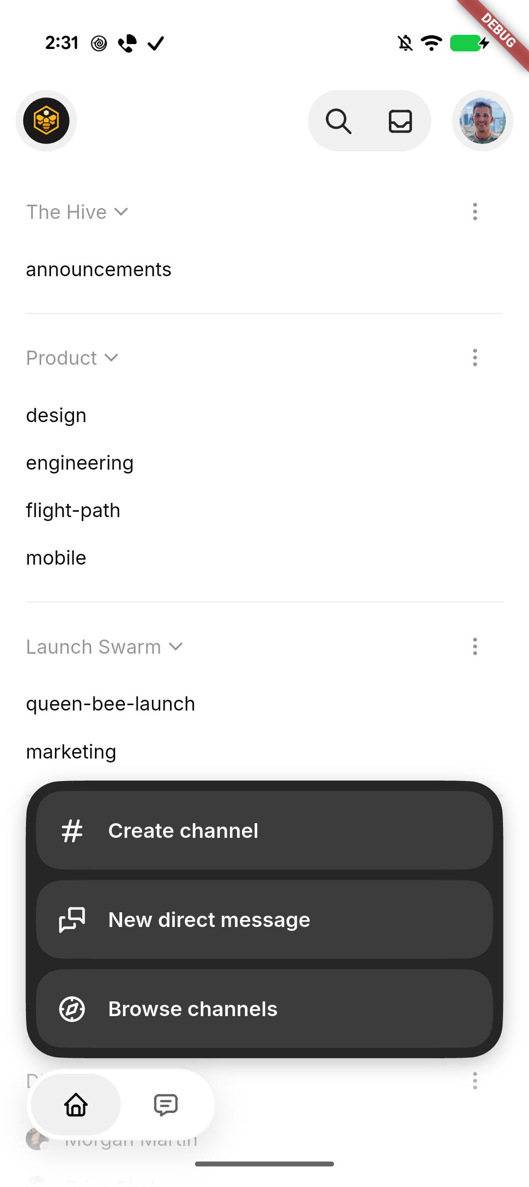
initialize selected filter contrast correctly. Collapse the plus menu
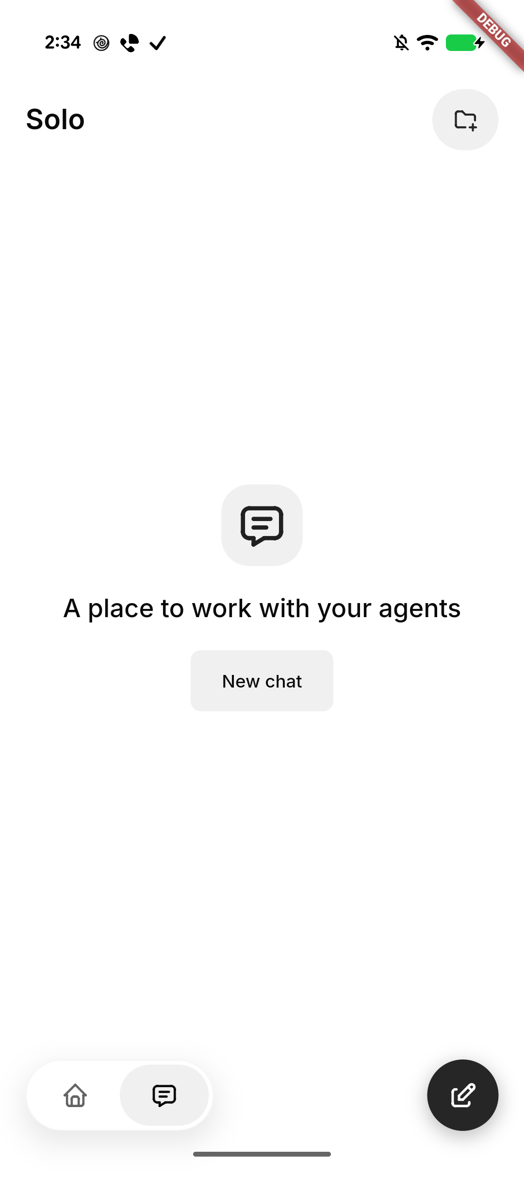
when leaving Home. Center Solo’s native-glass New chat empty state and
keep it stationary behind the keyboard.

Standardize Tabler icons and neutral backgrounds, retain SF Back/Close
on iOS, use native Liquid Glass headers, tab container, and actions
(solid grey selected tab, slightly darker on iOS) on iOS and black
actions on Android, and smooth the expanded menu corners. Repair native
header safe-area/return layout and compose movement after cancellation.

### Related issue
None found for this UI refinement; follows #8337.

### Testing
- Formatting, analysis, full mobile suite: 3,487 passed, 4 skipped; 3
push-configuration tests passed. File-size checks passed.
- Base UI built and installed on Pixel and iPhone in place. Pixel
navigation/New chat cancellation checked. Subsequent glass and rotation
refinements are previewed on iPhone; motion feel awaits human
confirmation.
- Draft pending human confirmation of the final Settings entrance/return
behavior on iPhone.

### Pixel snapshots
| Solo | Expanded actions |
| --- | --- |
| <img
src="https://raw.githubusercontent.com/block/buzz/16dc0f8af971e63d788fee20974997fab925dec9/docs/screenshots/mobile-home-solo/pixel-solo.png"
width="280" alt="Solo empty state with New chat" /> | <img
src="https://raw.githubusercontent.com/block/buzz/16dc0f8af971e63d788fee20974997fab925dec9/docs/screenshots/mobile-home-solo/pixel-actions.png"
width="280" alt="Expanded channel actions with smooth corners" /> |

---------

Signed-off-by: kenny lopez <klopez4212@gmail.com>
Co-authored-by: Terp <5856f6900e8e0a4e0ea1f4f8d2ee33e4753d2119bc122f94ecafc660b46c0511@buzz.block.builderlab.xyz>
126 lines
3.9 KiB
Dart
126 lines
3.9 KiB
Dart
import 'package:buzz/shared/theme/buzz_icons.dart';
|
|
import 'package:flutter/material.dart';
|
|
import 'package:flutter_test/flutter_test.dart';
|
|
import 'package:buzz/shared/theme/theme.dart';
|
|
import 'package:buzz/shared/widgets/app_list.dart';
|
|
import 'package:buzz/shared/widgets/app_list_card.dart';
|
|
|
|
Widget _host(Widget child) => MaterialApp(
|
|
theme: AppTheme.light(),
|
|
home: Scaffold(body: child),
|
|
);
|
|
|
|
void main() {
|
|
group('AppListRow', () {
|
|
testWidgets('centres the leading icon against a two-line row', (
|
|
tester,
|
|
) async {
|
|
await tester.pumpWidget(
|
|
_host(
|
|
const AppListRow(
|
|
icon: Icons.dns,
|
|
title: 'Connected to',
|
|
subtitle: 'https://relay.example.com',
|
|
),
|
|
),
|
|
);
|
|
|
|
final row = tester.getRect(find.byType(AppListRow));
|
|
final icon = tester.getRect(find.byType(Icon));
|
|
expect(icon.center.dy, closeTo(row.center.dy, 0.5));
|
|
});
|
|
|
|
testWidgets('centres the trailing control against a two-line row', (
|
|
tester,
|
|
) async {
|
|
await tester.pumpWidget(
|
|
_host(
|
|
const AppListRow(
|
|
icon: Icons.key,
|
|
title: 'Identity',
|
|
subtitle: 'deadbeef',
|
|
trailing: Icon(Icons.copy, key: Key('trailing')),
|
|
),
|
|
),
|
|
);
|
|
|
|
final row = tester.getRect(find.byType(AppListRow));
|
|
final trailing = tester.getRect(find.byKey(const Key('trailing')));
|
|
expect(trailing.center.dy, closeTo(row.center.dy, 0.5));
|
|
});
|
|
|
|
testWidgets('keeps the value flush against the trailing edge', (
|
|
tester,
|
|
) async {
|
|
await tester.pumpWidget(
|
|
_host(
|
|
const AppListRow(
|
|
icon: Icons.palette,
|
|
title: 'Theme',
|
|
value: 'Buzz',
|
|
trailing: Icon(BuzzIcons.chevronRight, key: Key('chevron')),
|
|
),
|
|
),
|
|
);
|
|
|
|
final value = tester.getRect(find.text('Buzz'));
|
|
final chevron = tester.getRect(find.byKey(const Key('chevron')));
|
|
// Only the row's own inter-widget gap sits between them — no flex slack.
|
|
expect(chevron.left - value.right, closeTo(Grid.xxs, 0.5));
|
|
});
|
|
});
|
|
|
|
group('AppListCard', () {
|
|
testWidgets('separates rows with dividers that clear the icon column', (
|
|
tester,
|
|
) async {
|
|
await tester.pumpWidget(
|
|
_host(
|
|
const AppListCard(
|
|
label: 'Style',
|
|
children: [
|
|
AppListRow(icon: Icons.sunny, title: 'Appearance'),
|
|
AppListRow(icon: Icons.palette, title: 'Theme'),
|
|
AppListRow(icon: Icons.water_drop, title: 'Accent color'),
|
|
],
|
|
),
|
|
),
|
|
);
|
|
|
|
final dividers = find.byType(Divider);
|
|
expect(dividers, findsNWidgets(2));
|
|
|
|
final divider = tester.widget<Divider>(dividers.first);
|
|
final scheme = AppTheme.light().colorScheme;
|
|
// Derived from the text color, not the scheme's border tokens — those sit
|
|
// within a few levels of the card fill and vanish.
|
|
expect(divider.color, scheme.onSurface.withValues(alpha: 0.07));
|
|
|
|
// The indent is painted inside the divider's box, so the line starts at
|
|
// the box's left edge plus the indent — level with the row titles.
|
|
final titleLeft = tester.getRect(find.text('Appearance')).left;
|
|
final lineLeft = tester.getRect(dividers.first).left + divider.indent!;
|
|
expect(lineLeft, closeTo(titleLeft, 0.5));
|
|
});
|
|
|
|
testWidgets('fills with the softest container step', (tester) async {
|
|
await tester.pumpWidget(
|
|
_host(
|
|
const AppListCard(children: [AppListRow(title: 'Remove community')]),
|
|
),
|
|
);
|
|
|
|
final material = tester.widget<Material>(
|
|
find.descendant(
|
|
of: find.byType(AppListCard),
|
|
matching: find.byType(Material),
|
|
),
|
|
);
|
|
expect(
|
|
material.color,
|
|
AppTheme.light().colorScheme.surfaceContainerHighest,
|
|
);
|
|
});
|
|
});
|
|
}
|