mirror of
https://github.com/block/buzz.git
synced 2026-10-27 20:41:57 +00:00
 c8ea4fb4eb
## Summary
Polish mobile Home and Solo: group Search/Inbox beside a separate
profile avatar, move Inbox and Settings to bottom-up pages with Close
controls, and place tabs opposite the plus/compose action. Morph plus to
compose clockwise when entering Solo and reverse counterclockwise when
returning Home, with a directional quarter-turn of the icon inside a
level button and a subtle scale pulse, respecting reduced motion. Align
Search’s Close control with Inbox, simplify its placeholder, and
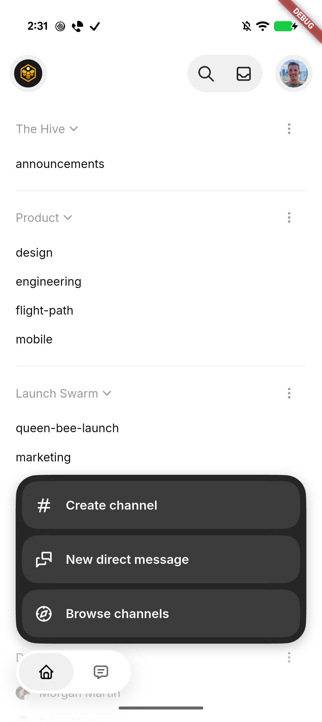
initialize selected filter contrast correctly. Collapse the plus menu
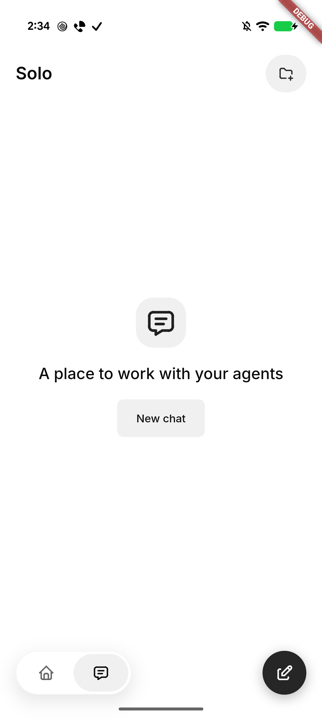
when leaving Home. Center Solo’s native-glass New chat empty state and
keep it stationary behind the keyboard.

Standardize Tabler icons and neutral backgrounds, retain SF Back/Close
on iOS, use native Liquid Glass headers, tab container, and actions
(solid grey selected tab, slightly darker on iOS) on iOS and black
actions on Android, and smooth the expanded menu corners. Repair native
header safe-area/return layout and compose movement after cancellation.

### Related issue
None found for this UI refinement; follows #8337.

### Testing
- Formatting, analysis, full mobile suite: 3,487 passed, 4 skipped; 3
push-configuration tests passed. File-size checks passed.
- Base UI built and installed on Pixel and iPhone in place. Pixel
navigation/New chat cancellation checked. Subsequent glass and rotation
refinements are previewed on iPhone; motion feel awaits human
confirmation.
- Draft pending human confirmation of the final Settings entrance/return
behavior on iPhone.

### Pixel snapshots
| Solo | Expanded actions |
| --- | --- |
| <img
src="https://raw.githubusercontent.com/block/buzz/16dc0f8af971e63d788fee20974997fab925dec9/docs/screenshots/mobile-home-solo/pixel-solo.png"
width="280" alt="Solo empty state with New chat" /> | <img
src="https://raw.githubusercontent.com/block/buzz/16dc0f8af971e63d788fee20974997fab925dec9/docs/screenshots/mobile-home-solo/pixel-actions.png"
width="280" alt="Expanded channel actions with smooth corners" /> |

---------

Signed-off-by: kenny lopez <klopez4212@gmail.com>
Co-authored-by: Terp <5856f6900e8e0a4e0ea1f4f8d2ee33e4753d2119bc122f94ecafc660b46c0511@buzz.block.builderlab.xyz>
103 lines
4.3 KiB
Dart
103 lines
4.3 KiB
Dart
import 'package:flutter/material.dart';
|
|
|
|
import 'accent_colors.dart';
|
|
import 'app_colors.dart';
|
|
import 'theme_extensions.dart';
|
|
|
|
/// Name of the first-party Buzz theme. Buzz reuses the GitHub Light palette for
|
|
/// every base color; the one thing that sets it apart is a branded gradient
|
|
/// painted across the app's top section. Mirrors desktop, where the same
|
|
/// gradient fills the sidebar canvas — see `data-buzz-sidebar` in
|
|
/// `desktop/src/shared/styles/globals/theme.css`.
|
|
const buzzThemeName = 'buzz';
|
|
|
|
/// Name of the dark counterpart, which reuses the GitHub Dark palette and the
|
|
/// dark-tuned gradient stops. Paired with [buzzThemeName] in `themePairs`, so
|
|
/// the two behave as a single "Buzz" choice under System mode.
|
|
const buzzDarkThemeName = 'buzz-dark';
|
|
|
|
/// Whether [themeName] is either half of the Buzz pair. Both halves enable the
|
|
/// gradient so System mode keeps it on across an OS light/dark switch.
|
|
bool isBuzzTheme(String themeName) =>
|
|
themeName == buzzThemeName || themeName == buzzDarkThemeName;
|
|
|
|
/// Whether the current widget tree is using the first-party Buzz treatment.
|
|
bool isBuzzThemeContext(BuildContext context) =>
|
|
Theme.of(context).extension<AppColors>()?.topSectionGradient != null;
|
|
|
|
/// Primary foreground for the mobile top navigation.
|
|
///
|
|
/// Every theme uses its own [ColorScheme.onSurface]. Buzz is the exception:
|
|
/// its desktop-matching top gradient needs a neutral black or white foreground
|
|
/// rather than the accent-derived color scheme foreground.
|
|
Color navigationPrimaryForeground(BuildContext context) {
|
|
final scheme = Theme.of(context).colorScheme;
|
|
if (!isBuzzThemeContext(context)) return scheme.onSurface;
|
|
return scheme.brightness == Brightness.dark ? Colors.white : Colors.black;
|
|
}
|
|
|
|
/// Secondary label and placeholder foreground for the mobile top navigation.
|
|
Color navigationSecondaryForeground(BuildContext context) {
|
|
final scheme = Theme.of(context).colorScheme;
|
|
if (!isBuzzThemeContext(context)) return scheme.onSurfaceVariant;
|
|
return navigationPrimaryForeground(context).withValues(alpha: 0.4);
|
|
}
|
|
|
|
/// Channel-section label and icon foreground for the mobile side navigation.
|
|
///
|
|
/// Section labels need more hierarchy than a placeholder. Buzz therefore uses
|
|
/// a stronger neutral over its gradient, while all other themes preserve their
|
|
/// established secondary foreground token.
|
|
Color navigationSectionForeground(BuildContext context) {
|
|
final scheme = Theme.of(context).colorScheme;
|
|
if (!isBuzzThemeContext(context)) return scheme.onSurfaceVariant;
|
|
return navigationPrimaryForeground(context).withValues(alpha: 0.8);
|
|
}
|
|
|
|
/// Search-field surface for the mobile top navigation.
|
|
Color navigationSearchSurface(BuildContext context) {
|
|
return context.controlSurface;
|
|
}
|
|
|
|
/// A low-contrast navigation divider derived from the active theme foreground.
|
|
Color navigationDivider(BuildContext context, double opacity) =>
|
|
navigationPrimaryForeground(context).withValues(alpha: opacity);
|
|
|
|
/// Buzz renders with its fixed neutral foreground while preserving the stored
|
|
/// wire accent so the user's choice returns on another theme.
|
|
int effectiveAccentIndex(String themeName, String storedAccent) {
|
|
if (isBuzzTheme(themeName)) return neutralAccentIndex;
|
|
return accentIndexForWireValue(storedAccent) ?? defaultAccentIndex;
|
|
}
|
|
|
|
/// Gradient stops, matching desktop's `--buzz-gradient-*` custom properties.
|
|
const _lightTop = Color(0xFFE6E6B6);
|
|
const _lightBottom = Color(0xFFC4D0DA);
|
|
const _darkTop = Color(0xFF4A4616);
|
|
const _darkBottom = Color(0xFF0A1423);
|
|
|
|
/// The Buzz gradient for the app's top section, or null when [themeName] is not
|
|
/// a Buzz theme — in which case the section keeps its default frosted fill.
|
|
///
|
|
/// The stops are fully opaque: under Buzz the color replaces the frosted
|
|
/// treatment rather than tinting it, matching desktop's solid sidebar canvas.
|
|
///
|
|
/// [brightness] comes from the applied color scheme rather than the theme name,
|
|
/// so System mode picks the right stops as the OS switches.
|
|
LinearGradient? buzzTopSectionGradient(
|
|
String themeName,
|
|
Brightness brightness,
|
|
) {
|
|
if (!isBuzzTheme(themeName)) return null;
|
|
|
|
final isDark = brightness == Brightness.dark;
|
|
return LinearGradient(
|
|
begin: Alignment.topCenter,
|
|
end: Alignment.bottomCenter,
|
|
colors: [
|
|
isDark ? _darkTop : _lightTop,
|
|
isDark ? _darkBottom : _lightBottom,
|
|
],
|
|
);
|
|
}
|