mirror of
https://github.com/block/buzz.git
synced 2026-10-30 22:11:36 +00:00
 a567dfc2df
## Summary - combine channel identity, actions, member previews, and lifecycle controls in one navigable mobile details page - add compact member management and desktop-aligned channel editing - smooth the profile entrance transition and standardize settings-group spacing - align Huddle lifecycle rows with regular message author and body spacing ## Testing - `just mobile-check` - `just mobile-test` — 1,477 tests - Pixel 10 debug build, install, and interaction review ## Snapshots ### Channel header 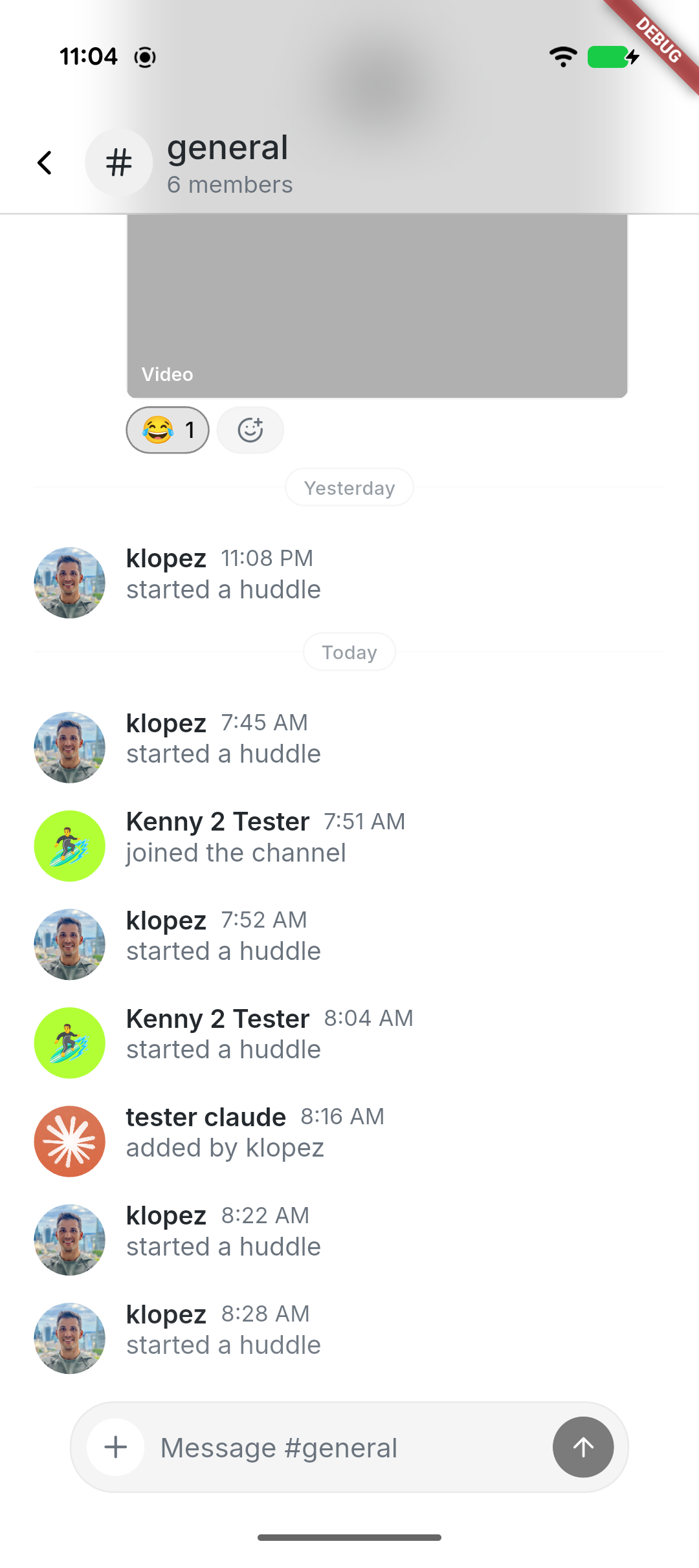 ### Combined channel details 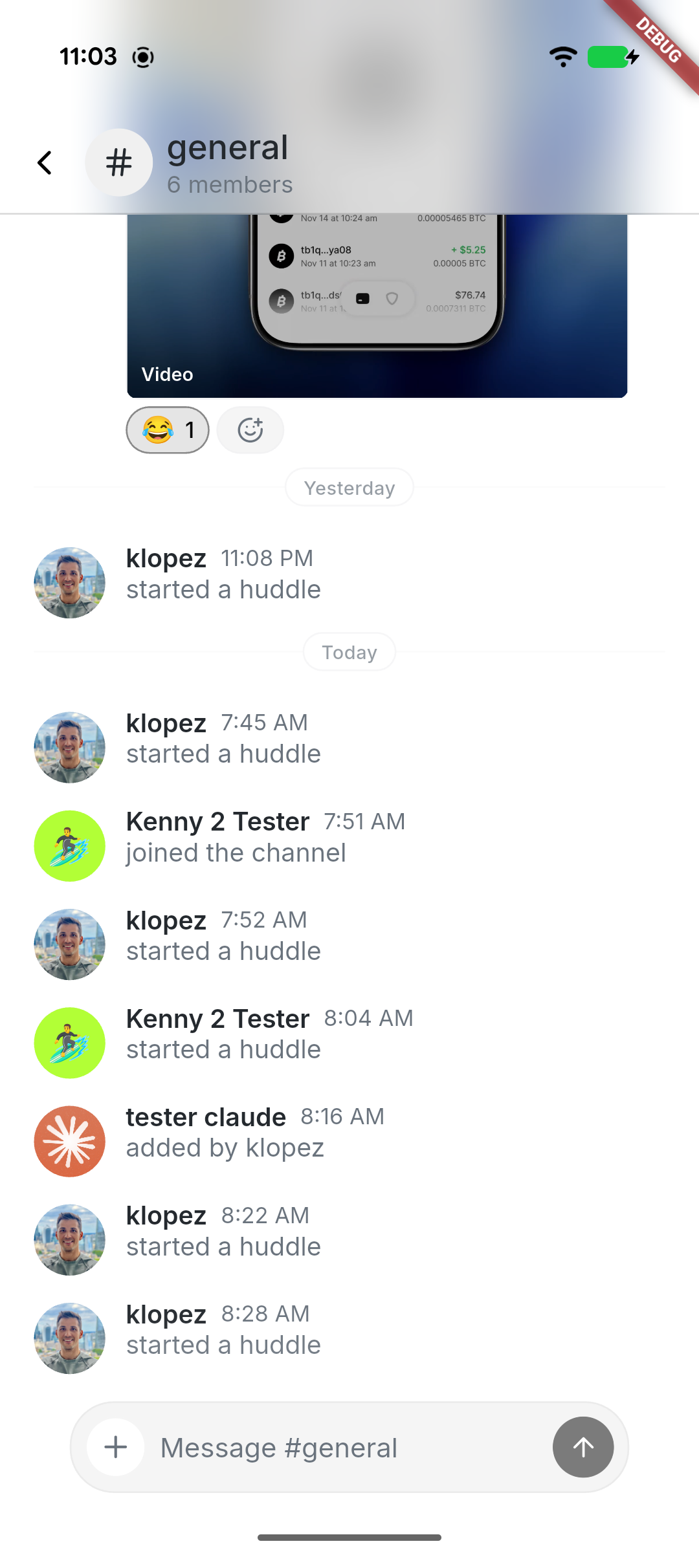 ### Manage channel 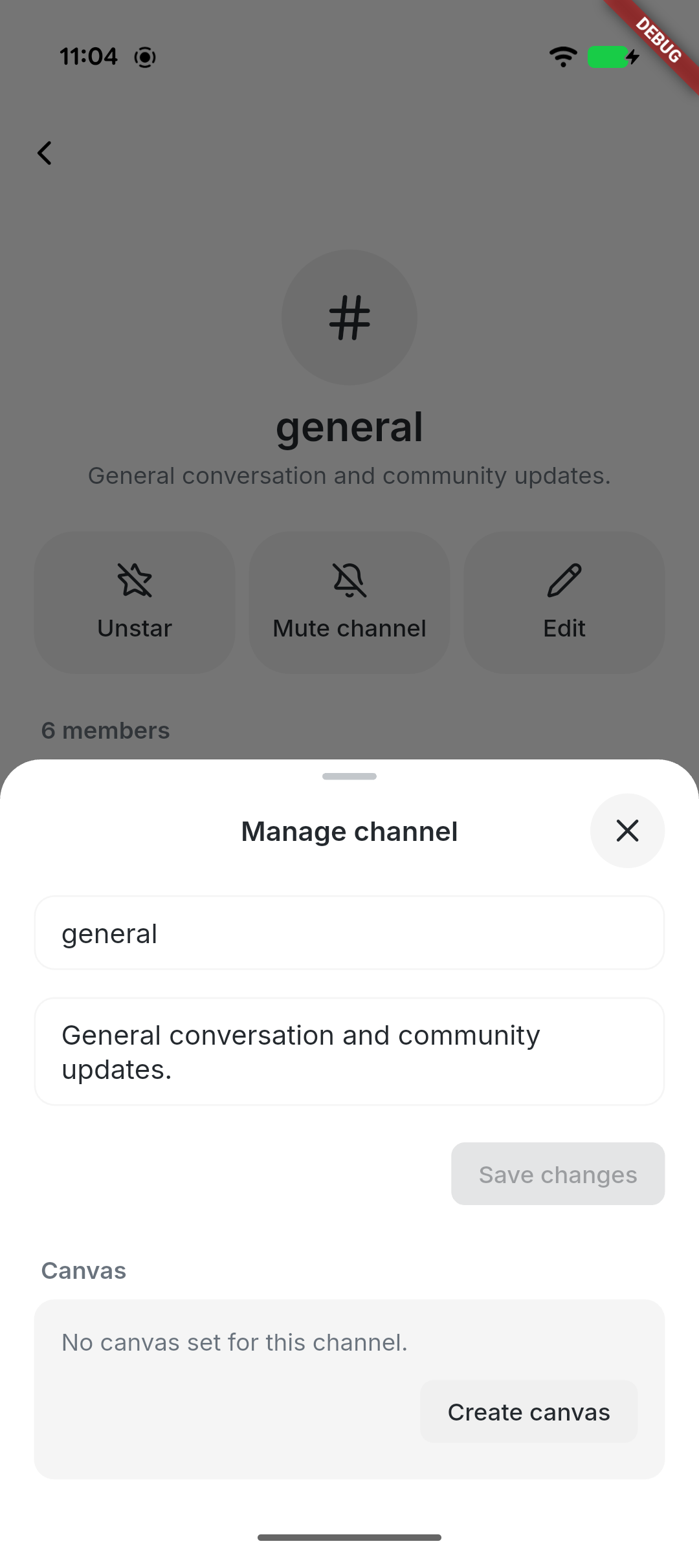 --------- Signed-off-by: kenny lopez <klopez4212@gmail.com> Signed-off-by: Fast Fizz <2df81cb51f05a9d5387ef24d7b9ecb8fcdfcd1c70ffabc67061c9596e1b5b1c4@buzz.block.builderlab.xyz> Co-authored-by: Fast Fizz <2df81cb51f05a9d5387ef24d7b9ecb8fcdfcd1c70ffabc67061c9596e1b5b1c4@buzz.block.builderlab.xyz>



116 lines
3.6 KiB
Dart
116 lines
3.6 KiB
Dart
import 'package:flutter/material.dart';
|
|
import 'package:hooks_riverpod/hooks_riverpod.dart';
|
|
|
|
import '../../shared/animated_avatar.dart';
|
|
import '../../shared/theme/theme.dart';
|
|
import '../../shared/widgets/avatar_image.dart';
|
|
import '../../shared/widgets/masked_avatar_badge.dart';
|
|
import 'profile_provider.dart';
|
|
import '../../shared/profile/user_profile.dart';
|
|
|
|
/// Matches desktop's sidebar profile card, whose avatar is 32px.
|
|
const _defaultAvatarSize = 32.0;
|
|
|
|
/// The visible dot is smaller than the notch it sits in, so a ring of
|
|
/// background separates it from the avatar. Desktop's `h-2 w-2` dot inside a
|
|
/// `h-3.5 w-3.5` badge frame.
|
|
const _presenceDotRatio = 8 / 14;
|
|
|
|
/// User avatar with a presence dot indicator, for use in the app bar.
|
|
///
|
|
/// The dot sits in a notch masked out of the avatar rather than overlapping it,
|
|
/// the same treatment desktop's `SidebarProfileCard` uses — so it needs no
|
|
/// background-coloured ring, and reads correctly over the themed top section.
|
|
class ProfileAvatar extends ConsumerWidget {
|
|
final VoidCallback? onTap;
|
|
final bool showPresence;
|
|
|
|
/// The avatar diameter in logical pixels; defaults to the 32px desktop match.
|
|
final double size;
|
|
|
|
const ProfileAvatar({
|
|
super.key,
|
|
this.onTap,
|
|
this.showPresence = true,
|
|
this.size = _defaultAvatarSize,
|
|
});
|
|
|
|
@override
|
|
Widget build(BuildContext context, WidgetRef ref) {
|
|
final profileAsync = ref.watch(profileProvider);
|
|
final presenceAsync = ref.watch(presenceProvider);
|
|
final presence = presenceAsync.when(
|
|
data: (v) => v,
|
|
loading: () => 'online',
|
|
error: (_, _) => 'offline',
|
|
);
|
|
|
|
return profileAsync.when(
|
|
loading: () => _buildPlaceholder(context),
|
|
error: (_, _) => _buildAvatar(context, null, presence),
|
|
data: (profile) => _buildAvatar(context, profile, presence),
|
|
);
|
|
}
|
|
|
|
Widget _buildPlaceholder(BuildContext context) {
|
|
return CircleAvatar(
|
|
radius: size / 2,
|
|
backgroundColor: context.colors.primaryContainer,
|
|
);
|
|
}
|
|
|
|
Widget _buildAvatar(
|
|
BuildContext context,
|
|
UserProfile? profile,
|
|
String presence,
|
|
) {
|
|
final animatedAvatar = parseAnimatedAvatarUrl(profile?.avatarUrl);
|
|
return GestureDetector(
|
|
onTap: onTap,
|
|
child: MaskedAvatarBadge(
|
|
size: size,
|
|
geometry: AvatarBadgeMaskGeometry.presenceDot,
|
|
avatar: ClipOval(
|
|
child: ColoredBox(
|
|
key: const ValueKey('profile-avatar-background'),
|
|
color: animatedAvatar == null
|
|
? context.colors.primaryContainer
|
|
: Colors.transparent,
|
|
child: AvatarImageContent(
|
|
imageUrl: animatedAvatar?.posterUrl ?? profile?.avatarUrl,
|
|
fallback: Text(
|
|
profile?.initial ?? '?',
|
|
style: context.textTheme.labelMedium?.copyWith(
|
|
color: context.colors.onPrimaryContainer,
|
|
),
|
|
),
|
|
),
|
|
),
|
|
),
|
|
badge: showPresence
|
|
? Center(
|
|
child: FractionallySizedBox(
|
|
widthFactor: _presenceDotRatio,
|
|
heightFactor: _presenceDotRatio,
|
|
child: DecoratedBox(
|
|
decoration: BoxDecoration(
|
|
color: _presenceColor(context, presence),
|
|
shape: BoxShape.circle,
|
|
),
|
|
),
|
|
),
|
|
)
|
|
: null,
|
|
),
|
|
);
|
|
}
|
|
|
|
Color _presenceColor(BuildContext context, String presence) {
|
|
return switch (presence) {
|
|
'online' => context.appColors.success,
|
|
'away' => context.appColors.warning,
|
|
_ => context.colors.outline,
|
|
};
|
|
}
|
|
}
|