mirror of
https://github.com/block/buzz.git
synced 2026-10-27 12:40:30 +00:00
 f79d346a17
**Category:** fix **User Impact:** Long Buzz link chips now wrap without overflowing in composers and sent messages; icon-bearing stubs use at most five graphemes when no earlier separator exists, so some sent chips attach the icon to a shorter prefix than before. Labels over 48 graphemes are visibly truncated in the composer while their full identity remains available to assistive technology and in the tooltip. **Problem:** Long repository, issue, pull request, and channel chip labels could orphan their icon or overflow narrow composers and sent messages. **Solution:** Keep the icon with a bounded, grapheme-safe leading fragment while allowing the remaining text to break anywhere; cap visible labels at 48 graphemes without changing the full tooltip or accessible identity. <details> <summary>File changes</summary> **desktop/src/features/messages/lib/composerMessageLinkNode.ts** Splits composer chip content into an icon-bearing leading fragment and a freely wrapping remainder while preserving the semantic label and link metadata. **desktop/src/features/messages/lib/composerMessageLinkNode.test.mjs** Updates renderer assertions for the fragment structure and verifies every supported Buzz link kind retains the intended visible label. **desktop/src/shared/styles/globals/composer.css** Keeps ordinary composer mention decorations inline while relying on the existing shared markdown chip wrapping rules for Buzz links. **desktop/src/shared/ui/mentionChip.ts** Centralizes grapheme-aware leading-fragment boundaries and label truncation so composer and sent chips share the same visible identity. **desktop/src/shared/ui/markdown/BuzzLinkChip.tsx** Uses the shared grapheme-aware boundary when rendering sent-message chip fragments. **desktop/tests/e2e/navigation.spec.ts** Covers increasing wrap depth across constrained widths, icon attachment, the sent-message wrap, accessible labeling, and tooltip positioning over both edge fragments. </details> ## Reproduction steps 1. Open a desktop channel and paste a Buzz link with a long repository or channel name into the composer. 2. Narrow the composer until the chip spans two or more lines. 3. Confirm the label breaks mid-string while the icon remains attached to the first label fragment. 4. Send the message, hover both the first and last rendered fragments, and confirm the tooltip follows the hovered fragment. ## Screenshots **Before — the icon drops onto a separate line from its chip label** 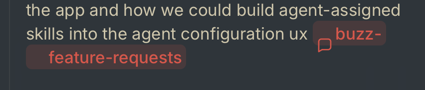 **After — the icon stays attached while the remaining label wraps** The same long repository chip at three composer widths. Its label gains line breaks as space contracts, while the icon remains attached to the leading fragment. **420px — one line**  **210px — two lines** 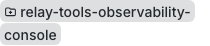 **150px — three lines** 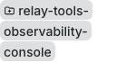 --------- Signed-off-by: Taylor Ho <taylorkmho@gmail.com> Co-authored-by: Carl <acda9e433d19dcd0e6b6840f7f4b98f3a56f1fab98049d444c087019e6d36560@buzz.block.builderlab.xyz>




Buzz
Desktop chat shell with:
- Tauri + React + TypeScript + Vite
- Tailwind CSS
- shadcn/ui-ready shared components
- Biome (lint/format/check)
- Feature-driven frontend structure
Scripts
pnpm dev- run the web frontendpnpm tauri dev- run the desktop apppnpm build- typecheck and build frontendpnpm typecheck- TypeScript checkspnpm lint- Biome lintpnpm format- Biome format (write)pnpm check- Biome check
Structure
src/shared- reusable app-wide code (ui,lib,styles)src/features- feature modules (vertical slices)src/app- top-level app composition