mirror of
https://github.com/block/buzz.git
synced 2026-10-27 12:40:30 +00:00
 03bfc837cb
**Category:** fix **User Impact:** Tooltips now use a higher-contrast surface, making their labels easier to read across desktop themes. **Problem:** Tooltip surfaces could blend into hovered content, making labels difficult to distinguish. **Solution:** Use the existing popover surface and foreground tokens for clearer visual separation and theme-aware contrast. <details> <summary>File changes</summary> **desktop/src/shared/ui/tooltip.tsx** Updates shared tooltip colors to use higher-contrast semantic surface and foreground tokens. </details> ## Reproduction steps 1. Run the desktop app and hover a control that displays a tooltip. 2. Compare the tooltip against the content beneath it in both light and dark themes. 3. Confirm the tooltip surface remains clearly distinguishable and its label is readable. ## Screenshots | Before | After | | --- | --- | | 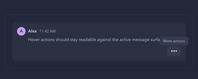 | 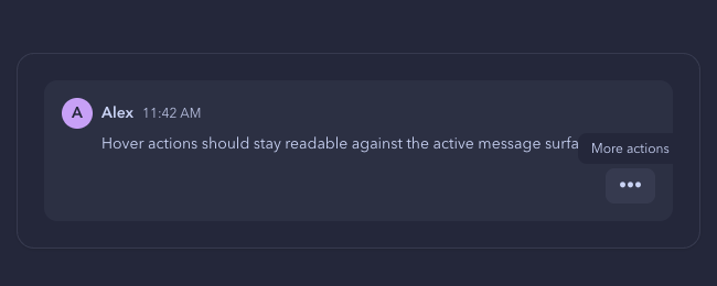 | ## Validation - `pnpm build:e2e` - `pnpm exec playwright test tests/e2e/tooltip-semantics.spec.ts --project=smoke` — 4 passed - `pnpm exec biome check src/shared/ui/tooltip.tsx tests/e2e/tooltip-semantics.spec.ts` - Pre-push desktop checks, typecheck, and unit tests - `git diff --check` - Full smoke project attempted; 345 of 1,222 tests passed without failure before the 10-minute local execution limit. --------- Signed-off-by: Taylor Ho <taylorkmho@gmail.com> Co-authored-by: Carl <acda9e433d19dcd0e6b6840f7f4b98f3a56f1fab98049d444c087019e6d36560@buzz.block.builderlab.xyz>

