mirror of
https://github.com/block/buzz.git
synced 2026-10-27 12:40:30 +00:00
 de8a2741c7
**Category:** improvement **User Impact:** Buzz links in messages now resolve into compact, descriptive chips with predictable navigation, while tooltips use the neutral secondary surface consistently across light and dark themes. **Problem:** Raw Buzz-native links and opaque identifiers make message context difficult to scan, while oversized previews disrupt the conversation. Missing, delayed, or deleted metadata also needs a stable presentation that does not mislead users or break navigation. **Solution:** Keep message and issue chips metadata-independent: message chips render only the channel name, while issue chips render only the repository name—never fetched content/title or an event hash. Fetched context remains available in each hover tooltip. Other native links continue to resolve into concise inline labels, with muted secondary fallbacks, distinct deleted states, and existing navigation paths preserved. This also makes two explicit shared-tooltip behavior changes: 1. **Color:** shared and rich tooltips move from the primary color pair to the neutral secondary semantic pair, including dedicated huddle-token handling and matching rich-descendant foregrounds. 2. **Hover behavior:** tooltip roots set Radix `disableHoverableContent`, and tooltip content is pointer-transparent, so moving off the trigger dismisses the tooltip instead of letting the pointer enter and keep the popover open. Together these preserve readable contrast, authoritative project context, and predictable hover dismissal. <details> <summary>File changes</summary> **desktop/src/features/communities/useCommunityInit.ts** Primes channel metadata needed to resolve native links promptly. **desktop/src/features/messages/lib/messageLinkMetadata.test.mjs** Covers message preview extraction, fallbacks, and deleted-message semantics. **desktop/src/features/messages/lib/messageLinkMetadata.ts** Normalizes fetched message metadata into compact labels and status-aware presentation. **desktop/src/features/messages/ui/SentFromThreadLine.tsx** Provides thread context to linked-message metadata resolution. **desktop/src/shared/lib/useResolvedLinkPreviews.ts** Exposes resolved preview state for native entity chips. **desktop/src/shared/styles/globals/markdown.css** Adds compact chip layout and semantic disabled-state styling. **desktop/src/shared/styles/globals/theme.css** Defines the semantic colors used by unavailable and deleted chips. **desktop/src/shared/ui/markdown.test.mjs** Exercises native-link rendering and provider-backed entity metadata behavior. **desktop/src/shared/ui/markdown.tsx** Routes native markdown links through metadata-aware chip components without changing navigation contracts. **desktop/src/shared/ui/markdown/ChannelDeepLink.test.mjs** Covers resolved, unresolved, private, archived, and forum channel presentations. **desktop/src/shared/ui/markdown/ChannelDeepLink.tsx** Renders channel names and concise channel metadata inline with stable fallbacks. **desktop/src/shared/ui/markdown/MessageLinkPill.tsx** Renders loading, ready, unavailable, DM, forum, and deleted message states compactly. **desktop/src/shared/ui/markdown/entityLinks.tsx** Enriches repository, issue, and pull-request chips and uses containing-project context in tooltips. **desktop/src/shared/ui/markdown/types.ts** Extends markdown runtime metadata required by native chip rendering. **desktop/src/shared/ui/markdown/useMessageLinkMetadata.ts** Fetches and classifies linked-message metadata while preserving navigable fallbacks. **desktop/src/testing/e2eBridge.ts** Adds deterministic metadata controls for runtime visual and navigation tests. **desktop/tailwind.config.js** Makes semantic disabled colors available to chip styles. **desktop/tests/e2e/entity-link-recipient-cards.spec.ts** Verifies entity labels, project-aware tooltips, delayed metadata, and navigation behavior. **desktop/tests/e2e/navigation.spec.ts** Verifies channel and message chip states, metadata resolution, deletion handling, and navigation. **desktop/src/shared/ui/tooltip.tsx** Migrates the shared tooltip surface from the primary color pair to the semantic secondary pair. It also sets Radix `disableHoverableContent` and makes tooltip content pointer-transparent so leaving the trigger dismisses the tooltip predictably. **desktop/src/features/agents/ui/RestartDiffBadge.tsx** Aligns restart-diff tooltip values and supporting copy with the secondary tooltip foreground. **desktop/src/features/channels/ui/AddChannelBotTeamsSection.tsx** Aligns rich team tooltip descriptions, persona chips, avatars, and names with secondary tooltip semantics. **desktop/src/features/projects/ui/ProjectAuthorIdentity.tsx** Uses the matching secondary tooltip foreground for project author metadata. **desktop/src/features/projects/ui/ProjectCards.tsx** Aligns repository-unavailable tooltip descriptions with the secondary tooltip foreground. **desktop/src/shared/styles/globals/utilities.css** Makes huddle tooltips consume their dedicated palette directly without misleading primary or secondary aliases. **desktop/src/shared/styles/globals/tooltipSemantics.test.mjs** Pins direct huddle-token consumption and rejects semantic alias drift. **desktop/tests/e2e/tooltip-semantics.spec.ts** Verifies simple and rich tooltip surfaces and descendant tokens in Buzz light and Catppuccin Mocha dark themes. **desktop/playwright.config.ts** Registers tooltip semantic coverage in the desktop smoke suite. </details> ## Reproduction steps 1. Run the desktop app and open a message containing Buzz links for a channel, message, repository, issue, and pull request. 2. Confirm message links show only the channel name and issue links show only the repository name inline, with no fetched content/title or event hash; confirm other native links remain compact rather than rendering raw identifiers or expanded previews. 3. Hover the chips and confirm the neutral secondary tooltip adds concise context without duplicating the visible label. 4. Open each chip and confirm it follows the same channel, message, repository, issue, or pull-request navigation as before. 5. Inspect links while metadata is loading, unavailable, or definitively deleted and confirm the fallback remains compact, legible, and navigable where appropriate. 6. In Buzz light and Catppuccin Mocha dark themes, compare a simple channel-members tooltip and the rich Add agents team tooltip; both should use secondary semantics with readable nested content. 7. Move the pointer from a trigger toward its tooltip; confirm the tooltip dismisses rather than remaining open as hoverable content. ## Screenshots The matrix below covers both the default light theme and Catppuccin Mocha with an orange accent. Message/issue-chip rows affected by the stable-label pivot are temporarily omitted until they can be recaptured from the real built UI; the prior images showed the obsolete expanding inline label. | State | Default light | Dark · orange accent | |---|---|---| | Public stream channel tooltip | 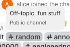 | 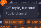 | | Private forum channel tooltip | 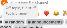 | 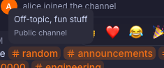 | | Public forum channel tooltip | 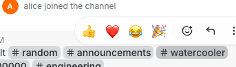 | 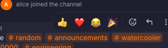 | | Channel references, including unresolved |  |  | | Unknown channel permalink |  |  | | Archived channel tooltip | 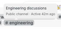 | 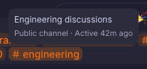 | | Repository entity | 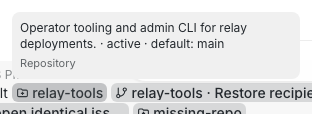 | 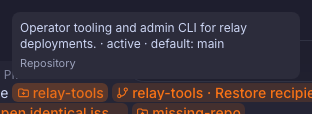 | | Pull request entity | 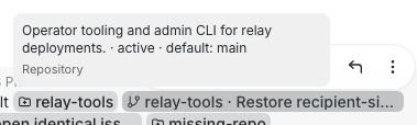 | 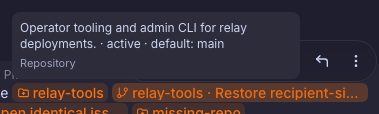 | | Entity metadata fallback | 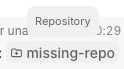 | 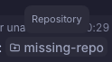 | ### Tooltip semantic surface spot check | Buzz light | Catppuccin Mocha dark | |---|---| | 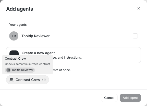 | 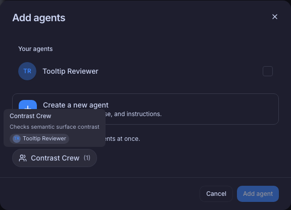 | --------- Signed-off-by: Taylor Ho <taylorkmho@gmail.com> Co-authored-by: Carl <acda9e433d19dcd0e6b6840f7f4b98f3a56f1fab98049d444c087019e6d36560@buzz.block.builderlab.xyz>




















Buzz
Desktop chat shell with:
- Tauri + React + TypeScript + Vite
- Tailwind CSS
- shadcn/ui-ready shared components
- Biome (lint/format/check)
- Feature-driven frontend structure
Scripts
pnpm dev- run the web frontendpnpm tauri dev- run the desktop apppnpm build- typecheck and build frontendpnpm typecheck- TypeScript checkspnpm lint- Biome lintpnpm format- Biome format (write)pnpm check- Biome check
Structure
src/shared- reusable app-wide code (ui,lib,styles)src/features- feature modules (vertical slices)src/app- top-level app composition