mirror of
https://github.com/block/buzz.git
synced 2026-10-27 20:41:57 +00:00
 a567dfc2df
## Summary - combine channel identity, actions, member previews, and lifecycle controls in one navigable mobile details page - add compact member management and desktop-aligned channel editing - smooth the profile entrance transition and standardize settings-group spacing - align Huddle lifecycle rows with regular message author and body spacing ## Testing - `just mobile-check` - `just mobile-test` — 1,477 tests - Pixel 10 debug build, install, and interaction review ## Snapshots ### Channel header 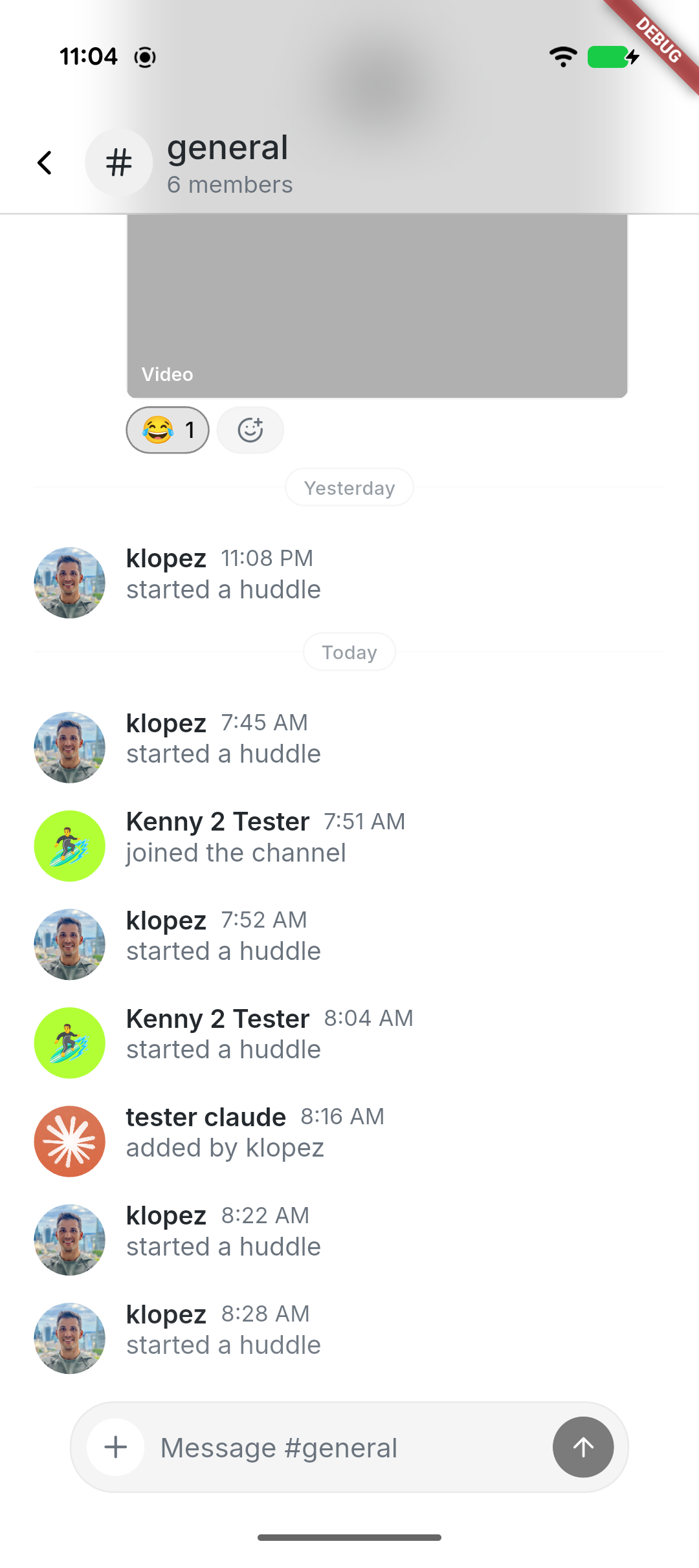 ### Combined channel details 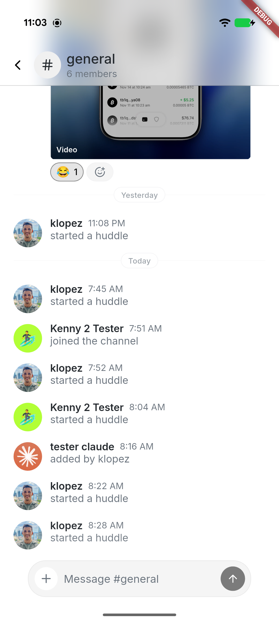 ### Manage channel 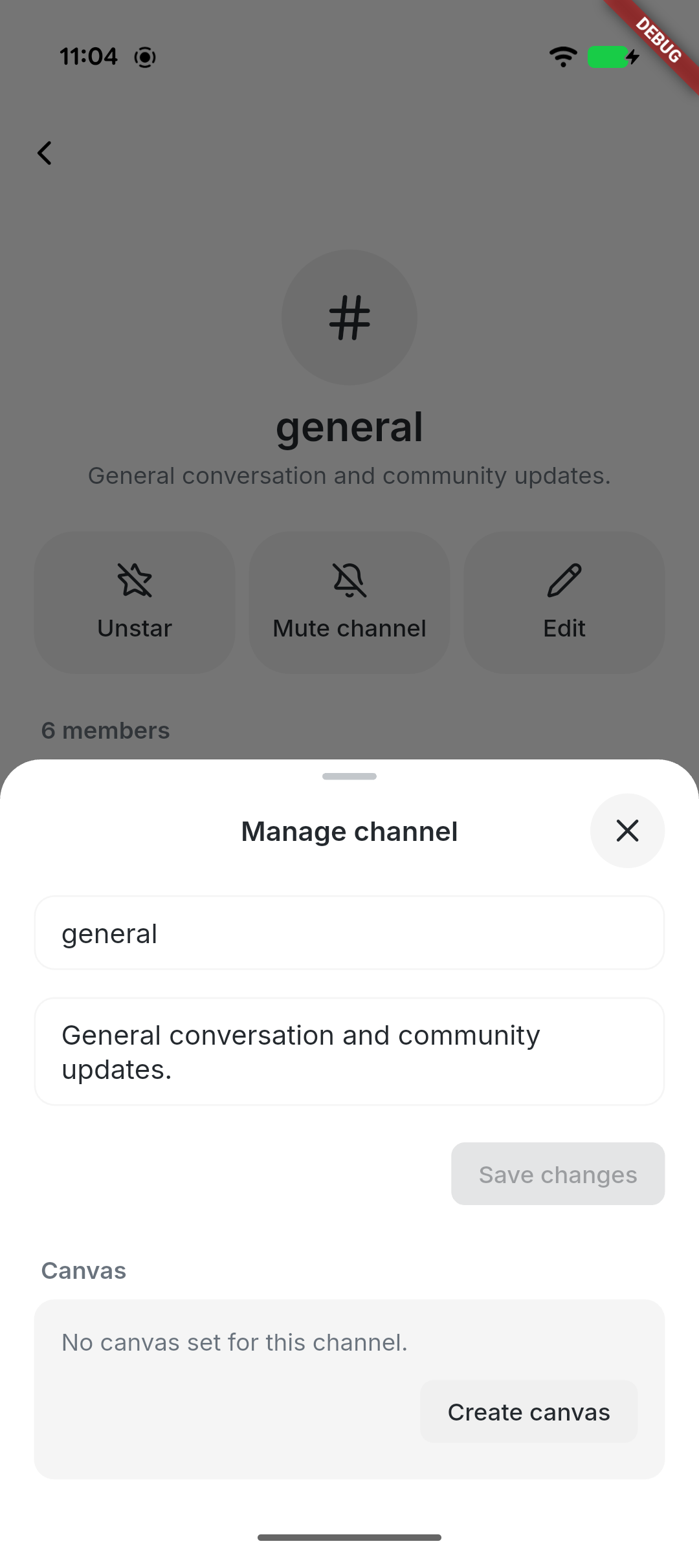 --------- Signed-off-by: kenny lopez <klopez4212@gmail.com> Signed-off-by: Fast Fizz <2df81cb51f05a9d5387ef24d7b9ecb8fcdfcd1c70ffabc67061c9596e1b5b1c4@buzz.block.builderlab.xyz> Co-authored-by: Fast Fizz <2df81cb51f05a9d5387ef24d7b9ecb8fcdfcd1c70ffabc67061c9596e1b5b1c4@buzz.block.builderlab.xyz>



175 lines
5.3 KiB
Dart
175 lines
5.3 KiB
Dart
import 'package:flutter/material.dart';
|
|
|
|
import '../theme/theme.dart';
|
|
import 'app_list_inset.dart';
|
|
|
|
/// Widest an inline [AppListRow.value] may grow before it ellipsises, leaving
|
|
/// room for a reasonable title beside it.
|
|
const double _maxValueWidth = 180.0;
|
|
|
|
/// Row height comes entirely from this padding — rows carry a single line of
|
|
/// text most of the time, so it sets how airy a card reads.
|
|
const double _rowVerticalPadding = Grid.xs;
|
|
|
|
/// A flush, borderless settings/list row: leading icon, title, optional
|
|
/// subtitle and trailing widget. Its own background comes from whatever
|
|
/// contains it — a grouped card, or the page itself.
|
|
class AppListRow extends StatelessWidget {
|
|
const AppListRow({
|
|
super.key,
|
|
this.icon,
|
|
required this.title,
|
|
this.subtitle,
|
|
this.subtitleStyle,
|
|
this.subtitleMaxLines,
|
|
this.value,
|
|
this.trailing,
|
|
this.titleColor,
|
|
this.onTap,
|
|
});
|
|
|
|
final IconData? icon;
|
|
final String title;
|
|
final String? subtitle;
|
|
final TextStyle? subtitleStyle;
|
|
final int? subtitleMaxLines;
|
|
|
|
/// The row's current setting, shown muted on the trailing side next to
|
|
/// [trailing] — for rows whose value is short enough to sit inline.
|
|
final String? value;
|
|
|
|
final Widget? trailing;
|
|
final Color? titleColor;
|
|
final VoidCallback? onTap;
|
|
|
|
@override
|
|
Widget build(BuildContext context) {
|
|
final row = Padding(
|
|
padding: EdgeInsets.symmetric(
|
|
horizontal: AppListInset.of(context),
|
|
vertical: _rowVerticalPadding,
|
|
),
|
|
child: Row(
|
|
// Centred rather than baseline-aligned to the title: on a two-line row
|
|
// the icon and trailing control read as belonging to the row, not to
|
|
// its first line.
|
|
children: [
|
|
if (icon != null) ...[
|
|
Icon(
|
|
icon,
|
|
size: 22,
|
|
color: titleColor ?? context.colors.onSurfaceVariant,
|
|
),
|
|
const SizedBox(width: Grid.xs),
|
|
],
|
|
Expanded(
|
|
child: Column(
|
|
crossAxisAlignment: CrossAxisAlignment.start,
|
|
mainAxisSize: MainAxisSize.min,
|
|
children: [
|
|
Text(
|
|
title,
|
|
style: context.textTheme.bodyLarge?.copyWith(
|
|
color: titleColor,
|
|
),
|
|
),
|
|
if (subtitle != null) ...[
|
|
const SizedBox(height: Grid.quarter),
|
|
Text(
|
|
subtitle!,
|
|
style:
|
|
subtitleStyle ??
|
|
context.textTheme.bodySmall?.copyWith(
|
|
color: context.colors.onSurfaceVariant,
|
|
),
|
|
maxLines: subtitleMaxLines,
|
|
overflow: subtitleMaxLines == null
|
|
? null
|
|
: TextOverflow.ellipsis,
|
|
),
|
|
],
|
|
],
|
|
),
|
|
),
|
|
if (value != null) ...[
|
|
const SizedBox(width: Grid.xxs),
|
|
// Inflexible, so the title's Expanded absorbs the slack and the
|
|
// value stays flush against the trailing edge; capped instead of
|
|
// flexed so a long value ellipsises rather than overflowing.
|
|
ConstrainedBox(
|
|
constraints: const BoxConstraints(maxWidth: _maxValueWidth),
|
|
child: Text(
|
|
value!,
|
|
style: context.textTheme.bodyMedium?.copyWith(
|
|
color: context.colors.onSurfaceVariant,
|
|
),
|
|
maxLines: 1,
|
|
overflow: TextOverflow.ellipsis,
|
|
textAlign: TextAlign.right,
|
|
),
|
|
),
|
|
],
|
|
if (trailing != null) ...[const SizedBox(width: Grid.xxs), trailing!],
|
|
],
|
|
),
|
|
);
|
|
|
|
if (onTap == null) return row;
|
|
return InkWell(onTap: onTap, child: row);
|
|
}
|
|
}
|
|
|
|
/// A custom leading widget variant of [AppListRow] for rows whose leading
|
|
/// slot is not a plain [IconData] (e.g. an emoji or image).
|
|
class AppListRowRaw extends StatelessWidget {
|
|
const AppListRowRaw({
|
|
super.key,
|
|
required this.leading,
|
|
required this.title,
|
|
this.subtitle,
|
|
this.trailing,
|
|
this.onTap,
|
|
this.verticalPadding = _rowVerticalPadding,
|
|
});
|
|
|
|
final Widget leading;
|
|
final Widget title;
|
|
final Widget? subtitle;
|
|
final Widget? trailing;
|
|
final VoidCallback? onTap;
|
|
final double verticalPadding;
|
|
|
|
@override
|
|
Widget build(BuildContext context) {
|
|
final row = Padding(
|
|
padding: EdgeInsets.symmetric(
|
|
horizontal: AppListInset.of(context),
|
|
vertical: verticalPadding,
|
|
),
|
|
child: Row(
|
|
children: [
|
|
leading,
|
|
const SizedBox(width: Grid.xs),
|
|
Expanded(
|
|
child: Column(
|
|
crossAxisAlignment: CrossAxisAlignment.start,
|
|
mainAxisSize: MainAxisSize.min,
|
|
children: [
|
|
title,
|
|
if (subtitle != null) ...[
|
|
const SizedBox(height: Grid.quarter),
|
|
subtitle!,
|
|
],
|
|
],
|
|
),
|
|
),
|
|
if (trailing != null) ...[const SizedBox(width: Grid.xxs), trailing!],
|
|
],
|
|
),
|
|
);
|
|
|
|
if (onTap == null) return row;
|
|
return InkWell(onTap: onTap, child: row);
|
|
}
|
|
}
|