mirror of
https://github.com/block/buzz.git
synced 2026-11-06 17:31:19 +00:00
 5d44038ea5
## Summary
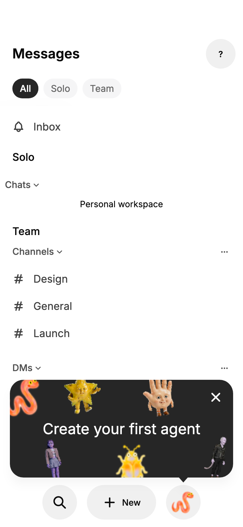
New users had no cue that the slot at the bottom of Home is where they
make an agent. A one-time, deliberately loud "Create your first agent"
card now sits above the empty Bestie slot and points at it.
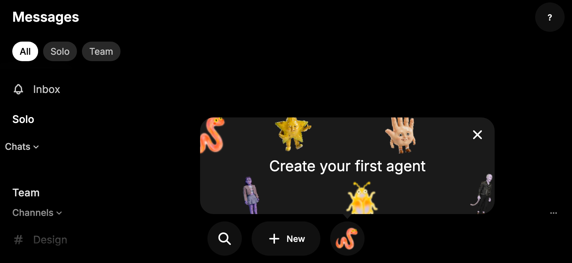
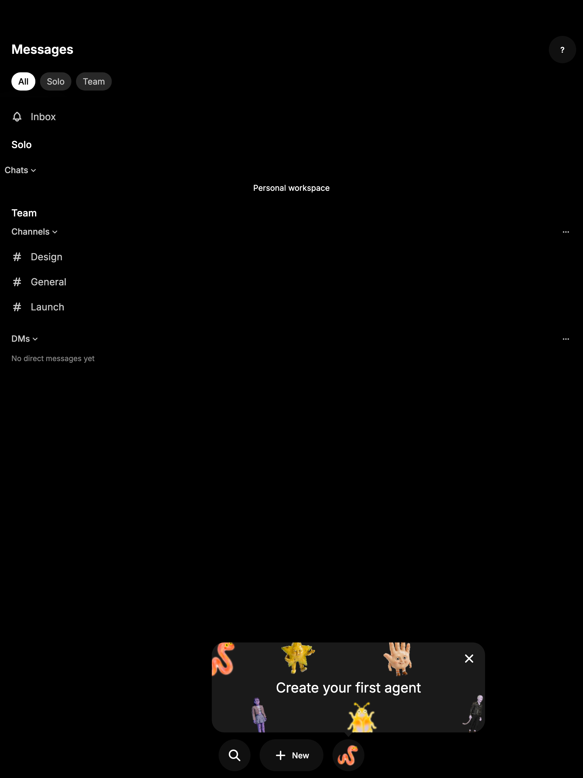
- The card spans the screen above the bottom bar, with agent pictures
(the same ones the empty slot cycles through) scattered around its edges
and the message centered as plain text. It's allowed to cover part of
the chat list.
- It waits three seconds on Home, then pops up from the agent slot with
the popover entrance (a quick fade, rise and scale). Leaving Home
restarts the wait, so it never pops over another screen. With reduced
motion it appears without animation after the same wait.
- Tapping the card starts agent creation. The close button dismisses it
for good, as does a screen reader's dismiss action, activating the slot,
or ending up with a Bestie. Dismissal is remembered per account and
community. Other taps on Home go through to the page and leave the card
up.
- It shows when remote agents are on, the Bestie preference has loaded
with none set, and the account owns no agents yet. The last check keeps
existing users who never picked a Bestie from being told to create their
"first" agent.
- It only shows while Home is the current route, so sheets and pushed
screens hide it and it comes back afterwards if it was never dismissed.
The card is a new `BuzzCallout.card` variant of the reusable
`BuzzCallout` in the mobile design system (the plain tip variant stays
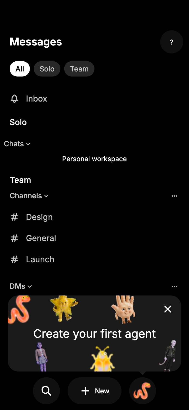
available). It uses the inverse surface in light mode and the raised
dark surface in dark mode (matching toasts), with an arrow, existing
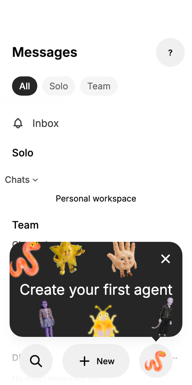
radius, spacing and popover elevation tokens, and stays phone-sized on
wider screens. It grows to fit large text below its close button, and it
has live-region semantics, so screen readers announce it.
## Screenshots
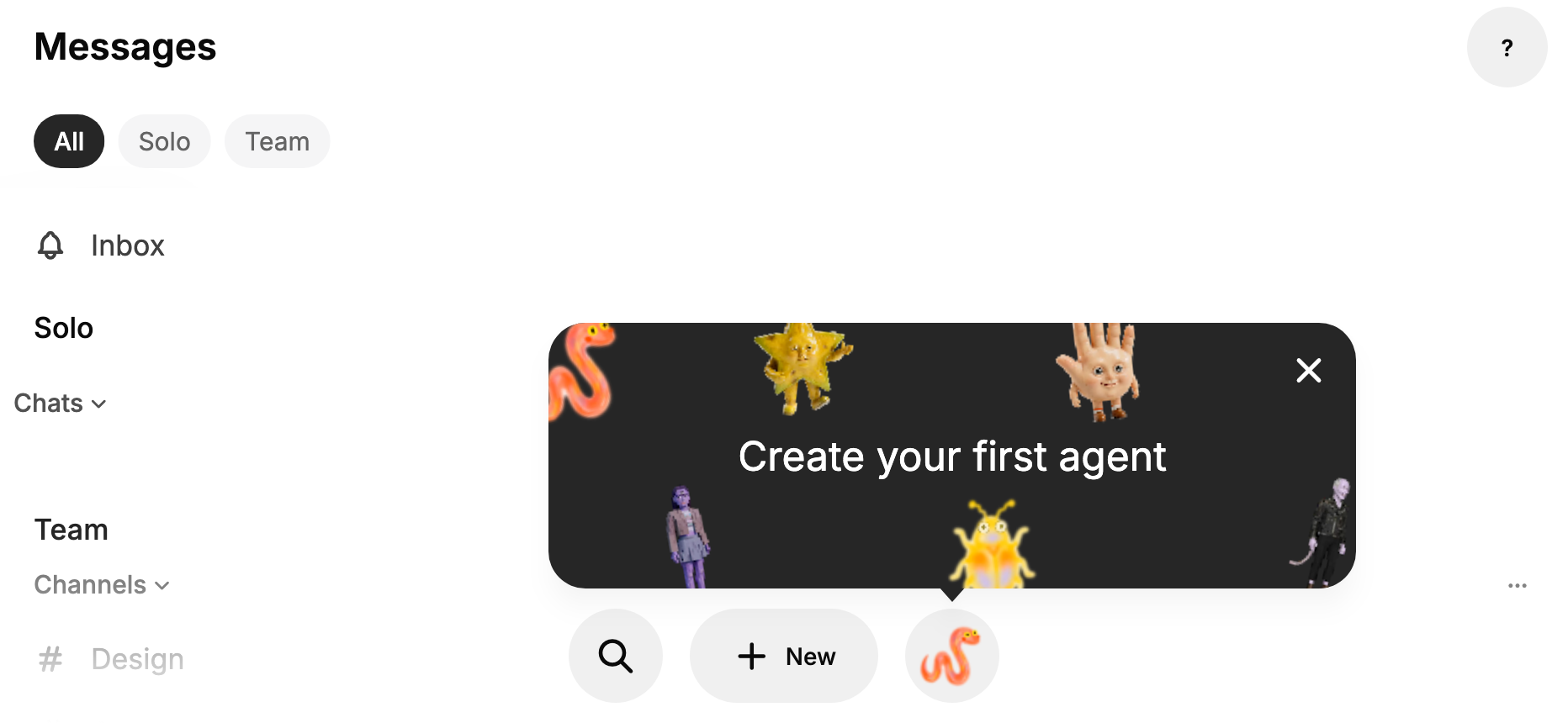
These come from the widget test harness with the real agent pictures, at
small (320), standard (393) and landscape phone sizes, plus a tablet.
The harness can't render the native iOS glass bar, so these use the
Flutter bar; the card is the same on both platforms. Pictures look a
little soft because the harness renders at 1x and scales up. In
landscape and on tablets the card stops at large-phone width so the
pictures don't spread too thin.
| Standard, light | Standard, dark | Small, light |
| --- | --- | --- |
| 
| 
| 
|
| Landscape, light | Landscape, dark |
| --- | --- |
| 
| 
|
| Tablet, dark |
| --- |
| 
|
## Testing
- Launcher tests cover first show and placement, Home staying tappable
underneath without dismissing, the card tap starting creation, the close
button, slot activation without a touch, screen reader dismiss, a Bestie
appearing, no reshow after dismissal, a separate community getting its
own first run, staying hidden for people with agents or without remote
agents, hiding under a sheet, the three-second wait and entrance,
reduced motion, and leaving Home during the wait (each
mutation-checked).
- Component tests cover the tip beside an edge target (320 and 1024
wide, 3x text) and the card: full width at 320, capped on wide screens,
growing at 3x text so the message stays clear of the close button
(mutation-checked), and the close button staying its own screen reader
control.
- The full mobile suite passes locally with CI's dart-defines, and
pre-push mobile checks passed at e2fdb791c.
- Still needs a device check on a real iPhone with a fresh account.
🤖 Generated with [Claude Code](https://claude.com/claude-code)
---------
Signed-off-by: morgmart <98432065+morgmart@users.noreply.github.com>
Co-authored-by: Carl <c217fe6b9d958f41c3a5e030dccc7f626775a923089cb6491305eade75ea1f1b@buzz.block.builderlab.xyz>
Co-authored-by: Claude Opus 5.5 <noreply@anthropic.com>
Co-authored-by: Morgarita <6e967af659416160ab4f2fd56d74c8c6f273791ee7bfc9468a1be37c387947be@buzz.block.builderlab.xyz>






376 lines
12 KiB
Dart
376 lines
12 KiB
Dart
import 'dart:async';
|
|
import 'dart:math' as math;
|
|
|
|
import 'package:flutter/material.dart';
|
|
import 'package:flutter/rendering.dart';
|
|
import 'package:flutter_hooks/flutter_hooks.dart';
|
|
|
|
import '../theme/buzz_icons.dart';
|
|
import '../theme/theme.dart';
|
|
import 'anchored_popover_menu.dart';
|
|
|
|
const _arrowHeight = Grid.xxs;
|
|
const _arrowWidth = Grid.xs;
|
|
const _targetGap = Grid.half;
|
|
const _cardMaxWidth = Grid.xxxl * 6;
|
|
|
|
/// A non-blocking callout card that points down at [child] while [visible].
|
|
///
|
|
/// It floats above everything else on the current route without a scrim, so
|
|
/// the screen underneath stays usable, and hides while another route covers
|
|
/// this one. With a [delay], it waits that long on screen before popping up
|
|
/// from [child], and the wait restarts whenever it's covered.
|
|
///
|
|
/// The card spans a phone, with [artwork] scattered around a centered
|
|
/// message. Tapping it calls [onTap]; only its close button, or a screen
|
|
/// reader's dismiss action, calls [onDismiss].
|
|
class BuzzCallout extends HookWidget {
|
|
const BuzzCallout({
|
|
required this.message,
|
|
required this.visible,
|
|
required this.onTap,
|
|
required this.onDismiss,
|
|
required this.child,
|
|
this.artwork = const [],
|
|
this.delay = Duration.zero,
|
|
super.key,
|
|
});
|
|
|
|
final String message;
|
|
final bool visible;
|
|
final VoidCallback onTap;
|
|
final VoidCallback onDismiss;
|
|
|
|
/// Up to six pictures scattered around the card's edges.
|
|
final List<Widget> artwork;
|
|
final Duration delay;
|
|
final Widget child;
|
|
|
|
@override
|
|
Widget build(BuildContext context) {
|
|
final eligible = visible && (ModalRoute.of(context)?.isCurrent ?? true);
|
|
final waited = useState(false);
|
|
useEffect(() {
|
|
waited.value = false;
|
|
if (!eligible || delay == Duration.zero) return null;
|
|
return Timer(delay, () => waited.value = true).cancel;
|
|
}, [eligible, delay]);
|
|
final showing = eligible && (delay == Duration.zero || waited.value);
|
|
final reducedMotion = MediaQuery.disableAnimationsOf(context);
|
|
final entrance = useAnimationController(duration: appPopoverEnterDuration);
|
|
final controller = useMemoized(OverlayPortalController.new);
|
|
useEffect(() {
|
|
if (!showing) {
|
|
entrance.value = 0;
|
|
} else if (reducedMotion) {
|
|
entrance.value = 1;
|
|
} else {
|
|
unawaited(entrance.forward(from: 0));
|
|
}
|
|
// The controller can't change during a build, so it follows a frame
|
|
// behind; the builder below hides the callout in the meantime.
|
|
WidgetsBinding.instance.addPostFrameCallback((_) {
|
|
if (!context.mounted || showing == controller.isShowing) return;
|
|
showing ? controller.show() : controller.hide();
|
|
});
|
|
return null;
|
|
}, [showing]);
|
|
return OverlayPortal.overlayChildLayoutBuilder(
|
|
controller: controller,
|
|
overlayChildBuilder: (context, info) {
|
|
if (!showing) return const SizedBox.shrink();
|
|
final target = MatrixUtils.transformRect(
|
|
info.childPaintTransform,
|
|
Offset.zero & info.childSize,
|
|
);
|
|
final padding = MediaQuery.paddingOf(context);
|
|
final placement = _CalloutPlacement(
|
|
target: target,
|
|
margin: EdgeInsets.only(
|
|
left: padding.left + Grid.xs,
|
|
right: padding.right + Grid.xs,
|
|
top: padding.top + Grid.xs,
|
|
),
|
|
color: _calloutColors(context).$1,
|
|
shadowColor: appPopoverShadowColor(context),
|
|
child: _Card(
|
|
message: message,
|
|
artwork: artwork,
|
|
onTap: onTap,
|
|
onDismiss: onDismiss,
|
|
),
|
|
);
|
|
// Pops up from the target: a fade and a short rise while scaling up
|
|
// around the arrow's tip.
|
|
return AnimatedBuilder(
|
|
animation: entrance,
|
|
builder: (context, placement) {
|
|
final t = appPopoverEnterCurve.transform(entrance.value);
|
|
return Opacity(
|
|
opacity: t,
|
|
child: Transform.translate(
|
|
offset: Offset(0, (1 - t) * Grid.xxs),
|
|
child: Transform.scale(
|
|
scale: appPopoverStartScale + (1 - appPopoverStartScale) * t,
|
|
alignment: Alignment.topLeft,
|
|
origin: Offset(target.center.dx, target.top),
|
|
child: placement,
|
|
),
|
|
),
|
|
);
|
|
},
|
|
child: placement,
|
|
);
|
|
},
|
|
child: child,
|
|
);
|
|
}
|
|
}
|
|
|
|
/// The callout's background and foreground. Inverse colors set it apart from
|
|
/// menus and the page; in dark mode, whose inverse is a flat light gray, it
|
|
/// uses the raised dark surface instead, as toasts do.
|
|
(Color, Color) _calloutColors(BuildContext context) {
|
|
final colors = context.colors;
|
|
return Theme.of(context).brightness == Brightness.dark
|
|
? (colors.surfaceContainer, colors.onSurface)
|
|
: (colors.inverseSurface, colors.onInverseSurface);
|
|
}
|
|
|
|
/// Where the card's artwork sits, after desktop's empty Agents tile: each
|
|
/// picture hangs partly off an edge, tilted, clear of the close button. The
|
|
/// message sits on top where they meet.
|
|
const _scatter = [
|
|
(Alignment(-1.12, -1.3), -0.21),
|
|
(Alignment(-0.42, -1.45), 0.12),
|
|
(Alignment(-0.78, 1.4), -0.17),
|
|
(Alignment(0.12, 1.5), 0.08),
|
|
(Alignment(0.45, -1.4), -0.1),
|
|
(Alignment(1.12, 1.25), 0.21),
|
|
];
|
|
|
|
class _Card extends StatelessWidget {
|
|
const _Card({
|
|
required this.message,
|
|
required this.artwork,
|
|
required this.onTap,
|
|
required this.onDismiss,
|
|
});
|
|
|
|
final String message;
|
|
final List<Widget> artwork;
|
|
final VoidCallback onTap;
|
|
final VoidCallback onDismiss;
|
|
|
|
@override
|
|
Widget build(BuildContext context) {
|
|
// Not a live region: it reappears on every return to Home, and would be
|
|
// announced each time. It stays in traversal with its actions.
|
|
return Semantics(
|
|
container: true,
|
|
button: true,
|
|
label: message,
|
|
onTap: onTap,
|
|
onDismiss: onDismiss,
|
|
child: GestureDetector(
|
|
behavior: HitTestBehavior.opaque,
|
|
excludeFromSemantics: true,
|
|
onTap: onTap,
|
|
child: ClipRRect(
|
|
borderRadius: BorderRadius.circular(Radii.popover),
|
|
child: Stack(
|
|
children: [
|
|
for (final (index, picture)
|
|
in artwork.take(_scatter.length).indexed)
|
|
Positioned.fill(
|
|
child: Align(
|
|
alignment: _scatter[index].$1,
|
|
child: Transform.rotate(
|
|
angle: _scatter[index].$2,
|
|
child: SizedBox.square(
|
|
dimension: Grid.xxxl,
|
|
child: ExcludeSemantics(child: picture),
|
|
),
|
|
),
|
|
),
|
|
),
|
|
// The message sets the card's height, keeping a close-button
|
|
// row above it at any text size. Where large text outgrows the
|
|
// room above the target, it scrolls instead of clipping. The
|
|
// card itself carries the message for screen readers.
|
|
ExcludeSemantics(
|
|
child: SingleChildScrollView(
|
|
primary: false,
|
|
padding: const EdgeInsets.symmetric(
|
|
horizontal: Grid.xs,
|
|
vertical: Grid.xxl,
|
|
),
|
|
child: Center(
|
|
heightFactor: 1,
|
|
child: Text(
|
|
message,
|
|
textAlign: TextAlign.center,
|
|
style: context.textTheme.titleLarge?.copyWith(
|
|
color: _calloutColors(context).$2,
|
|
),
|
|
),
|
|
),
|
|
),
|
|
),
|
|
Positioned(
|
|
top: Grid.half,
|
|
right: Grid.half,
|
|
child: IconButton(
|
|
tooltip: 'Dismiss',
|
|
onPressed: onDismiss,
|
|
color: _calloutColors(context).$2,
|
|
icon: const Icon(BuzzIcons.x),
|
|
),
|
|
),
|
|
],
|
|
),
|
|
),
|
|
),
|
|
);
|
|
}
|
|
}
|
|
|
|
/// Fills the overlay, placing its child above [target] inside [margin] and
|
|
/// painting one surface for the bubble and its arrow. Only the bubble is
|
|
/// hit-testable, so the rest of the screen keeps receiving touches.
|
|
class _CalloutPlacement extends SingleChildRenderObjectWidget {
|
|
const _CalloutPlacement({
|
|
required this.target,
|
|
required this.margin,
|
|
required this.color,
|
|
required this.shadowColor,
|
|
required super.child,
|
|
});
|
|
|
|
final Rect target;
|
|
final EdgeInsets margin;
|
|
final Color color;
|
|
final Color shadowColor;
|
|
|
|
@override
|
|
_RenderCalloutPlacement createRenderObject(BuildContext context) =>
|
|
_RenderCalloutPlacement(target, margin, color, shadowColor);
|
|
|
|
@override
|
|
void updateRenderObject(
|
|
BuildContext context,
|
|
_RenderCalloutPlacement renderObject,
|
|
) {
|
|
renderObject
|
|
..target = target
|
|
..margin = margin
|
|
..color = color
|
|
..shadowColor = shadowColor;
|
|
}
|
|
}
|
|
|
|
class _RenderCalloutPlacement extends RenderShiftedBox {
|
|
_RenderCalloutPlacement(
|
|
this._target,
|
|
this._margin,
|
|
this._color,
|
|
this._shadowColor,
|
|
) : super(null);
|
|
|
|
Rect _target;
|
|
set target(Rect value) {
|
|
if (value == _target) return;
|
|
_target = value;
|
|
markNeedsLayout();
|
|
}
|
|
|
|
EdgeInsets _margin;
|
|
set margin(EdgeInsets value) {
|
|
if (value == _margin) return;
|
|
_margin = value;
|
|
markNeedsLayout();
|
|
}
|
|
|
|
Color _color;
|
|
set color(Color value) {
|
|
if (value == _color) return;
|
|
_color = value;
|
|
markNeedsPaint();
|
|
}
|
|
|
|
Color _shadowColor;
|
|
set shadowColor(Color value) {
|
|
if (value == _shadowColor) return;
|
|
_shadowColor = value;
|
|
markNeedsPaint();
|
|
}
|
|
|
|
Path _path = Path();
|
|
|
|
@override
|
|
void performLayout() {
|
|
size = constraints.biggest;
|
|
final child = this.child;
|
|
if (child == null) return;
|
|
final bottom = _target.top - _targetGap - _arrowHeight;
|
|
final room = math.max(0.0, size.width - _margin.horizontal);
|
|
// The card spans a phone; on wider screens it stays phone-sized.
|
|
final width = math.min(room, _cardMaxWidth);
|
|
child.layout(
|
|
BoxConstraints(
|
|
minWidth: width,
|
|
maxWidth: width,
|
|
maxHeight: math.max(0, bottom - _margin.top),
|
|
),
|
|
parentUsesSize: true,
|
|
);
|
|
final left = (_target.center.dx - child.size.width / 2)
|
|
.clamp(
|
|
_margin.left,
|
|
math.max(_margin.left, size.width - _margin.right - child.size.width),
|
|
)
|
|
.toDouble();
|
|
final offset = Offset(left, bottom - child.size.height);
|
|
(child.parentData! as BoxParentData).offset = offset;
|
|
|
|
final bubble = offset & child.size;
|
|
final radius = math.min(Radii.popover, bubble.shortestSide / 2);
|
|
// Keep the arrow's base clear of the rounded corners.
|
|
final arrowX = _target.center.dx
|
|
.clamp(
|
|
bubble.left + radius + _arrowWidth / 2,
|
|
math.max(
|
|
bubble.left + radius + _arrowWidth / 2,
|
|
bubble.right - radius - _arrowWidth / 2,
|
|
),
|
|
)
|
|
.toDouble();
|
|
// One outline, so the shadow doesn't cross where the arrow joins.
|
|
_path = Path.combine(
|
|
PathOperation.union,
|
|
Path()
|
|
..addRRect(RRect.fromRectAndRadius(bubble, Radius.circular(radius))),
|
|
Path()..addPolygon([
|
|
Offset(arrowX - _arrowWidth / 2, bubble.bottom - 1),
|
|
Offset(arrowX, bubble.bottom + _arrowHeight),
|
|
Offset(arrowX + _arrowWidth / 2, bubble.bottom - 1),
|
|
], true),
|
|
);
|
|
}
|
|
|
|
@override
|
|
void paint(PaintingContext context, Offset offset) {
|
|
final child = this.child;
|
|
if (child == null) return;
|
|
final path = _path.shift(offset);
|
|
final canvas = context.canvas;
|
|
canvas.drawShadow(path, _shadowColor, appPopoverElevation, _color.a < 1);
|
|
canvas.drawPath(path, Paint()..color = _color);
|
|
super.paint(context, offset);
|
|
}
|
|
|
|
@override
|
|
bool hitTest(BoxHitTestResult result, {required Offset position}) =>
|
|
hitTestChildren(result, position: position);
|
|
}
|