mirror of
https://github.com/block/buzz.git
synced 2026-11-12 20:31:12 +00:00
 c8ea4fb4eb
## Summary
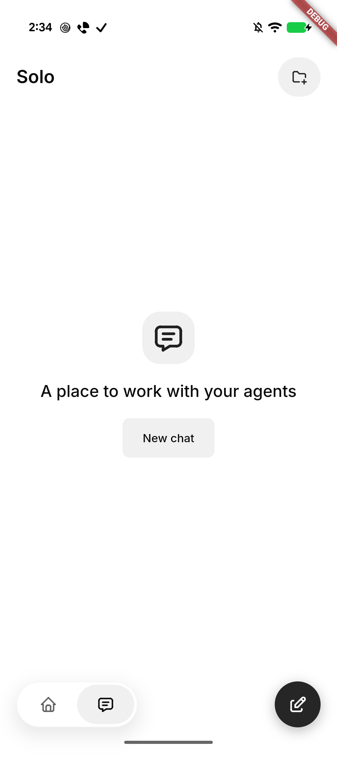
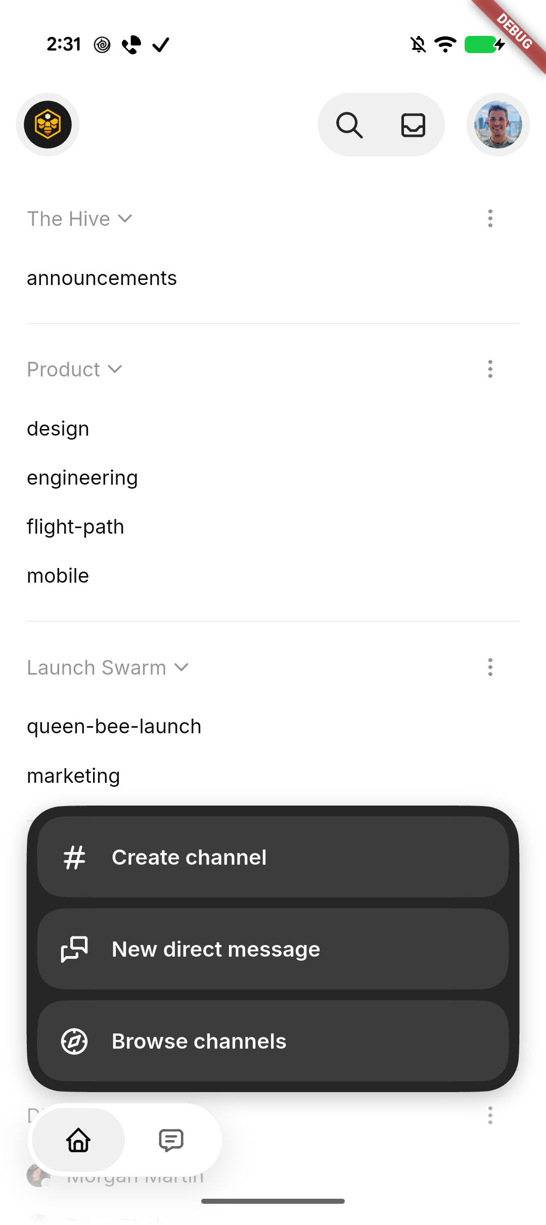
Polish mobile Home and Solo: group Search/Inbox beside a separate
profile avatar, move Inbox and Settings to bottom-up pages with Close
controls, and place tabs opposite the plus/compose action. Morph plus to
compose clockwise when entering Solo and reverse counterclockwise when
returning Home, with a directional quarter-turn of the icon inside a
level button and a subtle scale pulse, respecting reduced motion. Align
Search’s Close control with Inbox, simplify its placeholder, and
initialize selected filter contrast correctly. Collapse the plus menu
when leaving Home. Center Solo’s native-glass New chat empty state and
keep it stationary behind the keyboard.

Standardize Tabler icons and neutral backgrounds, retain SF Back/Close
on iOS, use native Liquid Glass headers, tab container, and actions
(solid grey selected tab, slightly darker on iOS) on iOS and black
actions on Android, and smooth the expanded menu corners. Repair native
header safe-area/return layout and compose movement after cancellation.

### Related issue
None found for this UI refinement; follows #8337.

### Testing
- Formatting, analysis, full mobile suite: 3,487 passed, 4 skipped; 3
push-configuration tests passed. File-size checks passed.
- Base UI built and installed on Pixel and iPhone in place. Pixel
navigation/New chat cancellation checked. Subsequent glass and rotation
refinements are previewed on iPhone; motion feel awaits human
confirmation.
- Draft pending human confirmation of the final Settings entrance/return
behavior on iPhone.

### Pixel snapshots
| Solo | Expanded actions |
| --- | --- |
| <img
src="https://raw.githubusercontent.com/block/buzz/16dc0f8af971e63d788fee20974997fab925dec9/docs/screenshots/mobile-home-solo/pixel-solo.png"
width="280" alt="Solo empty state with New chat" /> | <img
src="https://raw.githubusercontent.com/block/buzz/16dc0f8af971e63d788fee20974997fab925dec9/docs/screenshots/mobile-home-solo/pixel-actions.png"
width="280" alt="Expanded channel actions with smooth corners" /> |

---------

Signed-off-by: kenny lopez <klopez4212@gmail.com>
Co-authored-by: Terp <5856f6900e8e0a4e0ea1f4f8d2ee33e4753d2119bc122f94ecafc660b46c0511@buzz.block.builderlab.xyz>
116 lines
3.6 KiB
Dart
116 lines
3.6 KiB
Dart
import 'package:flutter/material.dart';
|
|
import 'package:hooks_riverpod/hooks_riverpod.dart';
|
|
|
|
import '../../shared/animated_avatar.dart';
|
|
import '../../shared/theme/theme.dart';
|
|
import '../../shared/widgets/avatar_image.dart';
|
|
import '../../shared/widgets/masked_avatar_badge.dart';
|
|
import 'profile_provider.dart';
|
|
import '../../shared/profile/user_profile.dart';
|
|
|
|
/// Matches desktop's sidebar profile card, whose avatar is 32px.
|
|
const _defaultAvatarSize = 32.0;
|
|
|
|
/// The visible dot is smaller than the notch it sits in, so a ring of
|
|
/// background separates it from the avatar. Desktop's `h-2 w-2` dot inside a
|
|
/// `h-3.5 w-3.5` badge frame.
|
|
const _presenceDotRatio = 8 / 14;
|
|
|
|
/// User avatar with a presence dot indicator, for use in the app bar.
|
|
///
|
|
/// The dot sits in a notch masked out of the avatar rather than overlapping it,
|
|
/// the same treatment desktop's `SidebarProfileCard` uses — so it needs no
|
|
/// background-coloured ring, and reads correctly over the themed top section.
|
|
class ProfileAvatar extends ConsumerWidget {
|
|
final VoidCallback? onTap;
|
|
final bool showPresence;
|
|
|
|
/// The avatar diameter in logical pixels; defaults to the 32px desktop match.
|
|
final double size;
|
|
|
|
const ProfileAvatar({
|
|
super.key,
|
|
this.onTap,
|
|
this.showPresence = true,
|
|
this.size = _defaultAvatarSize,
|
|
});
|
|
|
|
@override
|
|
Widget build(BuildContext context, WidgetRef ref) {
|
|
final profileAsync = ref.watch(profileProvider);
|
|
final presenceAsync = ref.watch(presenceProvider);
|
|
final presence = presenceAsync.when(
|
|
data: (v) => v,
|
|
loading: () => 'online',
|
|
error: (_, _) => 'offline',
|
|
);
|
|
|
|
return profileAsync.when(
|
|
loading: () => _buildPlaceholder(context),
|
|
error: (_, _) => _buildAvatar(context, null, presence),
|
|
data: (profile) => _buildAvatar(context, profile, presence),
|
|
);
|
|
}
|
|
|
|
Widget _buildPlaceholder(BuildContext context) {
|
|
return CircleAvatar(
|
|
radius: size / 2,
|
|
backgroundColor: context.controlSurface,
|
|
);
|
|
}
|
|
|
|
Widget _buildAvatar(
|
|
BuildContext context,
|
|
UserProfile? profile,
|
|
String presence,
|
|
) {
|
|
final animatedAvatar = parseAnimatedAvatarUrl(profile?.avatarUrl);
|
|
return GestureDetector(
|
|
onTap: onTap,
|
|
child: MaskedAvatarBadge(
|
|
size: size,
|
|
geometry: AvatarBadgeMaskGeometry.presenceDot,
|
|
avatar: ClipOval(
|
|
child: ColoredBox(
|
|
key: const ValueKey('profile-avatar-background'),
|
|
color: animatedAvatar == null
|
|
? context.controlSurface
|
|
: Colors.transparent,
|
|
child: AvatarImageContent(
|
|
imageUrl: animatedAvatar?.posterUrl ?? profile?.avatarUrl,
|
|
fallback: Text(
|
|
profile?.initial ?? '?',
|
|
style: context.textTheme.labelMedium?.copyWith(
|
|
color: context.colors.onPrimaryContainer,
|
|
),
|
|
),
|
|
),
|
|
),
|
|
),
|
|
badge: showPresence
|
|
? Center(
|
|
child: FractionallySizedBox(
|
|
widthFactor: _presenceDotRatio,
|
|
heightFactor: _presenceDotRatio,
|
|
child: DecoratedBox(
|
|
decoration: BoxDecoration(
|
|
color: _presenceColor(context, presence),
|
|
shape: BoxShape.circle,
|
|
),
|
|
),
|
|
),
|
|
)
|
|
: null,
|
|
),
|
|
);
|
|
}
|
|
|
|
Color _presenceColor(BuildContext context, String presence) {
|
|
return switch (presence) {
|
|
'online' => context.appColors.success,
|
|
'away' => context.appColors.warning,
|
|
_ => context.colors.outline,
|
|
};
|
|
}
|
|
}
|