mirror of
https://github.com/block/buzz.git
synced 2026-10-27 12:40:30 +00:00
 a5dfdd6d55
Aligns mobile with desktop's neutral palette and six chat colors. Appearance now offers Light, Dark, and System instead of themes, while preserving community preferences and the single Home and Chat preview pair. Chat colors survive local preference reloads without historical-index remapping, and the Chat preview shows the draft outgoing bubble color. Channel and section icons are removed, section chevrons sit beside names, and section dividers use 7% opacity. DM avatars remain. Validation: `just mobile-check`, 35 focused tests, and the full mobile suite passed (3,351 tests; 4 skipped). Updated light/dark previews were rendered and visually checked. The earlier release was verified on iPhone; this follow-up has not been reinstalled. The earlier repository-wide lint passed, but full `just ci` was stopped for low disk space. Hosted CI is running for the new head. **Intentional design parity:** Section labels and chevrons retain desktop’s `--text-unavailable` colors: light `#959595`, dark `#595959`. Verified against `block/buzz-app` main at `0201b54c496120a44e020834663dc534cae9a79f`. These colors do not meet 4.5:1 text contrast on the mobile section surfaces; the product decision for this PR is to preserve desktop parity and leave them unchanged. Kenneth explicitly accepts this known contrast tradeoff for this PR/release and requests that reviewers treat it as a scoped product exception rather than a blocker. This does not claim WCAG compliance or change the repository-wide accessibility target. Any future contrast adjustment should be coordinated across desktop and mobile. ### Snapshots Channel list: physical iPhone. Appearance and chat colors: Flutter-rendered previews. | Channels | Light | Dark | Chat colors | | --- | --- | --- | --- | | 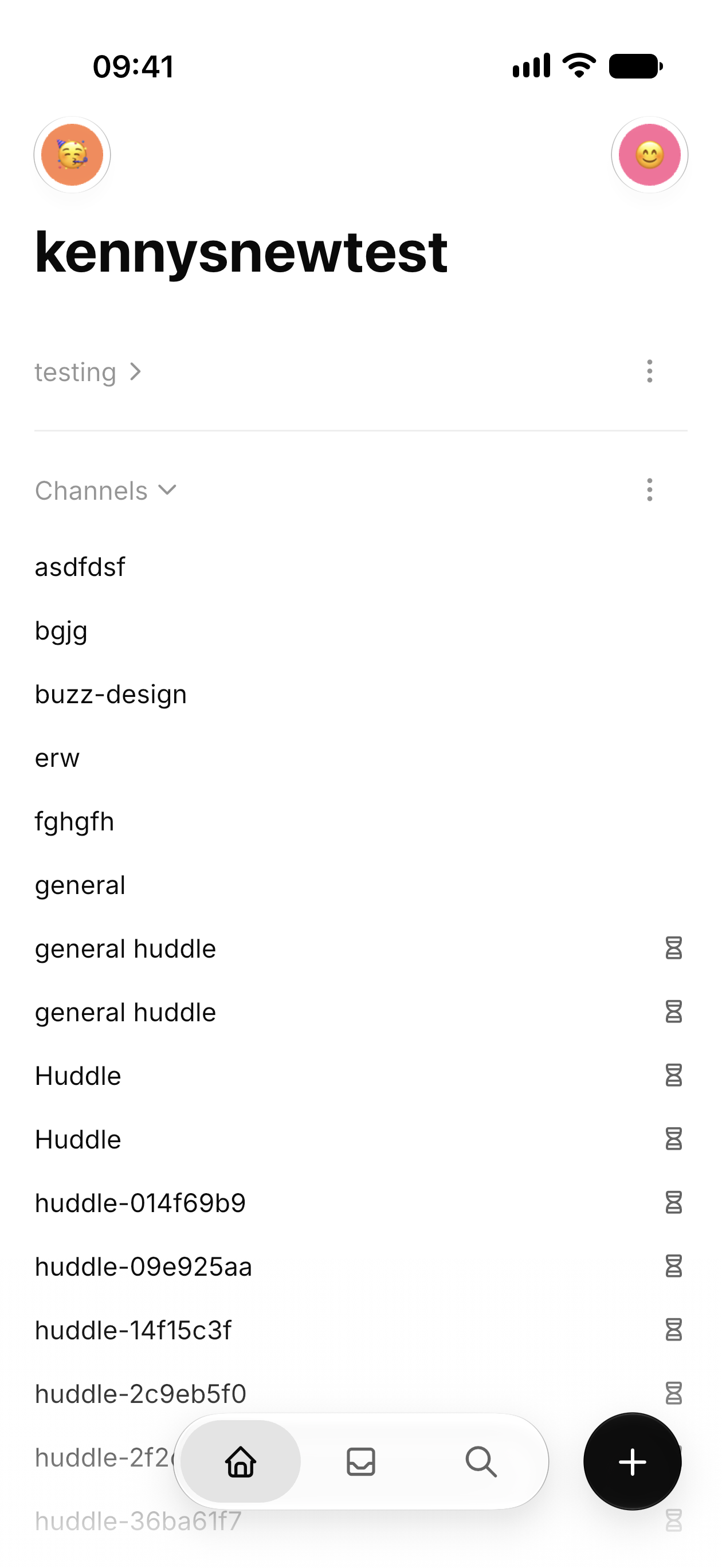 | 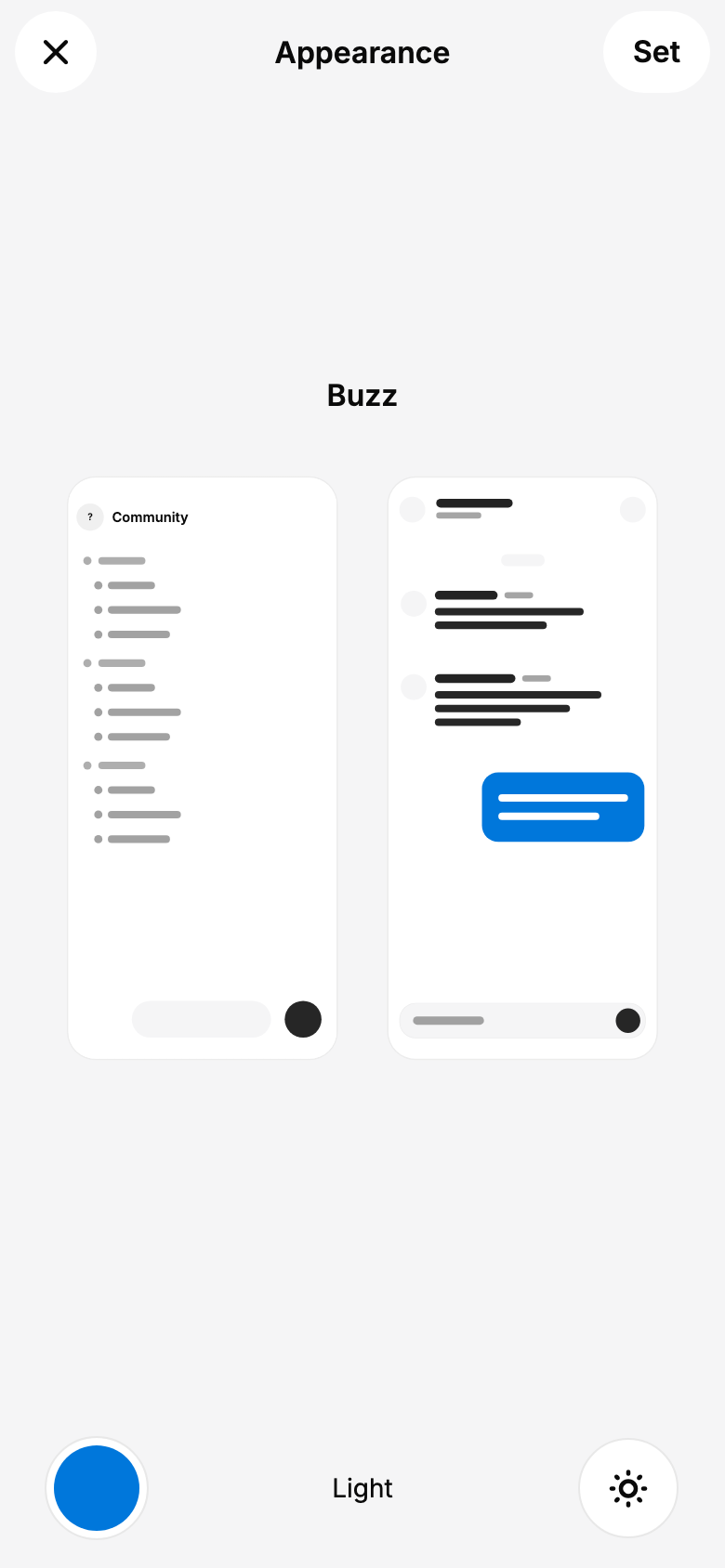 | 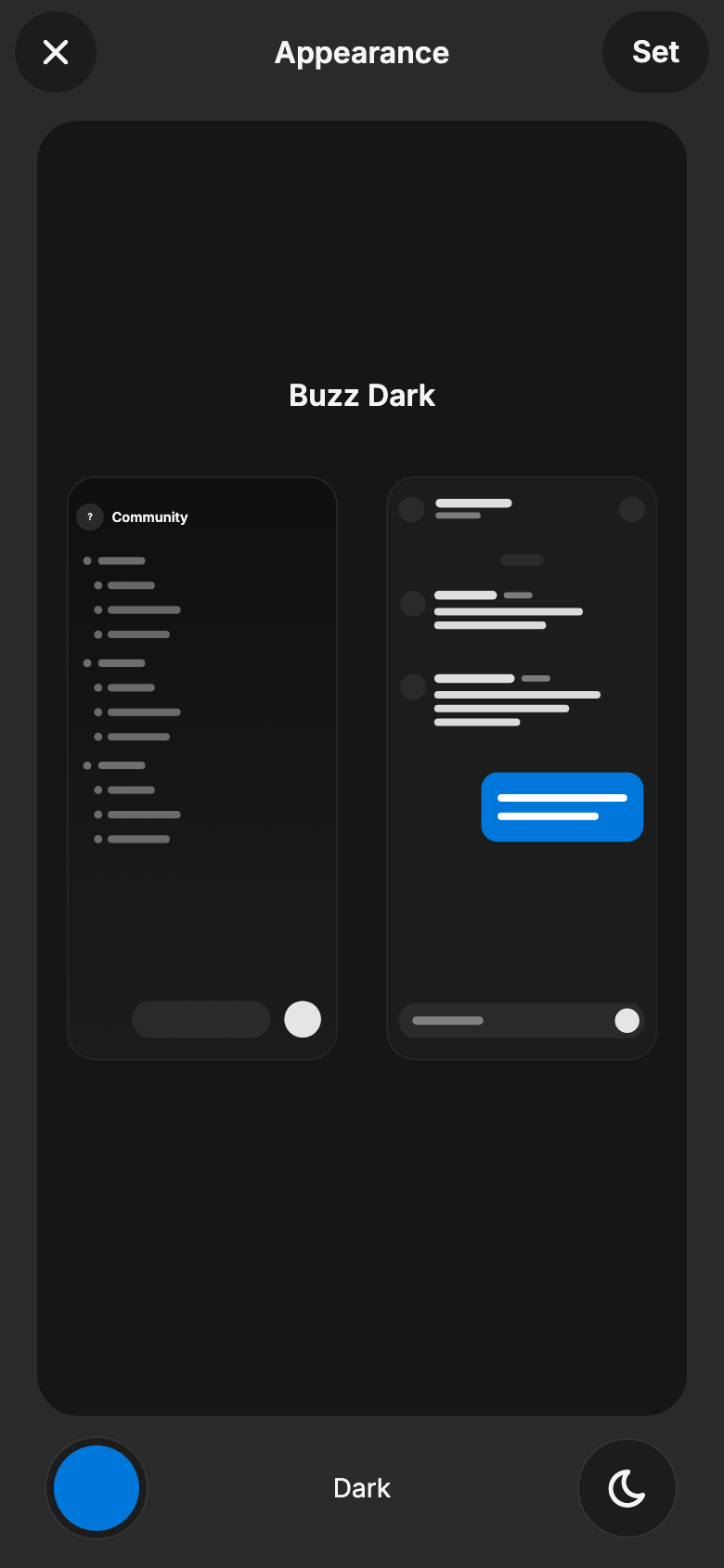 | 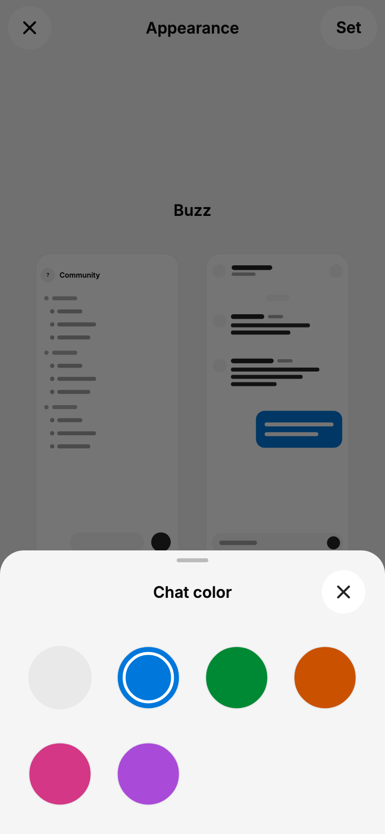 | --------- Signed-off-by: kenny lopez <klopez4212@gmail.com>




275 lines
7.9 KiB
Dart
275 lines
7.9 KiB
Dart
import 'dart:async';
|
|
|
|
import 'package:flutter/material.dart';
|
|
import 'package:flutter/services.dart';
|
|
import 'package:flutter_hooks/flutter_hooks.dart';
|
|
import 'package:buzz/shared/theme/buzz_icons.dart';
|
|
|
|
import '../../shared/theme/theme.dart';
|
|
import '../../shared/widgets/modal_presentation.dart';
|
|
|
|
const appearanceModeOptions = <({ThemeMode mode, String label, IconData icon})>[
|
|
(mode: ThemeMode.light, label: 'Light', icon: BuzzIcons.sun),
|
|
(mode: ThemeMode.dark, label: 'Dark', icon: BuzzIcons.moon),
|
|
(mode: ThemeMode.system, label: 'System', icon: BuzzIcons.sunMoon),
|
|
];
|
|
|
|
String appearanceModeLabel(ThemeMode mode) =>
|
|
appearanceModeOptions.firstWhere((option) => option.mode == mode).label;
|
|
|
|
Future<void> showAppearanceModePickerSheet({
|
|
required BuildContext context,
|
|
required ThemeMode selectedMode,
|
|
required ValueChanged<ThemeMode> onSelected,
|
|
}) => showBuzzModalBottomSheet<void>(
|
|
context: context,
|
|
title: 'Appearance',
|
|
showDragHandle: true,
|
|
builder: (_) =>
|
|
_AppearanceModePicker(initialMode: selectedMode, onSelected: onSelected),
|
|
);
|
|
|
|
Future<void> showAccentColorPickerSheet({
|
|
required BuildContext context,
|
|
required ColorScheme colorScheme,
|
|
required int selectedIndex,
|
|
required ValueChanged<int> onSelected,
|
|
}) => showBuzzModalBottomSheet<void>(
|
|
context: context,
|
|
title: 'Chat color',
|
|
showDragHandle: true,
|
|
builder: (_) => _AccentColorPicker(
|
|
colorScheme: colorScheme,
|
|
initialIndex: selectedIndex,
|
|
onSelected: onSelected,
|
|
),
|
|
);
|
|
|
|
class _AppearanceModePicker extends HookWidget {
|
|
const _AppearanceModePicker({
|
|
required this.initialMode,
|
|
required this.onSelected,
|
|
});
|
|
|
|
final ThemeMode initialMode;
|
|
final ValueChanged<ThemeMode> onSelected;
|
|
|
|
@override
|
|
Widget build(BuildContext context) {
|
|
final selected = useState(initialMode);
|
|
return SafeArea(
|
|
top: false,
|
|
child: Padding(
|
|
padding: const EdgeInsets.fromLTRB(
|
|
Grid.gutter,
|
|
Grid.xxs,
|
|
Grid.gutter,
|
|
Grid.xs,
|
|
),
|
|
child: SizedBox(
|
|
height: 132,
|
|
child: Row(
|
|
crossAxisAlignment: CrossAxisAlignment.stretch,
|
|
children: [
|
|
for (
|
|
var index = 0;
|
|
index < appearanceModeOptions.length;
|
|
index++
|
|
) ...[
|
|
if (index > 0) const SizedBox(width: Grid.xxs),
|
|
Expanded(
|
|
child: _AppearanceModeOption(
|
|
option: appearanceModeOptions[index],
|
|
selected:
|
|
appearanceModeOptions[index].mode == selected.value,
|
|
onTap: () {
|
|
final mode = appearanceModeOptions[index].mode;
|
|
unawaited(HapticFeedback.selectionClick());
|
|
selected.value = mode;
|
|
onSelected(mode);
|
|
},
|
|
),
|
|
),
|
|
],
|
|
],
|
|
),
|
|
),
|
|
),
|
|
);
|
|
}
|
|
}
|
|
|
|
class _AppearanceModeOption extends StatelessWidget {
|
|
const _AppearanceModeOption({
|
|
required this.option,
|
|
required this.selected,
|
|
required this.onTap,
|
|
});
|
|
|
|
final ({ThemeMode mode, String label, IconData icon}) option;
|
|
final bool selected;
|
|
final VoidCallback onTap;
|
|
|
|
@override
|
|
Widget build(BuildContext context) => Semantics(
|
|
button: true,
|
|
selected: selected,
|
|
label: '${option.label} appearance',
|
|
child: Container(
|
|
key: ValueKey('appearance-mode-${option.mode.name}'),
|
|
decoration: BoxDecoration(
|
|
color: context.colors.surfaceContainerHighest,
|
|
borderRadius: BorderRadius.circular(Radii.container),
|
|
),
|
|
foregroundDecoration: BoxDecoration(
|
|
borderRadius: BorderRadius.circular(Radii.container),
|
|
border: selected
|
|
? Border.all(color: context.colors.primary, width: 2)
|
|
: null,
|
|
),
|
|
child: Material(
|
|
color: Colors.transparent,
|
|
borderRadius: BorderRadius.circular(Radii.container),
|
|
clipBehavior: Clip.antiAlias,
|
|
child: InkWell(
|
|
onTap: onTap,
|
|
child: Stack(
|
|
alignment: Alignment.center,
|
|
children: [
|
|
Transform.translate(
|
|
offset: const Offset(0, -Grid.twelve),
|
|
child: Icon(
|
|
option.icon,
|
|
key: ValueKey('appearance-mode-${option.mode.name}-icon'),
|
|
size: 34,
|
|
color: selected
|
|
? context.colors.primary
|
|
: context.colors.onSurface,
|
|
),
|
|
),
|
|
Positioned(
|
|
left: Grid.xxs,
|
|
right: Grid.xxs,
|
|
bottom: Grid.xxs,
|
|
child: Text(
|
|
option.label,
|
|
key: ValueKey('appearance-mode-${option.mode.name}-label'),
|
|
textAlign: TextAlign.center,
|
|
style: context.textTheme.labelLarge?.copyWith(
|
|
color: selected
|
|
? context.colors.primary
|
|
: context.colors.onSurface,
|
|
fontWeight: FontWeight.w600,
|
|
),
|
|
),
|
|
),
|
|
],
|
|
),
|
|
),
|
|
),
|
|
),
|
|
);
|
|
}
|
|
|
|
class _AccentColorPicker extends HookWidget {
|
|
const _AccentColorPicker({
|
|
required this.colorScheme,
|
|
required this.initialIndex,
|
|
required this.onSelected,
|
|
});
|
|
|
|
final ColorScheme colorScheme;
|
|
final int initialIndex;
|
|
final ValueChanged<int> onSelected;
|
|
|
|
@override
|
|
Widget build(BuildContext context) {
|
|
final selected = useState(initialIndex);
|
|
return SafeArea(
|
|
top: false,
|
|
child: Padding(
|
|
padding: const EdgeInsets.fromLTRB(
|
|
Grid.gutter,
|
|
Grid.xxs,
|
|
Grid.gutter,
|
|
Grid.xs,
|
|
),
|
|
child: GridView.builder(
|
|
key: const ValueKey('accent-selection-grid'),
|
|
shrinkWrap: true,
|
|
primary: false,
|
|
padding: EdgeInsets.zero,
|
|
gridDelegate: const SliverGridDelegateWithFixedCrossAxisCount(
|
|
crossAxisCount: 4,
|
|
crossAxisSpacing: Grid.xxs,
|
|
mainAxisSpacing: Grid.xs,
|
|
),
|
|
itemCount: chatColorChoices.length,
|
|
itemBuilder: (context, index) => _AccentSheetOption(
|
|
index: index,
|
|
color: chatColorForScheme(colorScheme, index),
|
|
selected: selected.value == index,
|
|
onTap: () {
|
|
unawaited(HapticFeedback.selectionClick());
|
|
selected.value = index;
|
|
onSelected(index);
|
|
},
|
|
),
|
|
),
|
|
),
|
|
);
|
|
}
|
|
}
|
|
|
|
class _AccentSheetOption extends StatelessWidget {
|
|
const _AccentSheetOption({
|
|
required this.index,
|
|
required this.color,
|
|
required this.selected,
|
|
required this.onTap,
|
|
});
|
|
|
|
final int index;
|
|
final Color color;
|
|
final bool selected;
|
|
final VoidCallback onTap;
|
|
|
|
@override
|
|
Widget build(BuildContext context) => Semantics(
|
|
label: '${chatColorChoices[index].name} chat color',
|
|
button: true,
|
|
selected: selected,
|
|
child: InkResponse(
|
|
key: ValueKey('accent-option-$index'),
|
|
onTap: onTap,
|
|
radius: 36,
|
|
child: Center(
|
|
child: Container(
|
|
key: ValueKey('accent-swatch-$index'),
|
|
width: 64,
|
|
height: 64,
|
|
padding: const EdgeInsets.all(5),
|
|
decoration: BoxDecoration(
|
|
color: color,
|
|
shape: BoxShape.circle,
|
|
border: Border.all(color: context.colors.outlineVariant),
|
|
),
|
|
child: selected
|
|
? DecoratedBox(
|
|
decoration: BoxDecoration(
|
|
shape: BoxShape.circle,
|
|
border: Border.all(
|
|
color: color.computeLuminance() > 0.55
|
|
? const Color(0xFF111111)
|
|
: Colors.white,
|
|
width: 3,
|
|
),
|
|
),
|
|
)
|
|
: null,
|
|
),
|
|
),
|
|
),
|
|
);
|
|
}
|