mirror of
https://github.com/block/buzz.git
synced 2026-11-07 18:01:06 +00:00
 857e63c4dd
## Summary

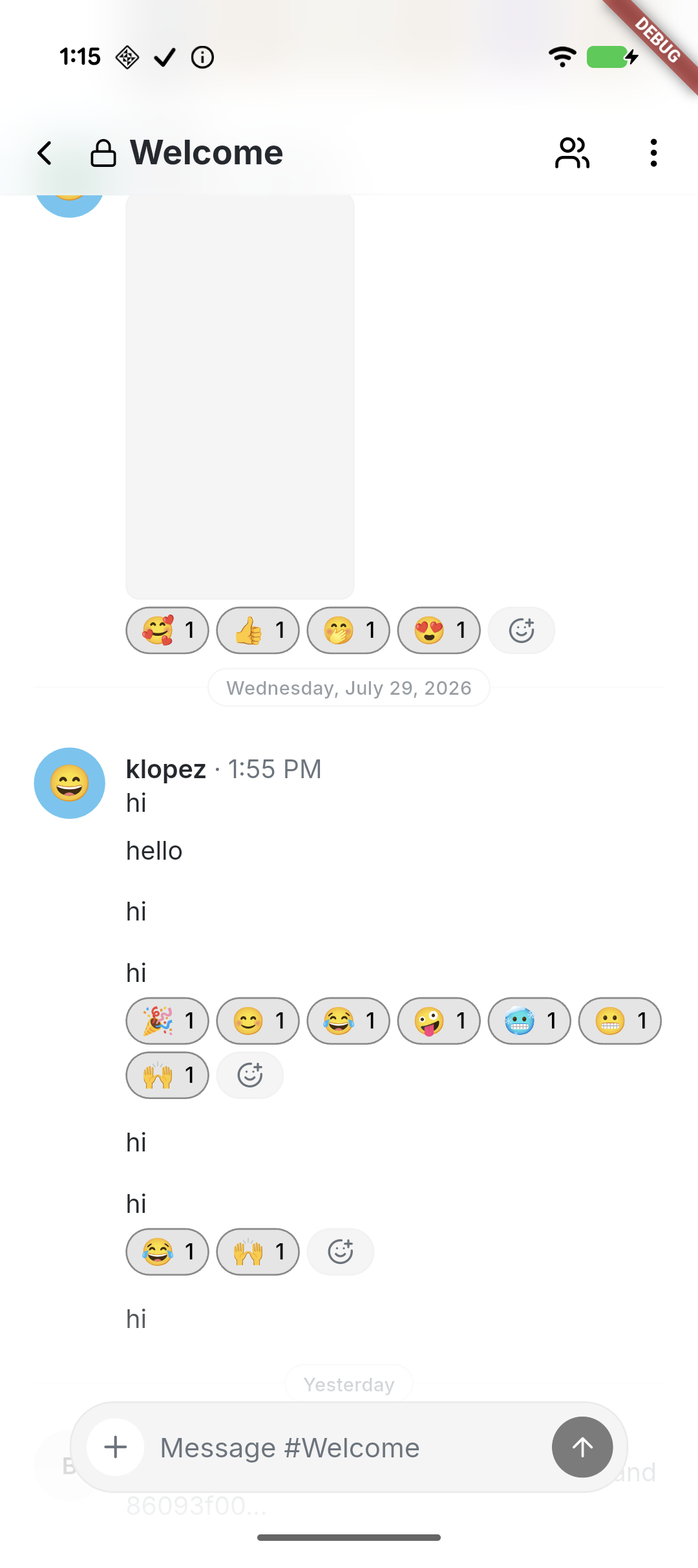
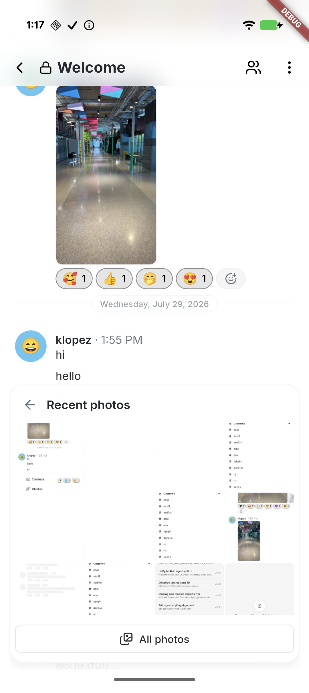
- Refine the mobile composer with compact and expanded states, shared
footer fades, haptics, reliable keyboard dismissal, and full-width
camera and photo surfaces.
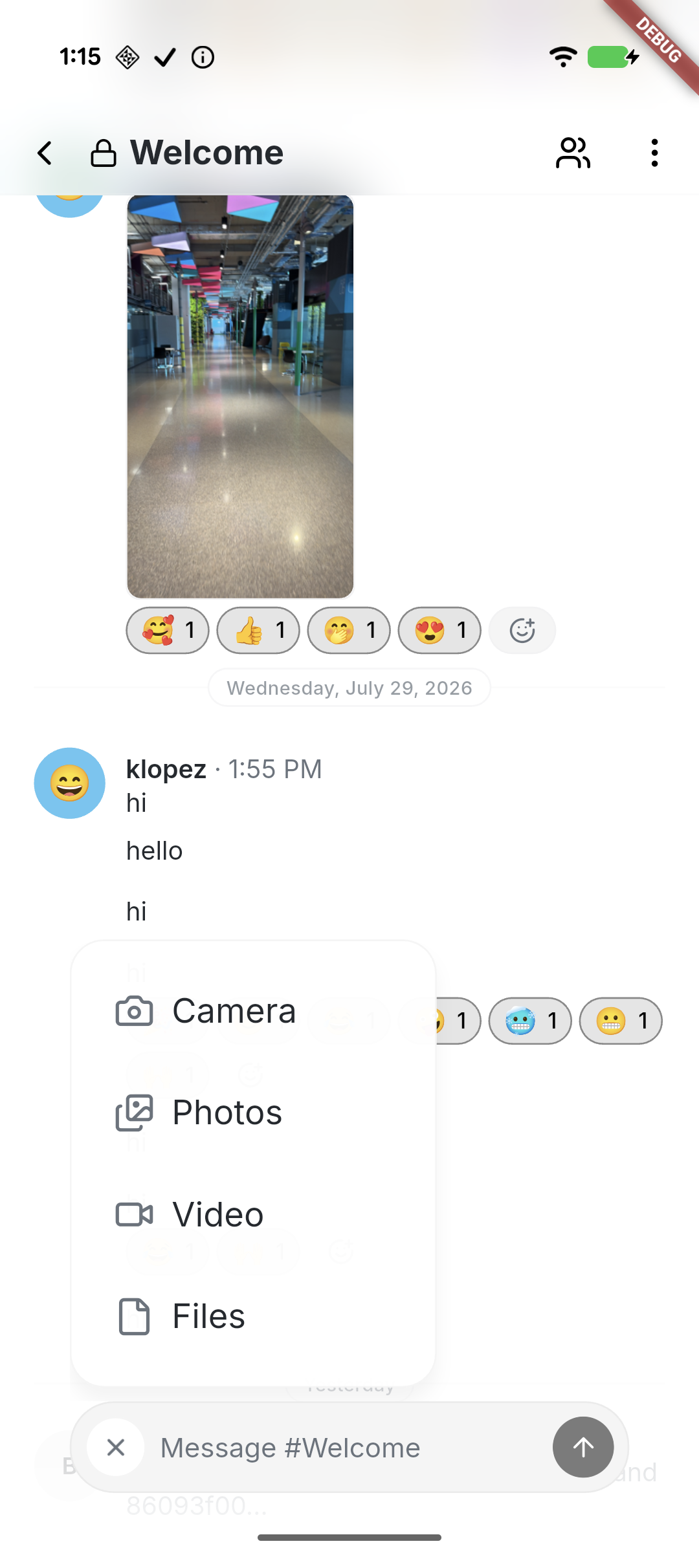
- Standardize popovers, filters, and section menus with consistent type,
strokes, radii, spacing, icons, and destructive styling.
- Align message presentation with desktop through consistent system
rows, typing and loading feedback, emoji placement, and predictable
photo viewing.

## Validation

- `just mobile-check`
- `just mobile-test` — 1,037 passed, 1 skipped
- Tested on Pixel 10 and a connected iPhone

## Snapshots

<table>
  <tr>
    <td align="center">Compact composer</td>
    <td align="center">Attachment menu</td>
    <td align="center">Recent photos</td>
  </tr>
  <tr>
<td><img
src="https://raw.githubusercontent.com/block/buzz/9732022cb13bb39ce797c4faaa714fe4c924955f/pr-3918--01-compact-composer.png"
width="260" /></td>
<td><img
src="https://raw.githubusercontent.com/block/buzz/9732022cb13bb39ce797c4faaa714fe4c924955f/pr-3918--02-attachment-menu.png"
width="260" /></td>
<td><img
src="https://raw.githubusercontent.com/block/buzz/9732022cb13bb39ce797c4faaa714fe4c924955f/pr-3918--03-photo-surface.png"
width="260" /></td>
  </tr>
</table>

---------

Signed-off-by: kenny lopez <klopez4212@gmail.com>
78 lines
2.3 KiB
Dart
78 lines
2.3 KiB
Dart
import 'package:flutter/material.dart';
|
|
|
|
import '../theme/theme.dart';
|
|
|
|
/// Height of the floating mobile tab bar, excluding its bottom clearance.
|
|
const mobileTabBarHeight = 56.0;
|
|
|
|
/// Gap between the floating mobile tab bar and the bottom safe area.
|
|
const mobileTabBarBottomGap = Grid.twelve;
|
|
|
|
/// Returns the shared footer backdrop height, including the logical safe area.
|
|
double mobileTabFooterBackdropHeight(BuildContext context) =>
|
|
mobileTabBarHeight +
|
|
mobileTabBarBottomGap +
|
|
MediaQuery.paddingOf(context).bottom +
|
|
Grid.xl +
|
|
Grid.gutter;
|
|
|
|
/// Builds the shared transparent-to-surface footer fade.
|
|
///
|
|
/// Kept separate from [MobileTabFooterBackdrop] so floating controls such as
|
|
/// the channel composer can paint the exact same fade behind their own content.
|
|
LinearGradient mobileTabFooterBackdropGradient(
|
|
BuildContext context, {
|
|
List<double> stops = const [0, 0.5, 1],
|
|
List<double> opacities = const [0, 0.75, 1],
|
|
}) {
|
|
assert(stops.length == opacities.length);
|
|
final surface = context.colors.surface;
|
|
return LinearGradient(
|
|
begin: Alignment.topCenter,
|
|
end: Alignment.bottomCenter,
|
|
stops: stops,
|
|
colors: [
|
|
for (final opacity in opacities) surface.withValues(alpha: opacity),
|
|
],
|
|
);
|
|
}
|
|
|
|
/// Shared fade behind the floating mobile tab bar.
|
|
class MobileTabFooterBackdrop extends StatelessWidget {
|
|
/// Vertical extent of the backdrop in logical pixels.
|
|
final double height;
|
|
|
|
/// Gradient stop positions, from the transparent top to the opaque bottom.
|
|
final List<double> stops;
|
|
|
|
/// Surface-color alpha values paired with [stops].
|
|
final List<double> opacities;
|
|
|
|
/// Creates a footer backdrop with the required [height].
|
|
///
|
|
/// Override [stops] and [opacities] together to customize the gradient.
|
|
const MobileTabFooterBackdrop({
|
|
super.key,
|
|
required this.height,
|
|
this.stops = const [0, 0.5, 1],
|
|
this.opacities = const [0, 0.75, 1],
|
|
}) : assert(stops.length == opacities.length);
|
|
|
|
@override
|
|
Widget build(BuildContext context) {
|
|
return SizedBox(
|
|
height: height,
|
|
width: double.infinity,
|
|
child: DecoratedBox(
|
|
decoration: BoxDecoration(
|
|
gradient: mobileTabFooterBackdropGradient(
|
|
context,
|
|
stops: stops,
|
|
opacities: opacities,
|
|
),
|
|
),
|
|
),
|
|
);
|
|
}
|
|
}
|