mirror of
https://github.com/block/buzz.git
synced 2026-10-30 22:11:36 +00:00
 a7e65c91da
Follow-up to [#8626](https://github.com/block/buzz/pull/8626). Mobile
remote-agent creation now matches desktop.

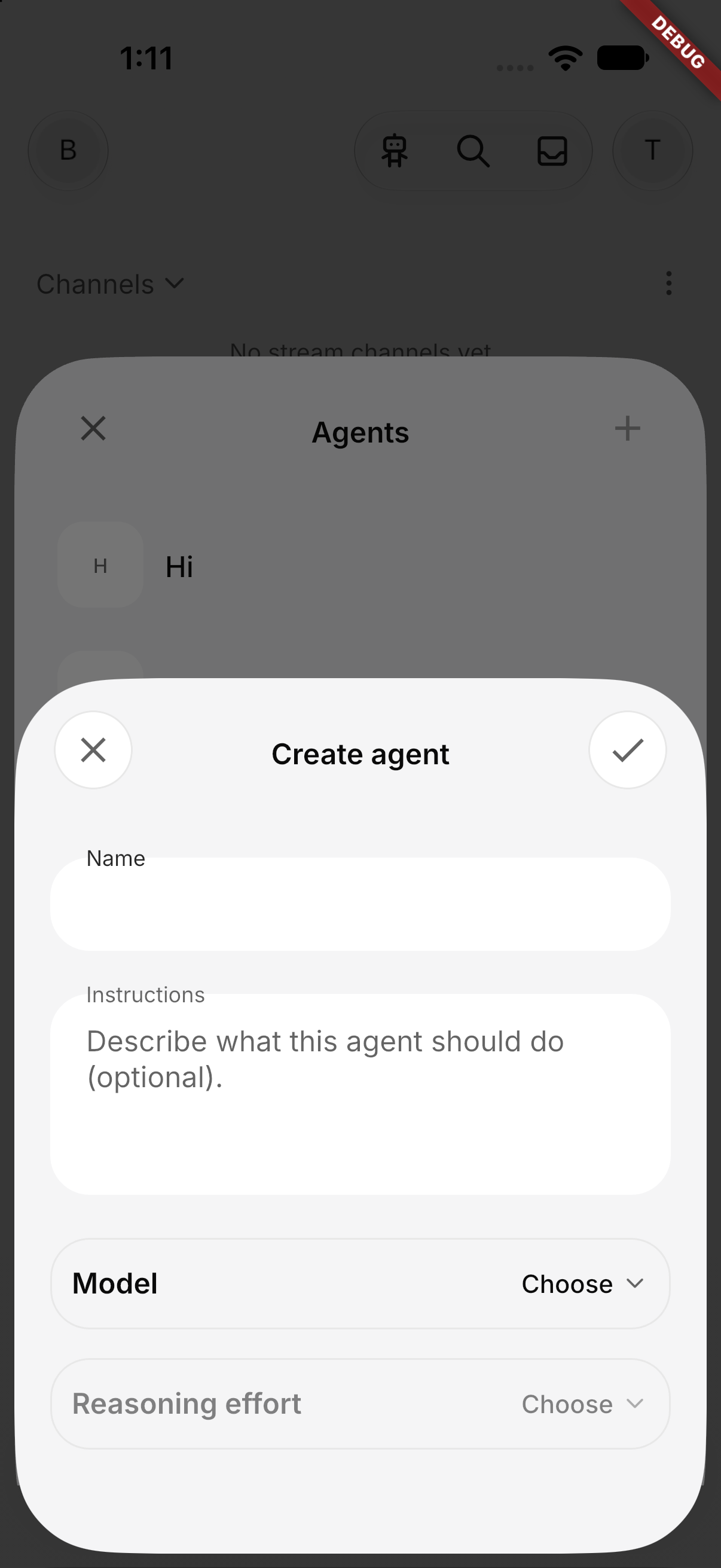
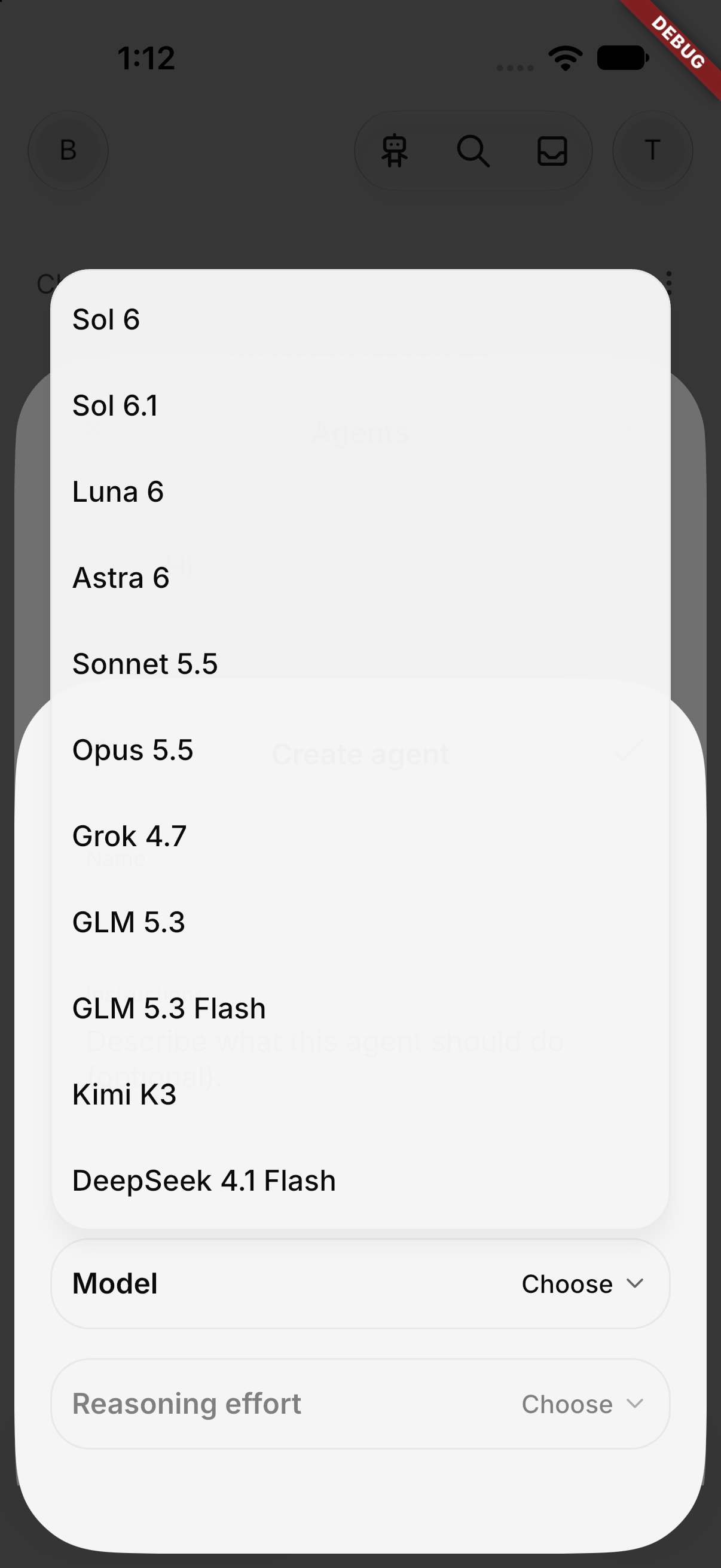
- **Model and reasoning effort:** Create agent has Model and Reasoning
effort menus. Their options come from the remote service's catalog, and
nothing is preselected (same as desktop). The server checks the
selection against the catalog again before registering, and saves it on
the agent.
- **Builderlab gate:** creating a remote agent requires a hosted
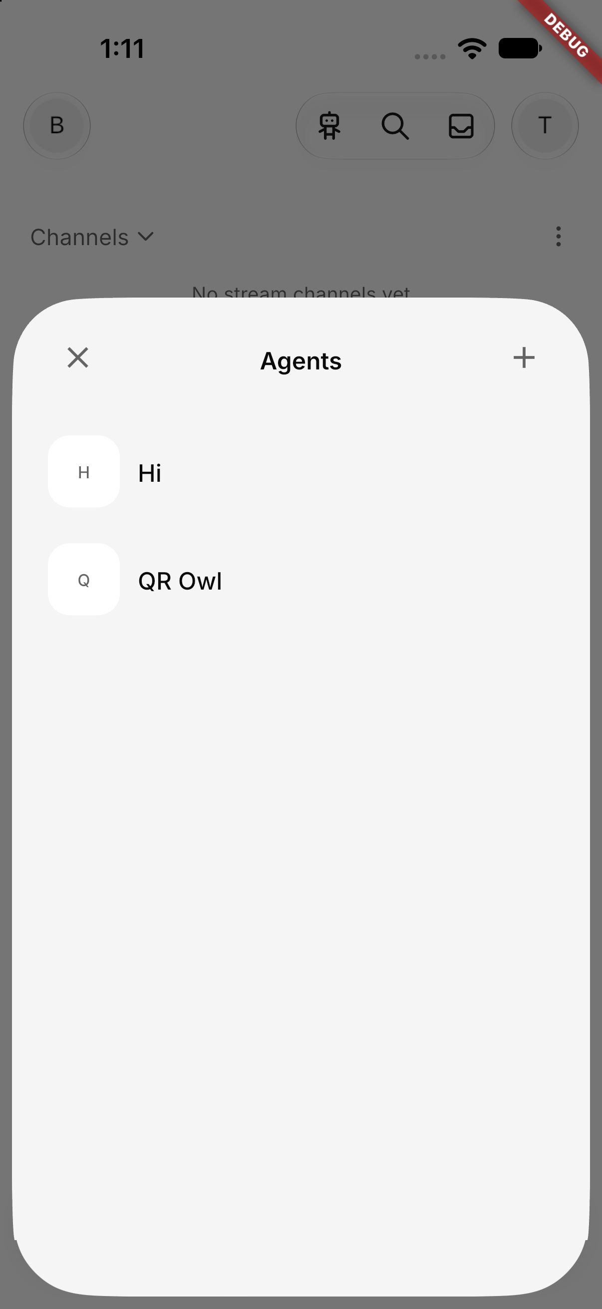
community and Builderlab sign-in. The Agents directory, community bots
and the Bestie chooser stay available without it. Signing out closes an
open Create agent sheet; the Agents sheet stays open.
- **Enrollment:** `attest-agent` enrolls the agent in the requested
community, as on desktop, so the separate `add-buzz-subscription` call
is gone.
- **Quieter progress:** spinners replace the progress bars and the
"Working…" label. Status and success text ("is ready", "Remote agent
deleted.", setup steps) is gone, and only failures show text. Refreshing
an already-loaded agent list no longer blanks it.
- **Shared setting menu:** `BuzzSettingMenu` is a bordered setting row
that opens a Material 3 menu spanning the row's width. Opening it
dismisses the keyboard. The channel-TTL setting in Create channel uses
it too.

Agent avatars and QR/link-based creation follow in stacked PRs. Editing
existing agents comes later.

| Agents | Create | Model menu |
| --- | --- | --- |
| <img
src="https://raw.githubusercontent.com/block/buzz/d0bee87c45d30b9bdd2163a75966ccd5d64f322a/pr-8650--1-agents.png"
width="240"> | <img
src="https://raw.githubusercontent.com/block/buzz/d0bee87c45d30b9bdd2163a75966ccd5d64f322a/pr-8650--2-create.png"
width="240"> | <img
src="https://raw.githubusercontent.com/block/buzz/d0bee87c45d30b9bdd2163a75966ccd5d64f322a/pr-8650--3-model-menu.png"
width="240"> |

### Validation

- Checked on the staging iOS simulator with a Builderlab account: the
Agents list, the Create sheet, and the model and effort menus (including
with the keyboard open).
- Added tests: catalog-gated model selection (including switching models
clears an unsupported effort), the Builderlab sign-in gate, controller
creation and resume with a model, a failed listing reported instead of
an empty registry, and create sheet busy and failure states (including
the catalog reload after a rejected create).
- The hosted-only agent tests are skipped without Builderlab defines,
which `mobile-test` doesn't pass. They pass locally with the staging
defines (20/20).
- Not covered: Android.

🤖 Generated with [Claude Code](https://claude.com/claude-code)

Signed-off-by: Tom Brow <tomb@block.xyz>
Co-authored-by: george <973be878edd6d4f79692a3827f20a6f7fe0ed0362f269ff6b6ba8867033d7d8e@sprout-oss.stage.blox.sqprod.co>
156 lines
5.5 KiB
Dart
156 lines
5.5 KiB
Dart
import 'package:flutter/material.dart';
|
|
|
|
import '../theme/buzz_icons.dart';
|
|
import '../theme/theme.dart';
|
|
import 'anchored_popover_menu.dart';
|
|
|
|
/// One choice in a [BuzzSettingMenu].
|
|
class BuzzSettingMenuOption<T> {
|
|
final Key? key;
|
|
final String label;
|
|
final T value;
|
|
|
|
const BuzzSettingMenuOption({
|
|
this.key,
|
|
required this.label,
|
|
required this.value,
|
|
});
|
|
}
|
|
|
|
/// A bordered settings row showing its current value, opening a checked menu.
|
|
class BuzzSettingMenu<T> extends StatelessWidget {
|
|
final Key controlKey;
|
|
final bool enabled;
|
|
final String label;
|
|
final ValueChanged<T> onSelected;
|
|
final List<BuzzSettingMenuOption<T>> options;
|
|
final T? value;
|
|
final IconData? valueIcon;
|
|
final String valueLabel;
|
|
|
|
const BuzzSettingMenu({
|
|
super.key,
|
|
required this.controlKey,
|
|
required this.enabled,
|
|
required this.label,
|
|
required this.onSelected,
|
|
required this.options,
|
|
required this.value,
|
|
this.valueIcon,
|
|
required this.valueLabel,
|
|
});
|
|
|
|
@override
|
|
Widget build(BuildContext context) {
|
|
final shape = RoundedRectangleBorder(
|
|
side: BorderSide(color: context.colors.outlineVariant),
|
|
borderRadius: BorderRadius.circular(Radii.container),
|
|
);
|
|
// The menu spans the row, like Material's dropdown menus.
|
|
return LayoutBuilder(
|
|
builder: (context, constraints) => MenuAnchor(
|
|
alignmentOffset: const Offset(0, Grid.half),
|
|
// Match the app's shared popover surface.
|
|
style: MenuStyle(
|
|
shape: WidgetStatePropertyAll(appPopoverShape(context)),
|
|
backgroundColor: WidgetStatePropertyAll(appPopoverColor(context)),
|
|
shadowColor: WidgetStatePropertyAll(appPopoverShadowColor(context)),
|
|
elevation: const WidgetStatePropertyAll(appPopoverElevation),
|
|
padding: const WidgetStatePropertyAll(
|
|
EdgeInsets.symmetric(vertical: Grid.half),
|
|
),
|
|
),
|
|
menuChildren: [
|
|
for (final option in options)
|
|
MenuItemButton(
|
|
key: option.key,
|
|
onPressed: () => onSelected(option.value),
|
|
style: MenuItemButton.styleFrom(
|
|
padding: const EdgeInsets.symmetric(horizontal: Grid.twelve),
|
|
),
|
|
// A trailing check keeps labels flush with the menu's edge.
|
|
trailingIcon: option.value == value
|
|
? Icon(Icons.check, size: 20, color: context.colors.primary)
|
|
: const SizedBox(width: 20),
|
|
// Root menu panels ignore size styles and shrink-wrap their items,
|
|
// so the label sets the width: the row's, less the item's padding,
|
|
// the check and the gap before it.
|
|
child: SizedBox(
|
|
width: constraints.maxWidth - Grid.twelve * 3 - 20,
|
|
child: Text(option.label),
|
|
),
|
|
),
|
|
],
|
|
builder: (context, menu, _) => Tooltip(
|
|
message: '$label: $valueLabel',
|
|
// Draw on an ink surface so the tap ripple shows inside the border.
|
|
child: Material(
|
|
color: context.colors.surface,
|
|
shape: shape,
|
|
clipBehavior: Clip.antiAlias,
|
|
child: InkWell(
|
|
onTap: enabled
|
|
? () {
|
|
if (menu.isOpen) return menu.close();
|
|
// Drop the keyboard so it can't cover the menu.
|
|
FocusManager.instance.primaryFocus?.unfocus();
|
|
menu.open();
|
|
}
|
|
: null,
|
|
child: Padding(
|
|
key: controlKey,
|
|
padding: const EdgeInsets.symmetric(
|
|
horizontal: Grid.twelve,
|
|
vertical: Grid.xs,
|
|
),
|
|
child: Opacity(
|
|
opacity: enabled ? 1 : 0.5,
|
|
child: Row(
|
|
children: [
|
|
Expanded(
|
|
child: Text(
|
|
label,
|
|
style: context.textTheme.labelLarge?.copyWith(
|
|
color: context.colors.onSurface,
|
|
fontWeight: FontWeight.w600,
|
|
),
|
|
),
|
|
),
|
|
if (valueIcon case final icon?) ...[
|
|
Icon(
|
|
icon,
|
|
size: 16,
|
|
color: context.colors.onSurfaceVariant,
|
|
),
|
|
const SizedBox(width: Grid.half),
|
|
],
|
|
// Long values truncate instead of squeezing the label.
|
|
ConstrainedBox(
|
|
constraints: const BoxConstraints(maxWidth: 180),
|
|
child: Text(
|
|
valueLabel,
|
|
overflow: TextOverflow.ellipsis,
|
|
style: context.textTheme.bodyMedium?.copyWith(
|
|
color: context.colors.onSurface,
|
|
fontWeight: FontWeight.w500,
|
|
),
|
|
),
|
|
),
|
|
const SizedBox(width: Grid.half),
|
|
Icon(
|
|
BuzzIcons.chevronDown,
|
|
size: 16,
|
|
color: context.colors.onSurfaceVariant,
|
|
),
|
|
],
|
|
),
|
|
),
|
|
),
|
|
),
|
|
),
|
|
),
|
|
),
|
|
);
|
|
}
|
|
}
|