mirror of
https://github.com/block/buzz.git
synced 2026-10-28 13:01:10 +00:00
 a567dfc2df
## Summary - combine channel identity, actions, member previews, and lifecycle controls in one navigable mobile details page - add compact member management and desktop-aligned channel editing - smooth the profile entrance transition and standardize settings-group spacing - align Huddle lifecycle rows with regular message author and body spacing ## Testing - `just mobile-check` - `just mobile-test` — 1,477 tests - Pixel 10 debug build, install, and interaction review ## Snapshots ### Channel header 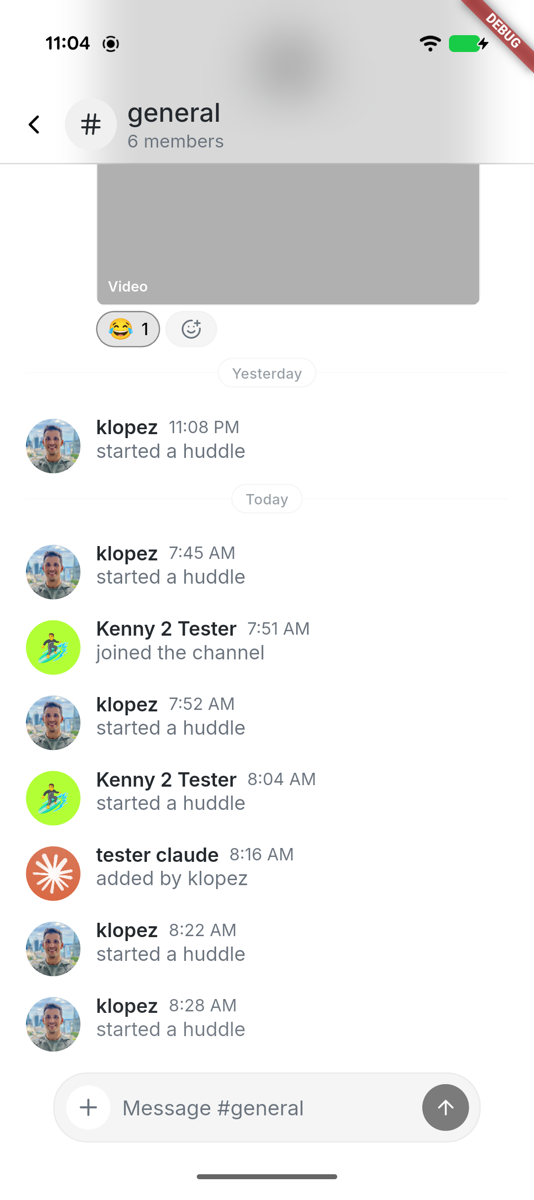 ### Combined channel details 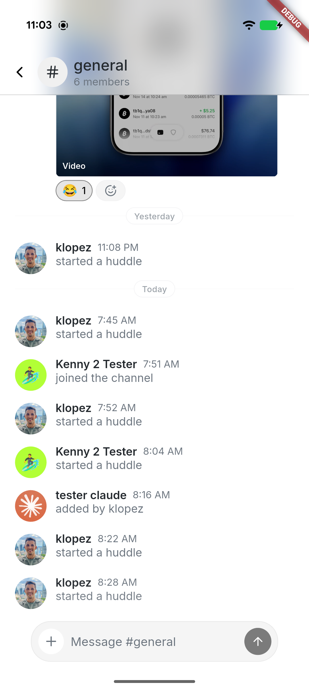 ### Manage channel 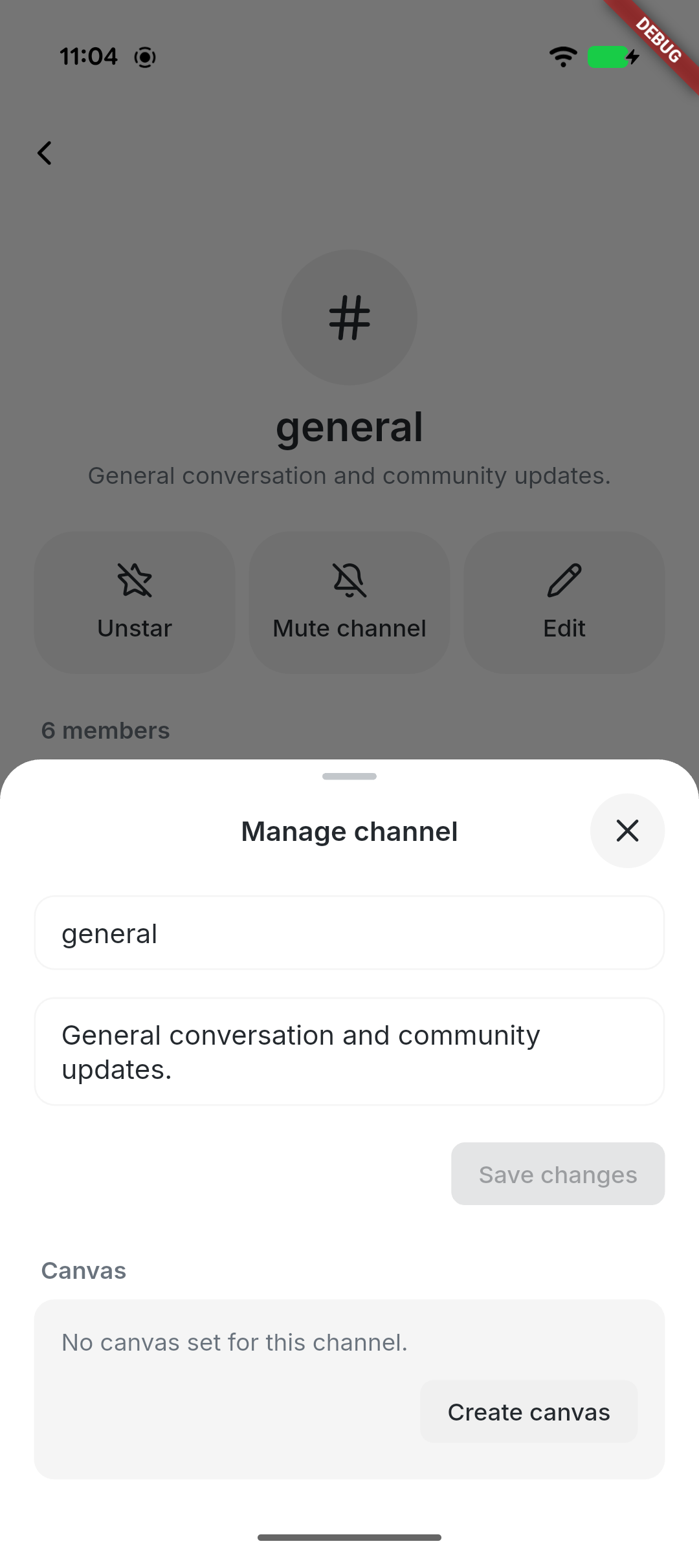 --------- Signed-off-by: kenny lopez <klopez4212@gmail.com> Signed-off-by: Fast Fizz <2df81cb51f05a9d5387ef24d7b9ecb8fcdfcd1c70ffabc67061c9596e1b5b1c4@buzz.block.builderlab.xyz> Co-authored-by: Fast Fizz <2df81cb51f05a9d5387ef24d7b9ecb8fcdfcd1c70ffabc67061c9596e1b5b1c4@buzz.block.builderlab.xyz>



95 lines
2.8 KiB
Dart
95 lines
2.8 KiB
Dart
import 'dart:async';
|
|
|
|
import 'package:flutter/material.dart';
|
|
import 'package:flutter/services.dart';
|
|
|
|
import '../theme/theme.dart';
|
|
import 'buzz_loading_indicator.dart';
|
|
|
|
/// Equal-width icon action used by profile and profile-adjacent surfaces.
|
|
class BuzzActionTile extends StatelessWidget {
|
|
/// Creates an action tile with an optional loading state.
|
|
const BuzzActionTile({
|
|
super.key,
|
|
required this.icon,
|
|
required this.label,
|
|
required this.onTap,
|
|
this.isEnabled = true,
|
|
this.isLoading = false,
|
|
this.loadingSemanticLabel,
|
|
});
|
|
|
|
/// Icon shown when the tile is not loading.
|
|
final IconData? icon;
|
|
|
|
/// Label shown below the icon.
|
|
final String label;
|
|
|
|
/// Called when the tile is tapped.
|
|
final VoidCallback onTap;
|
|
|
|
/// Whether the tile accepts taps.
|
|
final bool isEnabled;
|
|
|
|
/// Whether to show a loading indicator instead of [icon].
|
|
final bool isLoading;
|
|
|
|
/// Accessibility label for the loading indicator.
|
|
final String? loadingSemanticLabel;
|
|
|
|
@override
|
|
Widget build(BuildContext context) {
|
|
final canTap = isEnabled && !isLoading;
|
|
void handleTap() {
|
|
unawaited(HapticFeedback.lightImpact());
|
|
onTap();
|
|
}
|
|
|
|
return Semantics(
|
|
button: true,
|
|
enabled: canTap,
|
|
label: isLoading ? loadingSemanticLabel ?? label : label,
|
|
onTap: canTap ? handleTap : null,
|
|
excludeSemantics: true,
|
|
child: GestureDetector(
|
|
onTap: canTap ? handleTap : null,
|
|
excludeFromSemantics: true,
|
|
behavior: HitTestBehavior.opaque,
|
|
child: Opacity(
|
|
opacity: isEnabled ? 1 : 0.5,
|
|
child: Container(
|
|
width: double.infinity,
|
|
constraints: const BoxConstraints(minHeight: 68 + (Grid.xxs * 2)),
|
|
padding: const EdgeInsets.symmetric(vertical: Grid.xxs),
|
|
decoration: BoxDecoration(
|
|
color: context.colors.surfaceContainerHighest,
|
|
borderRadius: BorderRadius.circular(Radii.dialog),
|
|
),
|
|
child: Column(
|
|
mainAxisAlignment: MainAxisAlignment.center,
|
|
children: [
|
|
if (isLoading)
|
|
BuzzLoadingIndicator(
|
|
size: 22,
|
|
color: context.colors.onSurface,
|
|
semanticLabel: loadingSemanticLabel ?? label,
|
|
)
|
|
else
|
|
Icon(icon, size: 22, color: context.colors.onSurface),
|
|
const SizedBox(height: Grid.xxs),
|
|
Text(
|
|
label,
|
|
textAlign: TextAlign.center,
|
|
style: context.textTheme.labelMedium?.copyWith(
|
|
color: context.colors.onSurface,
|
|
),
|
|
),
|
|
],
|
|
),
|
|
),
|
|
),
|
|
),
|
|
);
|
|
}
|
|
}
|